Preview image. Unlock full-res
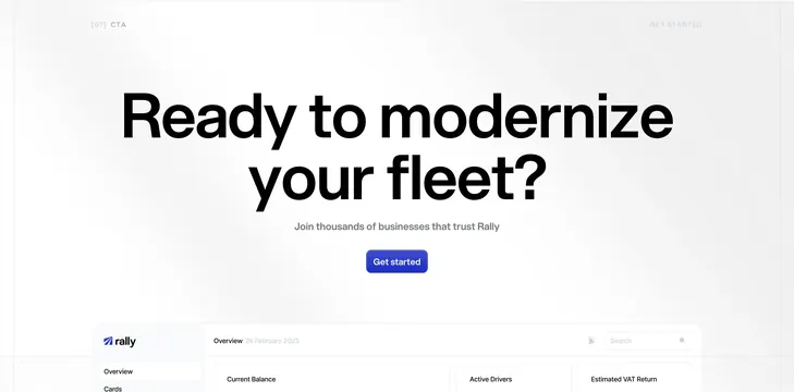
A centered "Ready to modernize your fleet?" CTA with blue button and a partial dashboard rising from the bottom edge.
Summary
A closing CTA band with minimal copy, one primary button, and the top of the Rally dashboard cropping up from below like a product reveal.
Visual description
Light gray off-white background with subtle diagonal hatch patterns in bottom corners. Top labels: "[07] CTA" left, "GET STARTED" right in light gray. Center: large bold headline "Ready to modernize your fleet?", gray subhead "Join thousands of businesses that trust Rally", and a rounded royal-blue "Get started" button. Bottom third shows the upper portion of a dashboard UI: Rally sidebar with Overview and Cards links, main header with date "26 February 2025", search field, and tops of three stat cards (Current Balance, Active Drivers, Estimated VAT Return).
Key takeaway
The dashboard peek as visual proof beneath a simple headline, so the CTA sells continuity into the product rather than ending on empty space. Section numbering ties it to a longer landing page system.
Reuse notes
Effective final CTA for long SaaS pages. Requires a polished product screenshot cropped intentionally. Hatch corner decoration is optional brand flavor; remove if it clashes with your system.
More cta sections
See all











More like this


Keep what you find
A free account saves references to boards and can send you a weekly email of picks based on what you save.
To see every result, go Pro.