Preview image. Unlock full-res
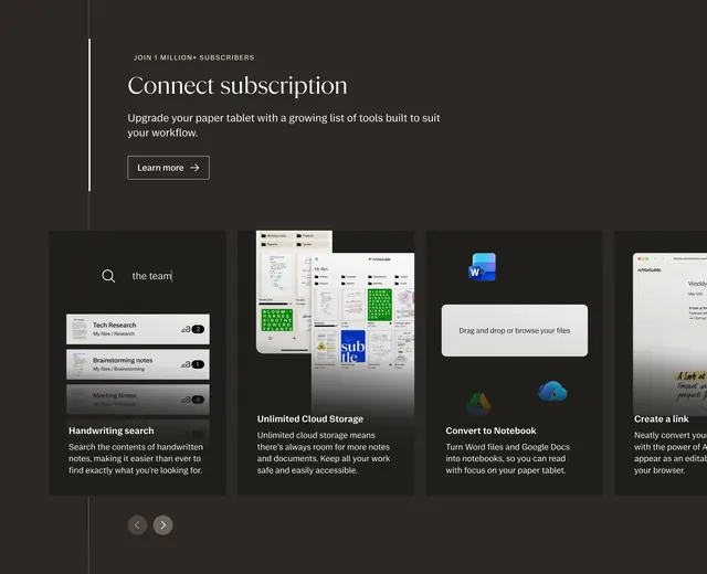
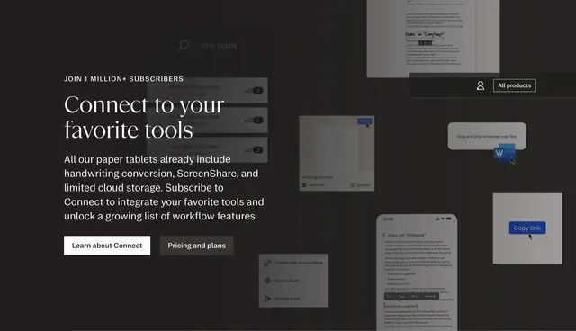
Dark split CTA with serif integration headline and dual buttons on the left, overlapping UI collage showing Slack, Word, and workflow tools on the right.
Summary
A dark lead-generation band that sells Connect integrations through copy and two CTAs on the left while a layered collage of app UI snippets demonstrates real workflow connections on the right.
Visual description
Charcoal full-bleed section split roughly 40/60. Left block shows JOIN 1 MILLION+ SUBSCRIBERS in small caps, oversized white serif headline Connect to your favorite tools, gray sans paragraph on included features versus Connect subscription benefits, a filled white Learn about Connect button, and a ghost Pricing and plans button beside it. Right side is a dense overlapping collage of UI fragments at varied depths: search bar with the team query, file lists, drag-and-drop import with Word icon, Send to Slack menu item, Copy link button, phone mockup with text selection, meeting minutes import card, and a faded document with handwritten notes in the background. Top-right chrome shows profile icon and outlined All products button within the collage area.
Key takeaway
The collage sells integrations faster than a logo row because each snippet shows an actual action. Primary and secondary CTAs separate education from pricing without competing visually. Serif headline on dark ground keeps a hardware brand feeling editorial, not utilitarian.
Reuse notes
Best for ecosystem or subscription upsell moments mid-page. Collage needs careful art direction so overlaps stay legible. Busy right side demands a quiet left column; avoid adding form fields here.