Preview image. Unlock full-res
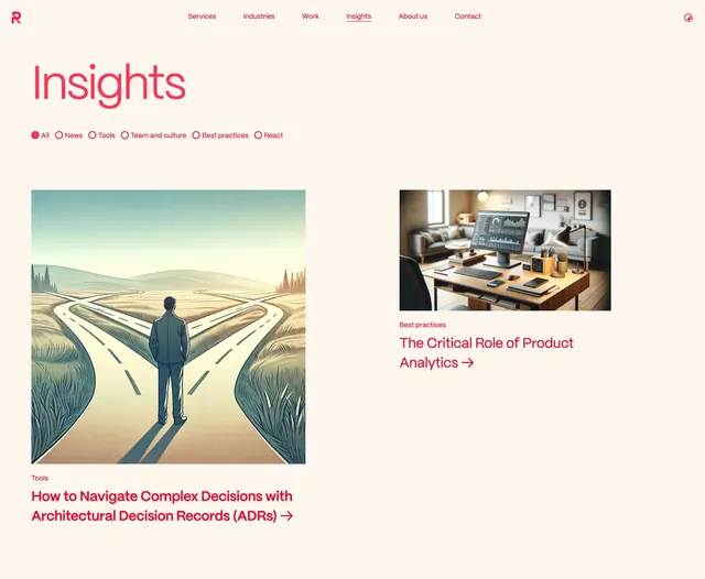
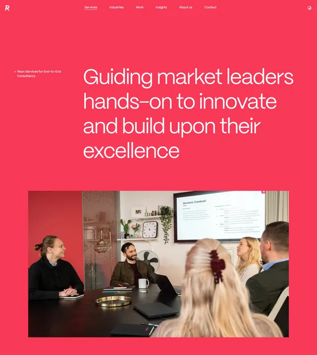
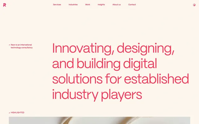
Cream hero with coral oversized headline, minimal nav, and asymmetric left-margin labels for a technology consultancy.
Summary
Cream hero with coral oversized headline, minimal nav, and asymmetric left-margin labels for a technology consultancy.
Visual description
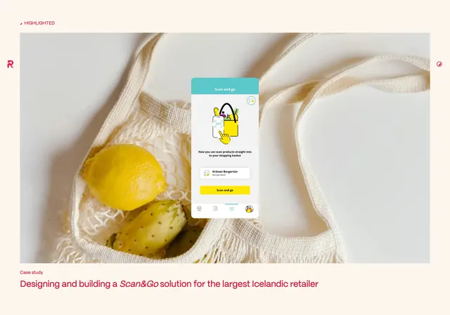
Warm off-white full-bleed canvas with all UI in a single coral-red. Top bar: bold R logomark left, six centered nav links (Services, Industries, Work, Insights, About us, Contact), and a small circular icon right. Mid-left, a tiny label with a triangle reads Reon is an international technology consultancy. Dominating the right two-thirds, a massive left-aligned headline in coral sans-serif spans multiple lines: Innovating, designing, and building digital solutions for established industry players. A HIGHLIGHTED label with triangle sits bottom-left; the bottom edge shows the top of a textured image peeking into the next section.
Key takeaway
One accent color carrying logo, nav, headline, and labels for instant brand cohesion. The asymmetric headline placement with generous left whitespace feels editorial without needing imagery in the hero itself.
Reuse notes
Strong pattern for B2B consultancies or studios that want authority through type alone. Works best with a distinctive accent on cream; pair with a photographic section immediately below the fold.