Preview image. Unlock full-res
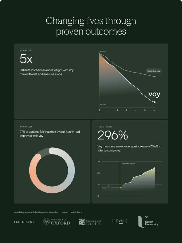
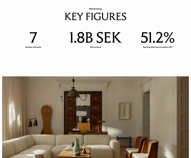
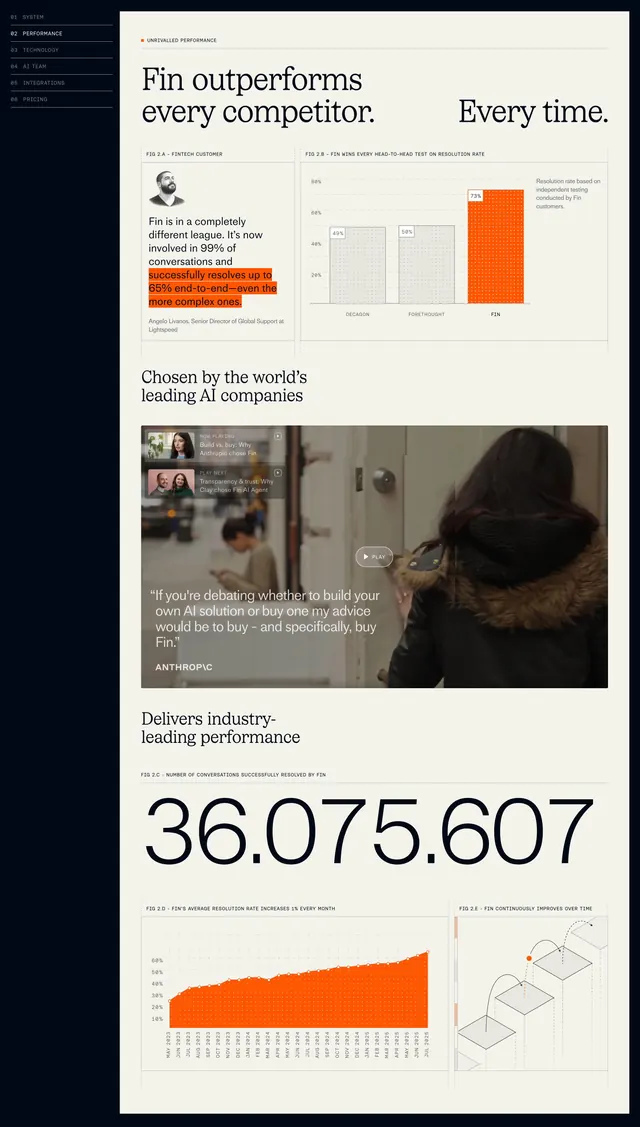
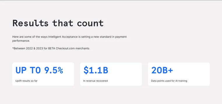
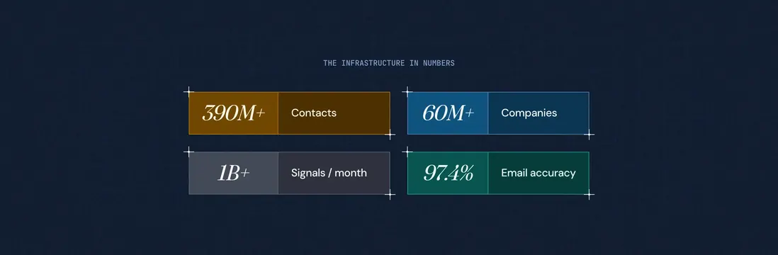
Two-by-two stat grid on a dark blueprint background with color-coded blocks, serif italic numbers, and corner crosshair framing.
Summary
Two-by-two stat grid on a dark blueprint background with color-coded blocks, serif italic numbers, and corner crosshair framing.
Visual description
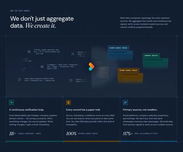
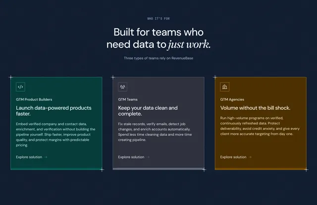
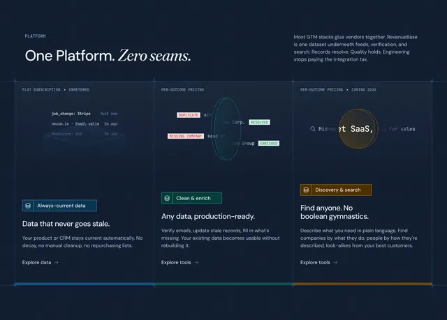
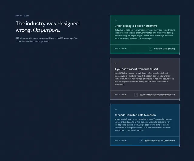
Dark navy field with a large faint grid texture. Small centered monospace caps read THE INFRASTRUCTURE IN NUMBERS. Four rectangular stat blocks form a 2x2 grid, each framed by white corner crosshairs. Every block splits vertically: left panel holds a large white italic serif number, right panel holds a sans label. Top-left is ochre/gold (390M+ Contacts), top-right medium blue (60M+ Companies), bottom-left gray (1B+ Signals / month), bottom-right teal (97.4% Email accuracy). Each block uses a slightly lighter left tone than its right label panel.
Key takeaway
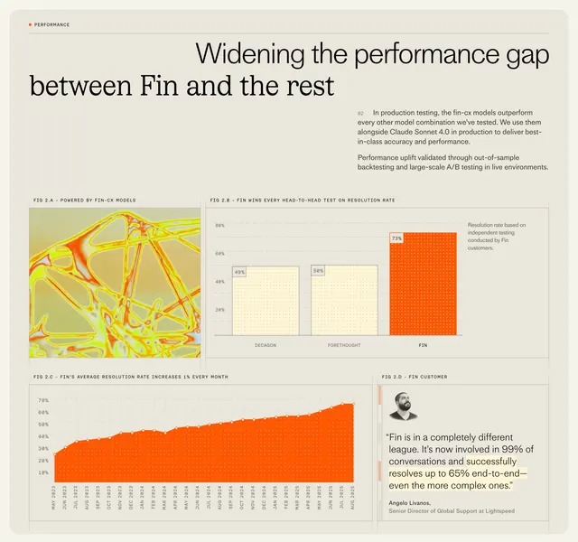
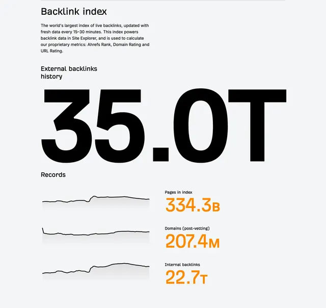
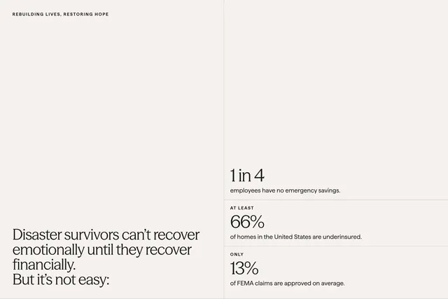
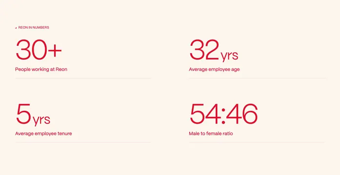
Assigning a distinct hue per metric makes a small set of numbers memorable without charts or icons. Splitting value and label inside each tile creates a strong horizontal rhythm across the grid. Blueprint corner marks unify the blocks into one instrument-panel composition.
Reuse notes
Ideal when you have three to six headline metrics that must feel credible and technical. Color coding works when categories differ (people, companies, signals, accuracy). Less suited to long explanatory stats that need paragraphs of context.