Preview image. Unlock full-res
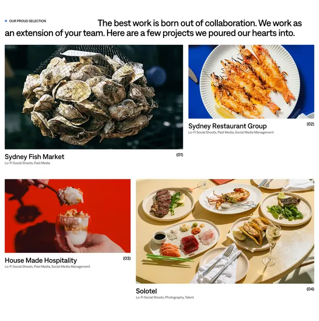
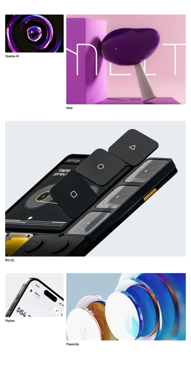
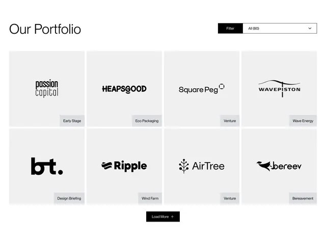
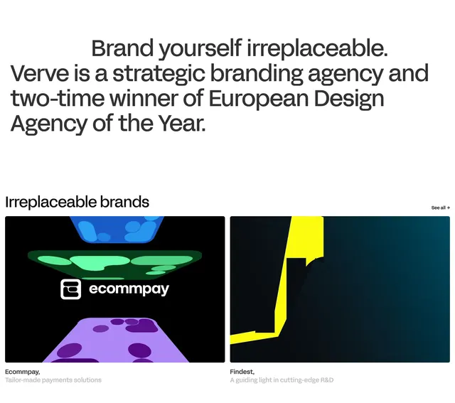
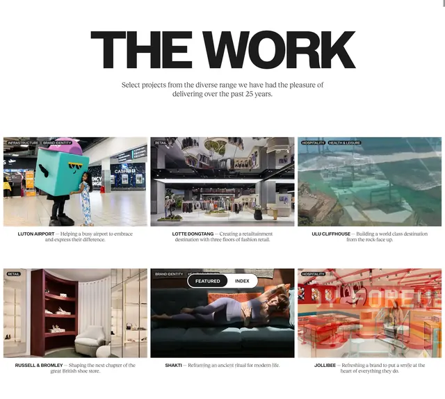
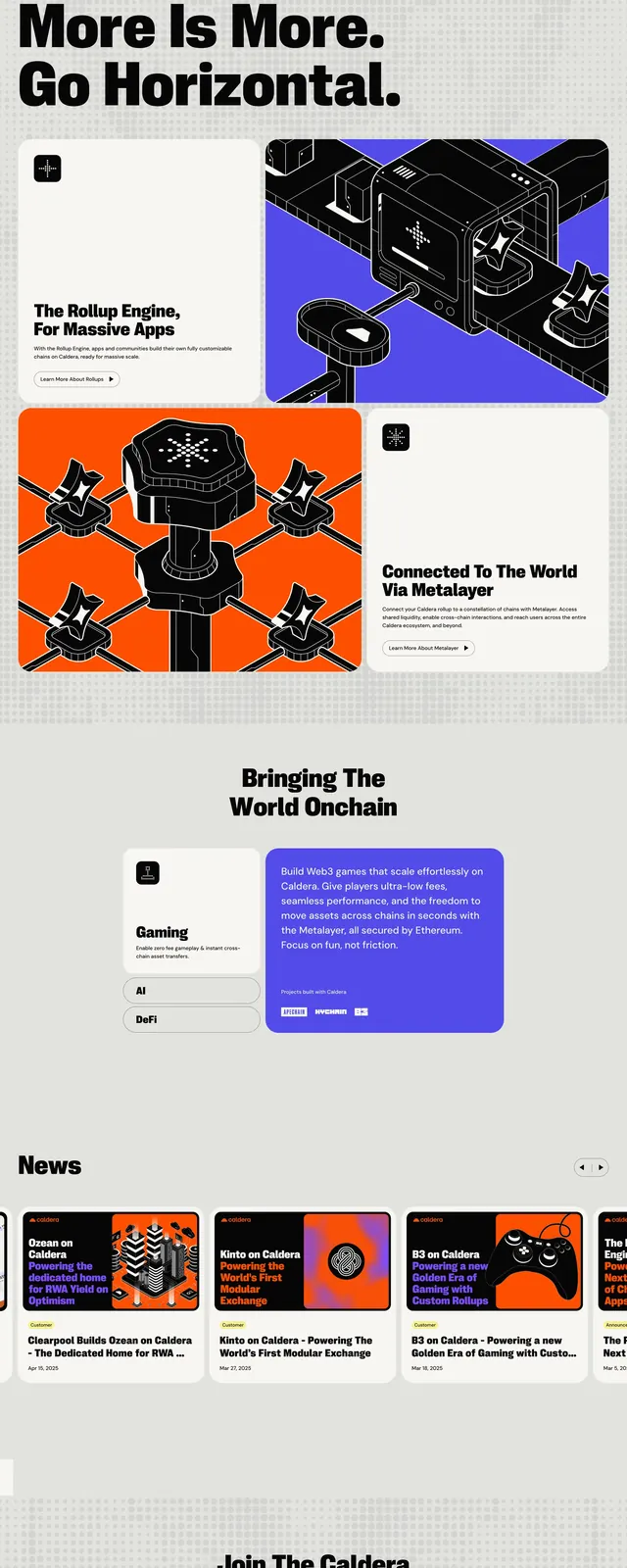
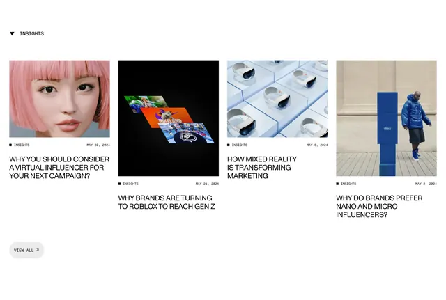
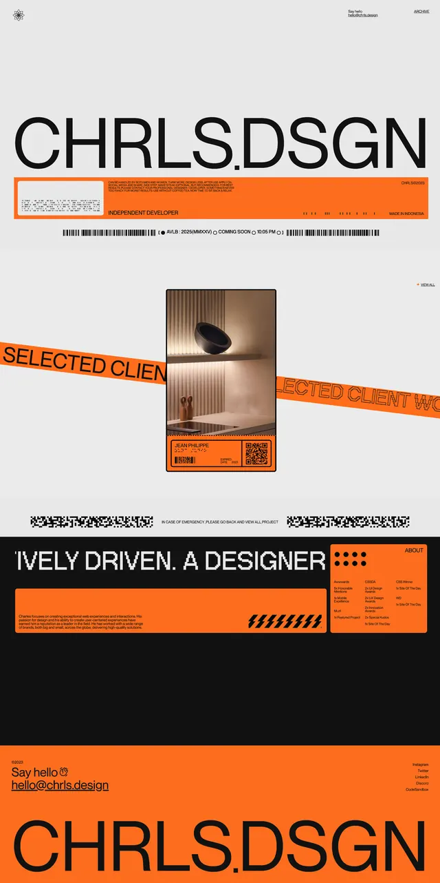
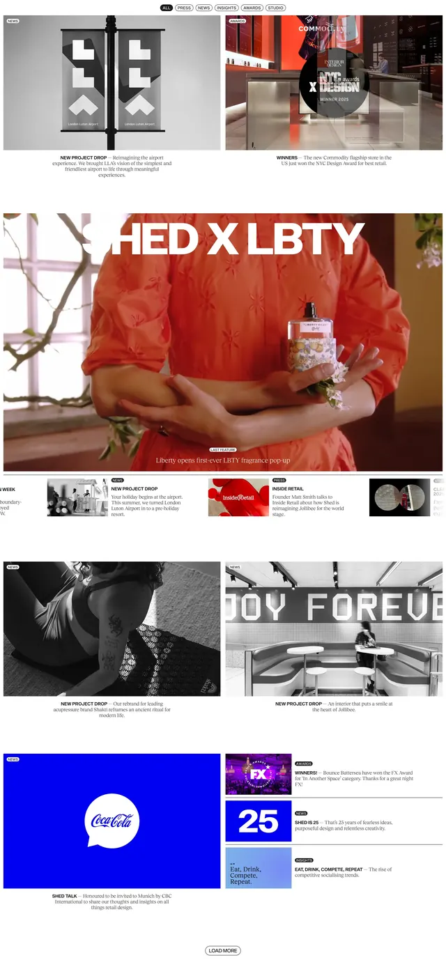
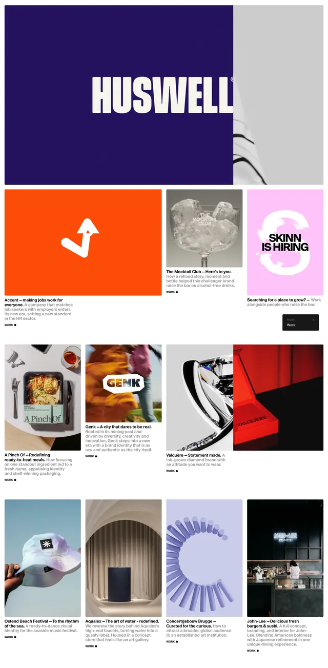
Asymmetric masonry portfolio grid mixing bold color blocks, photography, and case-study captions for a branding agency.
Summary
Asymmetric masonry portfolio grid mixing bold color blocks, photography, and case-study captions for a branding agency.
Visual description
Large white canvas with an irregular masonry grid of case-study tiles. Top-left opens with an oversized HUSWELL wordmark on a deep navy block beside a cropped product still. Tiles alternate between solid brand-color panels (orange Accent mark, pink Skinn hiring square), product and lifestyle photography, and split-image compositions (Valquere ring and red box). Each project tile has a caption block below: client name in bold, em dash, headline, short story sentence, and a WORK bullet marker. A dark FILTER Work + pill sits above the grid on the right. Tile sizes vary from wide rectangles to tall vertical strips, creating editorial rhythm without a rigid column count.
Key takeaway
Mix solid color identity tiles with photo tiles at different aspect ratios so the grid feels curated, not templated. The caption pattern (Client, headline, one-line story, WORK marker) gives every project the same readable hierarchy.
Reuse notes
Design studios and creative agencies showcasing diverse branding work. Needs strong project photography and at least a few bold single-color logo tiles to anchor the layout. Filter control scales when the archive grows.