Preview image. Unlock full-res
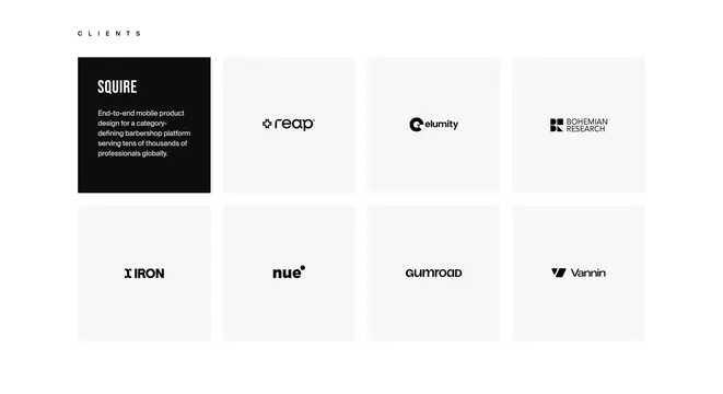
Light client logo grid with a black featured Squire case-study tile and seven muted logo squares in a 2x4 bento layout.
Summary
Light client logo grid with a black featured Squire case-study tile and seven muted logo squares in a 2x4 bento layout.
Visual description
Off-white full-width section with a spaced CLIENTS eyebrow above a 2x4 square grid. Top-left tile is solid black with bold white SQUIRE wordmark and small white project summary about mobile product design for a barbershop platform. The other seven tiles sit on pale gray squares with thin white gutters, each centering a black client wordmark or icon mark: reap, elumity, Bohemian Research, Iron, nue, Gumroad, and Vannin. Logos stay monochrome and evenly scaled within their cells.
Key takeaway
Swap one logo cell for a black feature tile so the grid tells a story instead of only listing names. Keep every other cell identical in size and tone so the featured client reads as intentional, not random.
Reuse notes
Freelance or boutique studio portfolios with a flagship client and a roster of recognizable marks. Needs at least one strong case-study blurb; without it, use a uniform logo-only grid instead.