Preview image. Unlock full-res
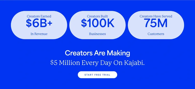
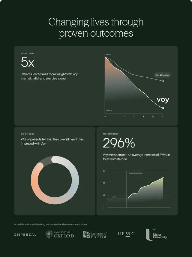
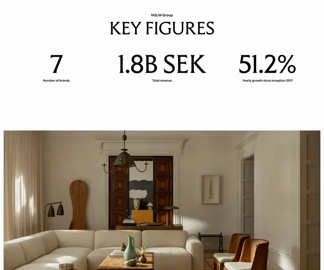
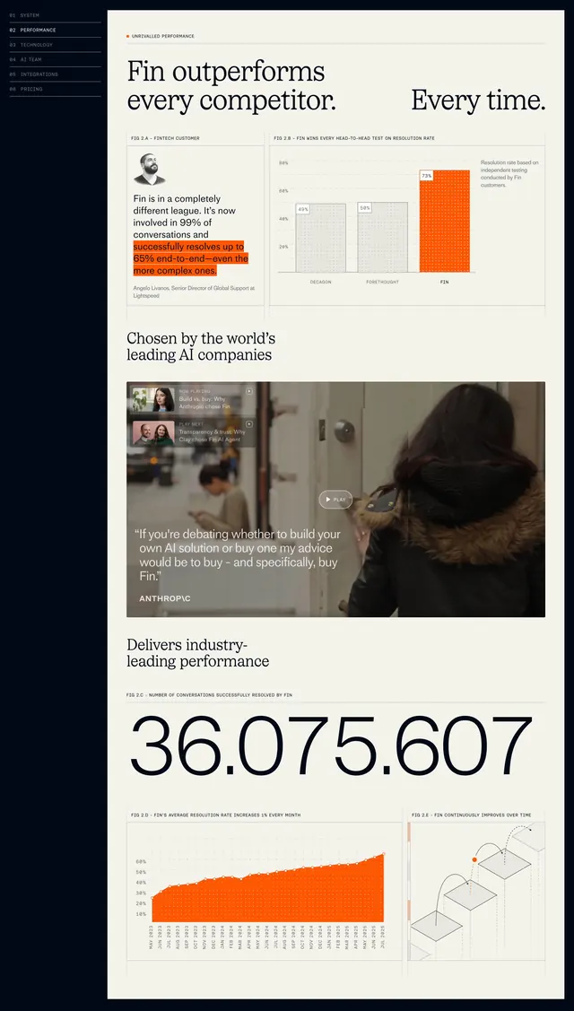
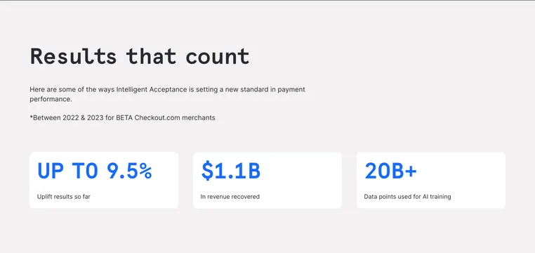
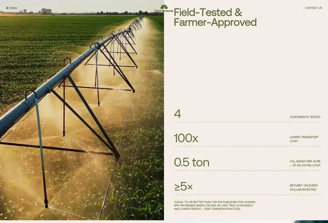
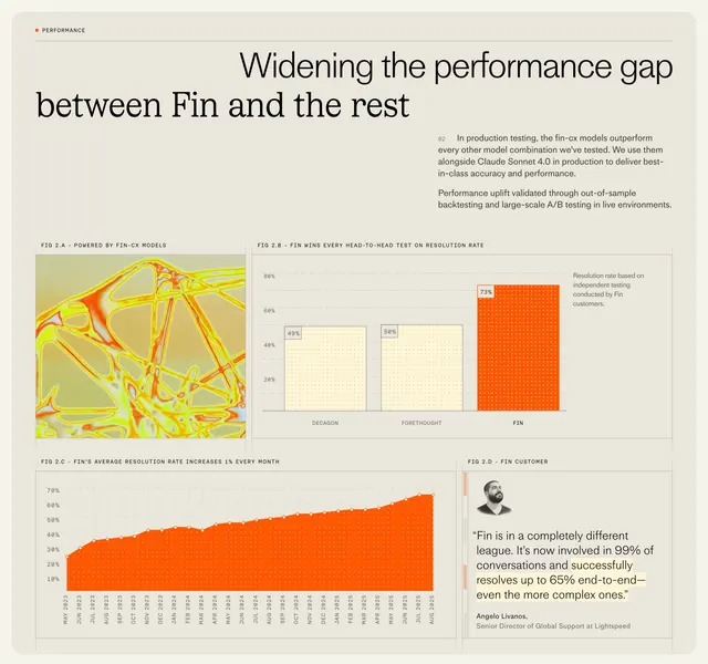
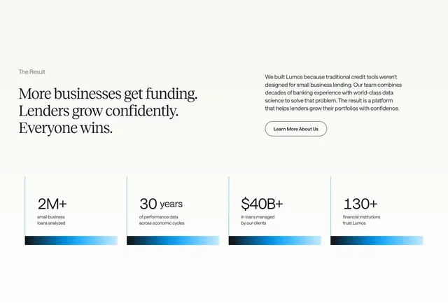
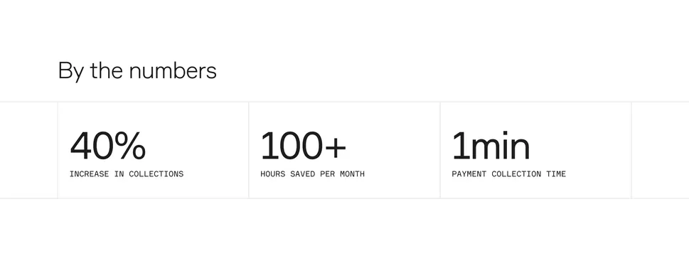
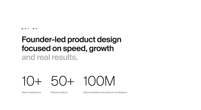
Light stats section with WHY ME label, split-weight founder-led headline, and three oversized metrics for years, projects, and users reached.
Summary
Light stats section with WHY ME label, split-weight founder-led headline, and three oversized metrics for years, projects, and users reached.
Visual description
White full-width band with left-aligned content. Small spaced WHY ME eyebrow sits above a large three-line headline: Founder-led product design focused on speed, growth in black, then and real results. in gray. Below, three equal columns each show an oversized thin numeral (10+, 50+, 100M) with a short gray caption underneath: Years of experience, Finished projects, and Users worldwide trust products I've designed. Generous vertical whitespace separates headline from metrics.
Key takeaway
Gray out the last phrase of a headline to create emphasis without a second font. Let three thin display numerals do the persuasion work with tiny captions instead of icon cards or charts.
Reuse notes
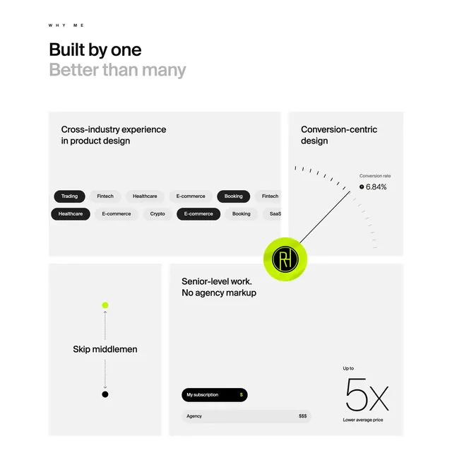
Freelancer or boutique studio credibility blocks near the top of a landing page. Only works with defensible numbers; swap captions to match your own experience tier. Pairs with Robin's other WHY ME bento sections on the same site.