Preview image. Unlock full-res
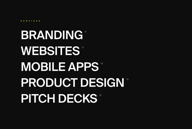
Dark full-bleed services index with a lime label, oversized white service names, and superscript project counts beside each category.
Summary
Dark full-bleed services index with a lime label, oversized white service names, and superscript project counts beside each category.
Visual description
Solid black canvas with a small lime-green SERVICES label in the upper left. Below it, five stacked service lines in very large white all-caps sans-serif: BRANDING, WEBSITES, MOBILE APPS, PRODUCT DESIGN, and PITCH DECKS. Each line carries a small white superscript count (5, 17, 12, 21, 12). The list sits left-aligned with generous empty space filling the right and lower frame.
Key takeaway
Let oversized category names do the navigation work instead of cards or icons. Superscript counts add credibility without breaking the typographic rhythm. A single lime label on black is enough accent for the whole section.
Reuse notes
Agency or studio services pages where breadth matters more than detail. Needs real project counts to feel authentic. Best as a dark interlude between lighter sections; the scale only works with short category names.