Preview image. Unlock full-res
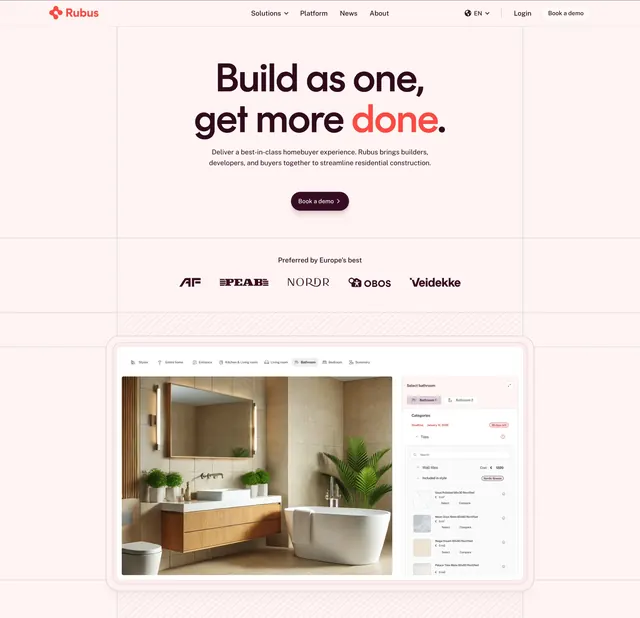
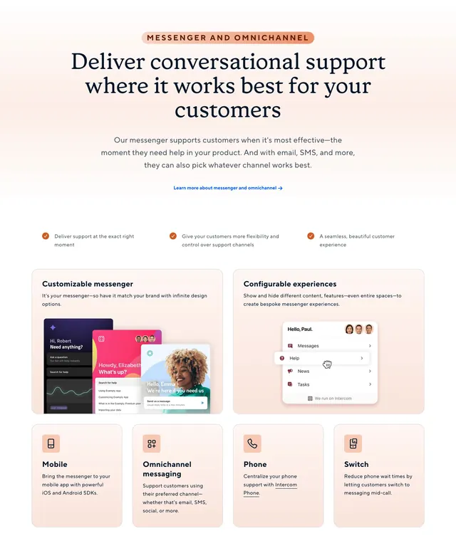
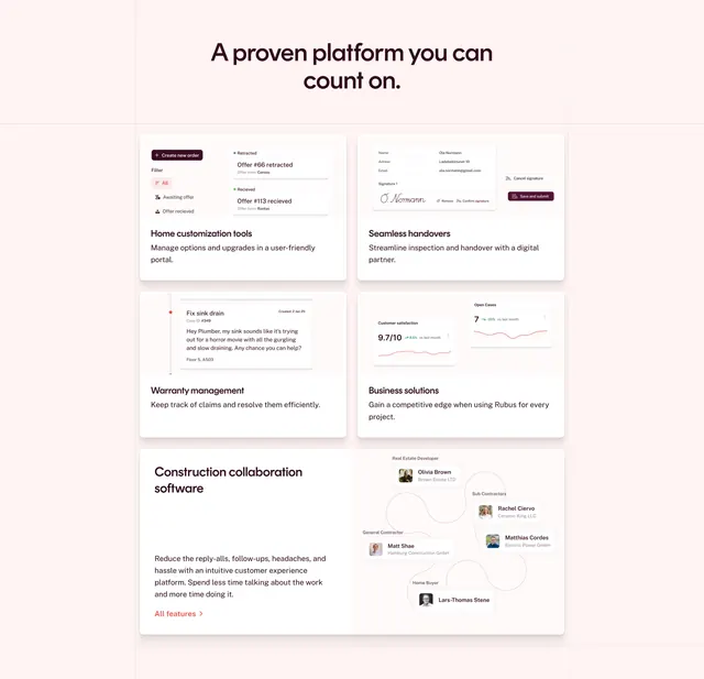
Soft-pink features section with a centered headline over a two-column bento grid of cards, each holding a small product mock.
Summary
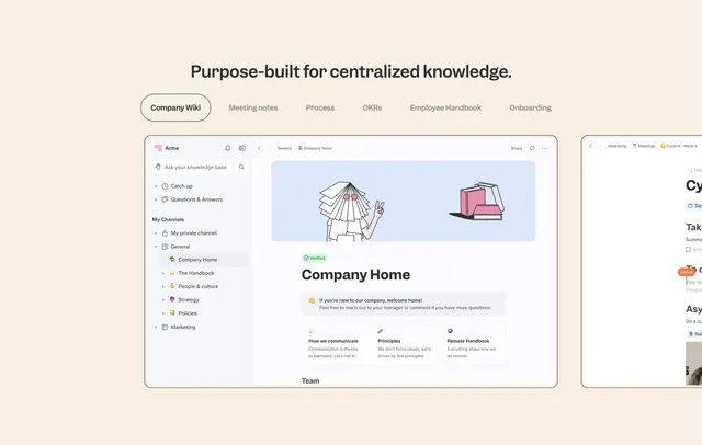
A warm, blush-toned features grid where each card carries a small product UI snippet above a short title and description, arranged as a loose bento. The defining move is using miniature in-context product mocks instead of abstract icons to explain each feature.
Visual description
Soft pink background with a centered two-line dark headline "A proven platform you can count on" in a friendly sans-serif. Below sit white feature cards in a two-column bento. Each card shows a small mocked interface (an order/offer list, a digital handover form with a signature, a warranty chat thread, a satisfaction chart) followed by a bold title (Home customization tools, Seamless handovers, Warranty management, Business solutions) and a sentence of copy. A wider bottom-left card carries the "Construction collaboration software" heading, a longer paragraph, and an orange "All features" link, paired with a node-and-avatar relationship diagram on the right. Thin grid guides frame the layout.
Key takeaway
The tiny realistic UI snippets make each feature concrete and let the copy stay brief. The blush palette with one orange accent keeps a dense grid feeling soft rather than busy. Varying card widths in the bottom row breaks the rigid grid and gives the section a focal point.
Reuse notes
Good for a product with several distinct capabilities that are easier shown than told. Works for real-estate, construction, or operations SaaS where the UI itself is the selling point. Needs clean, legible mini-mocks; blurry screenshots would undercut the soft, premium feel.