Preview image. Unlock full-res
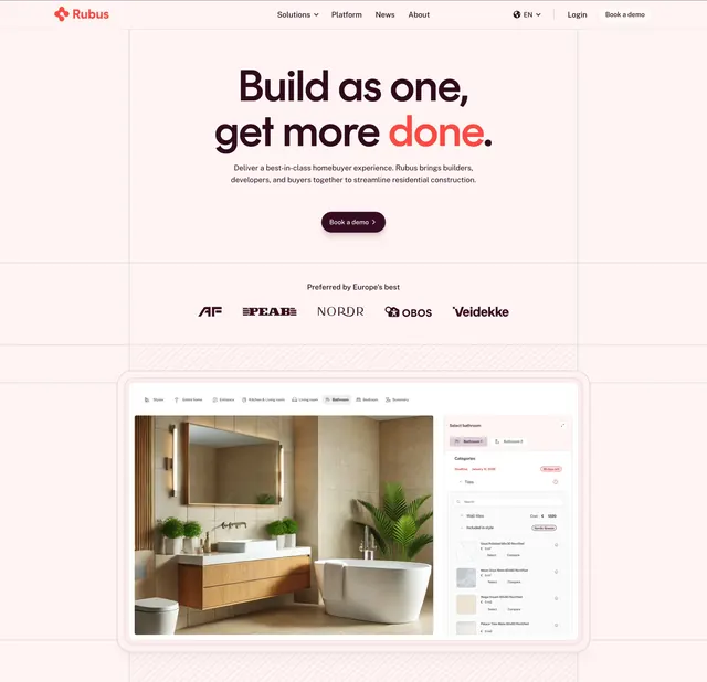
Centered light-pink hero with an oversized headline, a logo row, and a framed product screenshot of a home-configurator tool.
Summary
A centered, blush-toned hero that leads with a big two-line headline, backs it with a row of named client logos, and grounds the page in a framed screenshot of the product. The defining move is the single red accent word inside an otherwise dark headline.
Visual description
Pale pink background. A slim top nav holds the orange Rubus logo and mark, center links with dropdowns, a language switcher, Login, and an outlined "Book a demo" button. Centered below, the headline "Build as one, get more done." runs two lines in heavy dark sans-serif with "done" set in orange-red. A short two-line subhead and a single dark pill "Book a demo" button follow. Beneath, a small "Preferred by Europe's best" label sits over a monochrome logo row (AF, PEAB, NORDR, OBOS, Veidekke). The section closes with a large rounded browser-framed product screenshot showing a bathroom render alongside a tile-selection panel with categories and product thumbnails.
Key takeaway
Coloring one word of the headline is a cheap, high-impact way to direct the eye and inject brand color. Placing recognizable regional client logos directly under the CTA front-loads trust. The framed product shot with a real interior render makes an abstract platform feel tangible.
Reuse notes
A solid centered hero for a vertical SaaS where the product visual is photogenic, here construction and home configuration. Works best with strong, recognizable client logos to justify the "preferred by the best" line. The soft palette suits friendly B2B; swap the accent color to rebrand quickly.