Preview image. Unlock full-res
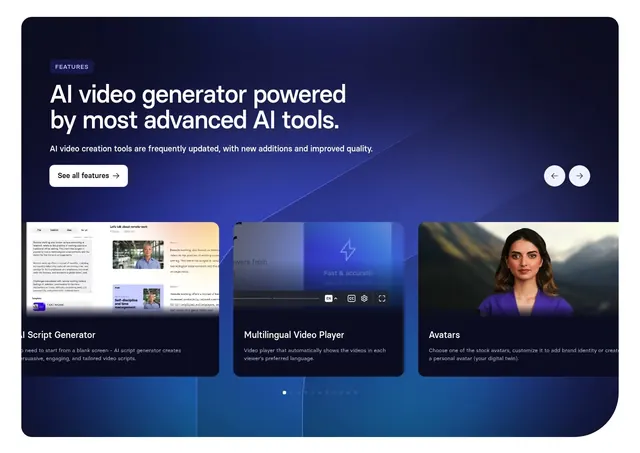
Dark blue contained feature carousel with a left intro, paging arrows, and a row of large product-mockup cards plus a dot indicator.
Summary
A contained dark-blue feature section built as a carousel, with a left intro block and paging arrows above a row of large product-mockup cards and a dot indicator. The slider, arrows, and dots make the horizontal browsing explicit.
Visual description
Inside a rounded deep-blue panel with a subtle diagonal gradient sheen, the top-left holds a "FEATURES" eyebrow pill, a two-line oversized white heading "AI video generator powered by most advanced AI tools.", a one-line subhead, and a white "See all features" button; two circular arrow buttons sit at the top right. Below, three feature cards show product mockups with titles and short copy: "AI Script Generator" (a script-editor UI), "Multilingual Video Player" (a player with language controls), and "Avatars" (a close-up AI avatar), the side cards partially cropped to imply more. A row of dots near the bottom marks carousel position. The palette is dark blue with white type.
Key takeaway
The contained rounded panel with its own gradient turns a feature carousel into a self-contained showcase that stands apart from the page. Cropping the flanking cards at the panel edges plus the dot indicator makes the slider obviously swipeable without animation. Each card leads with a real product mockup so features are shown, not just named.
Reuse notes
Good when there are more features than fit on screen and a carousel is justified by genuine product visuals. The paging arrows and dots are warranted here because the slider is visibly evident; do not borrow the motion cues without an actual carousel. The contained dark panel pairs well sitting over a lighter page background.