Preview image. Unlock full-res
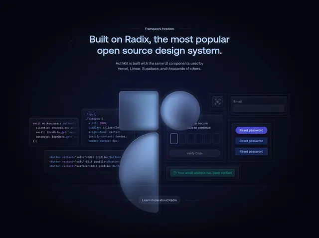
Dark developer feature section pairing a Radix headline with a layered collage of code snippets and auth UI components on glowing glass shapes.
Summary
AuthKit's framework section anchors on a Radix design-system headline, then fans out code and UI mockups across frosted blue geometric shapes.
Visual description
Deep navy background with centered gray overline "Framework freedom" and large glowing headline "Built on Radix, the most popular open source design system." Muted subcopy cites Vercel and Linear. Below, three large translucent blue shapes (rounded square, circle, tall arc) layer behind floating panels: left side shows JS auth logic, CSS input styles, and JSX button variants with syntax highlighting; right side shows email field, stacked Reset password button states, six-digit verify code inputs, and a green success alert. Small pill "Learn more about Radix" button sits centered at the bottom of the collage.
Key takeaway
Pairing real code with the UI it produces sells developer credibility faster than copy alone. Frosted geometric backdrops create depth while keeping many elements readable on dark mode.
Reuse notes
Best for design-system or component-library marketing aimed at engineers. Collage needs generous width; simplify to fewer panels on mobile.