Preview image. Unlock full-res
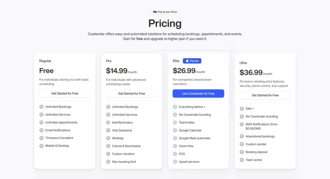
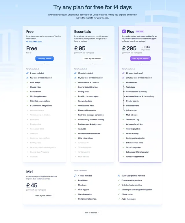
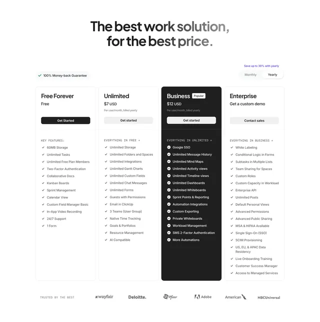
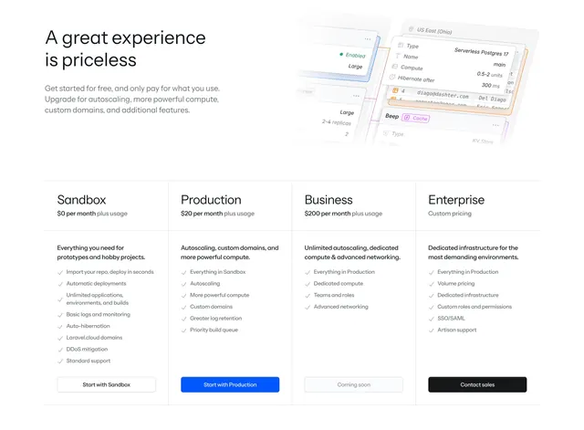
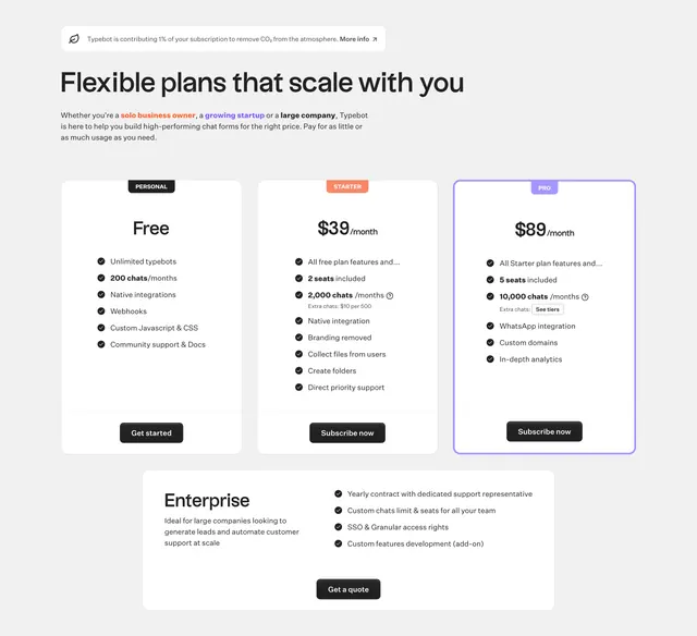
Light three-column pricing block with badge-topped plan cards, a highlighted Pro tier, and a wide Enterprise card spanning below.
Summary
A clean light pricing layout with three plan cards (Personal, Starter, Pro) where the Pro card is outlined in violet to mark it as the pick, plus a full-width Enterprise card underneath.
Visual description
A small pill banner about contributing to carbon removal sits above a left-aligned heading "Flexible plans that scale with you" and a short colored-keyword intro line. Three white pricing cards follow: each carries a small color-coded badge at top (dark Personal, orange Starter, violet Pro), a price in large type ("Free", "$39/month", "$89/month"), a checklist of features with circular check icons, and a dark or filled CTA button. The Pro card is enclosed in a violet rounded border to highlight it. Below the three, a wide white Enterprise card pairs a left description with a right feature checklist and a centered dark "Get a quote" button.
Key takeaway
Color-coding each tier with a matching badge plus outlining only the recommended plan steers the eye without shouting. Splitting Enterprise into its own full-width row below the standard tiers keeps the three-up grid tidy while still giving sales-led plans room.
Reuse notes
A reliable pattern for SaaS with three self-serve tiers plus a quote-based enterprise option. The carbon-contribution pill is a nice trust touch but optional. Works best when feature lists are short enough to keep card heights even.