Preview image. Unlock full-res
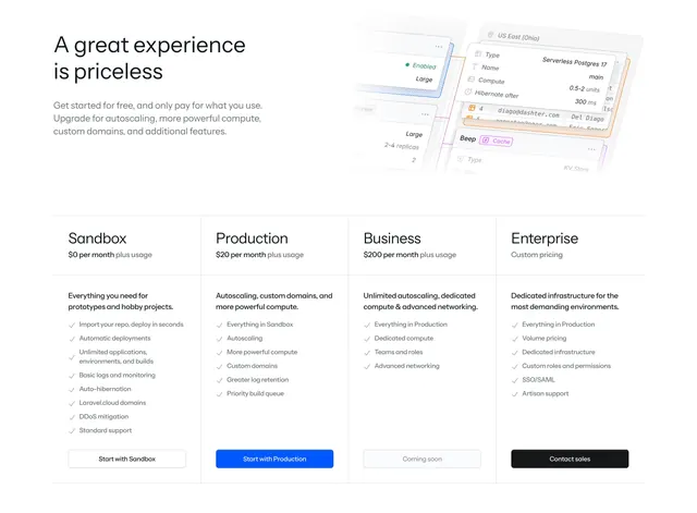
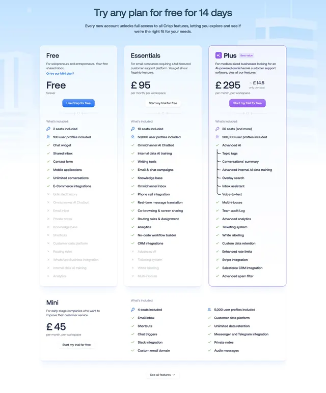
Light centered pricing section with four side-by-side plan cards, a highlighted Popular tier, and checklist feature lists.
Summary
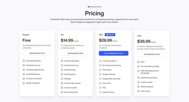
A clean light pricing section laying out four plan cards in a row, with one tier visually promoted via a Popular badge and a filled blue button. The defining structure is the four-tier comparison with an emphasized recommended plan.
Visual description
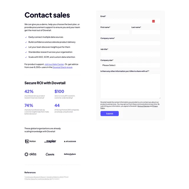
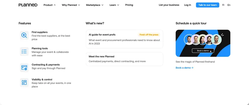
On a light grey-blue background, a small "Pay as you Grow" eyebrow pill sits centered above a large bold "Pricing" headline and two lines of grey subhead. Four white rounded cards sit side by side: Regular (Free), Pro ($14.99/month), Elite ($26.99/month with a blue "Popular" badge), and Ultra ($36.99/month). Each card shows the plan name, price, a one-line audience description, and a full-width CTA button (outlined "Get Started for Free" on three, a filled blue "Use Cowlendar for Free" on the Elite plan), followed by a checklist of features each preceded by a small circular check icon. A faint vertical guide line runs up from between the cards into the header.
Key takeaway
The four-across layout with a single Popular tier styled in the accent blue gives clear visual guidance toward the recommended plan. Phrasing every CTA around "free" lowers the commitment even on paid tiers. The consistent check-icon feature lists make scanning differences between plans fast.
Reuse notes
A reliable default for a self-serve SaaS or productivity tool with three to four tiers. Four columns get tight on narrow viewports, so plan for a stacked or carousel fallback on mobile. Works best when each tier's feature list is concise; long lists make the cards uneven in height.