Preview image. Unlock full-res
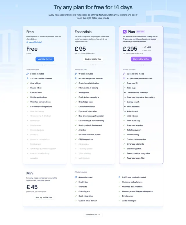
Light three-column pricing with a highlighted middle-plus tier, long check and cross feature lists, and a fourth plan row below.
Summary
A light three-tier pricing block (Free, Essentials, Plus) where the top recommended plan is boxed and badged, each column backed by a long check-and-cross feature list. A fourth Mini plan sits in a wide row beneath, breaking the three-column rhythm.
Visual description
A centered headline "Try any plan for free for 14 days" with a short subhead leads into three pricing cards on a pale blueprint-textured background. Each card stacks plan name, audience line, a large price, and a CTA button (filled blue on Free, ghost on Essentials, filled violet on the badged "Plus" card marked "Best value"). Below each price runs a long "What's included" checklist using green checks for included items and faint gray crosses for excluded ones, so coverage grows left to right. A separate full-width row at the bottom presents a cheaper "Mini" plan with its own three-column feature list, and a "See all features" pill closes the section.
Key takeaway
Using checks and faded crosses in the same list so a buyer reads exactly what each tier loses, not just what it gains. Boxing and badging only the recommended plan steers choice, and the wide secondary Mini row adds an entry-level option without forcing a fourth equal column.
Reuse notes
Best for feature-rich SaaS with clear tier differentiation where buyers compare line by line. The long lists demand careful copy or they overwhelm; keep excluded items visibly muted. The extra Mini row is handy when a budget plan would otherwise distort the main three-up grid.