Preview image. Unlock full-res
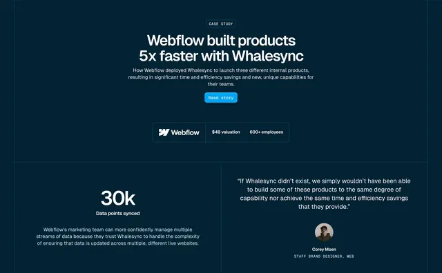
Dark case study hero with centered headline, client stats bar, and a two-column proof section with a large metric and testimonial quote.
Summary
A case study hero leads with "Webflow built products 5x faster with Whalesync," a client info bar showing valuation and headcount, then splits into a 30k metric column and a testimonial with avatar.
Visual description
Deep navy background throughout. Centered CASE STUDY pill, large white headline, explanatory subcopy, and bright blue Read story button. Below, a bordered horizontal bar holds the Webflow logo, $4B valuation, and 600+ employees separated by vertical dividers. A thin line divides hero from a two-column proof section: left shows oversized "30k" with "Data points synced" label and supporting paragraph; right holds a blockquote from Corey Moen, Staff Brand Designer, with circular avatar and title in small caps.
Key takeaway
Client stats bar (logo + valuation + headcount) adds enterprise credibility below the CTA without cluttering the headline. Oversized metric beside quote gives both quantitative and qualitative proof in one viewport. Single Read story CTA keeps the hero focused.
Reuse notes
Strong template for B2B case study landing pages. Needs a recognizable client logo and at least one hard number. Works best when metric and quote reinforce the same narrative.