
Preview image. Unlock full-res
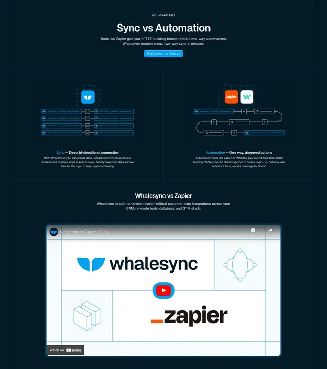
Dark comparison section pitting Whalesync bi-directional sync against Zapier-style automation with diagrams and an embedded YouTube video.
Summary
KEY ADVANTAGES section compares Sync vs Automation with side-by-side Whalesync and Zapier diagrams, a Whalesync vs Zapier CTA, and a YouTube video embed below.
Visual description
Dark navy background. Centered KEY ADVANTAGES pill, white headline "Sync vs Automation," explanatory subcopy contrasting IFTTT automations with deep two-way sync, blue Whalesync vs Zapier button. Two columns divided by vertical line: left Sync column with Whalesync icon, bidirectional field-bar diagram between app icons, blue-accent heading and description; right Automation column with Zapier and Whalesync icons, one-way winding workflow diagram, heading and description. Below, centered video section title and large YouTube embed with Whalesync and Zapier logos on a dot-grid thumbnail and visible play button.
Key takeaway
Visual diagrams side by side make abstract product category differences scannable in seconds. Naming the competitor in the headline and CTA targets high-intent comparison traffic. Video embed below captures users who need deeper proof after the diagram.
Reuse notes
Competitive positioning page pattern for sync/iPaaS vs automation tools. Diagrams must stay simplified; avoid real UI clutter. YouTube embed requires maintained video content.
More comparison sections
See all










More like this
Keep what you find
A free account saves references to boards and can send you a weekly email of picks based on what you save.
To see every result, go Pro.