Preview image. Unlock full-res
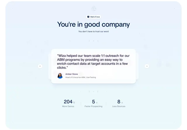
Light blue testimonials carousel showing one large quote card with author, flanked by arrows, over a three-metric stat row.
Summary
A calm light-blue testimonials section built as a single-quote carousel with left/right arrows, closing on a three-metric stat row. The one big rotating quote card plus headline metrics defines it.
Visual description
On a pale blue background with a faint dotted world-map texture, a small "Wall of love" pill sits above an oversized dark-navy heading "You're in good company" and a line of muted sub-copy. Centered below is one large white quote card with soft shadow: a multi-line quote ("Wiza helped our team scale 1:1 outreach for our ABM programs...") above a small circular avatar, author name (Amber Stone) and role (Head of Enterprise ABM, UserTesting). Faint peeked cards behind it and circular left/right arrow buttons on either side mark it as a carousel. A thin decorative divider with small glyphs runs above and below the card. At the bottom, three large metrics sit in a row separated by hairlines: "204%" More Demos, "5x" Faster Prospecting, "8x" Less Bounces.
Key takeaway
Featuring a single large testimonial at a time in a carousel rather than a wall, which gives each quote weight, and anchoring the section with three bold outcome metrics that turn testimonials into measurable proof. The faint dotted-map background adds texture without distraction.
Reuse notes
Best when you have a few strong, detailed quotes and concrete result numbers worth foregrounding. The single-quote carousel suits longer testimonials but relies on visible arrows or dots to signal more. The metric row pairs naturally beneath it; works on light pastel backgrounds.
More testimonials sections
See all



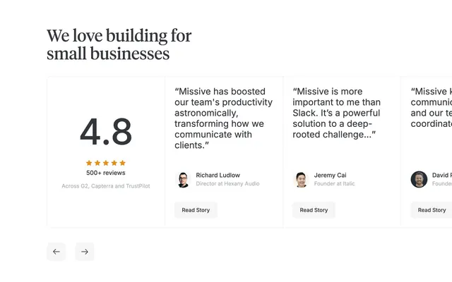
More like this
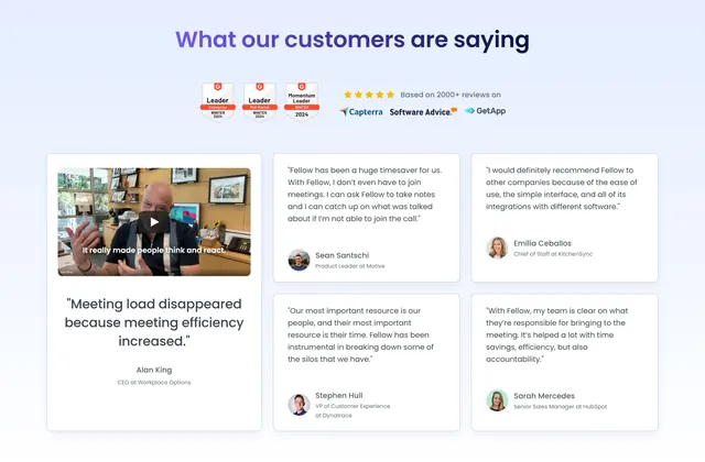
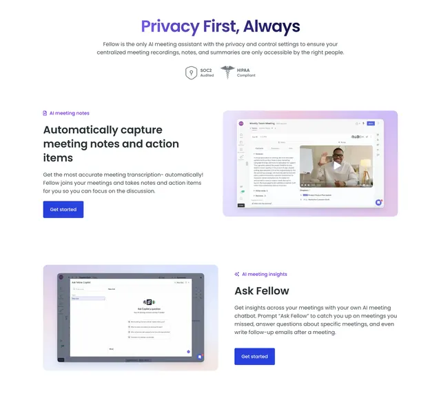


Keep what you find
A free account saves references to boards and can send you a weekly email of picks based on what you save.
To see every result, go Pro.