Preview image. Unlock full-res
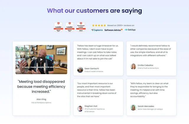
Light testimonials section with a centered headline, award badges and review-site logos, then a bento mix of a video-plus-pull-quote feature card and four text testimonial cards.
Summary
A light social-proof section led by a centered headline, G2 award badges, and review-site logos, then a bento layout combining one tall video-plus-pull-quote feature card with a 2-by-2 grid of text testimonial cards.
Visual description
On a pale blue-grey background, a centered two-tone headline reads "What our customers are saying" ("are saying" in violet). Below it sit three G2 award badges (Leader and Momentum Leader, Winter 2024), then a five-star rating with "Based on 2000+ reviews on" beside Capterra, Software Advice, and GetApp logos. The content area is a bento: the left column is a tall white card holding a video thumbnail of a man with a caption overlay, a large pull quote ("Meeting load disappeared because meeting efficiency increased."), and an attribution (Alan King, CEO at Workplace Options). To its right, four white testimonial cards form a 2-by-2 grid, each with a short quote and an avatar plus name and role (Sean Santschi, Emilia Ceballos, Stephen Hull, Sarah Mercedes), naming companies like Motive, KitchenSync, Dynatrace, and HubSpot.
Key takeaway
Stacking award badges and review-site logos directly under the heading front-loads third-party credibility before any single quote. Making one video testimonial a tall feature card beside a quieter 2-by-2 text grid creates clear hierarchy without losing volume of proof.
Reuse notes
Strong testimonials block when you have both a standout video quote and a roster of shorter written ones. Needs real avatars, names, and roles to land; generic quotes weaken it. Light and calm, it pairs well above a closing CTA.
More testimonials sections
See all
More like this

Keep what you find
A free account saves references to boards and can send you a weekly email of picks based on what you save.
To see every result, go Pro.