Preview image. Unlock full-res
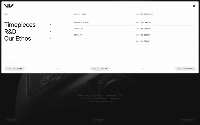
Full-screen white menu overlay with three link columns, oversized nav items, and numbered social pills.
Summary
A white full-screen navigation overlay with three labeled columns, large primary links, and pill social buttons over a dimmed product hero.
Visual description
White panel covers roughly the top two-thirds. Top-left WRK logo, top-right X close icon. Three columns: MENU with three large bold links (Timepieces, R&D, Our Ethos) and arrows; QUICK LINKS with smaller all-caps items separated by thin rules; LATEST RESEARCH with technical product links. Bottom row separated by a horizontal line holds three gray pill buttons (1.0 INSTAGRAM, 2.0 LINKEDIN, 3.0 PINTEREST) divided by slashes. Below the overlay, a dark blurred watch hero with tagline and pill labels (ADVANCED, HOROLOGY, ENGINEERING) remains partially visible.
Key takeaway
Tiered column hierarchy (primary nav large, secondary small caps) keeps a dense menu readable. Reusing the decimal social pill pattern from the footer creates cross-page consistency.
Reuse notes
Suited to luxury sites with few top-level pages but many deep links. Full-screen white overlay needs strong close affordance; background peek preserves context.
More navbar sections
See all











More like this

Keep what you find
A free account saves references to boards and can send you a weekly email of picks based on what you save.
To see every result, go Pro.