Preview image. Unlock full-res
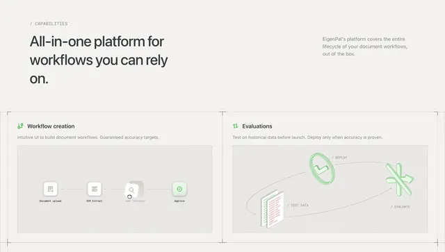
Light capabilities section with asymmetric headline row and two bordered feature cards showing workflow and evaluation diagrams.
Summary
Light capabilities section with asymmetric headline row and two bordered feature cards showing workflow and evaluation diagrams.
Visual description
Light gray page with / CAPABILITIES label top left, large bold headline All-in-one platform for workflows you can rely on on the left, and right-aligned gray intro copy about EigenPal covering the document lifecycle. Two equal bordered cards sit below. Left card Workflow creation shows a green node icon, subtitle, and a horizontal step diagram (Document upload, OCR Extract, Add Validate with cursor, Approve with checkmark). Right card Evaluations shows a refresh icon, subtitle, and a circular TEST DATA to DEPLOY to EVALUATE loop with green 3D-style icons.
Key takeaway
Pairing headline plus right-aligned supporting copy creates editorial asymmetry before the symmetric card grid. Each card embeds a purpose-built mini-diagram so features read as product capability, not bullet points.
Reuse notes
Ideal mid-page capabilities block for workflow or document platforms. Cards need two strong pillars with diagram room; simplify arrow flows on mobile and keep monospace section labels consistent with the rest of the EigenPal-style system.