Preview image. Unlock full-res
Mint split CTA section with rounded studio photo on the left and a bold explore headline with three underlined resource links on the right.
Summary
A pale mint band splits a rounded creative-studio photo against a right-column There's more to explore headline and three divider-separated resource links.
Visual description
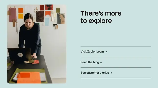
Solid light mint-green background in a two-column layout. Left shows a large rounded photo of a woman working at a desk with color swatches, tape, and a laptop with a daisy sticker; a mood board with fabric and paper samples hangs behind her. Right column has large bold black headline There's more to explore and three stacked links separated by thin horizontal rules: Visit Zapier Learn, Read the blog, and See customer stories, each with a right arrow. Generous whitespace keeps the section airy.
Key takeaway
Use lifestyle photography to soften a bottom-of-page wayfinding block instead of button stacks. Divider lines between text links create rhythm without heavy card chrome.
Reuse notes
Good late-page CTA for SaaS products pushing education and social proof. Photo should reinforce creativity or real work context; generic office stock reduces distinctiveness.