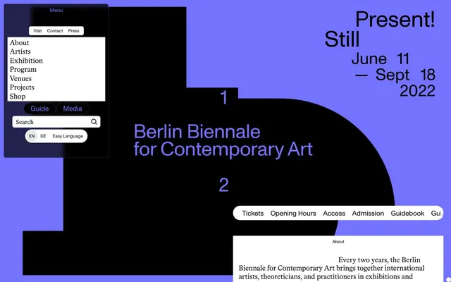
Preview image. Unlock full-res
Underground gallery, high contrast, stark violet punctuation
Color palette
Primary interactive element borders (links, buttons, cards), secondary text, and accents. This color is the main chromatic identifier and action indicator
Decorative fills and icon accents. A deeper, less saturated brand hue for subtle graphic elements
Primary text, surface backgrounds, borders, navigation elements. Creates dominant dark areas and strong contrast
Page backgrounds, card surfaces, interactive accent text. Provides a clean, bright backdrop
Subtle background for interactive list items and secondary buttons. Creates a gentle visual separation without stark contrast
Background for navigation items. A slightly darker variant of fog for subtle layering
Typography
- Weights
- 400, 700
- Sizes
- 12px, 14px, 16px, 17px, 19px, 20px, 22px, 25px, 29px, 32px
- Line height
- 1.02, 1.03, 1.15, 1.2, 2, 2.4
- Letter spacing
- -0.0100em at larger sizes (e.g. 29px-32px), 0.0100em at 12px, -0.0040em at other sizes
- Fallback
- Arial, Helvetica, sans-serif
Primary typeface for all UI elements, body text, and most headings. Its precise, contemporary feel supports the minimal aesthetic with tight tracking for a dense, architectural look.
- Weights
- 400
- Sizes
- 20px, 23px, 30px
- Line height
- 1.03, 1.15
- Letter spacing
- -0.0100em
- Fallback
- Georgia, serif
Used sparingly for stylistic accents in headings and input fields. Its subtly tracked, serif quality provides a refined contrast to the primary sans-serif.
Spacing & shape
Components
Background: Canvas (#ffffff), Text: Midnight (#000000), Border: 1px solid Midnight (#000000), Border Radius: 5px, Padding: 6.61935px vertical, 11.0323px horizontal.
Background: Midnight (#000000), Text: Vivid Violet (#7373ff), Border: 1px solid Vivid Violet (#7373ff), Border Radius: 44.129px (pill shape), Padding: 5.51613px vertical, 22.0645px horizontal.
No background or border. Text: Midnight (#000000), Padding: 0px vertical, 18.7548px right, 46.8871px left (for specific inline use cases).
No background, Text: Vivid Violet (#7373ff), Border: 1px solid Vivid Violet (#7373ff) for an underlined effect, Border Radius: 0px.
Background: Canvas (#ffffff), Border: No visible border, Box Shadow: None, Border Radius: 7px, Padding: 12px.
Background: Transparent, Border: No visible border, Box Shadow: None, Border Radius: 7px, Padding: 12px.
Background: Canvas (#ffffff), Text: Midnight (#000000), Placeholder: Midnight (#000000) (implied), Border: No visible border (likely just a bottom border from context photos for focus), Border Radius: 6.90968px, Padding: 7.89677px vertical, 9.87097px left, 35.5355px right (for icon area).
Background: Canvas (#ffffff), Border Radius: 3px, Padding: 3px vertical (top/bottom), 11px horizontal (left/right).
Background: Ash (#e7e7e7), Border Radius: 3px, Padding: 3px vertical (top/bottom), 11px horizontal (left/right).
Guidelines
- Always use Midnight (#000000) for primary text on Canvas (#ffffff) backgrounds to ensure AAA contrast.
- Apply Vivid Violet (#7373ff) as the primary accent color for active states, link underlinings, and outlined buttons.
- Maintain a compact typographic density with ABCMonumentGroteskWeb, utilizing tight letter-spacing (-0.0100em for large headings) to create an architectural feel.
- Use a default border-radius of 3px for most interactive elements, transitioning to 5px for primary buttons and 7px for cards and inputs.
- Structure layouts with a maximum content width of 1069px, centered, allowing ample negative space around content blocks.
- Employ Midnight (#000000) and Canvas (#ffffff) as core background colors, with Fog (#f2f2f2) and Ash (#e7e7e7) for subtle background differentiation in lists and navigation.
- Ensure all interactive elements have a clear visual feedback using Vivid Violet (#7373ff) for borders or text, especially for ghost or outlined components.
- Avoid complex gradients or multi-color shadows; the design relies on flat colors and minimal elevation.
- Do not introduce new typefaces; adhere strictly to ABCMonumentGroteskWeb and BradfordLLSub.
- Do not use overly large line-heights for body text; aim for compact information presentation.
- Do not deviate from the established radius values; specific radii like 5px for buttons and 7px for cards are part of the brand identity.
- Do not use highly saturated colors other than Vivid Violet (#7373ff) for UI elements; maintain a largely monochromatic palette with a single dominant accent.
- Avoid heavy borders or solid backgrounds on cards; rely on subtle background shifts and corner radii for visual separation.
- Do not use decorative background patterns or textures; surfaces should remain clean and uniform.
About this system
ShowHide
The 12th Berlin Biennale design system evokes an underground gallery experience: stark black and white punctuated by a vivid violet and subtle muted violet. Typography is compact and precise, often with tight letter-spacing, contrasting against large, bold elements or ample negative space. Components are lightweight with minimal elevation, focusing on clear functionality through high-contrast text against clean surfaces. The interface relies on hard edges and distinct blocks of color for rhythm, avoiding gradients or complex shadows.
The page uses a max-width contained layout set at 1069px, with content consistently centered. The hero section is full-bleed and dark (Midnight background) with large, centered headlines and abstract numerical shapes. Sections maintain consistent vertical spacing. Content is largely arranged in compact, text-heavy blocks, often within clearly defined card-like structures. Navigation consists of a top bar that becomes sticky on scroll, and a detailed off-canvas menu or pop-over overlay. The overall rhythm is stark and blocky, emphasizing high contrast and distinct areas of information rather than seamless flow.
This design system eschews photographic imagery, decorative illustrations, or product screenshots in favor of an 'icons-only' approach. The visual language is almost entirely UI-driven, with graphic elements being minimal and abstract geometric shapes, such as the large black '1' and '2' numbers or the map in the screenshots. When present, icons are typically solid filled, monochromatic (Midnight or Muted Violet), and serve a functional rather than decorative role. The density is text-dominant; imagery is used sparingly for navigation or conceptual emphasis, not for content presentation.
Reminiscent of AIGA, Bauhaus Dessau, The Tent, Future Fonts, Are.na.
# 12th Berlin Biennale for Contemporary Art — Style Reference
> Underground gallery, high contrast, stark violet punctuation

**Theme:** light

**Site:** https://12.berlinbiennale.de

The 12th Berlin Biennale design system evokes an underground gallery experience: stark black and white punctuated by a vivid violet and subtle muted violet. Typography is compact and precise, often with tight letter-spacing, contrasting against large, bold elements or ample negative space. Components are lightweight with minimal elevation, focusing on clear functionality through high-contrast text against clean surfaces. The interface relies on hard edges and distinct blocks of color for rhythm, avoiding gradients or complex shadows.

## Tokens — Colors

| Name | Value | Token | Role |
|------|------|------|------|
| Vivid Violet | `#7373ff` | `--color-vivid-violet` | Primary interactive element borders (links, buttons, cards), secondary text, and accents. This color is the main chromatic identifier and action indicator |
| Muted Violet | `#23234d` | `--color-muted-violet` | Decorative fills and icon accents. A deeper, less saturated brand hue for subtle graphic elements |
| Midnight | `#000000` | `--color-midnight` | Primary text, surface backgrounds, borders, navigation elements. Creates dominant dark areas and strong contrast |
| Canvas | `#ffffff` | `--color-canvas` | Page backgrounds, card surfaces, interactive accent text. Provides a clean, bright backdrop |
| Fog | `#f2f2f2` | `--color-fog` | Subtle background for interactive list items and secondary buttons. Creates a gentle visual separation without stark contrast |
| Ash | `#e7e7e7` | `--color-ash` | Background for navigation items. A slightly darker variant of fog for subtle layering |

## Tokens — Typography

### ABCMonumentGroteskWeb
- **Substitute:** Arial, Helvetica, sans-serif
- **Weights:** 400, 700
- **Sizes:** 12px, 14px, 16px, 17px, 19px, 20px, 22px, 25px, 29px, 32px
- **Line height:** 1.02, 1.03, 1.15, 1.2, 2, 2.4
- **Letter spacing:** -0.0100em at larger sizes (e.g. 29px-32px), 0.0100em at 12px, -0.0040em at other sizes
- **Role:** Primary typeface for all UI elements, body text, and most headings. Its precise, contemporary feel supports the minimal aesthetic with tight tracking for a dense, architectural look.

### BradfordLLSub
- **Substitute:** Georgia, serif
- **Weights:** 400
- **Sizes:** 20px, 23px, 30px
- **Line height:** 1.03, 1.15
- **Letter spacing:** -0.0100em
- **Role:** Used sparingly for stylistic accents in headings and input fields. Its subtly tracked, serif quality provides a refined contrast to the primary sans-serif.

## Tokens — Type Scale

Major Third (1.25) from 12px base.

| Role | Size | Line height | Letter spacing |
|------|------|------|------|
| caption | 12px | 2.4 | 0.01em |
| body-sm | 14px | 2 | -0.004em |
| heading-sm | 19px | 1.15 | -0.004em |
| heading-lg | 22px | 1.03 | -0.004em |
| display | 32px | 1.02 | -0.01em |

## Tokens — Spacing

- **Max width:** 1069px
- **Section gap:** 32px
- **Card padding:** 12px
- **Element gap:** 5px

## Tokens — Radius

- **Default:** 3px
- **Buttons:** 5px
- **Inputs:** 7px
- **Cards:** 7px
- **roundButtons:** 44.129px

## Layout

The page uses a max-width contained layout set at 1069px, with content consistently centered. The hero section is full-bleed and dark (Midnight background) with large, centered headlines and abstract numerical shapes. Sections maintain consistent vertical spacing. Content is largely arranged in compact, text-heavy blocks, often within clearly defined card-like structures. Navigation consists of a top bar that becomes sticky on scroll, and a detailed off-canvas menu or pop-over overlay. The overall rhythm is stark and blocky, emphasizing high contrast and distinct areas of information rather than seamless flow.

## Imagery

This design system eschews photographic imagery, decorative illustrations, or product screenshots in favor of an 'icons-only' approach. The visual language is almost entirely UI-driven, with graphic elements being minimal and abstract geometric shapes, such as the large black '1' and '2' numbers or the map in the screenshots. When present, icons are typically solid filled, monochromatic (Midnight or Muted Violet), and serve a functional rather than decorative role. The density is text-dominant; imagery is used sparingly for navigation or conceptual emphasis, not for content presentation.

## Components

### Primary Filled Button
*Standard interactive button for general actions.*

Background: Canvas (#ffffff), Text: Midnight (#000000), Border: 1px solid Midnight (#000000), Border Radius: 5px, Padding: 6.61935px vertical, 11.0323px horizontal.

### Secondary Pill Button (Outlined)
*Secondary action or tag component, distinctly rounded.*

Background: Midnight (#000000), Text: Vivid Violet (#7373ff), Border: 1px solid Vivid Violet (#7373ff), Border Radius: 44.129px (pill shape), Padding: 5.51613px vertical, 22.0645px horizontal.

### Bare Text Link
*Stylized text link, often inside a component or list.*

No background or border. Text: Midnight (#000000), Padding: 0px vertical, 18.7548px right, 46.8871px left (for specific inline use cases).

### Vivid Violet Text Link
*Distinguished interactive text link.*

No background, Text: Vivid Violet (#7373ff), Border: 1px solid Vivid Violet (#7373ff) for an underlined effect, Border Radius: 0px.

### Default Card
*Container for content, appearing as a floating panel.*

Background: Canvas (#ffffff), Border: No visible border, Box Shadow: None, Border Radius: 7px, Padding: 12px.

### Transparent Card
*Subtle content container, often for lists within a dark section.*

Background: Transparent, Border: No visible border, Box Shadow: None, Border Radius: 7px, Padding: 12px.

### Search Input
*Interactive text input field.*

Background: Canvas (#ffffff), Text: Midnight (#000000), Placeholder: Midnight (#000000) (implied), Border: No visible border (likely just a bottom border from context photos for focus), Border Radius: 6.90968px, Padding: 7.89677px vertical, 9.87097px left, 35.5355px right (for icon area).

### Navigation Item (White BG)
*Menu items within navigation blocks.*

Background: Canvas (#ffffff), Border Radius: 3px, Padding: 3px vertical (top/bottom), 11px horizontal (left/right).

### Navigation Item (Ash BG)
*Menu items within navigation blocks, slightly differentiated.*

Background: Ash (#e7e7e7), Border Radius: 3px, Padding: 3px vertical (top/bottom), 11px horizontal (left/right).

## Guidelines

### Do

- Always use Midnight (#000000) for primary text on Canvas (#ffffff) backgrounds to ensure AAA contrast.
- Apply Vivid Violet (#7373ff) as the primary accent color for active states, link underlinings, and outlined buttons.
- Maintain a compact typographic density with ABCMonumentGroteskWeb, utilizing tight letter-spacing (-0.0100em for large headings) to create an architectural feel.
- Use a default border-radius of 3px for most interactive elements, transitioning to 5px for primary buttons and 7px for cards and inputs.
- Structure layouts with a maximum content width of 1069px, centered, allowing ample negative space around content blocks.
- Employ Midnight (#000000) and Canvas (#ffffff) as core background colors, with Fog (#f2f2f2) and Ash (#e7e7e7) for subtle background differentiation in lists and navigation.
- Ensure all interactive elements have a clear visual feedback using Vivid Violet (#7373ff) for borders or text, especially for ghost or outlined components.

### Don't

- Avoid complex gradients or multi-color shadows; the design relies on flat colors and minimal elevation.
- Do not introduce new typefaces; adhere strictly to ABCMonumentGroteskWeb and BradfordLLSub.
- Do not use overly large line-heights for body text; aim for compact information presentation.
- Do not deviate from the established radius values; specific radii like 5px for buttons and 7px for cards are part of the brand identity.
- Do not use highly saturated colors other than Vivid Violet (#7373ff) for UI elements; maintain a largely monochromatic palette with a single dominant accent.
- Avoid heavy borders or solid backgrounds on cards; rely on subtle background shifts and corner radii for visual separation.
- Do not use decorative background patterns or textures; surfaces should remain clean and uniform.

## Agent Prompt Guide

Quick Color Reference:
text: #000000
background: #ffffff
border: #000000
accent: #7373ff
primary action: #7373ff (outlined action border)

Example Component Prompts:
Create a hero section: Dark background with large centered text in ABCMonumentGroteskWeb, 700 weight, Midnight (#000000), 32px size, letter-spacing -0.01em. Add an abstract geometric element to the left of the text, filled with Muted Violet (#23234d).
Create a card: Canvas (#ffffff) background, 7px radius, 12px padding. Inside, place a heading (ABCMonumentGroteskWeb 700, 20px, Midnight #000000) and body text (ABCMonumentGroteskWeb 400, 16px, Midnight #000000).
Create an Outlined Primary Action: Transparent background, #7373ff border and text, 9999px radius, compact pill padding. Use it for the main CTA instead of a filled button.
Create a secondary pill button: Midnight (#000000) background, Vivid Violet (#7373ff) text, 1px solid Vivid Violet (#7373ff) border, 44.129px radius, 5.51613px vertical padding, 22.0645px horizontal padding. Text is ABCMonumentGroteskWeb 400, 14px.
Create a search input field: Canvas (#ffffff) background, Midnight (#000000) text (placeholder shown), 7px radius, no visible border, 7.89677px vertical padding, 9.87097px left padding, 35.5355px right padding.
More like this









Keep what you find
A free account saves references to boards and can send you a weekly email of picks based on what you save.
To see every result, go Pro.