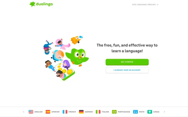
Preview image. Unlock full-res
Playground Starter Kit
Color palette
Primary CTAs, logos, headlines, interactive highlights — the brand's key signifier of action and identity.
Background tints for highlighted or active states, often paired with Duo Green.
Secondary outline buttons, inline text links — provides a clear, alternative interactive cue.
Used exclusively within illustrations for pops of warmth and energy.
Used exclusively within illustrations as a cool, playful accent.
Used exclusively within illustrations for vibrant, friendly details.
Page backgrounds, button text, card surfaces.
Borders for secondary buttons and dividers.
Placeholder text, disabled states, secondary info text.
Body copy, descriptive text.
Subheadings, secondary headlines.
Primary body and UI text.
Typography
- Weights
- 700
- Sizes
- 48px, 64px
- Line height
- 1.2
- Letter spacing
- -0.02em
- Fallback
- Fredoka One, Baloo 2
Used exclusively for large, impactful headlines (H1, H2). Its extremely rounded, heavy, and slightly condensed character gives the brand its signature playful and confident voice.
- Weights
- 500, 700
- Sizes
- 13px, 14px, 15px, 17px, 19px, 32px
- Line height
- 1.15
- Letter spacing
- 0.053em
- Fallback
- Nunito Sans, Varela Round
The workhorse font for all UI text, body copy, and buttons. The noticeably wide letter-spacing (`0.053em`) is a key trait, creating a very open and readable texture. Weight 700 is used for buttons and emphasized text.
Spacing & shape
Components
Uses the 'feather' font at 48px or 64px with '700' weight and tight letter-spacing (-0.02em). The color is 'Duo Green' ('#58cc02'), making it a vibrant focal point.
Large, organic vector illustrations featuring diverse, playful characters. Built with a palette of 'Duo Green', 'Sunshine Yellow', 'Grape Soda', and 'Bubblegum Pink'. They are flat but use simple layering and occasional gradients for depth.
Text is colored 'Sky Blue' ('#1cb0f6') and often includes a subtle underline on hover. It uses the standard 'din-round' body font.
A small rectangular flag icon followed by uppercase text (e.g., 'ENGLISH') in 'Graphite' ('#777777'). Uses the 'din-round' font. The whole item is a link.
Guidelines
- Use 'Duo Green' '#58cc02' for all primary CTAs and brand-voice headlines.
- Apply a 12px border-radius to all interactive UI components like buttons and inputs.
- Use the 'feather' font exclusively for large, impactful headlines (48px+).
- Create depth on primary buttons with a solid, darker green bottom 'shadow' (e.g., `box-shadow: 0 4px 0 #3f8f01`).
- Pair every major content section with a large, on-brand character illustration.
- Use 'Sky Blue' '#1cb0f6' for all secondary interactive elements like outline buttons and text links.
- Set body copy and UI text with 'din-round' and its distinctive `letter-spacing: 0.053em`.
- Don't use sharp corners on any UI element.
- Don't use any color other than 'Duo Green' '#58cc02' for the main 'Get Started' action.
- Don't use the 'feather' headline font for small text or body copy.
- Don't apply traditional `box-shadow` for elevation on panels or cards.
- Don't create text links in any color other than 'Sky Blue' '#1cb0f6'.
- Don't use system fonts; the custom 'feather' and 'din-round' styles are integral to the brand.
- Don't design a section without considering its accompanying illustration.
About this system
ShowHide
The design feels like an energetic, gamified classroom. Its core is built on a trinity of exuberant choices: the plump, ultra-rounded 'Feather' headline font, the vibrant 'Duo Green' that saturates all primary actions and logos, and the cast of charming, blob-like character illustrations. The layout uses vast white space as a clean canvas, making these colorful elements pop. A signature detail is the 3D-style button, which uses a solid bottom shadow to feel tactile and pressable, a stark contrast to the otherwise flat UI. The entire experience is crafted to feel fun, friendly, and encouraging, turning language learning from a chore into a game.
The site uses a centered, max-width layout (approx. 1140px) on an expansive white background. The hero section is asymmetric, with a large illustration on the left and a text block with CTAs on the right. Below the hero, the page flows in generous, vertically-spaced sections. Most sections are either single-column centered text blocks or two-column layouts that alternate between `illustration-left, text-right` and vice-versa. There are no colored background containers; the content and illustrations 'float' on the white page, creating an open, airy, and focused structure.
The visual language is defined by a universe of custom vector illustrations. These are not decorative; they are central characters. The style is flat, friendly, and organic, featuring blobby shapes, simple features, and a diverse cast of people and mascots. The color palette for illustrations is an extension of the brand's core colors, adding warm yellows, purples, and pinks. These illustrations are large, often taking up half the screen width, and are always paired with a key message or feature, making the abstract concepts of learning feel tangible and fun.
Reminiscent of Headspace, Kahoot!, Mailchimp, Discord.
# Duolingo — Style Reference
> Playground Starter Kit

**Theme:** light

**Site:** https://duolingo.com

The design feels like an energetic, gamified classroom. Its core is built on a trinity of exuberant choices: the plump, ultra-rounded 'Feather' headline font, the vibrant 'Duo Green' that saturates all primary actions and logos, and the cast of charming, blob-like character illustrations. The layout uses vast white space as a clean canvas, making these colorful elements pop. A signature detail is the 3D-style button, which uses a solid bottom shadow to feel tactile and pressable, a stark contrast to the otherwise flat UI. The entire experience is crafted to feel fun, friendly, and encouraging, turning language learning from a chore into a game.

## Tokens — Colors

| Name | Value | Token | Role |
|------|------|------|------|
| Duo Green | `#58cc02` | `--color-duo-green` | Primary CTAs, logos, headlines, interactive highlights — the brand's key signifier of action and identity. |
| Duo Green Light | `#d7ffb8` | `--color-duo-green-light` | Background tints for highlighted or active states, often paired with Duo Green. |
| Sky Blue | `#1cb0f6` | `--color-sky-blue` | Secondary outline buttons, inline text links — provides a clear, alternative interactive cue. |
| Sunshine Yellow | `#ffc700` | `--color-sunshine-yellow` | Used exclusively within illustrations for pops of warmth and energy. |
| Grape Soda | `#a570ff` | `--color-grape-soda` | Used exclusively within illustrations as a cool, playful accent. |
| Bubblegum Pink | `#cc348d` | `--color-bubblegum-pink` | Used exclusively within illustrations for vibrant, friendly details. |
| Snow White | `#ffffff` | `--color-snow-white` | Page backgrounds, button text, card surfaces. |
| Cloud Gray | `#e5e5e5` | `--color-cloud-gray` | Borders for secondary buttons and dividers. |
| Silver | `#afafaf` | `--color-silver` | Placeholder text, disabled states, secondary info text. |
| Graphite | `#777777` | `--color-graphite` | Body copy, descriptive text. |
| Charcoal | `#4b4b4b` | `--color-charcoal` | Subheadings, secondary headlines. |
| Almost Black | `#3c3c3c` | `--color-almost-black` | Primary body and UI text. |

## Tokens — Typography

### feather
- **Substitute:** Fredoka One, Baloo 2
- **Weights:** 700
- **Sizes:** 48px, 64px
- **Line height:** 1.2
- **Letter spacing:** -0.02em
- **Role:** Used exclusively for large, impactful headlines (H1, H2). Its extremely rounded, heavy, and slightly condensed character gives the brand its signature playful and confident voice.

### din-round
- **Substitute:** Nunito Sans, Varela Round
- **Weights:** 500, 700
- **Sizes:** 13px, 14px, 15px, 17px, 19px, 32px
- **Line height:** 1.15
- **Letter spacing:** 0.053em
- **Role:** The workhorse font for all UI text, body copy, and buttons. The noticeably wide letter-spacing (`0.053em`) is a key trait, creating a very open and readable texture. Weight 700 is used for buttons and emphasized text.

## Tokens — Type Scale

| Role | Size | Line height | Letter spacing |
|------|------|------|------|
| caption | 13px | 1.4 | 0.69px |
| body | 15px | 1.4 | 0.8px |
| heading-sm | 19px | 1.2 | 1.01px |
| heading | 32px | 1.2 | 1.7px |
| heading-lg | 48px | 1.2 | -0.96px |
| display | 64px | 1.2 | -1.28px |

## Tokens — Spacing

- **Max width:** 1140px
- **Section gap:** 80-120px
- **Card padding:** 24px
- **Element gap:** 16px

## Tokens — Radius

- **Buttons:** 12px
- **Inputs:** 12px
- **Cards:** 12px

## Layout

The site uses a centered, max-width layout (approx. 1140px) on an expansive white background. The hero section is asymmetric, with a large illustration on the left and a text block with CTAs on the right. Below the hero, the page flows in generous, vertically-spaced sections. Most sections are either single-column centered text blocks or two-column layouts that alternate between `illustration-left, text-right` and vice-versa. There are no colored background containers; the content and illustrations 'float' on the white page, creating an open, airy, and focused structure.

## Imagery

The visual language is defined by a universe of custom vector illustrations. These are not decorative; they are central characters. The style is flat, friendly, and organic, featuring blobby shapes, simple features, and a diverse cast of people and mascots. The color palette for illustrations is an extension of the brand's core colors, adding warm yellows, purples, and pinks. These illustrations are large, often taking up half the screen width, and are always paired with a key message or feature, making the abstract concepts of learning feel tangible and fun.

## Components

### CTA Button Group

### Language Selector Bar

### Feature Section — Free Fun Effective

### Green Headline
*Feature section titles like 'free. fun. effective.'*

Uses the 'feather' font at 48px or 64px with '700' weight and tight letter-spacing (-0.02em). The color is 'Duo Green' ('#58cc02'), making it a vibrant focal point.

### Character Illustration
*Visual anchors for every major page section.*

Large, organic vector illustrations featuring diverse, playful characters. Built with a palette of 'Duo Green', 'Sunshine Yellow', 'Grape Soda', and 'Bubblegum Pink'. They are flat but use simple layering and occasional gradients for depth.

### Inline Text Link
*Clickable text within a paragraph.*

Text is colored 'Sky Blue' ('#1cb0f6') and often includes a subtle underline on hover. It uses the standard 'din-round' body font.

### Language Flag Item
*Used in the language selector list.*

A small rectangular flag icon followed by uppercase text (e.g., 'ENGLISH') in 'Graphite' ('#777777'). Uses the 'din-round' font. The whole item is a link.

## Guidelines

### Do

- Use 'Duo Green' '#58cc02' for all primary CTAs and brand-voice headlines.
- Apply a 12px border-radius to all interactive UI components like buttons and inputs.
- Use the 'feather' font exclusively for large, impactful headlines (48px+).
- Create depth on primary buttons with a solid, darker green bottom 'shadow' (e.g., `box-shadow: 0 4px 0 #3f8f01`).
- Pair every major content section with a large, on-brand character illustration.
- Use 'Sky Blue' '#1cb0f6' for all secondary interactive elements like outline buttons and text links.
- Set body copy and UI text with 'din-round' and its distinctive `letter-spacing: 0.053em`.

### Don't

- Don't use sharp corners on any UI element.
- Don't use any color other than 'Duo Green' '#58cc02' for the main 'Get Started' action.
- Don't use the 'feather' headline font for small text or body copy.
- Don't apply traditional `box-shadow` for elevation on panels or cards.
- Don't create text links in any color other than 'Sky Blue' '#1cb0f6'.
- Don't use system fonts; the custom 'feather' and 'din-round' styles are integral to the brand.
- Don't design a section without considering its accompanying illustration.

## Agent Prompt Guide

### Quick Color Reference
- **Page Background**: `#ffffff` (Snow White)
- **Primary Text**: `#3c3c3c` (Almost Black)
- **Primary CTA**: `#58cc02` (Duo Green)
- **Secondary Action**: `#1cb0f6` (Sky Blue)
- **Borders**: `#e5e5e5` (Cloud Gray)

### Example Component Prompts
1. **Primary Button**: "Create a button with 'GET STARTED' text. Background is '#58cc02', text is '#ffffff'. Use a 12px border-radius. Font is 'din-round' at 15px, weight 700. Padding is 16px 32px. Add a `box-shadow: 0 4px 0 #3f8f01`."
2. **Headline**: "Create a headline 'free. fun. effective.'. Font is 'feather' at 64px, weight 700. Color is '#58cc02'. Set letter-spacing to -1.28px."
3. **Outline Button**: "Create an outline button with 'I ALREADY HAVE AN ACCOUNT' text. Background is transparent. Text color is '#1cb0f6'. Border is 2px solid '#e5e5e5'. Use a 12px border-radius. Font is 'din-round' at 15px, weight 700. Padding is 14px 24px."
More like this






Keep what you find
A free account saves references to boards and can send you a weekly email of picks based on what you save.
To see every result, go Pro.