Preview image. Unlock full-res
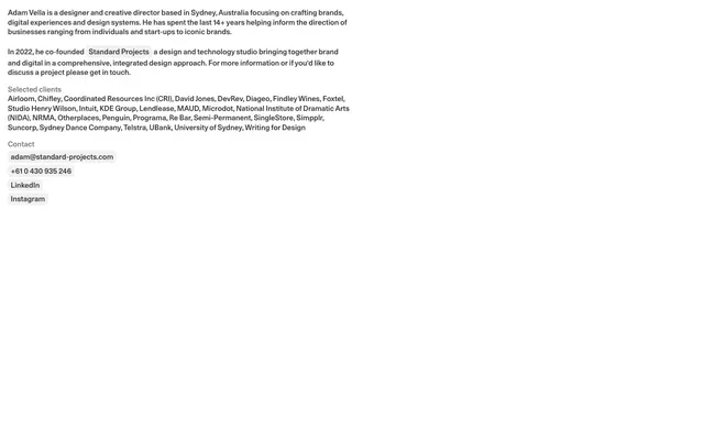
Black & White Manuscript - Clean type on a white page, with minimal interactive elements highlighted discreetly.
Color palette
Page backgrounds, primary surface for content blocks
Dark borders and separators for elevated surfaces and inverted UI. Do not promote it to the primary CTA color
Body text, secondary headings, link text on white backgrounds
Tertiary text, labels, subtle section dividers where a darker line would be too prominent
Subtle background for interactive elements like buttons and links to provide a hover state
Typography
- Weights
- 400
- Sizes
- 16px
- Line height
- 1.2
- Letter spacing
- normal
- Fallback
- serif
General body text and sub-sections, communicating information with a classic, authoritative tone. The system font ensures robustness and universal rendering.
- Weights
- 400
- Sizes
- 15px
- Line height
- 1.25, 1.3
- Letter spacing
- normal
- Fallback
- Inter
Primary body text, link text, and content labels, offering a more contemporary, compact feel. Its use at 15px with tight line height contributes to the compact density of information.
Spacing & shape
Components
Text links appearing as Charcoal Gray (#333333) with no background by default. On hover or active state, they gain a subtle Ghost White (#f1f1f1) background and a 5px border-radius, with the text color remaining Charcoal Gray (#333333). Padding is tight for a compact appearance: 3px vertical, 6px horizontal.
Standard text is Ink Black (#000000) or Charcoal Gray (#333333), with a subtle Ink Black (#000000) border. This is used for lists of items like 'Selected Clients' to subtly separate them visually without heavy dividers. Padding is minimal at 3px vertical and 6px horizontal, echoing interactive elements but without background.
Guidelines
- Prioritize text with Times (serif) for headings and Unica77LL-Medium (sans-serif) for body, leveraging subtle stylistic differences for hierarchy.
- Use Ink Black (#000000) for primary titles and high-contrast text, reserving Charcoal Gray (#333333) for general body content.
- Employ Ghost White (#f1f1f1) exclusively as a subtle background highlight for interactive elements like buttons and links on hover/focus.
- Maintain a compact visual density using 15px font size for body text and tightly defined line heights (1.25 or 1.30).
- Apply a consistent 5px border-radius to all interactive link-like components, creating a soft corner without appearing rounded.
- Use 4px for small vertical spacing between related list items or elements to maintain a dense visual rhythm.
- Establish clear visual grouping using 15px vertical margins between logical sections like paragraphs or client lists.
- Avoid introducing any additional chromatic colors; the system is strictly monochromatic.
- Do not use heavy shadows or gradients; the design relies on flat surfaces and typography for definition.
- Refrain from large, decorative headings; rely on font weight and the Times serif for understated authority.
- Do not break away from the dominant Canvas White background; all content should feel grounded on this primary surface.
- Avoid wide internal component padding; maintain the compact impression with minimal interior spacing like 3px/6px.
- Do not use generic button styles; interactive elements should be minimal text links or text with subtle Ghost White (#f1f1f1) backgrounds.
- Do not introduce complex grid layouts; maintain a simple, single-column document flow where content stacks linearly.
About this system
ShowHide
Adam Vella's digital identity employs a stark, text-first approach, reminiscent of a minimalist resume. The design prioritizes content density and clear hierarchy over visual adornment, using a monochrome palette with subtle gray variations and a crisp white canvas. Typography is foundational, carrying the visual weight through a blend of a serif for emphasis and a sans-serif for readability, defining structure without reliance on heavy graphical elements.
The page adheres to a maximal-width, centered layout, allowing content to stretch across the full browser width, or near full by the content of the screenshot. The hero section is essentially a text block, immediately presenting the primary information without visual fanfare. Sections maintain a consistent vertical rhythm with minimal spacing between paragraphs and lists, reinforcing a document-like density. Content is presented in a single, linear column, without complex multi-column grids or alternating patterns, creating a continuous, scrollable narrative. Navigation is implied through internal text links, rather than a distinct header or sidebar.
The visual language is exclusively text-based. There are no photographs, illustrations, icons, product screenshots, or abstract graphics whatsoever. The design communicates purely through typography, conveying information with unadorned directness and focusing entirely on the written content.
Reminiscent of Frank Chimero, Heydon Pickering, Craig Mod, Manuel Schmalstieg.
# Adam Vella — Style Reference
> Black & White Manuscript -  Clean type on a white page, with minimal interactive elements highlighted discreetly.

**Theme:** light

**Site:** https://www.adamvella.com.au

Adam Vella's digital identity employs a stark, text-first approach, reminiscent of a minimalist resume. The design prioritizes content density and clear hierarchy over visual adornment, using a monochrome palette with subtle gray variations and a crisp white canvas. Typography is foundational, carrying the visual weight through a blend of a serif for emphasis and a sans-serif for readability, defining structure without reliance on heavy graphical elements.

## Tokens — Colors

| Name | Value | Token | Role |
|------|------|------|------|
| Canvas White | `#ffffff` | `--color-canvas-white` | Page backgrounds, primary surface for content blocks |
| Ink Black | `#000000` | `--color-ink-black` | Dark borders and separators for elevated surfaces and inverted UI. Do not promote it to the primary CTA color |
| Charcoal Gray | `#333333` | `--color-charcoal-gray` | Body text, secondary headings, link text on white backgrounds |
| Muted Ash | `#757575` | `--color-muted-ash` | Tertiary text, labels, subtle section dividers where a darker line would be too prominent |
| Ghost White | `#f1f1f1` | `--color-ghost-white` | Subtle background for interactive elements like buttons and links to provide a hover state |

## Tokens — Typography

### Times
- **Substitute:** serif
- **Weights:** 400
- **Sizes:** 16px
- **Line height:** 1.2
- **Letter spacing:** normal
- **Role:** General body text and sub-sections, communicating information with a classic, authoritative tone. The system font ensures robustness and universal rendering.

### Unica77LL-Medium
- **Substitute:** Inter
- **Weights:** 400
- **Sizes:** 15px
- **Line height:** 1.25, 1.3
- **Letter spacing:** normal
- **Role:** Primary body text, link text, and content labels, offering a more contemporary, compact feel. Its use at 15px with tight line height contributes to the compact density of information.

## Tokens — Spacing

- **Card padding:** 16px
- **Element gap:** 4px

## Tokens — Radius

- **links:** 5px

## Layout

The page adheres to a maximal-width, centered layout, allowing content to stretch across the full browser width, or near full by the content of the screenshot. The hero section is essentially a text block, immediately presenting the primary information without visual fanfare. Sections maintain a consistent vertical rhythm with minimal spacing between paragraphs and lists, reinforcing a document-like density. Content is presented in a single, linear column, without complex multi-column grids or alternating patterns, creating a continuous, scrollable narrative. Navigation is implied through internal text links, rather than a distinct header or sidebar.

## Imagery

The visual language is exclusively text-based. There are no photographs, illustrations, icons, product screenshots, or abstract graphics whatsoever. The design communicates purely through typography, conveying information with unadorned directness and focusing entirely on the written content.

## Components

### Ghost Link
*Interactive text link*

Text links appearing as Charcoal Gray (#333333) with no background by default. On hover or active state, they gain a subtle Ghost White (#f1f1f1) background and a 5px border-radius, with the text color remaining Charcoal Gray (#333333). Padding is tight for a compact appearance: 3px vertical, 6px horizontal.

### Bordered Text Tag
*Informational label or client name*

Standard text is Ink Black (#000000) or Charcoal Gray (#333333), with a subtle Ink Black (#000000) border. This is used for lists of items like 'Selected Clients' to subtly separate them visually without heavy dividers. Padding is minimal at 3px vertical and 6px horizontal, echoing interactive elements but without background.

## Guidelines

### Do

- Prioritize text with Times (serif) for headings and Unica77LL-Medium (sans-serif) for body, leveraging subtle stylistic differences for hierarchy.
- Use Ink Black (#000000) for primary titles and high-contrast text, reserving Charcoal Gray (#333333) for general body content.
- Employ Ghost White (#f1f1f1) exclusively as a subtle background highlight for interactive elements like buttons and links on hover/focus.
- Maintain a compact visual density using 15px font size for body text and tightly defined line heights (1.25 or 1.30).
- Apply a consistent 5px border-radius to all interactive link-like components, creating a soft corner without appearing rounded.
- Use 4px for small vertical spacing between related list items or elements to maintain a dense visual rhythm.
- Establish clear visual grouping using 15px vertical margins between logical sections like paragraphs or client lists.

### Don't

- Avoid introducing any additional chromatic colors; the system is strictly monochromatic.
- Do not use heavy shadows or gradients; the design relies on flat surfaces and typography for definition.
- Refrain from large, decorative headings; rely on font weight and the Times serif for understated authority.
- Do not break away from the dominant Canvas White background; all content should feel grounded on this primary surface.
- Avoid wide internal component padding; maintain the compact impression with minimal interior spacing like 3px/6px.
- Do not use generic button styles; interactive elements should be minimal text links or text with subtle Ghost White (#f1f1f1) backgrounds.
- Do not introduce complex grid layouts; maintain a simple, single-column document flow where content stacks linearly.

## Agent Prompt Guide

Quick Color Reference:
text: #333333
background: #ffffff
border: #000000
accent: no distinct accent color
primary action: no distinct CTA color

Example Component Prompts:
Create a standard paragraph: Unica77LL-Medium, weight 400, 15px, lineHeight 1.25, Charcoal Gray (#333333).
Create a bolded sub-heading: Times, weight 400, 16px, lineHeight 1.20, Ink Black (#000000).
Create an interactive link: Unica77LL-Medium, weight 400, 15px, lineHeight 1.25, Charcoal Gray (#333333); on hover, background is Ghost White (#f1f1f1) with 5px radius and padding 3px vertical, 6px horizontal.
Create a list of client names: Times, weight 400, 16px, lineHeight 1.20, Ink Black (#000000), each item subtly bordered with Ink Black (#000000), padding 3px vertical, 6px horizontal, 5px radius.
More like this









Keep what you find
A free account saves references to boards and can send you a weekly email of picks based on what you save.
To see every result, go Pro.