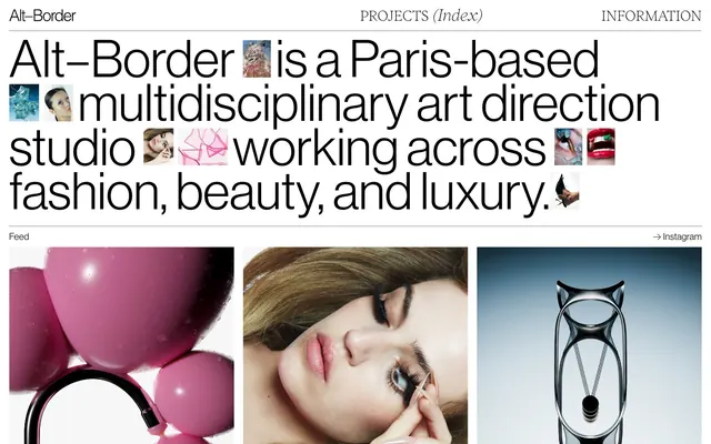
Preview image. Unlock full-res
monochromatic minimalist gallery
Color palette
Page backgrounds, card surfaces, active text color for ghost buttons
Primary text, headings, strong borders, ghost button borders
Secondary text, muted borders, subtle visual breaks in content
Decorative borders for content frames, subtle dividers
Typography
- Weights
- 200, 300, 400
- Sizes
- 14px, 21px, 34px, 120px
- Line height
- 1, 2
- Letter spacing
- -1.4
- Fallback
- Georgia
Headlines, navigation links, and content area text — a precise, narrow serif that brings a high-fashion editorial feel through its controlled tracking and varied weights. Weight 200/300 for a whispered authority, 400 for structural content.
- Weights
- 300
- Sizes
- 105px
- Line height
- 0.85, 0.92
- Letter spacing
- 0
- Fallback
- Helvetica Neue
Large display headings and hero statements — its extra-condensed, light weight provides architectural rigor and a striking impact at large sizes, drawing immediate attention.
- Weights
- 300
- Sizes
- 21px
- Line height
- 1
- Letter spacing
- -0.57
- Fallback
- Inter
Body text and descriptive content — a clean, legible sans-serif for reading, maintaining a modern and unobtrusive presence with its light weight.
Spacing & shape
Components
Text in Inferi weight 200-300, color Ink Black, with 5px padding-bottom that serves as a visual hit area. No background or distinct border, relying on spacing and context for discoverability.
Transparent background with Ink Black text, 0px border-radius, no padding defined. Primarily used for navigational elements like '← Previous' and '→ Next' to maintain visual lightness.
Each image within a 1px solid Pine Stone border, with 10px corner radius. Image titles below use Ink Black text at a small size (e.g., 14px Inferi weight 200). Content cards are themselves containers, often arranged in dense grids.
Large text using Inferi weight 300, color Ink Black, typically around 34px, with a negative letter-spacing for a condensed look. Often paired with a subtle Charcoal Grey border-bottom as a visual separator.
A 1px solid Charcoal Grey or Pine Stone line, typically full-width or extending to frame specific content, providing structure without heaviness.
Guidelines
- Prioritize Neuehaasdisplay 300 at extremely large sizes (e.g., 105px) for hero headlines to maximize immediate visual impact.
- Use Inferi across all typographic elements that require controlled, refined elegance, adjusting weights (200-400) for hierarchy but maintaining its signature narrow tracking.
- Employ Ink Black (#000000) for all primary text and critical borders to create strong visual anchors against the Canvas White (#ffffff) background.
- Structure layouts using visible 1px solid borders in Charcoal Grey (#333333) or Pale Stone (#808080) to define content areas without relying on shadows or heavy backgrounds.
- Maintain a compact visual density, using standard element gaps of 9px and card padding of 9px to keep elements close-knit.
- Apply a 10px border-radius consistently to all image frames and contained card components to soften hard edges slightly.
- Keep backgrounds minimal and pure, primarily using Canvas White (#ffffff) as the dominant surface for all content.
- Avoid using drop shadows or elevation effects; elements should rely on borders and spatial separation for hierarchy.
- Do not introduce chromatic colors for UI elements; the palette is strictly monochromatic with white, black, and grays.
- Refrain from using heavily padded buttons or buttons with solid backgrounds; actions should primarily be expressed through ghost buttons or text links.
- Do not deviate from the specified negative letter-spacing for headlines and navigation links; this is key to the brand's typographic identity.
- Avoid decorative gradients or background images that would disrupt the clean, high-contrast, text-forward aesthetic.
- Do not use generic sans-serifs where a custom font is specified; the precise character of Inferi and Neuehaasdisplay is foundational to the brand.
About this system
ShowHide
Alt-Border embodies a minimalist art gallery aesthetic: stark white canvases juxtaposed with deep black text and hairline dividers. Layouts are tight and grid-based, preferring dense information presentation over expansive negative space. Typography is critical, using a precise, narrow sans-serif at varying weights for an intellectual and assertive tone. The visual system emphasizes content, with images acting as art pieces within structured frames, devoid of soft shadows or chromatic accents, relying on sharp contrast and precise alignment to communicate a high-end, curated feel.
The site employs a primarily contained, max-width layout for its textual content, but images frequently break free to fill horizontal space, creating a dynamic visual flow. The hero section often features a large-scale headline (Neuehaasdisplay) over a white background with interspersed small, decorative thumbnails. Sections maintain a consistent vertical rhythm, separated by clean horizontal dividers (Charcoal Grey lines). Content is arranged in structured grids, such as 3-column image grids for projects, or 2-column layouts for text-and-image features. The layout feels dense and information-rich yet highly organized, maintaining a strict grid alignment. Navigation is a minimalist top bar with text links.
This design system heavily features high-end, editorial-style photography and CGI renders. Images are typically contained within a solid border (Ink Black or Pale Stone) and a 10px border-radius, presenting them like curated art pieces. They are product-focused or abstract, often featuring clean, stark backgrounds that complement the overall minimalism. There is a strong emphasis on visual storytelling through the images themselves, with minimal text overlay. Icons are absent from standard UI, with the focus solely on photographic and CGI content for visual flair. Image density is high, with large, prominent images dominating sections, but always within a structured layout.
Reminiscent of AIGA (American Institute of Graphic Arts), Kerning City, The Brand Identity, Actual Source.
# Alt–Border — Style Reference
> monochromatic minimalist gallery

**Theme:** light

**Site:** https://www.alt-border.com

Alt-Border embodies a minimalist art gallery aesthetic: stark white canvases juxtaposed with deep black text and hairline dividers. Layouts are tight and grid-based, preferring dense information presentation over expansive negative space. Typography is critical, using a precise, narrow sans-serif at varying weights for an intellectual and assertive tone. The visual system emphasizes content, with images acting as art pieces within structured frames, devoid of soft shadows or chromatic accents, relying on sharp contrast and precise alignment to communicate a high-end, curated feel.

## Tokens — Colors

| Name | Value | Token | Role |
|------|------|------|------|
| Canvas White | `#ffffff` | `--color-canvas-white` | Page backgrounds, card surfaces, active text color for ghost buttons |
| Ink Black | `#000000` | `--color-ink-black` | Primary text, headings, strong borders, ghost button borders |
| Charcoal Grey | `#333333` | `--color-charcoal-grey` | Secondary text, muted borders, subtle visual breaks in content |
| Pale Stone | `#808080` | `--color-pale-stone` | Decorative borders for content frames, subtle dividers |

## Tokens — Typography

### Inferi
- **Substitute:** Georgia
- **Weights:** 200, 300, 400
- **Sizes:** 14px, 21px, 34px, 120px
- **Line height:** 1, 2
- **Letter spacing:** -1.4
- **Role:** Headlines, navigation links, and content area text — a precise, narrow serif that brings a high-fashion editorial feel through its controlled tracking and varied weights. Weight 200/300 for a whispered authority, 400 for structural content.

### Neuehaasdisplay
- **Substitute:** Helvetica Neue
- **Weights:** 300
- **Sizes:** 105px
- **Line height:** 0.85, 0.92
- **Letter spacing:** 0
- **Role:** Large display headings and hero statements — its extra-condensed, light weight provides architectural rigor and a striking impact at large sizes, drawing immediate attention.

### Suisseintl
- **Substitute:** Inter
- **Weights:** 300
- **Sizes:** 21px
- **Line height:** 1
- **Letter spacing:** -0.57
- **Role:** Body text and descriptive content — a clean, legible sans-serif for reading, maintaining a modern and unobtrusive presence with its light weight.

## Tokens — Type Scale

| Role | Size | Line height | Letter spacing |
|------|------|------|------|
| caption | 14px | 1 | -0.38px |
| body | 21px | 1 | -0.57px |
| subheading | 34px | 1 | -0.92px |
| heading | 105px | 0.85 | — |
| display | 120px | 1 | -1.4px |

## Tokens — Spacing

- **Section gap:** 48px
- **Card padding:** 9px
- **Element gap:** 9px

## Tokens — Radius

- **Cards:** 10px
- **Images:** 10px

## Layout

The site employs a primarily contained, max-width layout for its textual content, but images frequently break free to fill horizontal space, creating a dynamic visual flow. The hero section often features a large-scale headline (Neuehaasdisplay) over a white background with interspersed small, decorative thumbnails. Sections maintain a consistent vertical rhythm, separated by clean horizontal dividers (Charcoal Grey lines). Content is arranged in structured grids, such as 3-column image grids for projects, or 2-column layouts for text-and-image features. The layout feels dense and information-rich yet highly organized, maintaining a strict grid alignment. Navigation is a minimalist top bar with text links.

## Imagery

This design system heavily features high-end, editorial-style photography and CGI renders. Images are typically contained within a solid border (Ink Black or Pale Stone) and a 10px border-radius, presenting them like curated art pieces. They are product-focused or abstract, often featuring clean, stark backgrounds that complement the overall minimalism. There is a strong emphasis on visual storytelling through the images themselves, with minimal text overlay. Icons are absent from standard UI, with the focus solely on photographic and CGI content for visual flair. Image density is high, with large, prominent images dominating sections, but always within a structured layout.

## Components

### Navigation Link
*Primary site navigation, secondary links like 'Read more'*

Text in Inferi weight 200-300, color Ink Black, with 5px padding-bottom that serves as a visual hit area. No background or distinct border, relying on spacing and context for discoverability.

### Ghost Button
*Actionable text that blends into surrounds but indicates interaction*

Transparent background with Ink Black text, 0px border-radius, no padding defined. Primarily used for navigational elements like '← Previous' and '→ Next' to maintain visual lightness.

### Image Grid Card
*Displaying project thumbnails and content previews in a masonry-style grid*

Each image within a 1px solid Pine Stone border, with 10px corner radius. Image titles below use Ink Black text at a small size (e.g., 14px Inferi weight 200). Content cards are themselves containers, often arranged in dense grids.

### Content Section Headline
*Breaking up content sections with prominent descriptive text*

Large text using Inferi weight 300, color Ink Black, typically around 34px, with a negative letter-spacing for a condensed look. Often paired with a subtle Charcoal Grey border-bottom as a visual separator.

### Dividing Line
*Subtle visual separation between content blocks or navigation items*

A 1px solid Charcoal Grey or Pine Stone line, typically full-width or extending to frame specific content, providing structure without heaviness.

## Guidelines

### Do

- Prioritize Neuehaasdisplay 300 at extremely large sizes (e.g., 105px) for hero headlines to maximize immediate visual impact.
- Use Inferi across all typographic elements that require controlled, refined elegance, adjusting weights (200-400) for hierarchy but maintaining its signature narrow tracking.
- Employ Ink Black (#000000) for all primary text and critical borders to create strong visual anchors against the Canvas White (#ffffff) background.
- Structure layouts using visible 1px solid borders in Charcoal Grey (#333333) or Pale Stone (#808080) to define content areas without relying on shadows or heavy backgrounds.
- Maintain a compact visual density, using standard element gaps of 9px and card padding of 9px to keep elements close-knit.
- Apply a 10px border-radius consistently to all image frames and contained card components to soften hard edges slightly.
- Keep backgrounds minimal and pure, primarily using Canvas White (#ffffff) as the dominant surface for all content.

### Don't

- Avoid using drop shadows or elevation effects; elements should rely on borders and spatial separation for hierarchy.
- Do not introduce chromatic colors for UI elements; the palette is strictly monochromatic with white, black, and grays.
- Refrain from using heavily padded buttons or buttons with solid backgrounds; actions should primarily be expressed through ghost buttons or text links.
- Do not deviate from the specified negative letter-spacing for headlines and navigation links; this is key to the brand's typographic identity.
- Avoid decorative gradients or background images that would disrupt the clean, high-contrast, text-forward aesthetic.
- Do not use generic sans-serifs where a custom font is specified; the precise character of Inferi and Neuehaasdisplay is foundational to the brand.

## Agent Prompt Guide

Quick Color Reference:
text: #000000
background: #ffffff
border: #333333
accent: no distinct accent color
primary action: no distinct CTA color

3-5 Example Component Prompts:
1. Create a hero section with a centered headline 'WE MAKE IMAGES' using Neuehaasdisplay weight 300, color #000000, size 105px. Below it, apply a 1px solid border #333333 spanning the content width.
2. Design a navigation bar with a link 'INFORMATION' using Inferi weight 200, color #000000, size 14px, with 5px padding-bottom.
3. Construct a project image card: an image with a 10px border-radius, within a 1px solid #808080 border, with a caption 'Water Games' below it in Inferi weight 200, color #000000, size 14px.
4. Build a content section: a headline 'OUR PRACTICE' using Inferi weight 300, color #000000, size 34px, letter-spacing -0.92px, followed by a 1px solid #333333 divider, and body text 'We create concept-driven imagery' using Suisseintl weight 300, color #000000, size 21px.
More like this









Keep what you find
A free account saves references to boards and can send you a weekly email of picks based on what you save.
To see every result, go Pro.