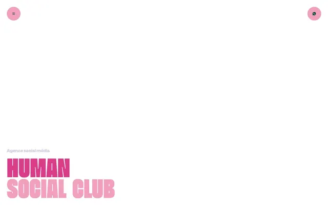
Preview image. Unlock full-res
Vibrant Pink Playground — heavy type dances on a clean white stage, punctuated by electric color accents.
Color palette
Primary text, interactive elements, button background in specific contexts — provides grounding contrast to the vibrant pink.
Key branding color for headlines, badges, and prominent interactive elements — injects energy and distinctiveness. It's the primary accent.
Softer background for buttons and decorative elements, maintaining the energetic pink theme but with less intensity.
Page backgrounds, body text in specific contexts, button text against strong colors.
Subtle background for badges and secondary text elements, a lighter pinkish-gray that softens areas without losing brand warmth.
Rarely used for headings or secondary text, a cool gray providing a hint of contrast to the warm palette.
Used for utility text, icons, and some card elements — provides maximum contrast against lighter backgrounds.
Typography
- Weights
- 400, 500, 700
- Sizes
- 10px, 12px, 13px, 14px, 16px, 20px, 24px, 30px
- Line height
- 0.85, 1.2
- Letter spacing
- normal
- Fallback
- Inter
The workhorse sans-serif for body text, links, buttons, and detailed information across the site. Its tight line-height of 0.85 indicates a compact, modern aesthetic for smaller text, sometimes used in titles as well.
- Weights
- 900
- Sizes
- 46px, 80px, 94px, 130px, 230px
- Line height
- 0.7
- Letter spacing
- normal
- Fallback
- Bebas Neue
The signature display font for all major headlines and brand statements. Its extreme weight and tight line-height are central to the brand's bold, impactful voice, making text a primary visual element rather than merely carrying information.
Spacing & shape
Components
Transparent background (rgba(255, 248, 246, 0.4)), 'Pale Canvas' text (#fff8f6). No border radius, minimal padding (0px). Primarily used for video controls or subtle navigation, appearing almost as text rather than a distinct button.
Background 'Bubblegum Blush' (#f29ebd), text 'Deep Forest' (#00522d), 50% border radius for a perfect circle. Used for prominent circular icons or actions.
Background 'Pale Canvas' (#fff8f6), text 'Deep Forest' (#00522d), 50% border radius for a perfect circle. Used for prominent circular icons or actions, offering a less saturated alternative to the pink version.
Background 'Bubblegum Blush' (#f29ebd), text 'Pale Canvas' (#fff8f6), 10px border radius, generous padding (20px). This is the most visually assertive button style.
No background, 0px border radius, no shadow, no padding. Used when content needs subtle grouping without visual separation from the background.
No background, 20px border radius, no shadow, no padding. Used for visually separating content areas with soft corners, often for functional groupings.
Background 'Foudre Pink' (#db3c8a), 25px border radius, no shadow, heavy padding (60px). Used for highly prominent content sections, often for showcasing key services.
Background 'Deep Forest' (#00522d), 20px border radius, no shadow, generous padding (30px). Used for strong, contrasting content sections, often a direct counterpoint to Foudre Pink cards.
Background 'Foudre Pink' (#db3c8a), text 'Pale Canvas' (#fff8f6), 10px border radius, 12px padding. Visually distinct and draws attention to labels.
Background 'Ash Whisper' (#fce5df), text 'Foudre Pink' (#db3c8a), 10px border radius, 7px vertical and 8px horizontal padding. A lighter, more understated badge.
Guidelines
- Do use 'Foudre Pink' (#db3c8a) and 'Deep Forest' (#00522d) in high contrast for interactive elements or brand highlights to maintain energy.
- Do apply the `Beni` font, weight 900, at large sizes (46px-230px, lineHeight 0.7) for all primary headlines, treating it as a dynamic visual component.
- Do use 'Clash Grotesk' as the primary font for all body copy and UI elements, adhering to its compact 1.2 line-height for readability within UI components.
- Do apply 10px radius for buttons and badges, reserving 20px for cards and 25px for prominent content blocks.
- Do utilize minimal padding (0px) on ghost buttons to integrate them seamlessly into content like video controls.
- Do ensure a generous `sectionGap` of 60px to 120px between major content blocks to provide breathing room and emphasis.
- Don't use 'Clash Grotesk' for primary headlines; its role is for detailed information, not brand-level impact.
- Don't introduce additional bright colors; the system relies on the impactful contrast between 'Foudre Pink' and 'Deep Forest'.
- Don't apply shadows or complex elevation; the design relies on bold color blocks and typography for hierarchy and visual interest.
- Don't use generic square buttons; all primary action buttons should either be circular (50% radius) or utilize a 10px radius with 'Bubblegum Blush' background.
- Don't vary the 0.7 line-height for `Beni` headings; it's a critical element of its impactful, stackable appearance.
About this system
ShowHide
Agence Foudre's design system is a bold, energetic playground, where bright, contrasting colors and chunky typography create a dynamic, youthful appeal. The juxtaposition of a vivacious pink and a deep forest green is the core of its identity, creating a vibrant tension. Typography, especially the heavy, impactful Beni font, is treated as a primary visual element, often fading or interacting with the background, reinforcing a playful, almost rebellious mood. This is a system that uses color and expressive type to make a statement, rather than relying on complex layouts or shadows.
The site's visual language is dominated by its typography and color, with imagery playing a secondary, often abstract role. When present, images are tightly integrated with text, sometimes serving as background for the bold 'Beni' headlines, giving them a 'ghosted' effect. Graphics are minimal, often just circular icons or very simple vector shapes, treated in either 'Foudre Pink' or 'Deep Forest'. There is no dominant photography style; the focus is on UI elements and expressive text.
Reminiscent of AIGA, Femme & Fierce, Design by Women, The Brand Identity.
# Agence Foudre — Style Reference
> Vibrant Pink Playground — heavy type dances on a clean white stage, punctuated by electric color accents.

**Theme:** light

**Site:** https://www.agencefoudre.com

Agence Foudre's design system is a bold, energetic playground, where bright, contrasting colors and chunky typography create a dynamic, youthful appeal. The juxtaposition of a vivacious pink and a deep forest green is the core of its identity, creating a vibrant tension. Typography, especially the heavy, impactful Beni font, is treated as a primary visual element, often fading or interacting with the background, reinforcing a playful, almost rebellious mood. This is a system that uses color and expressive type to make a statement, rather than relying on complex layouts or shadows.

## Tokens — Colors

| Name | Value | Token | Role |
|------|------|------|------|
| Deep Forest | `#00522d` | `--color-deep-forest` | Primary text, interactive elements, button background in specific contexts — provides grounding contrast to the vibrant pink. |
| Foudre Pink | `#db3c8a` | `--color-foudre-pink` | Key branding color for headlines, badges, and prominent interactive elements — injects energy and distinctiveness. It's the primary accent. |
| Bubblegum Blush | `#f29ebd` | `--color-bubblegum-blush` | Softer background for buttons and decorative elements, maintaining the energetic pink theme but with less intensity. |
| Pale Canvas | `#fff8f6` | `--color-pale-canvas` | Page backgrounds, body text in specific contexts, button text against strong colors. |
| Ash Whisper | `#fce5df` | `--color-ash-whisper` | Subtle background for badges and secondary text elements, a lighter pinkish-gray that softens areas without losing brand warmth. |
| Slate Tint | `#d1cfe4` | `--color-slate-tint` | Rarely used for headings or secondary text, a cool gray providing a hint of contrast to the warm palette. |
| Midnight Ink | `#000000` | `--color-midnight-ink` | Used for utility text, icons, and some card elements — provides maximum contrast against lighter backgrounds. |

## Tokens — Typography

### Clash Grotesk
- **Substitute:** Inter
- **Weights:** 400, 500, 700
- **Sizes:** 10px, 12px, 13px, 14px, 16px, 20px, 24px, 30px
- **Line height:** 0.85, 1.2
- **Letter spacing:** normal
- **Role:** The workhorse sans-serif for body text, links, buttons, and detailed information across the site. Its tight line-height of 0.85 indicates a compact, modern aesthetic for smaller text, sometimes used in titles as well.

### Beni
- **Substitute:** Bebas Neue
- **Weights:** 900
- **Sizes:** 46px, 80px, 94px, 130px, 230px
- **Line height:** 0.7
- **Letter spacing:** normal
- **Role:** The signature display font for all major headlines and brand statements. Its extreme weight and tight line-height are central to the brand's bold, impactful voice, making text a primary visual element rather than merely carrying information.

## Tokens — Type Scale

| Role | Size | Line height | Letter spacing |
|------|------|------|------|
| caption | 10px | 0.85 | — |
| body | 14px | 0.85 | — |
| subheading | 20px | 0.85 | — |
| heading | 30px | 0.85 | — |
| heading-lg | 46px | 0.7 | — |
| display | 230px | 0.7 | — |

## Tokens — Spacing

- **Section gap:** 60-120px
- **Card padding:** 30-60px
- **Element gap:** 10-20px

## Tokens — Radius

- **Buttons:** 10px
- **Cards:** 20px
- **badges:** 10px

## Imagery

The site's visual language is dominated by its typography and color, with imagery playing a secondary, often abstract role. When present, images are tightly integrated with text, sometimes serving as background for the bold 'Beni' headlines, giving them a 'ghosted' effect. Graphics are minimal, often just circular icons or very simple vector shapes, treated in either 'Foudre Pink' or 'Deep Forest'. There is no dominant photography style; the focus is on UI elements and expressive text.

## Components

### Brand Statement Headline Block

### Service Cards — Foudre Pink & Deep Forest

### Badge Collection & CTA Button Group

### Ghost Button
*Navigation, secondary actions*

Transparent background (rgba(255, 248, 246, 0.4)), 'Pale Canvas' text (#fff8f6). No border radius, minimal padding (0px). Primarily used for video controls or subtle navigation, appearing almost as text rather than a distinct button.

### Primary Circular Button (Foudre Pink)
*Interactive elements, menu toggles*

Background 'Bubblegum Blush' (#f29ebd), text 'Deep Forest' (#00522d), 50% border radius for a perfect circle. Used for prominent circular icons or actions.

### Primary Circular Button (Pale Canvas)
*Interactive elements, menu toggles*

Background 'Pale Canvas' (#fff8f6), text 'Deep Forest' (#00522d), 50% border radius for a perfect circle. Used for prominent circular icons or actions, offering a less saturated alternative to the pink version.

### Primary Filled Button
*Main calls to action*

Background 'Bubblegum Blush' (#f29ebd), text 'Pale Canvas' (#fff8f6), 10px border radius, generous padding (20px). This is the most visually assertive button style.

### Transparent Card
*Informational blocks, content grouping*

No background, 0px border radius, no shadow, no padding. Used when content needs subtle grouping without visual separation from the background.

### Rounded Transparent Card
*Informational blocks, decorative grouping*

No background, 20px border radius, no shadow, no padding. Used for visually separating content areas with soft corners, often for functional groupings.

### Foudre Pink Content Card
*Highlighted content, service showcases*

Background 'Foudre Pink' (#db3c8a), 25px border radius, no shadow, heavy padding (60px). Used for highly prominent content sections, often for showcasing key services.

### Deep Forest Content Card
*Highlighted content, service showcases*

Background 'Deep Forest' (#00522d), 20px border radius, no shadow, generous padding (30px). Used for strong, contrasting content sections, often a direct counterpoint to Foudre Pink cards.

### Foudre Pink Badge
*Categorization, short labels*

Background 'Foudre Pink' (#db3c8a), text 'Pale Canvas' (#fff8f6), 10px border radius, 12px padding. Visually distinct and draws attention to labels.

### Accent Badge
*Secondary categorization, subtle labels*

Background 'Ash Whisper' (#fce5df), text 'Foudre Pink' (#db3c8a), 10px border radius, 7px vertical and 8px horizontal padding. A lighter, more understated badge.

## Guidelines

### Do

- Do use 'Foudre Pink' (#db3c8a) and 'Deep Forest' (#00522d) in high contrast for interactive elements or brand highlights to maintain energy.
- Do apply the `Beni` font, weight 900, at large sizes (46px-230px, lineHeight 0.7) for all primary headlines, treating it as a dynamic visual component.
- Do use 'Clash Grotesk' as the primary font for all body copy and UI elements, adhering to its compact 1.2 line-height for readability within UI components.
- Do apply 10px radius for buttons and badges, reserving 20px for cards and 25px for prominent content blocks.
- Do utilize minimal padding (0px) on ghost buttons to integrate them seamlessly into content like video controls.
- Do ensure a generous `sectionGap` of 60px to 120px between major content blocks to provide breathing room and emphasis.

### Don't

- Don't use 'Clash Grotesk' for primary headlines; its role is for detailed information, not brand-level impact.
- Don't introduce additional bright colors; the system relies on the impactful contrast between 'Foudre Pink' and 'Deep Forest'.
- Don't apply shadows or complex elevation; the design relies on bold color blocks and typography for hierarchy and visual interest.
- Don't use generic square buttons; all primary action buttons should either be circular (50% radius) or utilize a 10px radius with 'Bubblegum Blush' background.
- Don't vary the 0.7 line-height for `Beni` headings; it's a critical element of its impactful, stackable appearance.

## Agent Prompt Guide

### Quick Color Reference
- **Text (primary):** #00522d (Deep Forest)
- **Background (page):** #fff8f6 (Pale Canvas)
- **CTA (primary):** #db3c8a (Foudre Pink)
- **Outline/Subtle Text:** #d1cfe4 (Slate Tint)
- **Accent (button bg):** #f29ebd (Bubblegum Blush)

### Example Component Prompts
1. **Create a hero section:** White background (#fff8f6). Headline 'HUMAN SOCIAL CLUB' using 'Beni' font, weight 900, size 130px, line-height 0.7, color #db3c8a (Foudre Pink), centered. A smaller sub-heading 'Agence social média' using 'Clash Grotesk' font, weight 400, size 24px, line-height 0.85, color #00522d (Deep Forest), left-aligned above the main headline.
2. **Generate a primary action button:** Text 'Explorer' using 'Clash Grotesk' font, weight 400, size 16px, line-height 0.85, color #fff8f6 (Pale Canvas). Background #f29ebd (Bubblegum Blush), 10px border radius, 20px padding (all sides).
3. **Design a 'Foudre Pink' content card:** Background #db3c8a (Foudre Pink), 25px border radius, 60px padding (all sides). Inside, a heading 'Analyse de l’existant' using 'Clash Grotesk' font, weight 700, size 30px, line-height 0.85, color #fff8f6 (Pale Canvas). Below it, body text using 'Clash Grotesk' font, weight 400, size 16px, line-height 0.85, color #fff8f6 (Pale Canvas).
4. **Create a circular menu toggle:** Background #f29ebd (Bubblegum Blush), 50% border-radius. Inside, an icon (example: three horizontal lines for a menu) colored #00522d (Deep Forest). No padding, positioned at the top-right of the viewport.
5. **Construct a badge:** Text 'Benchmark' using 'Clash Grotesk' font, weight 500, size 14px, line-height 0.85, color #fff8f6 (Pale Canvas). Background #db3c8a (Foudre Pink), 10px border radius, 12px padding (all sides).
More like this









Keep what you find
A free account saves references to boards and can send you a weekly email of picks based on what you save.
To see every result, go Pro.