
Preview image. Unlock full-res
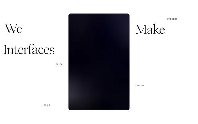
Minimalist editorial canvas; stark black text on an expansive white backdrop, with every letter precisely placed.
Color palette
Primary text, critical icons, primary borders, high-contrast accents.
Page backgrounds, primary container backgrounds.
Subtle background for specific sections, providing a minimal textural shift from pure white.
Secondary text for links, navigation, and body copy that maintains high contrast but is slightly softer than true black.
Muted text, subtle borders, and background accents for secondary elements.
Typography
- Weights
- 400, 700
- Sizes
- 10px, 12px, 14px, 15px, 17px, 19px, 29px, 90px
- Line height
- 0.86, 1, 1.1, 1.5
- Letter spacing
- -0.016
- Fallback
- Inter
Primary sans-serif for body content, navigation, buttons, and smaller headings. Its slightly condensed forms maintain a compact yet readable appearance, even with generous negative letter spacing.
- Weights
- 400
- Sizes
- 19px, 90px
- Line height
- 0.9, 1
- Letter spacing
- -0.016
- Fallback
- Playfair Display
Primary serif for prominent headings and selected navigational elements. Its elegant, slightly condensed forms with a whisper of letter spacing provide a distinct editorial voice without feeling decorative.
Spacing & shape
Components
Text uses Saol Display, weight 400, size 19px for top-level, and Neue Montreal at various sizes for sub-menus, in Pitch Black. Letter spacing is -0.0160em. No underline by default; hover state is not explicitly defined in data but implies a potential shift in color or weight for interaction. A generous left/right padding of 90px on the navigation bar indicates wide spacing.
Transparent background (rgba(0, 0, 0, 0)), Pitch Black text and border top color (rgb(0, 0, 0)). Fully circular with borderRadius=50%, no padding, size is determined by icon content, suggesting compact, unobtrusive controls.
Uses Neue Montreal at 15px or 17px, weight 400, in Graphite Text (#212121) or Pitch Black (#000000). Line height is typically 1.50 for readability, with subtle letter spacing inherent to the typeface.
Uses Saol Display, weight 400, at 90px. Letter spacing is -0.0160em, in Pitch Black. Combined with minimal line height (e.g., 0.90), this creates a commanding yet refined visual presence.
Guidelines
- Use Pitch Black (#000000) for primary text elements and Frost White (#ffffff) for backgrounds to maintain high contrast (21.0:1 AAA).
- Employ Saol Display for all large headings (90px) and key navigation items (19px) to establish the brand's editorial voice.
- Apply letter-spacing of -0.0160em to both Saol Display and Neue Montreal typefaces across all sizes to reinforce precision.
- Utilize Neue Montreal for all body copy, button labels, and secondary navigation elements, ensuring legibility at smaller sizes (10px - 29px).
- Prioritize generous padding and margin to create spacious layouts, especially with 90px padding around major content blocks.
- Implement circular ghost buttons (borderRadius: 50%, transparent background, #000000 border) for all compact interactive icons.
- For subtle background variation, use Canvas White (#f1edeb) instead of pure Frost White when a slight textural shift is desired.
- Avoid using saturated or chromatic colors; the palette is strictly achromatic to preserve the system's stark, minimalist identity.
- Do not introduce heavy shadows or gradients; the design relies purely on typography, spacing, and subtle color shifts for depth.
- Refrain from altering the defined letter spacing for typefaces; the -0.0160em value is critical to the brand's precise visual character.
- Do not clutter layouts with extraneous visual elements; the aesthetic demands expansive white space and a focus on essential information.
- Avoid standard rectangular button shapes; interactive elements should be subtle, circular, or text-based to align with the minimalist interaction model.
- Do not use font weights other than 400 and 700 for Neue Montreal, and only 400 for Saol Display; these specific weights define the typographic hierarchy.
About this system
ShowHide
This design system evokes a sense of stark minimalism and intellectual rigor, like a high-fashion editorial. The limited monochrome palette paired with custom serif and sans-serif typefaces creates a distinctive, almost academic-yet-modern feel. The generous use of letter spacing on display text, combined with tightly controlled line heights at smaller sizes, adds to the precise, almost etched quality of the content. Absence of decorative elements pushes focus entirely onto typography and content.
The page exhibits a full-bleed layout which prioritizes extreme white space, with content typically centered or justified to the left/right edges of the viewport defined by generous implied padding (seen with 90px on content blocks). The header features minimal, widely spaced navigation links on the right, balanced by the brand logo on the left. Section rhythm is implied by content shifts rather than distinct dividers; elements are vertically stacked with substantial section gaps (e.g., 90px). There's no evident grid for cards or complex content arrangements, leaning towards single-column, highly editorial presentations. The overall density is spacious, emphasizing breathing room around all elements. Navigation is a top bar, fixed or sticky (implied by header structure).
The visual language is characterized by an absence of traditional imagery in the provided view, relying instead on pure UI elements. If present, it would likely feature highly composed, perhaps monochromatic or desaturated photography, or very abstract, minimal graphics that would not disrupt the stark, typographic focus of the design. The current presentation is text-dominant, with icons functioning as functional accents rather than decorative elements. There is no product photography, illustrations, or 3D renders evident, suggesting a focus on information and interaction over visual 'fluff'.
Reminiscent of Awwwards, Basic Agency, Pentagram.
# Unseen Studio® — Style Reference
> Minimalist editorial canvas; stark black text on an expansive white backdrop, with every letter precisely placed.

**Theme:** light

**Site:** https://unseen.co

This design system evokes a sense of stark minimalism and intellectual rigor, like a high-fashion editorial. The limited monochrome palette paired with custom serif and sans-serif typefaces creates a distinctive, almost academic-yet-modern feel. The generous use of letter spacing on display text, combined with tightly controlled line heights at smaller sizes, adds to the precise, almost etched quality of the content. Absence of decorative elements pushes focus entirely onto typography and content.

## Tokens — Colors

| Name | Value | Token | Role |
|------|------|------|------|
| Pitch Black | `#000000` | `--color-pitch-black` | Primary text, critical icons, primary borders, high-contrast accents. |
| Frost White | `#ffffff` | `--color-frost-white` | Page backgrounds, primary container backgrounds. |
| Canvas White | `#f1edeb` | `--color-canvas-white` | Subtle background for specific sections, providing a minimal textural shift from pure white. |
| Graphite Text | `#212121` | `--color-graphite-text` | Secondary text for links, navigation, and body copy that maintains high contrast but is slightly softer than true black. |
| Light Gray Text | `#d6d6d6` | `--color-light-gray-text` | Muted text, subtle borders, and background accents for secondary elements. |

## Tokens — Typography

### Neue Montreal
- **Substitute:** Inter
- **Weights:** 400, 700
- **Sizes:** 10px, 12px, 14px, 15px, 17px, 19px, 29px, 90px
- **Line height:** 0.86, 1, 1.1, 1.5
- **Letter spacing:** -0.016
- **Role:** Primary sans-serif for body content, navigation, buttons, and smaller headings. Its slightly condensed forms maintain a compact yet readable appearance, even with generous negative letter spacing.

### Saol Display
- **Substitute:** Playfair Display
- **Weights:** 400
- **Sizes:** 19px, 90px
- **Line height:** 0.9, 1
- **Letter spacing:** -0.016
- **Role:** Primary serif for prominent headings and selected navigational elements. Its elegant, slightly condensed forms with a whisper of letter spacing provide a distinct editorial voice without feeling decorative.

## Tokens — Type Scale

| Role | Size | Line height | Letter spacing |
|------|------|------|------|
| caption | 10px | 1.5 | -0.016em |
| body | 15px | 1.5 | -0.016em |
| heading | 19px | 1 | -0.016em |
| heading-lg | 29px | 1 | -0.016em |
| display | 90px | 0.9 | -0.016em |

## Tokens — Spacing

- **Section gap:** 90px
- **Card padding:** 17px
- **Element gap:** 6px

## Tokens — Radius

- **Default:** 23.76px
- **small:** 17.28px

## Layout

The page exhibits a full-bleed layout which prioritizes extreme white space, with content typically centered or justified to the left/right edges of the viewport defined by generous implied padding (seen with 90px on content blocks). The header features minimal, widely spaced navigation links on the right, balanced by the brand logo on the left. Section rhythm is implied by content shifts rather than distinct dividers; elements are vertically stacked with substantial section gaps (e.g., 90px). There's no evident grid for cards or complex content arrangements, leaning towards single-column, highly editorial presentations. The overall density is spacious, emphasizing breathing room around all elements. Navigation is a top bar, fixed or sticky (implied by header structure).

## Imagery

The visual language is characterized by an absence of traditional imagery in the provided view, relying instead on pure UI elements. If present, it would likely feature highly composed, perhaps monochromatic or desaturated photography, or very abstract, minimal graphics that would not disrupt the stark, typographic focus of the design. The current presentation is text-dominant, with icons functioning as functional accents rather than decorative elements. There is no product photography, illustrations, or 3D renders evident, suggesting a focus on information and interaction over visual 'fluff'.

## Components

### Navigation Links

### Editorial Heading Display

### Project Index Card

### Navigation Link
*Main navigation items and sub-navigation.*

Text uses Saol Display, weight 400, size 19px for top-level, and Neue Montreal at various sizes for sub-menus, in Pitch Black. Letter spacing is -0.0160em. No underline by default; hover state is not explicitly defined in data but implies a potential shift in color or weight for interaction. A generous left/right padding of 90px on the navigation bar indicates wide spacing.

### Ghost Button (Circular)
*Icon-only interactive elements like hamburger menus or sound toggles.*

Transparent background (rgba(0, 0, 0, 0)), Pitch Black text and border top color (rgb(0, 0, 0)). Fully circular with borderRadius=50%, no padding, size is determined by icon content, suggesting compact, unobtrusive controls.

### Body Text Block
*General paragraph content and descriptions.*

Uses Neue Montreal at 15px or 17px, weight 400, in Graphite Text (#212121) or Pitch Black (#000000). Line height is typically 1.50 for readability, with subtle letter spacing inherent to the typeface.

### Editorial Heading
*Primary page titles and section headers.*

Uses Saol Display, weight 400, at 90px. Letter spacing is -0.0160em, in Pitch Black. Combined with minimal line height (e.g., 0.90), this creates a commanding yet refined visual presence.

## Guidelines

### Do

- Use Pitch Black (#000000) for primary text elements and Frost White (#ffffff) for backgrounds to maintain high contrast (21.0:1 AAA).
- Employ Saol Display for all large headings (90px) and key navigation items (19px) to establish the brand's editorial voice.
- Apply letter-spacing of -0.0160em to both Saol Display and Neue Montreal typefaces across all sizes to reinforce precision.
- Utilize Neue Montreal for all body copy, button labels, and secondary navigation elements, ensuring legibility at smaller sizes (10px - 29px).
- Prioritize generous padding and margin to create spacious layouts, especially with 90px padding around major content blocks.
- Implement circular ghost buttons (borderRadius: 50%, transparent background, #000000 border) for all compact interactive icons.
- For subtle background variation, use Canvas White (#f1edeb) instead of pure Frost White when a slight textural shift is desired.

### Don't

- Avoid using saturated or chromatic colors; the palette is strictly achromatic to preserve the system's stark, minimalist identity.
- Do not introduce heavy shadows or gradients; the design relies purely on typography, spacing, and subtle color shifts for depth.
- Refrain from altering the defined letter spacing for typefaces; the -0.0160em value is critical to the brand's precise visual character.
- Do not clutter layouts with extraneous visual elements; the aesthetic demands expansive white space and a focus on essential information.
- Avoid standard rectangular button shapes; interactive elements should be subtle, circular, or text-based to align with the minimalist interaction model.
- Do not use font weights other than 400 and 700 for Neue Montreal, and only 400 for Saol Display; these specific weights define the typographic hierarchy.

## Agent Prompt Guide

### Quick Color Reference
- Text: #000000 (Pitch Black)
- Background: #ffffff (Frost White)
- Accent Background: #f1edeb (Canvas White)
- Secondary Text: #212121 (Graphite Text)
- Border/Subtle Text: #d6d6d6 (Light Gray Text)

### Example Component Prompts
1. **Create a primary navigation bar**: Full width, Frost White background. Left-aligned logo 'Unseen Studio®' using Neue Montreal, 19px, weight 400, Pitch Black. Right-aligned navigation links 'Index', 'Projects', 'Contact' using Saol Display, 19px, weight 400, letter-spacing -0.016em, Pitch Black, with 35px spacing between links.
2. **Generate a ghost circular button for an icon**: Transparent background, 50% border radius, 1px Pitch Black border, no padding. Icon in Pitch Black.
3. **Design a main page heading**: Saol Display, 90px, weight 400, line-height 0.9, letter-spacing -0.016em, Pitch Black. Positioned centrally in the viewport with a Frost White background.
4. **Create a body text paragraph**: Text using Neue Montreal, 15px, weight 400, line-height 1.5, letter-spacing -0.016em, Graphite Text (#212121). Ensure a top margin of 35px after a previous element.
More like this








Keep what you find
A free account saves references to boards and can send you a weekly email of picks based on what you save.
To see every result, go Pro.