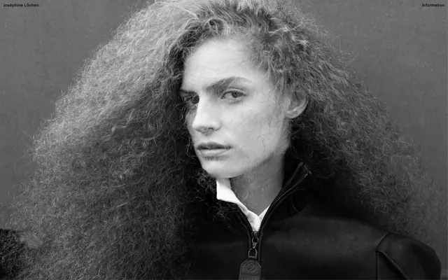
Preview image. Unlock full-res
monochromatic gallery, stark and precise
Color palette
Dark borders and separators for elevated surfaces and inverted UI. Do not promote it to the primary CTA color
Page backgrounds, surface background for heroic content blocks
Muted secondary text, subtle decorative borders, ghost element outlines. Offers a softer interaction against Ink Black
Typography
- Weights
- 400
- Sizes
- 14px
- Line height
- 1.25
- Letter spacing
- 0.0150em
- Fallback
- Inter
All text: headlines, body copy, navigation, and links. Its uniform application across all text elements reinforces the minimalist and precise tone, giving a consistent, almost whispered presence.
Spacing & shape
Components
Text in Ink Black (#000000) with an implied 1px border. On interaction, the text animates with an ease timing function. Example: 'Information' link.
Text in Ink Black (#000000) at 14px EU-SwissRail-Medium weight 400, line height 1.25, with paragraphs separated by 1px marginBottom. Used for client lists or descriptions.
Text in Ink Black (#000000) at 14px EU-SwissRail-Medium weight 400, with letter-spacing 0.015em. Positioned in the top-left corner, serving as a non-interactive brand identifier.
Text in Muted Gray (#cecece) at 14px EU-SwissRail-Medium weight 400, with implied 1px borders surrounding the text. Example: '[ Print ]', '[ Pages ]'.
Text in Muted Gray (#cecece) at 14px EU-SwissRail-Medium weight 400, with implied 1px borders. Positioned top-right for less prominent actions. Example: 'Information'.
Guidelines
- Maintain a strictly monochromatic palette, using only Ink Black (#000000), Canvas White (#ffffff), and Muted Gray (#cecece).
- Apply the EU-SwissRail-Medium font consistently for all text elements, at 14px size and 400 weight with 0.0150em letter spacing.
- Use 1px borders to define interactive areas or visual separation for text-based elements, often implied rather than explicitly drawn.
- Ensure all interactive elements animate with an 'ease' timing function over 0.4s to convey responsiveness.
- Utilize 7px as a compact default for spacing between related elements and 50px for vertical separation between distinct content sections.
- Place the brand name in the top-left corner and supplementary navigation items in the top-right, maintaining a consistent header pattern.
- Introduce any saturated colors; limit the palette to the defined achromatic neutrals.
- Vary font families, sizes, or weights from EU-SwissRail-Medium 14px/400, to preserve typographic precision.
- Use prominent or heavy shadows for elevation; rely on subtle visual cues like borders and compact spacing.
- Break the full-bleed content layout with a max-width container; content should extend to the viewport edges.
- Decorate with graphic elements that are not core to the content itself; the focus is on content presentation.
- Disturb the compact spacing rhythm with large, airy gaps, particularly for element gaps.
About this system
ShowHide
Joséphine Löchen employs a stark, monochromatic aesthetic, creating a visual language that emphasizes raw content over elaborate UI. The design is a minimalist canvas where imagery and text hold equal weight, defined by precise typography, tight spacing, and an absence of color. The overall impression is one of high-fidelity, unadorned presentation, allowing the creative work to take center stage.
The site follows a full-bleed layout model, where primary content, mainly large-scale photography, extends edge-to-edge. The hero section is a full-viewport image with crisp, minimal navigation text overlaid at the top left and right. Sections flow seamlessly without distinct visual dividers or alternating background bands, maintaining consistent vertical spacing. Content is highly image-dominant, using a minimal grid for text arrangements, mostly stacking text centrally or in small, precise blocks. The navigation is a fixed top bar with a left-aligned brand name and right-aligned links, maintaining a subtle presence over the full-bleed imagery.
The site primarily features high-contrast, black and white fine-art photography. Images are full-bleed, occupying the entire viewport or significant sections of it, serving as the dominant visual content rather than decorative elements. There are no rounded corners or complex masking; images are presented squarely, often with a raw, unedited edge quality, emphasizing the starkness and directness of the work. Icons are not present, and the visual language is entirely image-driven with minimal interface elements.
Reminiscent of A.P.C. (archive sections), Acne Studios (archive photography), The Row (older site versions), Selected works of Jil Sander.
# Joséphine Löchen — Style Reference
> monochromatic gallery, stark and precise

**Theme:** light

**Site:** https://josephinelochen.com

Joséphine Löchen employs a stark, monochromatic aesthetic, creating a visual language that emphasizes raw content over elaborate UI. The design is a minimalist canvas where imagery and text hold equal weight, defined by precise typography, tight spacing, and an absence of color. The overall impression is one of high-fidelity, unadorned presentation, allowing the creative work to take center stage.

## Tokens — Colors

| Name | Value | Token | Role |
|------|------|------|------|
| Ink Black | `#000000` | `--color-ink-black` | Dark borders and separators for elevated surfaces and inverted UI. Do not promote it to the primary CTA color |
| Canvas White | `#ffffff` | `--color-canvas-white` | Page backgrounds, surface background for heroic content blocks |
| Muted Gray | `#cecece` | `--color-muted-gray` | Muted secondary text, subtle decorative borders, ghost element outlines. Offers a softer interaction against Ink Black |

## Tokens — Typography

### EU-SwissRail-Medium
- **Substitute:** Inter
- **Weights:** 400
- **Sizes:** 14px
- **Line height:** 1.25
- **Letter spacing:** 0.0150em
- **Role:** All text: headlines, body copy, navigation, and links. Its uniform application across all text elements reinforces the minimalist and precise tone, giving a consistent, almost whispered presence.

## Tokens — Type Scale

| Role | Size | Line height | Letter spacing |
|------|------|------|------|
| body | 14px | 1.25 | 0.21px |

## Tokens — Spacing

- **Section gap:** 50px
- **Card padding:** 11px
- **Element gap:** 7px

## Tokens — Radius

- **none:** 0px

## Layout

The site follows a full-bleed layout model, where primary content, mainly large-scale photography, extends edge-to-edge. The hero section is a full-viewport image with crisp, minimal navigation text overlaid at the top left and right. Sections flow seamlessly without distinct visual dividers or alternating background bands, maintaining consistent vertical spacing. Content is highly image-dominant, using a minimal grid for text arrangements, mostly stacking text centrally or in small, precise blocks. The navigation is a fixed top bar with a left-aligned brand name and right-aligned links, maintaining a subtle presence over the full-bleed imagery.

## Imagery

The site primarily features high-contrast, black and white fine-art photography. Images are full-bleed, occupying the entire viewport or significant sections of it, serving as the dominant visual content rather than decorative elements. There are no rounded corners or complex masking; images are presented squarely, often with a raw, unedited edge quality, emphasizing the starkness and directness of the work. Icons are not present, and the visual language is entirely image-driven with minimal interface elements.

## Components

### Text Link Outlined
*Interactive navigation and informational links*

Text in Ink Black (#000000) with an implied 1px border. On interaction, the text animates with an ease timing function. Example: 'Information' link.

### Body Text Block
*Descriptive text and content listings*

Text in Ink Black (#000000) at 14px EU-SwissRail-Medium weight 400, line height 1.25, with paragraphs separated by 1px marginBottom. Used for client lists or descriptions.

### Header Branding
*Site title*

Text in Ink Black (#000000) at 14px EU-SwissRail-Medium weight 400, with letter-spacing 0.015em. Positioned in the top-left corner, serving as a non-interactive brand identifier.

### Gallery Navigation
*Contextual navigation within image galleries*

Text in Muted Gray (#cecece) at 14px EU-SwissRail-Medium weight 400, with implied 1px borders surrounding the text. Example: '[ Print ]', '[ Pages ]'.

### Information Link
*Secondary navigation or utility link*

Text in Muted Gray (#cecece) at 14px EU-SwissRail-Medium weight 400, with implied 1px borders. Positioned top-right for less prominent actions. Example: 'Information'.

## Guidelines

### Do

- Maintain a strictly monochromatic palette, using only Ink Black (#000000), Canvas White (#ffffff), and Muted Gray (#cecece).
- Apply the EU-SwissRail-Medium font consistently for all text elements, at 14px size and 400 weight with 0.0150em letter spacing.
- Use 1px borders to define interactive areas or visual separation for text-based elements, often implied rather than explicitly drawn.
- Ensure all interactive elements animate with an 'ease' timing function over 0.4s to convey responsiveness.
- Utilize 7px as a compact default for spacing between related elements and 50px for vertical separation between distinct content sections.
- Place the brand name in the top-left corner and supplementary navigation items in the top-right, maintaining a consistent header pattern.

### Don't

- Introduce any saturated colors; limit the palette to the defined achromatic neutrals.
- Vary font families, sizes, or weights from EU-SwissRail-Medium 14px/400, to preserve typographic precision.
- Use prominent or heavy shadows for elevation; rely on subtle visual cues like borders and compact spacing.
- Break the full-bleed content layout with a max-width container; content should extend to the viewport edges.
- Decorate with graphic elements that are not core to the content itself; the focus is on content presentation.
- Disturb the compact spacing rhythm with large, airy gaps, particularly for element gaps.

## Agent Prompt Guide

Quick Color Reference: text: #000000, background: #ffffff, border: #cecece, accent: no distinct accent color, primary action: no distinct CTA color

Example Component Prompts:
1. Create a header: 'Joséphine Löchen' left-aligned (14px EU-SwissRail-Medium 400, letter-spacing 0.015em, #000000), 'Information' right-aligned (14px EU-SwissRail-Medium 400, #cecece, letter-spacing 0.015em), both with subtle implied 1px borders as interactive elements.
2. Create a full-bleed hero section: a large black and white image spanning the viewport, with the header elements overlaid. Ensure no radius on the image.
3. Create a descriptive text block: 'Study, Harper's Bazaar France, Modern Matter, D la Repubblica, AnOther, M le Monde' as multiple lines of 14px EU-SwissRail-Medium 400 text, #000000, with 1px margin-bottom between entries.
More like this









Keep what you find
A free account saves references to boards and can send you a weekly email of picks based on what you save.
To see every result, go Pro.