Preview image. Unlock full-res
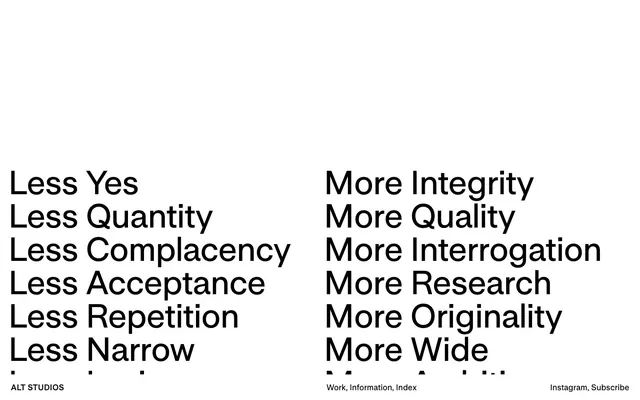
Monochromatic typographic statement
Color palette
Page backgrounds, large content surfaces
Dark borders and separators for elevated surfaces and inverted UI. Do not promote it to the primary CTA color
Typography
- Weights
- 600
- Sizes
- 18px
- Line height
- 1, 1.2
UniversalSans-750 — detected in extracted data but not described by AI
- Weights
- 600
- Sizes
- 18px, 43px, 75px
- Line height
- 1, 1.07, 1.2
- Letter spacing
- -0.0200em
- Fallback
- Helvetica Neue
All headings, main body text, navigation elements – its consistent bold weight creates a unified, assertive voice across the entire interface. The character spacing is tight, making even large headlines feel economical.
Spacing & shape
Components
Bold UniversalSans at 75px, Ink Black text, with tight letter-spacing to form compact, impactful titles. No additional styling, relying entirely on typography for visual weight.
Bold UniversalSans at 43px, Ink Black text, compressed letter-spacing. Used for key phrases that structure content without being full display text.
UniversalSans at 18px, Ink Black text. Default and hover states are indistinguishable except for the slight change to a 600 weight.
Guidelines
- Prioritize text as the primary visual element; use Ink Black (#000000) for all textual content against Canvas White (#ffffff) backgrounds.
- Employ UniversalSans-600 universally across all text roles to establish a consistent, assertive typographic voice.
- Maintain strict typographic hierarchy: 75px (line-height 1.2) for main display text, 43px (line-height 1.07) for significant headings, and 18px (line-height 1.0) for body and navigation.
- Apply a consistent letter-spacing of -0.0200em to all UniversalSans text to achieve a visually compressed and impactful appearance.
- Use 18px padding for content blocks to provide breathing room without compromising density, and 24px for distinct structural elements.
- Avoid using any colors other than Ink Black (#000000) and Canvas White (#ffffff); color is deliberately absent from the system.
- Do not introduce any border-radius values; all corners should remain sharp and angular.
- Refrain from using shadows or elevation effects; the design is intentionally flat and two-dimensional.
- Do not introduce decorative elements, background gradients, or UI chrome; the focus is solely on typography and content.
- Avoid breaking the high-contrast text-on-background pattern; all text must be Ink Black on Canvas White for maximum impact.
About this system
ShowHide
Alt Studios employs a stark, editorial aesthetic centered on high contrast and typographic hierarchy. The design is a minimal canvas of white punctuated by strong black text, prioritizing content with no distracting elements. Typography is compressed and commanding, acting as the primary visual language, creating a sense of directness and intellectual clarity.
This design system is imagery-minimal, almost text-only. The visual language relies entirely on typography and stark contrast rather than photography, illustration, or product shots. When imagery is absolutely necessary (not visible here), it should be treated in a way that minimizes its visual footprint and maintains the high-contrast, black-and-white aesthetic, likely as grayscale or monochrome treatments if included at all. The design is dominantly text-based, showcasing content as art.
Reminiscent of Kerning Cultures, Actual Source, Norm Architects.
# Alt Studios — Style Reference
> Monochromatic typographic statement

**Theme:** light

**Site:** https://alt-studios.com

Alt Studios employs a stark, editorial aesthetic centered on high contrast and typographic hierarchy. The design is a minimal canvas of white punctuated by strong black text, prioritizing content with no distracting elements. Typography is compressed and commanding, acting as the primary visual language, creating a sense of directness and intellectual clarity.

## Tokens — Colors

| Name | Value | Token | Role |
|------|------|------|------|
| Canvas White | `#ffffff` | `--color-canvas-white` | Page backgrounds, large content surfaces |
| Ink Black | `#000000` | `--color-ink-black` | Dark borders and separators for elevated surfaces and inverted UI. Do not promote it to the primary CTA color |

## Tokens — Typography

### UniversalSans-750
- **Weights:** 600
- **Sizes:** 18px
- **Line height:** 1, 1.2
- **Role:** UniversalSans-750 — detected in extracted data but not described by AI

### UniversalSans
- **Substitute:** Helvetica Neue
- **Weights:** 600
- **Sizes:** 18px, 43px, 75px
- **Line height:** 1, 1.07, 1.2
- **Letter spacing:** -0.0200em
- **Role:** All headings, main body text, navigation elements – its consistent bold weight creates a unified, assertive voice across the entire interface. The character spacing is tight, making even large headlines feel economical.

## Tokens — Type Scale

| Role | Size | Line height | Letter spacing |
|------|------|------|------|
| caption | 18px | 1 | -0.36px |
| heading | 43px | 1.07 | -0.86px |
| display | 75px | 1.2 | -1.5px |

## Tokens — Spacing

- **Section gap:** 75px
- **Card padding:** 18px
- **Element gap:** 24px

## Tokens — Radius

- **none:** 0px

## Imagery

This design system is imagery-minimal, almost text-only. The visual language relies entirely on typography and stark contrast rather than photography, illustration, or product shots. When imagery is absolutely necessary (not visible here), it should be treated in a way that minimizes its visual footprint and maintains the high-contrast, black-and-white aesthetic, likely as grayscale or monochrome treatments if included at all. The design is dominantly text-based, showcasing content as art.

## Components

### Primary Headline
*Primary content headings*

Bold UniversalSans at 75px, Ink Black text, with tight letter-spacing to form compact, impactful titles. No additional styling, relying entirely on typography for visual weight.

### Sub-Headline/Major Text Block
*Secondary content headings and visual divisions*

Bold UniversalSans at 43px, Ink Black text, compressed letter-spacing. Used for key phrases that structure content without being full display text.

### Navigation Link
*Interactive navigation items and descriptive labels.*

UniversalSans at 18px, Ink Black text. Default and hover states are indistinguishable except for the slight change to a 600 weight.

## Guidelines

### Do

- Prioritize text as the primary visual element; use Ink Black (#000000) for all textual content against Canvas White (#ffffff) backgrounds.
- Employ UniversalSans-600 universally across all text roles to establish a consistent, assertive typographic voice.
- Maintain strict typographic hierarchy: 75px (line-height 1.2) for main display text, 43px (line-height 1.07) for significant headings, and 18px (line-height 1.0) for body and navigation.
- Apply a consistent letter-spacing of -0.0200em to all UniversalSans text to achieve a visually compressed and impactful appearance.
- Use 18px padding for content blocks to provide breathing room without compromising density, and 24px for distinct structural elements.

### Don't

- Avoid using any colors other than Ink Black (#000000) and Canvas White (#ffffff); color is deliberately absent from the system.
- Do not introduce any border-radius values; all corners should remain sharp and angular.
- Refrain from using shadows or elevation effects; the design is intentionally flat and two-dimensional.
- Do not introduce decorative elements, background gradients, or UI chrome; the focus is solely on typography and content.
- Avoid breaking the high-contrast text-on-background pattern; all text must be Ink Black on Canvas White for maximum impact.

## Agent Prompt Guide

Quick Color Reference:
text: #000000
background: #ffffff
border: #000000
accent: no distinct accent color
primary action: no distinct CTA color

3-5 Example Component Prompts:
Create a primary display section: Canvas White background. Headline at 75px UniversalSans weight 600, Ink Black text, letter-spacing -1.5px. The main text is 'Less Yes'. Below it, a line of 18px UniversalSans weight 600, Ink Black text, letter-spacing -0.36px, saying 'ALT STUDIOS'.

Generate a navigation footer: Canvas White background. All text is 18px UniversalSans weight 600, Ink Black text, letter-spacing -0.36px. Create three text links: 'Work', 'Information', 'Index'. Spacing between links is 24px.

Design a secondary content block: Canvas White background. Main heading at 43px UniversalSans weight 600, Ink Black text, letter-spacing -0.86px. Sub-heading text on the next line also at 43px UniversalSans weight 600, Ink Black text, letter-spacing -0.86px. Both lines have an 18px top and bottom padding.
More like this










Keep what you find
A free account saves references to boards and can send you a weekly email of picks based on what you save.
To see every result, go Pro.