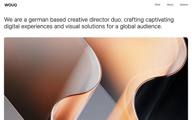
Preview image. Unlock full-res
monochromatic gallery, etched edges
Color palette
Dark borders and separators for elevated surfaces and inverted UI. Do not promote it to the primary CTA color
Hairline borders, dividers, input outlines, and card edges on light surfaces. Do not promote it to the primary CTA color
Typography
- Weights
- 400
- Sizes
- 18px, 22px
- Line height
- 1, 1.67
- Letter spacing
- normal
- Fallback
- Open Sans
Body text and general content, ensuring readability with its balanced forms. Despite its commonality, it is used here to create a neutral, unobtrusive tone.
- Weights
- 400
- Sizes
- 18px, 27px, 45px
- Line height
- 1, 1.11, 1.5
- Letter spacing
- normal
- Fallback
- Inter Light
Large headings, navigational elements, and certain interactive text. Its light weight at larger sizes creates an airy, sophisticated presence, avoiding visual heaviness.
- Weights
- 400
- Sizes
- 18px, 45px
- Line height
- 1.11, 1.5
- Letter spacing
- normal
- Fallback
- Inter
Standard headings and body text, providing a slightly more grounded feel than its Light counterpart while maintaining the distinct brand character.
Spacing & shape
Components
Text is Midnight Ink (#000000) using ESAllianz-Light at 18px. Underlines appear on hover/active states with a 1px Midnight Ink border. Padding of 25px around text content.
Midnight Ink (#000000) ESAllianz-Light, 45px, lineHeight 1.11. Uses ample top padding creating space.
White background, Midnight Ink (#000000) text (ESAllianz-Light 45px or ESAllianz-Regular 18px). Has a 10px border-radius and appears to have border color changes or subtle interaction effects.
Guidelines
- Use Canvas White (#ffffff) as the primary background color for all main sections and components.
- Employ Midnight Ink (#000000) for all primary text, headings, and interactive elements to maintain high contrast and clarity.
- Apply ESAllianz-Light at 45px with a 1.11 lineHeight for all major headlines to convey an airy, sophisticated tone.
- Implement a 10px border-radius consistently for all card-like elements and interactive components.
- Maintain generous vertical spacing between sections (75px) to support the spacious feel of the design.
- Avoid introducing additional chromatic colors; the palette is strictly monochrome.
- Do not use heavy shadows or gradients; flat surfaces and subtle borders define elevation.
- Never deviate from the specified Open Sans or ESAllianz font families for any UI text.
- Do not overcrowd content; utilize the 1460px max-width and generous padding (25-30px) to ensure ample whitespace.
- Avoid bold or ultra-heavy font weights; the design relies on lighter weights for its distinctive character.
About this system
ShowHide
WOUQ employs a minimalist light theme with high contrast typography and ample whitespace. The design emphasizes content through a stark juxtaposition of black text on white backgrounds, occasionally softened by subtle light gray interactive states. Custom typography lends a distinctive character, maintaining readability while providing visual interest, particularly in navigation and large text blocks. Components are border-defined and largely achromatic, allowing content and occasional imagery to provide color and visual depth.
The page adheres to a max-width of 1460px, centrally aligned. The hero section prominently features a large headline centered over a full-width abstract image. Subsequent sections arrange content in a grid-like fashion, showcasing projects with prominent image blocks and accompanying titles. There is a consistent vertical rhythm with significant spacing (75px) between sections, creating a spacious and unhurried browsing experience. Navigation is a minimal top bar, sticky or otherwise. Project links appear in a multi-column grid, often two or three columns wide, without visual dividers between projects.
This design utilizes a mix of abstract and product-focused photography and high-quality product renders. Imagery is typically contained within rectangular frames, sometimes with subtle rounded corners (10px). Photography leans towards high-key or product-focused shots, often with a clean, de-saturated aesthetic allowing product forms and textures to be the focal point. Icons are minimal, likely outlined, and monochromatic, used sparingly for navigation or functional cues. The density is moderate to high, with large images being central to project showcases.
Reminiscent of Awwwards-winning portfolio sites, Basic Agency, Koto.
# WOUQ — Style Reference
> monochromatic gallery, etched edges

**Theme:** light

**Site:** https://wearewouq.com

WOUQ employs a minimalist light theme with high contrast typography and ample whitespace. The design emphasizes content through a stark juxtaposition of black text on white backgrounds, occasionally softened by subtle light gray interactive states. Custom typography lends a distinctive character, maintaining readability while providing visual interest, particularly in navigation and large text blocks. Components are border-defined and largely achromatic, allowing content and occasional imagery to provide color and visual depth.

## Tokens — Colors

| Name | Value | Token | Role |
|------|------|------|------|
| Midnight Ink | `#000000` | `--color-midnight-ink` | Dark borders and separators for elevated surfaces and inverted UI. Do not promote it to the primary CTA color |
| Canvas White | `#ffffff` | `--color-canvas-white` | Hairline borders, dividers, input outlines, and card edges on light surfaces. Do not promote it to the primary CTA color |

## Tokens — Typography

### Open Sans
- **Substitute:** Open Sans
- **Weights:** 400
- **Sizes:** 18px, 22px
- **Line height:** 1, 1.67
- **Letter spacing:** normal
- **Role:** Body text and general content, ensuring readability with its balanced forms. Despite its commonality, it is used here to create a neutral, unobtrusive tone.

### ESAllianz-Light
- **Substitute:** Inter Light
- **Weights:** 400
- **Sizes:** 18px, 27px, 45px
- **Line height:** 1, 1.11, 1.5
- **Letter spacing:** normal
- **Role:** Large headings, navigational elements, and certain interactive text. Its light weight at larger sizes creates an airy, sophisticated presence, avoiding visual heaviness.

### ESAllianz-Regular
- **Substitute:** Inter
- **Weights:** 400
- **Sizes:** 18px, 45px
- **Line height:** 1.11, 1.5
- **Letter spacing:** normal
- **Role:** Standard headings and body text, providing a slightly more grounded feel than its Light counterpart while maintaining the distinct brand character.

## Tokens — Type Scale

Perfect Fourth (1.333) from 18px base.

| Role | Size | Line height | Letter spacing |
|------|------|------|------|
| body-sm | 18px | 1.67 | — |
| subheading | 22px | 1 | — |
| heading | 27px | 1 | — |
| display | 45px | 1.11 | — |

## Tokens — Spacing

- **Max width:** 1460px
- **Section gap:** 75px
- **Card padding:** 25-30px
- **Element gap:** 5px

## Tokens — Radius

- **Buttons:** 10px
- **Cards:** 10px
- **elements:** 10px

## Layout

The page adheres to a max-width of 1460px, centrally aligned. The hero section prominently features a large headline centered over a full-width abstract image. Subsequent sections arrange content in a grid-like fashion, showcasing projects with prominent image blocks and accompanying titles. There is a consistent vertical rhythm with significant spacing (75px) between sections, creating a spacious and unhurried browsing experience. Navigation is a minimal top bar, sticky or otherwise. Project links appear in a multi-column grid, often two or three columns wide, without visual dividers between projects.

## Imagery

This design utilizes a mix of abstract and product-focused photography and high-quality product renders. Imagery is typically contained within rectangular frames, sometimes with subtle rounded corners (10px). Photography leans towards high-key or product-focused shots, often with a clean, de-saturated aesthetic allowing product forms and textures to be the focal point. Icons are minimal, likely outlined, and monochromatic, used sparingly for navigation or functional cues. The density is moderate to high, with large images being central to project showcases.

## Components

### Navigation Link
*Interactive navigation items in the header*

Text is Midnight Ink (#000000) using ESAllianz-Light at 18px. Underlines appear on hover/active states with a 1px Midnight Ink border. Padding of 25px around text content.

### Hero Headline
*Primary heading for the initial screen*

Midnight Ink (#000000) ESAllianz-Light, 45px, lineHeight 1.11. Uses ample top padding creating space.

### Project Card
*Clickable cards displaying project previews*

White background, Midnight Ink (#000000) text (ESAllianz-Light 45px or ESAllianz-Regular 18px). Has a 10px border-radius and appears to have border color changes or subtle interaction effects.

## Guidelines

### Do

- Use Canvas White (#ffffff) as the primary background color for all main sections and components.
- Employ Midnight Ink (#000000) for all primary text, headings, and interactive elements to maintain high contrast and clarity.
- Apply ESAllianz-Light at 45px with a 1.11 lineHeight for all major headlines to convey an airy, sophisticated tone.
- Implement a 10px border-radius consistently for all card-like elements and interactive components.
- Maintain generous vertical spacing between sections (75px) to support the spacious feel of the design.

### Don't

- Avoid introducing additional chromatic colors; the palette is strictly monochrome.
- Do not use heavy shadows or gradients; flat surfaces and subtle borders define elevation.
- Never deviate from the specified Open Sans or ESAllianz font families for any UI text.
- Do not overcrowd content; utilize the 1460px max-width and generous padding (25-30px) to ensure ample whitespace.
- Avoid bold or ultra-heavy font weights; the design relies on lighter weights for its distinctive character.

## Agent Prompt Guide

Quick Color Reference:
text: #000000
background: #ffffff
border: #000000
accent: #000000
primary action: no distinct CTA color

Example Component Prompts:
1. Create a navigation item: ESAllianz-Light, 18px, #000000 text, 25px padding-x, 1px #000000 border on hover.
2. Create a hero text block: ESAllianz-Light, 45px, #000000 text, lineHeight 1.11.
3. Create a project preview card: Background #ffffff, border-radius 10px. Project title: ESAllianz-Regular, 18px, #000000. Display a smaller descriptive text using Open Sans, 18px, #000000.
More like this









Keep what you find
A free account saves references to boards and can send you a weekly email of picks based on what you save.
To see every result, go Pro.