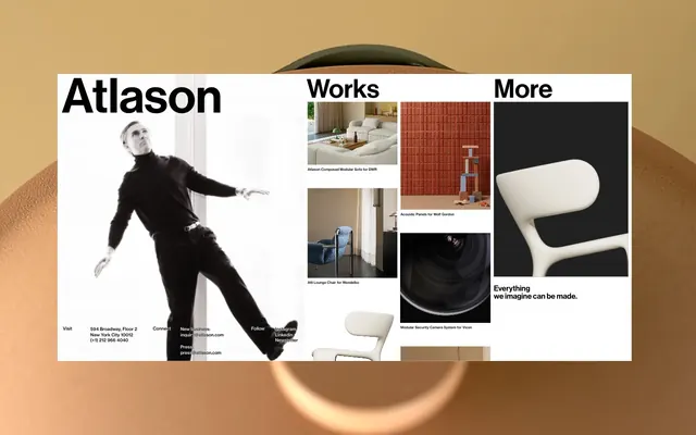
Preview image. Unlock full-res
Color palette
Page backgrounds, large content areas, primary light surface
Primary text, headings, prominent borders, secondary dark surface
Muted text, subtle borders, secondary information
Typography
- Weights
- 400, 500
- Sizes
- 16px, 18px, 36px
- Line height
- 0.9, 1, 1.2, 1.3
- Letter spacing
- normal
- Fallback
- Inter
Body text, navigation links, secondary headings. Its relatively normal letter-spacing ensures comfortable reading for longer passages while maintaining a modern feel.
- Weights
- 500
- Sizes
- 48px, 106px, 230px, 288px
- Line height
- 0.77, 0.8, 1, 1.2
- Letter spacing
- normal
- Fallback
- Inter Display
Large headings and display text. The compact line heights, especially at larger sizes, contribute to a tight, impactful visual block, reinforcing the deliberate design aesthetic.
Spacing & shape
Components
Text in Ink Black (#000000), Haas Grotesk TX Pro weight 500, size 36px, with no explicit padding, relying on surrounding elements for spacing. Interactive state indicated by a 1px Ink Black underline on hover.
Image area with a 1px Ink Black (#000000) border, surrounding text in Haas Grotesk TX Pro, 16px, weight 400. Text has 8px top padding and 10px right/left padding, background is Canvas White (#ffffff).
Body text in Haas Grotesk TX Pro, 16px, weight 400, Ink Black (#000000). Links are also Inlk Black, with a 1px Ink Black (#000000) bottom border for emphasis. Uses 8px vertical spacing between lines.
Text in Ash Gray (#b0b0b0), Haas Grotesk TX Pro, 16px. Links are Ink Black (#000000). Elements have 8px padding and 10px spacing.
Guidelines
- Use Canvas White (#ffffff) as the primary background for all page content to maintain a clean, expansive feel.
- Employ Ink Black (#000000) for all primary text, headings, and significant borders to achieve strong contrast and visual impact.
- Utilize Haas Grotesk DS Pro, weight 500, for all display-level headings (48px and above) with compact line heights to create impactful typographic blocks.
- Apply Haas Grotesk TX Pro, weight 400 or 500, for all body text, links, and secondary information, distinguishing its usage from display headings.
- Maintain a clear visual hierarchy by placing product visuals framed by generous Canvas White (#ffffff) space and minimal text overlays.
- Use 8px as the default `elementGap` for vertical spacing between related content elements and 48px for `sectionGap` between distinct content blocks.
- Border product thumbnail cards with a 1px solid Ink Black (#000000) line to create distinct content modules.
- Avoid introducing saturated colors outside of embedded imagery; the interface should remain monochrome.
- Do not use subtle variations of black or white for background or text where Ink Black or Canvas White provide sufficient contrast.
- Refrain from using any form of elevation (shadows) on UI elements; the design emphasizes flat surfaces.
- Do not use rounded corners on any UI components; all elements should maintain sharp, defined edges.
- Avoid dense, text-heavy blocks. Break up information with imagery and ample whitespace.
- Do not use generic system fonts; stick to `haas-grotesk-tx-pro` and `haas-grotesk-ds-pro` or their designated substitutes.
- Do not create highly interactive or animated elements; the motion profile is functional and subtle (ease, durations 0.3-0.5s).
About this system
ShowHide
Atlason's visual system evokes a gallery of curated industrial design, prioritizing form and function through stark contrasts and precise typography. The aesthetic is black and white, with expansive negative space framing product visuals. Typography is compact and commanding, set in a sans-serif that conveys a sense of modernity and clarity. The overall impression is one of sophisticated minimalism, where every element is intentional and serves to highlight the featured works.
The page primarily uses a max-width contained layout, though specific hero or section elements may appear full-bleed. The hero pattern features a dominant, often full-bleed or near full-bleed, striking image juxtaposed with large, impactful typography that directly states the brand name or key message. Subsequent sections alternate between large individual content blocks and grid-based layouts, such as 2-column or 3-column feature/product grids. Content arrangement often utilizes a clean, centered stack or side-by-side text and image pairing, with ample vertical spacing between sections. The navigation is minimal, likely a top bar, integrating seamlessly with the large display typography.
The site uses a mix of high-quality product photography and abstract graphic elements. Product photography is typically studio-shot, featuring tight crops, often on neutral or white backgrounds, emphasizing the object itself without external context. Visuals are contained within defined areas, often with Ink Black (#000000) borders, creating a gallery-like presentation. There is a strong interplay of large, impactful images and smaller, supporting visuals, suggesting a curated exhibition. Icons (if present) are minimal, likely outlined, and monochrome, blending seamlessly with the typographic style. The imagery serves to showcase the product design, acting as the primary content without decorative distraction.
Reminiscent of AIGA Design Archives, Kinfolk Magazine, Apple Design Resources, Dieter Rams Collection.
# Altason — Style Reference
> Black & White Gallery

**Theme:** light

**Site:** https://atlason.com

Atlason's visual system evokes a gallery of curated industrial design, prioritizing form and function through stark contrasts and precise typography. The aesthetic is black and white, with expansive negative space framing product visuals. Typography is compact and commanding, set in a sans-serif that conveys a sense of modernity and clarity. The overall impression is one of sophisticated minimalism, where every element is intentional and serves to highlight the featured works.

## Tokens — Colors

| Name | Value | Token | Role |
|------|------|------|------|
| Canvas White | `#ffffff` | `--color-canvas-white` | Page backgrounds, large content areas, primary light surface |
| Ink Black | `#000000` | `--color-ink-black` | Primary text, headings, prominent borders, secondary dark surface |
| Ash Gray | `#b0b0b0` | `--color-ash-gray` | Muted text, subtle borders, secondary information |

## Tokens — Typography

### haas-grotesk-tx-pro
- **Substitute:** Inter
- **Weights:** 400, 500
- **Sizes:** 16px, 18px, 36px
- **Line height:** 0.9, 1, 1.2, 1.3
- **Letter spacing:** normal
- **Role:** Body text, navigation links, secondary headings. Its relatively normal letter-spacing ensures comfortable reading for longer passages while maintaining a modern feel.

### haas-grotesk-ds-pro
- **Substitute:** Inter Display
- **Weights:** 500
- **Sizes:** 48px, 106px, 230px, 288px
- **Line height:** 0.77, 0.8, 1, 1.2
- **Letter spacing:** normal
- **Role:** Large headings and display text. The compact line heights, especially at larger sizes, contribute to a tight, impactful visual block, reinforcing the deliberate design aesthetic.

## Tokens — Type Scale

| Role | Size | Line height | Letter spacing |
|------|------|------|------|
| body-sm | 16px | 1.3 | — |
| body | 18px | 1.2 | — |
| heading-sm | 36px | 1 | — |
| heading | 48px | 0.8 | — |
| heading-lg | 106px | 0.77 | — |
| display | 288px | 0.77 | — |

## Tokens — Spacing

- **Section gap:** 48px
- **Card padding:** 20px
- **Element gap:** 8px

## Layout

The page primarily uses a max-width contained layout, though specific hero or section elements may appear full-bleed. The hero pattern features a dominant, often full-bleed or near full-bleed, striking image juxtaposed with large, impactful typography that directly states the brand name or key message. Subsequent sections alternate between large individual content blocks and grid-based layouts, such as 2-column or 3-column feature/product grids. Content arrangement often utilizes a clean, centered stack or side-by-side text and image pairing, with ample vertical spacing between sections. The navigation is minimal, likely a top bar, integrating seamlessly with the large display typography.

## Imagery

The site uses a mix of high-quality product photography and abstract graphic elements. Product photography is typically studio-shot, featuring tight crops, often on neutral or white backgrounds, emphasizing the object itself without external context. Visuals are contained within defined areas, often with Ink Black (#000000) borders, creating a gallery-like presentation. There is a strong interplay of large, impactful images and smaller, supporting visuals, suggesting a curated exhibition. Icons (if present) are minimal, likely outlined, and monochrome, blending seamlessly with the typographic style. The imagery serves to showcase the product design, acting as the primary content without decorative distraction.

## Components

### Navigation Link (Header)
*Primary navigation links in headers.*

Text in Ink Black (#000000), Haas Grotesk TX Pro weight 500, size 36px, with no explicit padding, relying on surrounding elements for spacing. Interactive state indicated by a 1px Ink Black underline on hover.

### Product Thumbnail Card
*Displays product images with titles.*

Image area with a 1px Ink Black (#000000) border, surrounding text in Haas Grotesk TX Pro, 16px, weight 400. Text has 8px top padding and 10px right/left padding, background is Canvas White (#ffffff).

### Contact Information Block
*Lists contact details and address.*

Body text in Haas Grotesk TX Pro, 16px, weight 400, Ink Black (#000000). Links are also Inlk Black, with a 1px Ink Black (#000000) bottom border for emphasis. Uses 8px vertical spacing between lines.

### Footer Section
*Contains navigation links and copyright information.*

Text in Ash Gray (#b0b0b0), Haas Grotesk TX Pro, 16px. Links are Ink Black (#000000). Elements have 8px padding and 10px spacing.

## Guidelines

### Do

- Use Canvas White (#ffffff) as the primary background for all page content to maintain a clean, expansive feel.
- Employ Ink Black (#000000) for all primary text, headings, and significant borders to achieve strong contrast and visual impact.
- Utilize Haas Grotesk DS Pro, weight 500, for all display-level headings (48px and above) with compact line heights to create impactful typographic blocks.
- Apply Haas Grotesk TX Pro, weight 400 or 500, for all body text, links, and secondary information, distinguishing its usage from display headings.
- Maintain a clear visual hierarchy by placing product visuals framed by generous Canvas White (#ffffff) space and minimal text overlays.
- Use 8px as the default `elementGap` for vertical spacing between related content elements and 48px for `sectionGap` between distinct content blocks.
- Border product thumbnail cards with a 1px solid Ink Black (#000000) line to create distinct content modules.

### Don't

- Avoid introducing saturated colors outside of embedded imagery; the interface should remain monochrome.
- Do not use subtle variations of black or white for background or text where Ink Black or Canvas White provide sufficient contrast.
- Refrain from using any form of elevation (shadows) on UI elements; the design emphasizes flat surfaces.
- Do not use rounded corners on any UI components; all elements should maintain sharp, defined edges.
- Avoid dense, text-heavy blocks. Break up information with imagery and ample whitespace.
- Do not use generic system fonts; stick to `haas-grotesk-tx-pro` and `haas-grotesk-ds-pro` or their designated substitutes.
- Do not create highly interactive or animated elements; the motion profile is functional and subtle (ease, durations 0.3-0.5s).

## Agent Prompt Guide

Quick Color Reference:
text: #000000
background: #ffffff
border: #000000
accent: none observed
primary action: no distinct CTA color

Example Component Prompts:
1. Create a Header: Use Ink Black (#000000) for the 'Atlason' brand name (haas-grotesk-ds-pro, 48px, weight 500, lineHeight 0.8em). Subsequent navigation links (e.g., 'Works', 'More') should be Ink Black (#000000), haas-grotesk-tx-pro, 36px, weight 500, with a 1px Ink Black bottom border on hover. The header should align to a conceptual maximum width, but its background is Canvas White (#ffffff).
2. Create a Product Thumbnail Card: Background Canvas White (#ffffff). Image area should have a 1px Ink Black (#000000) border. Below the image, include product title text: Ink Black (#000000), haas-grotesk-tx-pro, 16px, weight 400. Apply 8px top padding and 10px left/right padding to the text block.
3. Create a Contact Information Block: Set the heading for each section (e.g., 'Visit', 'Connect') in Ink Black (#000000), haas-grotesk-tx-pro, 16px, weight 500. Body text (address, phone, email) should use Ink Black (#000000), haas-grotesk-tx-pro, 16px, weight 400. Ensure 8px vertical spacing between lines within the block. Links (email, phone) should have an Ink Black (#000000) 1px bottom border.
More like this









Keep what you find
A free account saves references to boards and can send you a weekly email of picks based on what you save.
To see every result, go Pro.