Preview image. Unlock full-res
Gallery Canvas, Sculpted Forms
Color palette
Page backgrounds, card surfaces, button backgrounds — provides a pristine base for artistic content
Primary text, headings, icons, borders — creates strong contrast and asserts a bold presence
Subtle borders on ghost buttons and other UI elements — barely-there dividers for soft structure
Soft, diffused shadows beneath cards and buttons, providing subtle depth without harshness
Typography
- Weights
- 400
- Sizes
- 14px, 16px, 18px, 24px, 55px
- Line height
- 0.95, 1, 1.05, 1.1, 1.43
- Letter spacing
- -0.0400em at 14px, -0.0340em at 16px, -0.0300em at 18px, -0.0270em at 24px, -0.0200em at 55px
- Fallback
- system-ui (sans-serif)
Body copy, captions, supporting text, and subheadings — a neutral, workhorse sans-serif for clarity and structure.
- Weights
- 400
- Sizes
- 14px, 18px, 24px, 43px
- Line height
- 0.95, 1, 1.1, 1.43
- Letter spacing
- -0.0400em at 14px, -0.0340em at 18px, -0.0270em at 24px, -0.0200em at 43px
- Fallback
- Playfair Display (serif)
Captivating headlines and emphasized text — a distinctive serif that lends an artistic and elegant personality, often overlapping or scaled large.
Spacing & shape
Elevation
Components
Background: #ffffff, Text: #000000, Border: #e5e7eb, Radius: 9999px. Minimal padding is applied for a compact feel.
Background: #ffffff, Text: #000000, Border: #e5e7eb, Radius: 9999px. Padding is implicitly handled by content, suggesting it's more for text links with background hover effects or minimal frames.
Background: #ffffff, Text: #000000, Border: #e5e7eb, Radius: 50%. Used for subtle interactive points like menu toggles or 'show more' indicators.
Background: #ffffff, Radius: 120px. No explicit internal padding, relies on image/content for implied spacing. Features a very soft shadow: rgba(0, 0, 0, 0.25) 0px 0px 18px 0px.
Background: #ffffff, Radius: 300px. Large, rounded container used for primary visual elements, giving a playful, cloud-like impression. No inherent shadow.
Guidelines
- Prioritize Diatype for all body text and functional UI elements (14px, 16px, 18px).
- Use Romie exclusively for headlines and artistic displays to establish an editorial and creative tone (24px, 43px).
- Maintain a monochromatic base using Text Black (#000000) for text and Canvas White (#ffffff) for backgrounds.
- Apply Border Fog (#e5e7eb) for ghost button borders and subtle UI separations.
- Employ ultra-round radii (9999px) for all buttons and small interactive elements.
- Use the soft Shadow Ash layer (rgba(0, 0, 0, 0.25) 0px 0px 18px 0px) to give a subtle lift to primary cards and buttons.
- Ensure section vertical spacing is consistently 80px using the sectionGap token.
- Avoid introducing additional saturated colors; maintain the black, white, and gray palette.
- Do not apply hard, sharp corners; use rounded corners for almost all containers and interactive elements.
- Do not use heavy, opaque shadows; leverage the light, diffused Shadow Ash for depth.
- Do not use generic sans-serifs for headlines; Romie is reserved for distinctive typographic statements.
- Avoid tight element groupings; utilize comfortable spacing with an 8px elementGap and 40px cardPadding.
- Do not use color for primary action indicators, rely on visual weight from borders and text color.
- Never hardcode spacing values; use the established spacing tokens for consistent rhythm.
About this system
ShowHide
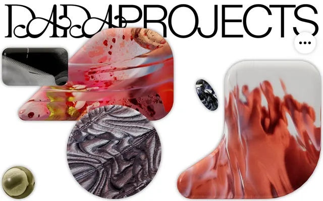
DADA PROJECTS embodies a sophisticated editorial aesthetic with a stark black-and-white foundation and a playful, organic touch through its imagery. Typography utilizes a mix of elegant display serifs and functional sans-serifs. Surfaces are predominantly white and soft, often taking on exaggerated rounded forms or fluid, abstract shapes. The overall impression is artistic and experimental, balancing classic refinement with contemporary digital art.
The page structure is full-bleed, allowing visual content to stretch across the viewport without a fixed max-width container, creating an immersive, gallery-like feel. The hero section often features oversized, overlapping typographic elements (Romie) that interact with the background imagery or serve as a dramatic overlay. Sections maintain consistent vertical spacing (80px), transitioning seamlessly rather than using distinct dividers. Content often appears as centered stacks, or large, unique visual compositions that imply a bespoke layout for each section rather than a strict grid.
This design system features abstract, often organic, and highly textural 3D renders combined with fluid graphic elements. Imagery is dense and artistic, frequently cropped into exaggerated rounded shapes (120px and 300px radii) or bleeding off-canvas. The photography present is high-key and product-focused, with a bright, almost ethereal treatment. Icons are minimal, possibly outlined, blending into the UI rather than standing out. Imagery's role is primarily decorative atmosphere and artistic showcase, often taking precedence over text information.
Reminiscent of AIGA Eye on Design, Certain graphic design portfolios, Off-White (fashion brand website).
# DADA PROJECTS — Style Reference
> Gallery Canvas, Sculpted Forms

**Theme:** light

**Site:** https://dada-projects.com

DADA PROJECTS embodies a sophisticated editorial aesthetic with a stark black-and-white foundation and a playful, organic touch through its imagery. Typography utilizes a mix of elegant display serifs and functional sans-serifs. Surfaces are predominantly white and soft, often taking on exaggerated rounded forms or fluid, abstract shapes. The overall impression is artistic and experimental, balancing classic refinement with contemporary digital art.

## Tokens — Colors

| Name | Value | Token | Role |
|------|------|------|------|
| Canvas White | `#ffffff` | `--color-canvas-white` | Page backgrounds, card surfaces, button backgrounds — provides a pristine base for artistic content |
| Text Black | `#000000` | `--color-text-black` | Primary text, headings, icons, borders — creates strong contrast and asserts a bold presence |
| Border Fog | `#e5e7eb` | `--color-border-fog` | Subtle borders on ghost buttons and other UI elements — barely-there dividers for soft structure |
| Shadow Ash | `#bfbfbf` | `--color-shadow-ash` | Soft, diffused shadows beneath cards and buttons, providing subtle depth without harshness |

## Tokens — Typography

### Diatype
- **Substitute:** system-ui (sans-serif)
- **Weights:** 400
- **Sizes:** 14px, 16px, 18px, 24px, 55px
- **Line height:** 0.95, 1, 1.05, 1.1, 1.43
- **Letter spacing:** -0.0400em at 14px, -0.0340em at 16px, -0.0300em at 18px, -0.0270em at 24px, -0.0200em at 55px
- **Role:** Body copy, captions, supporting text, and subheadings — a neutral, workhorse sans-serif for clarity and structure.

### Romie
- **Substitute:** Playfair Display (serif)
- **Weights:** 400
- **Sizes:** 14px, 18px, 24px, 43px
- **Line height:** 0.95, 1, 1.1, 1.43
- **Letter spacing:** -0.0400em at 14px, -0.0340em at 18px, -0.0270em at 24px, -0.0200em at 43px
- **Role:** Captivating headlines and emphasized text — a distinctive serif that lends an artistic and elegant personality, often overlapping or scaled large.

## Tokens — Type Scale

Perfect Fourth (1.333) from 16px base.

| Role | Size | Line height | Letter spacing |
|------|------|------|------|
| caption | 14px | 1.43 | -0.56px |
| body | 16px | 1.1 | -0.544px |
| subheading | 18px | 1.05 | -0.54px |
| heading | 24px | 1 | -0.648px |
| heading-lg | 43px | 0.95 | -0.86px |
| display | 55px | 0.95 | -1.1px |

## Tokens — Spacing

- **Section gap:** 80px
- **Card padding:** 40px
- **Element gap:** 8px

## Tokens — Radius

- **Buttons:** 9999px
- **cardsDefault:** 120px
- **cardsPromo:** 300px

## Tokens — Elevation

- **Project Card:** `rgba(0, 0, 0, 0.25) 0px 0px 18px 0px`

## Layout

The page structure is full-bleed, allowing visual content to stretch across the viewport without a fixed max-width container, creating an immersive, gallery-like feel. The hero section often features oversized, overlapping typographic elements (Romie) that interact with the background imagery or serve as a dramatic overlay. Sections maintain consistent vertical spacing (80px), transitioning seamlessly rather than using distinct dividers. Content often appears as centered stacks, or large, unique visual compositions that imply a bespoke layout for each section rather than a strict grid.

## Imagery

This design system features abstract, often organic, and highly textural 3D renders combined with fluid graphic elements. Imagery is dense and artistic, frequently cropped into exaggerated rounded shapes (120px and 300px radii) or bleeding off-canvas. The photography present is high-key and product-focused, with a bright, almost ethereal treatment. Icons are minimal, possibly outlined, blending into the UI rather than standing out. Imagery's role is primarily decorative atmosphere and artistic showcase, often taking precedence over text information.

## Components

### Filled button
*Standard interactive element for calls to action.*

Background: #ffffff, Text: #000000, Border: #e5e7eb, Radius: 9999px. Minimal padding is applied for a compact feel.

### Ghost button
*Secondary action or navigational link with minimal visual weight.*

Background: #ffffff, Text: #000000, Border: #e5e7eb, Radius: 9999px. Padding is implicitly handled by content, suggesting it's more for text links with background hover effects or minimal frames.

### Circular button
*Icon-only interaction or small, self-contained action.*

Background: #ffffff, Text: #000000, Border: #e5e7eb, Radius: 50%. Used for subtle interactive points like menu toggles or 'show more' indicators.

### Project Card
*Container for showcasing visual project assets.*

Background: #ffffff, Radius: 120px. No explicit internal padding, relies on image/content for implied spacing. Features a very soft shadow: rgba(0, 0, 0, 0.25) 0px 0px 18px 0px.

### Hero Project Card
*Prominent display for key project visuals, featuring an extreme radius.*

Background: #ffffff, Radius: 300px. Large, rounded container used for primary visual elements, giving a playful, cloud-like impression. No inherent shadow.

## Guidelines

### Do

- Prioritize Diatype for all body text and functional UI elements (14px, 16px, 18px).
- Use Romie exclusively for headlines and artistic displays to establish an editorial and creative tone (24px, 43px).
- Maintain a monochromatic base using Text Black (#000000) for text and Canvas White (#ffffff) for backgrounds.
- Apply Border Fog (#e5e7eb) for ghost button borders and subtle UI separations.
- Employ ultra-round radii (9999px) for all buttons and small interactive elements.
- Use the soft Shadow Ash layer (rgba(0, 0, 0, 0.25) 0px 0px 18px 0px) to give a subtle lift to primary cards and buttons.
- Ensure section vertical spacing is consistently 80px using the sectionGap token.

### Don't

- Avoid introducing additional saturated colors; maintain the black, white, and gray palette.
- Do not apply hard, sharp corners; use rounded corners for almost all containers and interactive elements.
- Do not use heavy, opaque shadows; leverage the light, diffused Shadow Ash for depth.
- Do not use generic sans-serifs for headlines; Romie is reserved for distinctive typographic statements.
- Avoid tight element groupings; utilize comfortable spacing with an 8px elementGap and 40px cardPadding.
- Do not use color for primary action indicators, rely on visual weight from borders and text color.
- Never hardcode spacing values; use the established spacing tokens for consistent rhythm.

## Agent Prompt Guide

### Quick Color Reference
- text: #000000
- background: #ffffff
- border: #e5e7eb
- accent: no distinct accent color
- primary action: no distinct CTA color

### 3-5 Example Component Prompts
- Create a text section with a headline using Romie 43px weight 400, #000000, line-height 0.95, letter-spacing -0.86px. Follow with body text using Diatype 18px weight 400, #000000, line-height 1.05, letter-spacing -0.54px. Ensure 80px vertical spacing to the next section.
- Design a project card: background #ffffff, border-radius 120px, with a soft shadow rgba(0, 0, 0, 0.25) 0px 0px 18px 0px. Internal content should have 40px padding.
- Build a ghost button: text 'Show more' in Diatype 16px weight 400, #000000, with a 1px border in #e5e7eb, and a border-radius of 9999px. Minimal padding.
- Create a hero Project Card: background #ffffff, border-radius 300px. This should be a large visual container, and should use 40px internal padding.
More like this









Keep what you find
A free account saves references to boards and can send you a weekly email of picks based on what you save.
To see every result, go Pro.