Preview image. Unlock full-res
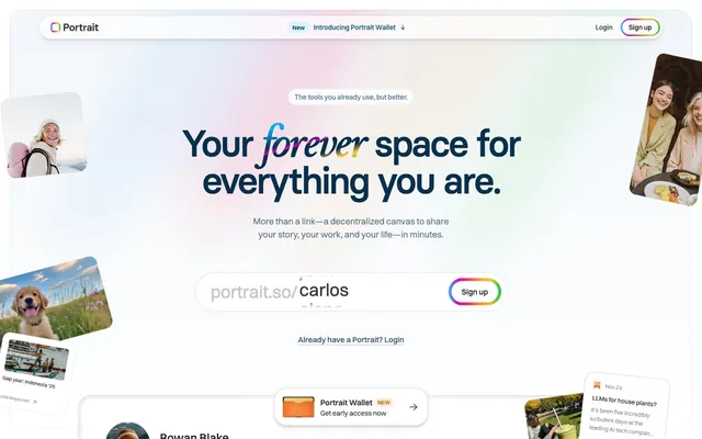
Generative digital canvas
Color palette
Prominent heading text, functional iconography, active states, and borders for ghost buttons – a deep, authoritative brand accent
Blue outline accent for tags, dividers, and focused UI edges. Do not promote it to the primary CTA color
Supporting palette color for small decorative accents when the core palette needs contrast. Do not promote it to the primary CTA color
Green outline accent for tags, dividers, and focused UI edges. Use as a supporting accent, not as a status color
Violet outline accent for tags, dividers, and focused UI edges. Do not promote it to the primary CTA color
Page backgrounds, elevated surfaces, primary card backgrounds, interactive element fills
Dark borders and separators for elevated surfaces and inverted UI. Do not promote it to the primary CTA color
Deepest text or icon fills, subtle shadow effects – reserved for maximum contrast or depth
Subtle borders, secondary card backgrounds, separator lines – creating division without harshness
Muted secondary text, ghost button borders, subtle icon strokes – for hierarchy and de-emphasis
Soft accent background for prominent cards or sections, adding a hint of color to large surfaces
Typography
- Weights
- 400, 500, 540, 600, 700
- Sizes
- 10px, 11px, 12px, 14px, 16px, 18px, 20px, 24px, 36px
- Line height
- 1, 1.11, 1.38, 1.43, 1.45, 1.5
- Letter spacing
- 0.025em for small text, 0.14em for decorative caps
- Fallback
- system-ui, sans-serif
Primary UI text for body, captions, navigation, and detailed information. Its default weight of 400 offers clear readability, while varied line heights are used to fine-tune density across different content blocks.
- Weights
- 500, 600
- Sizes
- 16px, 18px, 20px, 31px, 39px, 44px, 49px, 76px
- Line height
- 1, 1.04, 1.08, 1.1, 1.2, 1.5
- Letter spacing
- -0.056em at 76px, -0.050em at 49px, -0.013em at 16px
- Fallback
- system-ui, sans-serif
Used for headlines and prominent calls to action. Its distinct, tightly tracked letter spacing creates a strong, compact visual presence, especially at larger sizes, preventing headlines from feeling sparse.
Spacing & shape
Elevation
Components
Text-only button with transparent background, Ink Black text, and a 28px border-radius. Primarily used for less emphasized actions or navigation items. Example: 'Login'.
Button with a 28px border-radius, Ink Black text, a 1px Ink Black border, and a transparent background. Indicates a primary action without the visual dominance of a filled button. Example: 'Sign up'.
Text input field with a 28px border-radius and a dynamic 'Rainbow Glow' linear-gradient border on hover/focus. Uses Ink Black text and a Canvas White background.
White card with 24px border-radius and 16px internal padding. Uses no border and a subtle layer of multi-directional shadow for elevation. Contains various content such as images, text, or interactive elements.
Card leveraging Pale Blue Mist background, a 26px border-radius, and 6px internal padding. Features a soft, deep shadow stack that provides significant elevation off the primary surface.
Decorative card with a 24px border-radius, 10px internal padding, and a Canvas White background. Often contains an image with complementary corner radius.
Small tag with a 28px border-radius, Pale Blue Mist background, and Sky Blue text. Used for 'New' or similar status labels, typically within navigation or banners. 6px padding.
Guidelines
- Prioritize Canvas White (#ffffff) for all main backgrounds and elevated surfaces, ensuring a bright, expansive feel.
- Use Ink Black (#353535) for primary headings and body text, maintaining high contrast for readability.
- Apply a 24px border-radius to all major content cards and images to ensure a consistent soft, rounded aesthetic.
- Incorporate the 'Rainbow Glow' gradient on interactive elements or borders to introduce branded playfulness and visual pop.
- Use Basier Circle for headlines with precise, tight letter-spacing (-0.056em at 76px) to create a compact, confident visual presence.
- Apply layered, subtle shadow stacks to cards and navigation elements for depth, avoiding stark or heavy elevation.
- Maintain a clear visual hierarchy by using Ocean Blue (#08304c) for critical functional icons and active states, drawing attention without being overtly strong.
- Avoid using hard, sharp corners; always apply border-radii of 8px or higher to all UI elements.
- Do not introduce strong, solid background colors that conflict with the Canvas White theme, except for accent components.
- Avoid overly dense text blocks; use Switzer with generous line heights and element gaps to ensure comfortable readability.
- Do not use generic system shadows; leverage the multi-directional, low-opacity shadow stacks for consistent brand elevation.
- Refrain from using saturated colors for large paragraph text or backgrounds where they might compete with the vibrant accent colors.
- Do not use letter-spacing values less than -0.013em for body text; tight tracking is reserved for display typography only.
- Avoid placing text directly on top of the 'Rainbow Glow' gradient; reserve the gradient for borders or decorative fills.
About this system
ShowHide
Portrait evokes a generative canvas feel with a bright, spacious theme featuring softly textured cards and borders. A vibrant, multi-hued color spectrum appears as a playful accent, punctuating an otherwise clean, achromatic UI. Typography is confident and dense, using precise tracking to maintain presence. Elements avoid hard edges, preferring generous radii and subtle, layered shadows that lend depth without heaviness.
The page primarily uses a max-width contained layout, centered at around 1200px. The hero section is full-bleed with a luminous, gradient background and centered headline. Content sections follow a rhythm of spacious vertical separation (48px section gap). Content is arranged in alternating text-left/image-right patterns and multi-column card grids, emphasizing visual balance and comfortable readability. Navigation is a sticky top bar with minimal elements.
Imagery on Portrait is primarily photographic, featuring warm, high-key lifestyle shots often presented within contained, rounded-corner cards. Product screenshots are clean and direct, focused on displaying the UI without additional context. Decorative illustrations are used minimally, often as small, colorful accents to complement the vibrant gradients. Icons are generally outlined, matching the lightness of the UI, with strokes in Ocean Blue or Ink Black.
Reminiscent of Framer, Linear, Superhuman.
# Portrait — Style Reference
> Generative digital canvas

**Theme:** light

**Site:** https://portrait.so

Portrait evokes a generative canvas feel with a bright, spacious theme featuring softly textured cards and borders. A vibrant, multi-hued color spectrum appears as a playful accent, punctuating an otherwise clean, achromatic UI. Typography is confident and dense, using precise tracking to maintain presence. Elements avoid hard edges, preferring generous radii and subtle, layered shadows that lend depth without heaviness.

## Tokens — Colors

| Name | Value | Token | Role |
|------|------|------|------|
| Ocean Blue | `#08304c` | `--color-ocean-blue` | Prominent heading text, functional iconography, active states, and borders for ghost buttons – a deep, authoritative brand accent |
| Sky Blue | `#084e72` | `--color-sky-blue` | Blue outline accent for tags, dividers, and focused UI edges. Do not promote it to the primary CTA color |
| Rainbow Glow | `#26c0ff` | `--color-rainbow-glow` | Supporting palette color for small decorative accents when the core palette needs contrast. Do not promote it to the primary CTA color |
| Success Green | `#00cc3d` | `--color-success-green` | Green outline accent for tags, dividers, and focused UI edges. Use as a supporting accent, not as a status color |
| Interactive Violet | `#8e51ff` | `--color-interactive-violet` | Violet outline accent for tags, dividers, and focused UI edges. Do not promote it to the primary CTA color |
| Canvas White | `#ffffff` | `--color-canvas-white` | Page backgrounds, elevated surfaces, primary card backgrounds, interactive element fills |
| Ink Black | `#353535` | `--color-ink-black` | Dark borders and separators for elevated surfaces and inverted UI. Do not promote it to the primary CTA color |
| Charcoal | `#000000` | `--color-charcoal` | Deepest text or icon fills, subtle shadow effects – reserved for maximum contrast or depth |
| Cloud Gray | `#eeeeee` | `--color-cloud-gray` | Subtle borders, secondary card backgrounds, separator lines – creating division without harshness |
| Stone Gray | `#797979` | `--color-stone-gray` | Muted secondary text, ghost button borders, subtle icon strokes – for hierarchy and de-emphasis |
| Pale Blue Mist | `#e8f1ff` | `--color-pale-blue-mist` | Soft accent background for prominent cards or sections, adding a hint of color to large surfaces |

## Tokens — Typography

### Switzer
- **Substitute:** system-ui, sans-serif
- **Weights:** 400, 500, 540, 600, 700
- **Sizes:** 10px, 11px, 12px, 14px, 16px, 18px, 20px, 24px, 36px
- **Line height:** 1, 1.11, 1.38, 1.43, 1.45, 1.5
- **Letter spacing:** 0.025em for small text, 0.14em for decorative caps
- **Role:** Primary UI text for body, captions, navigation, and detailed information. Its default weight of 400 offers clear readability, while varied line heights are used to fine-tune density across different content blocks.

### Basier Circle
- **Substitute:** system-ui, sans-serif
- **Weights:** 500, 600
- **Sizes:** 16px, 18px, 20px, 31px, 39px, 44px, 49px, 76px
- **Line height:** 1, 1.04, 1.08, 1.1, 1.2, 1.5
- **Letter spacing:** -0.056em at 76px, -0.050em at 49px, -0.013em at 16px
- **Role:** Used for headlines and prominent calls to action. Its distinct, tightly tracked letter spacing creates a strong, compact visual presence, especially at larger sizes, preventing headlines from feeling sparse.

## Tokens — Type Scale

Augmented Fourth (1.414) from 14px base.

| Role | Size | Line height | Letter spacing |
|------|------|------|------|
| caption | 10px | 1.45 | — |
| body | 14px | 1.43 | — |
| subheading | 18px | 1.45 | -0.23px |
| heading-sm | 24px | 1.38 | — |
| heading | 39px | 1.08 | -1.25px |
| heading-lg | 49px | 1.08 | -1.48px |
| display | 76px | 1.04 | -4.26px |

## Tokens — Spacing

- **Max width:** 1200px
- **Section gap:** 48px
- **Card padding:** 16px
- **Element gap:** 16px

## Tokens — Radius

- **Buttons:** 28px
- **Cards:** 24px
- **containers:** 16px
- **formInputs:** 8px
- **imageContainers:** 24px
- **microElements:** 12px

## Tokens — Elevation

- **Card:** `rgba(0, 0, 0, 0.03) 0px 16px 16px -8px, rgba(0, 0, 0, 0.03) 0px 10px 10px -5px, rgba(0, 0, 0, 0.03) 0px 5px 5px -2.5px, rgba(0, 0, 0, 0.03) 0px 3px 3px -1.5px, rgba(0, 0, 0, 0.03) 0px 2px 2px -1px, rgba(0, 0, 0, 0.03) 0px 1px 1px -0.5px`
- **Hovered Card / Active Navigation:** `oklab(0 0 0 / 0.08) 0px 0px 0px 1px, rgba(0, 0, 0, 0.03) 0px 16px 16px -8px, rgba(0, 0, 0, 0.03) 0px 10px 10px -5px, rgba(0, 0, 0, 0.03) 0px 5px 5px -2.5px, rgba(0, 0, 0, 0.03) 0px 3px 3px -1.5px, rgba(0, 0, 0, 0.03) 0px 2px 2px -1px, rgba(0, 0, 0, 0.03) 0px 1px 1px -0.5px`
- **Tooltip / Layered Element:** `oklab(0 0 0 / 0.06) 0px 0px 0px 1px, rgba(0, 0, 0, 0.07) 0px 20px 20px -10px, rgba(0, 0, 0, 0.04) 0px 10px 10px -5px, rgba(0, 0, 0, 0.03) 0px 5px 5px -2.5px, rgba(0, 0, 0, 0.03) 0px 3px 3px -1.5px, rgba(0, 0, 0, 0.03) 0px 2px 2px -1px, rgba(0, 0, 0, 0.03) 0px 1px 1px -0.5px`

## Layout

The page primarily uses a max-width contained layout, centered at around 1200px. The hero section is full-bleed with a luminous, gradient background and centered headline. Content sections follow a rhythm of spacious vertical separation (48px section gap). Content is arranged in alternating text-left/image-right patterns and multi-column card grids, emphasizing visual balance and comfortable readability. Navigation is a sticky top bar with minimal elements.

## Imagery

Imagery on Portrait is primarily photographic, featuring warm, high-key lifestyle shots often presented within contained, rounded-corner cards. Product screenshots are clean and direct, focused on displaying the UI without additional context. Decorative illustrations are used minimally, often as small, colorful accents to complement the vibrant gradients. Icons are generally outlined, matching the lightness of the UI, with strokes in Ocean Blue or Ink Black.

## Components

### Ghost Button
*Secondary action control*

Text-only button with transparent background, Ink Black text, and a 28px border-radius. Primarily used for less emphasized actions or navigation items. Example: 'Login'.

### Outlined Button
*Primary action button*

Button with a 28px border-radius, Ink Black text, a 1px Ink Black border, and a transparent background. Indicates a primary action without the visual dominance of a filled button. Example: 'Sign up'.

### Rainbow Input Field
*Interactive text input*

Text input field with a 28px border-radius and a dynamic 'Rainbow Glow' linear-gradient border on hover/focus. Uses Ink Black text and a Canvas White background.

### Basic Card
*Content container*

White card with 24px border-radius and 16px internal padding. Uses no border and a subtle layer of multi-directional shadow for elevation. Contains various content such as images, text, or interactive elements.

### Elevated Tooltip Card
*Informational overlay*

Card leveraging Pale Blue Mist background, a 26px border-radius, and 6px internal padding. Features a soft, deep shadow stack that provides significant elevation off the primary surface.

### Image Gallery Item
*Visual content display*

Decorative card with a 24px border-radius, 10px internal padding, and a Canvas White background. Often contains an image with complementary corner radius.

### Notification Tag
*Ephemeral status indicator*

Small tag with a 28px border-radius, Pale Blue Mist background, and Sky Blue text. Used for 'New' or similar status labels, typically within navigation or banners. 6px padding.

## Guidelines

### Do

- Prioritize Canvas White (#ffffff) for all main backgrounds and elevated surfaces, ensuring a bright, expansive feel.
- Use Ink Black (#353535) for primary headings and body text, maintaining high contrast for readability.
- Apply a 24px border-radius to all major content cards and images to ensure a consistent soft, rounded aesthetic.
- Incorporate the 'Rainbow Glow' gradient on interactive elements or borders to introduce branded playfulness and visual pop.
- Use Basier Circle for headlines with precise, tight letter-spacing (-0.056em at 76px) to create a compact, confident visual presence.
- Apply layered, subtle shadow stacks to cards and navigation elements for depth, avoiding stark or heavy elevation.
- Maintain a clear visual hierarchy by using Ocean Blue (#08304c) for critical functional icons and active states, drawing attention without being overtly strong.

### Don't

- Avoid using hard, sharp corners; always apply border-radii of 8px or higher to all UI elements.
- Do not introduce strong, solid background colors that conflict with the Canvas White theme, except for accent components.
- Avoid overly dense text blocks; use Switzer with generous line heights and element gaps to ensure comfortable readability.
- Do not use generic system shadows; leverage the multi-directional, low-opacity shadow stacks for consistent brand elevation.
- Refrain from using saturated colors for large paragraph text or backgrounds where they might compete with the vibrant accent colors.
- Do not use letter-spacing values less than -0.013em for body text; tight tracking is reserved for display typography only.
- Avoid placing text directly on top of the 'Rainbow Glow' gradient; reserve the gradient for borders or decorative fills.

## Agent Prompt Guide

Quick Color Reference:
text: #353535
background: #ffffff
border: #eeeeee
accent: #08304c
primary action: #08304c (outlined action border)

Example Component Prompts:
1. Create an Outlined Primary Action: Transparent background, #08304c border and text, 9999px radius, compact pill padding. Use it for the main CTA instead of a filled button.
2. Design a Feature Card: A Basic Card (#ffffff background, 24px radius, layered shadows) containing an image with a 24px radius, 10px padding, and 'Featured Story' as the headline (Basier Circle, weight 500, size 24px, color #353535). Add a 'Read More' link (Switzer, weight 400, size 14px, color #08304c).
3. Create an Outlined 'Sign Up' Button: Use an Outlined Button component with Ink Black text (#353535) and a 1px solid Ink Black border. It should have a 28px border-radius and 12px horizontal padding. Include the text 'Sign up'.
4. Develop a Notification Tag: A small tag using Pale Blue Mist (#e8f1ff) background, 28px border-radius, and text 'New' in Sky Blue (#084e72). Apply 6px padding symmetrically.
More like this








Keep what you find
A free account saves references to boards and can send you a weekly email of picks based on what you save.
To see every result, go Pro.