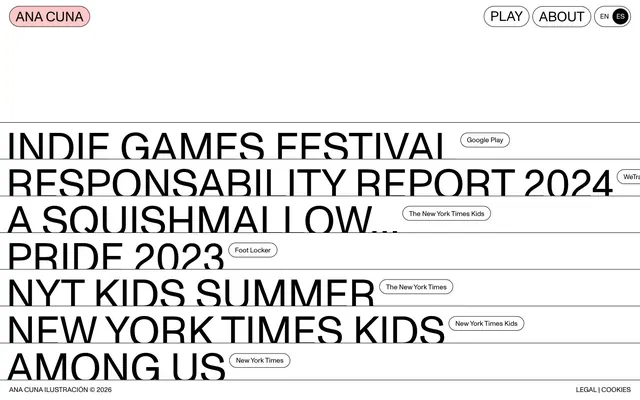
Preview image. Unlock full-res
Color palette
Red action color for filled buttons, selected navigation states, and focused conversion moments.
Page backgrounds, default surface color, text backgrounds for contrast within lists
Primary text, borders for all interactive and structural elements, decorative rules for content separation, icon outlines
Typography
- Weights
- 400
- Sizes
- 15px, 31px, 94px
- Line height
- 1, 1.11
- Letter spacing
- normal
- Fallback
- Space Grotesk, Montserrat, Inter
The sole typeface on the site. Its consistent weight and geometric structure convey directness. Used for all headings, body text, links, and buttons, maintaining a unified visual voice across all content levels. The varied sizes provide hierarchy without relying on weight changes.
Spacing & shape
Components
Ghost button with an Ink Black stroke and default Canvas White background. 27.4285px border radius, 7.71px vertical padding, 13.71px horizontal padding.
A filled button with a Flamingo Pink background, Ink Black text, and 27.4285px border radius. 7.71px vertical padding, 13.71px horizontal padding.
A 1px solid Ink Black border, providing horizontal separation between large text blocks or interactive list items.
A full-width Ink Black bottom border. The main text is 94px ABCMonumentGrotesk-Regular, followed by a smaller, ghost-style tag (15px ABCMonumentGrotesk-Regular, Ink Black text, Canvas White background, 27.4285px radius, with 7.71px vertical and 13.71px horizontal padding) offset to the right.
Guidelines
- Always use ABCMonumentGrotesk-Regular for all text elements.
- Apply Ink Black (#000000) for all text color and border strokes.
- Ensure backgrounds are Canvas White (#ffffff) unless explicitly a Flamingo Pink (#ffc8c8) brand tag.
- Use 27.4285px border radius for all interactive elements like buttons and tags.
- Separate major content sections using a 1px solid Ink Black (#000000) horizontal rule.
- Maintain a minimum of 7px elementGap for horizontal spacing between inline elements.
- Pad interactive tags and buttons with 7.71px vertical and 13.71px horizontal padding.
- Do not introduce additional color beyond Canvas White, Ink Black, and Flamingo Pink.
- Avoid using drop shadows or complex elevation; maintain a flat, border-driven aesthetic.
- Do not vary font weights; all text should be ABCMonumentGrotesk-Regular at weight 400.
- Refrain from using color to indicate primary or secondary actions; instead, use composition and border styles.
- Do not use internal padding within content blocks; rely on the universal horizontal rule for separation.
- Avoid introducing additional fonts or typographic styles; maintain the single, consistent typeface.
- Do not deviate from the specified border radius; its unusual value is a core brand identifier.
About this system
ShowHide
Anacuna embodies a striking 'digital Brutalism' aesthetic: stark contrast of black text on a generous white canvas, punctuated by ultra-minimalist interaction elements. Typography is primary, dominating the visual field with large, bold characters and precise tracking. Subtle borders and a single playful accent color soften the edges of this otherwise stark, information-dense interface, creating an experience that is both direct and distinctively artistic.
The page uses a full-bleed layout without a max-width container, allowing the main content to span the entire viewport. The hero consists of simple header navigation with a brand tag. The primary content area features large, stacked headlines, each acting as a link, separated by thin horizontal Ink Black rules. Most content is left-aligned, creating a dynamic, newspaper-like column. Navigation is a minimal top-right bar with ghost buttons, consistent across sections.
The site uses no traditional imagery beyond text-based logos or tiny decorative icons within specific link contexts. Visuals are entirely driven by typography, layout, and the stark black-and-white contrast. When small graphics are present (e.g., brand logos within tags), they are monochrome and treated as inline text elements.
Reminiscent of Brutalism.js, Are.na, Studio Dumbar, The Practical Brutalism (design trend).
# Anacuna — Style Reference
> Type-first stark canvas

**Theme:** light

**Site:** https://anacuna.com

Anacuna embodies a striking 'digital Brutalism' aesthetic: stark contrast of black text on a generous white canvas, punctuated by ultra-minimalist interaction elements. Typography is primary, dominating the visual field with large, bold characters and precise tracking. Subtle borders and a single playful accent color soften the edges of this otherwise stark, information-dense interface, creating an experience that is both direct and distinctively artistic.

## Tokens — Colors

| Name | Value | Token | Role |
|------|------|------|------|
| Flamingo Pink | `#ffc8c8` | `--color-flamingo-pink` | Red action color for filled buttons, selected navigation states, and focused conversion moments. |
| Canvas White | `#ffffff` | `--color-canvas-white` | Page backgrounds, default surface color, text backgrounds for contrast within lists |
| Ink Black | `#000000` | `--color-ink-black` | Primary text, borders for all interactive and structural elements, decorative rules for content separation, icon outlines |

## Tokens — Typography

### ABCMonumentGrotesk-Regular
- **Substitute:** Space Grotesk, Montserrat, Inter
- **Weights:** 400
- **Sizes:** 15px, 31px, 94px
- **Line height:** 1, 1.11
- **Letter spacing:** normal
- **Role:** The sole typeface on the site. Its consistent weight and geometric structure convey directness. Used for all headings, body text, links, and buttons, maintaining a unified visual voice across all content levels. The varied sizes provide hierarchy without relying on weight changes.

## Tokens — Type Scale

| Role | Size | Line height | Letter spacing |
|------|------|------|------|
| caption | 15px | 1.11 | — |
| body | 31px | 1.11 | — |
| display | 94px | 1 | — |

## Tokens — Spacing

- **Card padding:** 14px
- **Element gap:** 7px

## Tokens — Radius

- **Buttons:** 27.4285px
- **tags:** 27.4285px

## Layout

The page uses a full-bleed layout without a max-width container, allowing the main content to span the entire viewport. The hero consists of simple header navigation with a brand tag. The primary content area features large, stacked headlines, each acting as a link, separated by thin horizontal Ink Black rules. Most content is left-aligned, creating a dynamic, newspaper-like column. Navigation is a minimal top-right bar with ghost buttons, consistent across sections.

## Imagery

The site uses no traditional imagery beyond text-based logos or tiny decorative icons within specific link contexts. Visuals are entirely driven by typography, layout, and the stark black-and-white contrast. When small graphics are present (e.g., brand logos within tags), they are monochrome and treated as inline text elements.

## Components

### Navigation Button
*Secondary navigation and utility buttons*

Ghost button with an Ink Black stroke and default Canvas White background. 27.4285px border radius, 7.71px vertical padding, 13.71px horizontal padding.

### Brand Tag
*Primary brand identifier button in the header*

A filled button with a Flamingo Pink background, Ink Black text, and 27.4285px border radius. 7.71px vertical padding, 13.71px horizontal padding.

### Section Separator
*Visual division between list items and main content sections*

A 1px solid Ink Black border, providing horizontal separation between large text blocks or interactive list items.

### Headline Link with Tag
*Main content items combining a large headline with an associated descriptive tag*

A full-width Ink Black bottom border. The main text is 94px ABCMonumentGrotesk-Regular, followed by a smaller, ghost-style tag (15px ABCMonumentGrotesk-Regular, Ink Black text, Canvas White background, 27.4285px radius, with 7.71px vertical and 13.71px horizontal padding) offset to the right.

## Guidelines

### Do

- Always use ABCMonumentGrotesk-Regular for all text elements.
- Apply Ink Black (#000000) for all text color and border strokes.
- Ensure backgrounds are Canvas White (#ffffff) unless explicitly a Flamingo Pink (#ffc8c8) brand tag.
- Use 27.4285px border radius for all interactive elements like buttons and tags.
- Separate major content sections using a 1px solid Ink Black (#000000) horizontal rule.
- Maintain a minimum of 7px elementGap for horizontal spacing between inline elements.
- Pad interactive tags and buttons with 7.71px vertical and 13.71px horizontal padding.

### Don't

- Do not introduce additional color beyond Canvas White, Ink Black, and Flamingo Pink.
- Avoid using drop shadows or complex elevation; maintain a flat, border-driven aesthetic.
- Do not vary font weights; all text should be ABCMonumentGrotesk-Regular at weight 400.
- Refrain from using color to indicate primary or secondary actions; instead, use composition and border styles.
- Do not use internal padding within content blocks; rely on the universal horizontal rule for separation.
- Avoid introducing additional fonts or typographic styles; maintain the single, consistent typeface.
- Do not deviate from the specified border radius; its unusual value is a core brand identifier.

## Agent Prompt Guide

Quick Color Reference:
text: #000000
background: #ffffff
border: #000000
accent: #ffc8c8
primary action: #ffc8c8 (filled action)

Example Component Prompts:
1. Create a top navigation bar: Canvas White background. 'Ana Cuna' Brand Tag (Flamingo Pink background, Ink Black text, 27.4285px radius, 7.71px vertical padding, 13.71px horizontal padding). 'Play' and 'About' Navigation Buttons (Ink Black 1px border, Canvas White background, 27.4285px radius, 7.71px vertical padding, 13.71px horizontal padding). All text 15px ABCMonumentGrotesk-Regular.
2. Create a main content link section: Full width. Display text 'INDIE GAMES FESTIVAL' (94px ABCMonumentGrotesk-Regular, Ink Black, 1.0 lineHeight). Below it, a 1px Ink Black horizontal separator line. Followed by a 'Google Play' Tag (Ink Black 1px border, Canvas White background, 27.4285px radius, 7.71px vertical padding, 13.71px horizontal padding), 7px to the right of the main text.
3. Create a footer: Ink Black text (15px ABCMonumentGrotesk-Regular). Link 'LEGAL' and 'COOKIES' using Canvas White background, Ink Black text. No interactive styling.
More like this









Keep what you find
A free account saves references to boards and can send you a weekly email of picks based on what you save.
To see every result, go Pro.