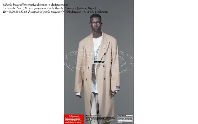
Preview image. Unlock full-res
Color palette
Primary page backgrounds, surface fills, unadorned surfaces
Primary text, informational icons, ghost button borders, essential outlines
Typography
- Weights
- 400
- Sizes
- 22px
- Line height
- 1.14
- Letter spacing
- -0.46px at 22px
- Fallback
- Garamond
Primary body text, headers, and general content. Its traditional serif form provides an editorial, classic feel.
- Weights
- 400
- Sizes
- 22px
- Line height
- 1.14
- Letter spacing
- -0.46px at 22px
- Fallback
- Garamond Italic
Italic text for links and subtle emphasis, maintaining the traditional serif aesthetic.
Spacing & shape
Components
Uses Midnight Ink (#000000) for text and border. No background fill. Border thickness is 1px or 2px solid. Text uses ItalianGaramondW01-Roma at 22px, weight 400. Padding of 20px around content is implied.
Utilizes ItalianGaramondW01-Ital at 22px, weight 400, in Midnight Ink (#000000) with a letter-spacing of -0.46px. Underline is not consistently present, relying on italics for distinction.
Guidelines
- Always use Canvas White (#ffffff) for dominant page backgrounds.
- Render all text in Midnight Ink (#000000) for high contrast and legibility.
- Prefer ItalianGaramondW01-Roma (or Garamond substitute) weight 400 for all primary typographic content.
- Apply -0.023em letter-spacing to all text elements using ItalianGaramondW01-Roma and ItalianGaramondW01-Ital to enhance the editorial feel.
- Maintain a clear separation between content blocks using implied 20px padding or spacing values.
- Use 1px or 2px solid Midnight Ink (#000000) borders for subtle element definition, eschewing heavy outlines or shadows.
- Emphasize links and interactive elements by switching to ItalianGaramondW01-Ital.
- Do not introduce additional saturated colors; maintain the monochrome palette of black and white.
- Avoid using drop shadows or complex elevation; the design relies on flat, border-defined surfaces.
- Do not deviate from the specified Garamond-based typography for headlines or body text.
- Do not use generic sans-serif fonts; the serif identity is central to the brand.
- Do not overcrowd the layout; ensure ample white space for a premium feel.
- Do not use gradients; the system is built on solid, flat colors.
About this system
ShowHide
The Public Image design system is a monochrome, high-contrast visual identity centered around the interplay of stark black text on a clean white canvas. Its aesthetic is minimal and editorial, relying heavily on refined typography to convey sophistication. Spacing is comfortable, allowing elements to breathe without feeling sparse, and the overall impression is one of understated luxury and directness.
The page exhibits a clear full-bleed horizontal structure while reserving a white canvas on the left. Content is primarily centered within the available column, creating a strong vertical axis. The hero section, if present, would likely feature a prominent visual (like the model) against a solid background. Sections appear to flow continuously without explicit dividers, relying on shifts in content type and comfortable spacing to define visual rhythm. The layout suggests a single-column stacking of content, prioritizing large, impactful visuals with concise textual accompaniments. Navigation seems minimal, possibly limited to discrete text links within the primary content area.
Reminiscent of Acne Studios, Bottega Veneta (older campaigns), The Row, Figma.
# ©Public Image — Style Reference
> Editorial White Space

**Theme:** light

**Site:** https://public-image.co

The Public Image design system is a monochrome, high-contrast visual identity centered around the interplay of stark black text on a clean white canvas. Its aesthetic is minimal and editorial, relying heavily on refined typography to convey sophistication. Spacing is comfortable, allowing elements to breathe without feeling sparse, and the overall impression is one of understated luxury and directness.

## Tokens — Colors

| Name | Value | Token | Role |
|------|------|------|------|
| Canvas White | `#ffffff` | `--color-canvas-white` | Primary page backgrounds, surface fills, unadorned surfaces |
| Midnight Ink | `#000000` | `--color-midnight-ink` | Primary text, informational icons, ghost button borders, essential outlines |

## Tokens — Typography

### ItalianGaramondW01-Roma
- **Substitute:** Garamond
- **Weights:** 400
- **Sizes:** 22px
- **Line height:** 1.14
- **Letter spacing:** -0.46px at 22px
- **Role:** Primary body text, headers, and general content. Its traditional serif form provides an editorial, classic feel.

### ItalianGaramondW01-Ital
- **Substitute:** Garamond Italic
- **Weights:** 400
- **Sizes:** 22px
- **Line height:** 1.14
- **Letter spacing:** -0.46px at 22px
- **Role:** Italic text for links and subtle emphasis, maintaining the traditional serif aesthetic.

## Tokens — Spacing

- **Section gap:** 40px
- **Card padding:** 20px
- **Element gap:** 20px

## Tokens — Radius

- **none:** 0px

## Layout

The page exhibits a clear full-bleed horizontal structure while reserving a white canvas on the left. Content is primarily centered within the available column, creating a strong vertical axis. The hero section, if present, would likely feature a prominent visual (like the model) against a solid background. Sections appear to flow continuously without explicit dividers, relying on shifts in content type and comfortable spacing to define visual rhythm. The layout suggests a single-column stacking of content, prioritizing large, impactful visuals with concise textual accompaniments. Navigation seems minimal, possibly limited to discrete text links within the primary content area.

## Components

### Ghost Border Button
*Interactive elements, secondary actions, navigation items.*

Uses Midnight Ink (#000000) for text and border. No background fill. Border thickness is 1px or 2px solid. Text uses ItalianGaramondW01-Roma at 22px, weight 400. Padding of 20px around content is implied.

### Plain Text Link
*Inline navigation, emphasized text, contact information.*

Utilizes ItalianGaramondW01-Ital at 22px, weight 400, in Midnight Ink (#000000) with a letter-spacing of -0.46px. Underline is not consistently present, relying on italics for distinction.

## Guidelines

### Do

- Always use Canvas White (#ffffff) for dominant page backgrounds.
- Render all text in Midnight Ink (#000000) for high contrast and legibility.
- Prefer ItalianGaramondW01-Roma (or Garamond substitute) weight 400 for all primary typographic content.
- Apply -0.023em letter-spacing to all text elements using ItalianGaramondW01-Roma and ItalianGaramondW01-Ital to enhance the editorial feel.
- Maintain a clear separation between content blocks using implied 20px padding or spacing values.
- Use 1px or 2px solid Midnight Ink (#000000) borders for subtle element definition, eschewing heavy outlines or shadows.
- Emphasize links and interactive elements by switching to ItalianGaramondW01-Ital.

### Don't

- Do not introduce additional saturated colors; maintain the monochrome palette of black and white.
- Avoid using drop shadows or complex elevation; the design relies on flat, border-defined surfaces.
- Do not deviate from the specified Garamond-based typography for headlines or body text.
- Do not use generic sans-serif fonts; the serif identity is central to the brand.
- Do not overcrowd the layout; ensure ample white space for a premium feel.
- Do not use gradients; the system is built on solid, flat colors.

## Agent Prompt Guide

Quick Color Reference:
- text: #000000
- background: #ffffff
- border: #000000
- accent: no distinct accent color
- primary action: no distinct CTA color

Example Component Prompts:
- Create a simple header containing copyright text: Black text '#000000' in ItalianGaramondW01-Roma, weight 400, size 22px, line-height 1.14, letter-spacing -0.46px.
- Render a contact link: Text '#000000' in ItalianGaramondW01-Ital, weight 400, size 22px, line-height 1.14, letter-spacing -0.46px. The link text is 'services[at]public-image.co'.
- Design a ghost button for navigation: Border 1px solid #000000, text '#000000' ItalianGaramondW01-Roma, weight 400, size 22px, line-height 1.14, letter-spacing -0.46px. Padding of approximately 20px horizontally and vertically.
More like this
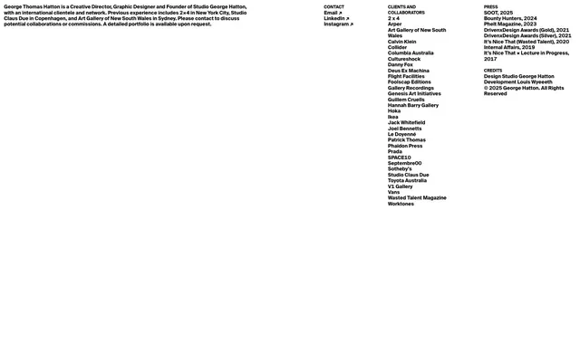









Keep what you find
A free account saves references to boards and can send you a weekly email of picks based on what you save.
To see every result, go Pro.