Preview image. Unlock full-res
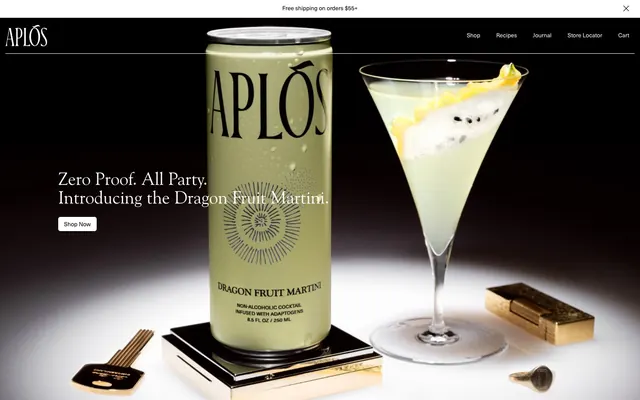
monochrome elegance with botanical whispers
Color palette
Primary text, dark backgrounds, high-contrast borders, icon fills. Dominates dark sections
Content surfaces, light text on dark backgrounds, interactive element borders without distinct fill, background for many standard sections
Background for light sections, subtle button backgrounds, secondary content panels. Provides a soft, warm base
Muted body text, secondary interface borders, helper text
Supporting neutral for secondary UI, dividers, and muted labels. Do not promote it to the primary CTA color
Typography
- Weights
- 400
- Sizes
- 26px, 40px
- Line height
- 1.05, 1.08
- Letter spacing
- -0.0120em
- Fallback
- Palatino Linotype, Georgia
Hero headlines and key brand messaging. The slight letter-spacing creates an open, elegant feel, reflecting the brand's sophisticated tone.
Spacing & shape
Components
Transparent background, Canvas White text and border, 0px radius. Used for minimalist navigation in dark header. Padding: 0px.
Transparent background, Midnight Ink text and border, 0px radius. Used for minimalist navigation in light sections. Padding: 0px.
Transparent background, Canvas White text and 1px border, 5px radius. Padding: 9px top/bottom, 12px left/right. Provides a click target that remains subtle.
Background rgba(255, 255, 255, 0.2), Canvas White text and 1px border, 5px radius. Padding: 9px top/bottom, 12px left/right. Offers a subtle, elevated feel compared to the ghost button.
Transparent background, Desert Sand color, with a subtle border in a slightly darker shade. 5px radius. Padding: 9px top/bottom, 12px left/right.
Desert Sand background, 5px radius, 12px padding. Uses the subtle background to visually distinguish content blocks without heavy borders.
Transparent background, Canvas White text and bottom border, 0px radius. Placeholder text in Canvas White, 12px vertical padding, 0px horizontal padding.
Guidelines
- Use Goudy Old Style Regular (400) for all headlines and key branding text, applying a letter-spacing of -0.0120em.
- Prioritize Canvas White (#ffffff) and Midnight Ink (#000000) for primary text and background contrast in headers and hero sections.
- Employ Desert Sand (#f2f1ed) as the primary background for all light content sections, ensuring a warm, inviting canvas.
- Define interactive elements like buttons and links with transparent backgrounds and Canvas White or Midnight Ink borders, embracing a ghost button aesthetic.
- Apply a consistent border-radius of 5px to all interactive elements and content cards for a uniform soft edge.
- Maintain a clear visual hierarchy by limiting text colors to Midnight Ink (#000000), Canvas White (#ffffff), and Slate Gray (#646464).
- Utilize 96px for vertical section spacing and 12px for element and card interior padding to ensure comfortable density.
- Avoid using solid, heavy fills for primary action buttons; prefer ghost or subtly frosted styles.
- Do not introduce new typefaces; rely solely on Goudy Old Style for branding and system fonts for body text.
- Refrain from using strong, chromatic accent colors; the system maintains a monochrome palette with subtle shifts in neutral warmth.
- Do not deviate from the established 5px border-radius; roundness is consistent across all components.
- Steer clear of complex shadows or heavy elevation; surfaces are largely flat or use very subtle box-shadows (e.g., #b4aeac).
- Avoid overly bold or condensed typography; the brand prefers an open, elegant, and understated textual presence.
- Do not break the dark/light section alternating pattern without a strong functional reason; maintain the visual rhythm.
About this system
ShowHide
Aplós employs a sophisticated, restrained aesthetic, balancing dark elegance with a warm, clean light theme for content. Stark monochrome primary surfaces create a high-contrast foundation. Typography is refined and understated, while interactive elements are subtly defined by borders rather than heavy fills. The system favors spacious layouts and soft transitions, suggesting a premium, calm, and deliberate user experience.
The page primarily uses a full-bleed layout for hero sections, transitioning to a centered, max-width layout for content blocks. The hero section features a dark background with centered product imagery and text overlay. Content sections below alternate between dark (often full-width) and light (often max-width contained, Desert Sand background) bands, creating a clear vertical rhythm. Content arrangement typically involves stacked elements or simple 2-column layouts for features. Navigation is a minimal top bar, sticky in the dark hero, with ghost-style buttons.
The visual language relies heavily on high-quality product photography. Images are generally full-bleed in hero sections or contained in defined blocks for product showcases. Treatment is high-key with focus on the product, often bathed in a soft light. The photography is product-focused, showcasing bottles or cocktails in elegant, minimalist settings, often with dramatic lighting. There are no illustrations or abstract graphics. Icons are minimal, outlined, and monochromatic, integrated subtly into navigation. The density is moderate to high, with imagery often dominant in key sections, serving both decorative atmosphere and product showcase roles.
Reminiscent of Seed, Kin Euphorics, Ghia, Aesop, The Nue Co..
# Aplós — Style Reference
> monochrome elegance with botanical whispers

**Theme:** mixed

**Site:** https://aplos.world

Aplós employs a sophisticated, restrained aesthetic, balancing dark elegance with a warm, clean light theme for content. Stark monochrome primary surfaces create a high-contrast foundation. Typography is refined and understated, while interactive elements are subtly defined by borders rather than heavy fills. The system favors spacious layouts and soft transitions, suggesting a premium, calm, and deliberate user experience.

## Tokens — Colors

| Name | Value | Token | Role |
|------|------|------|------|
| Midnight Ink | `#000000` | `--color-midnight-ink` | Primary text, dark backgrounds, high-contrast borders, icon fills. Dominates dark sections |
| Canvas White | `#ffffff` | `--color-canvas-white` | Content surfaces, light text on dark backgrounds, interactive element borders without distinct fill, background for many standard sections |
| Desert Sand | `#f2f1ed` | `--color-desert-sand` | Background for light sections, subtle button backgrounds, secondary content panels. Provides a soft, warm base |
| Slate Gray | `#646464` | `--color-slate-gray` | Muted body text, secondary interface borders, helper text |
| Shadow Tint | `#b4aeac` | `--color-shadow-tint` | Supporting neutral for secondary UI, dividers, and muted labels. Do not promote it to the primary CTA color |

## Tokens — Typography

### Goudy Old Style
- **Substitute:** Palatino Linotype, Georgia
- **Weights:** 400
- **Sizes:** 26px, 40px
- **Line height:** 1.05, 1.08
- **Letter spacing:** -0.0120em
- **Role:** Hero headlines and key brand messaging. The slight letter-spacing creates an open, elegant feel, reflecting the brand's sophisticated tone.

## Tokens — Type Scale

| Role | Size | Line height | Letter spacing |
|------|------|------|------|
| body | 26px | 1.05 | — |
| heading | 40px | 1.08 | — |

## Tokens — Spacing

- **Section gap:** 96px
- **Card padding:** 12px
- **Element gap:** 12px

## Tokens — Radius

- **Default:** 5px

## Layout

The page primarily uses a full-bleed layout for hero sections, transitioning to a centered, max-width layout for content blocks. The hero section features a dark background with centered product imagery and text overlay. Content sections below alternate between dark (often full-width) and light (often max-width contained, Desert Sand background) bands, creating a clear vertical rhythm. Content arrangement typically involves stacked elements or simple 2-column layouts for features. Navigation is a minimal top bar, sticky in the dark hero, with ghost-style buttons.

## Imagery

The visual language relies heavily on high-quality product photography. Images are generally full-bleed in hero sections or contained in defined blocks for product showcases. Treatment is high-key with focus on the product, often bathed in a soft light. The photography is product-focused, showcasing bottles or cocktails in elegant, minimalist settings, often with dramatic lighting. There are no illustrations or abstract graphics. Icons are minimal, outlined, and monochromatic, integrated subtly into navigation. The density is moderate to high, with imagery often dominant in key sections, serving both decorative atmosphere and product showcase roles.

## Components

### Ghost Header Button (Light)
*Navigation and secondary actions in header.*

Transparent background, Canvas White text and border, 0px radius. Used for minimalist navigation in dark header. Padding: 0px.

### Ghost Header Button (Dark)
*Navigation and secondary actions.*

Transparent background, Midnight Ink text and border, 0px radius. Used for minimalist navigation in light sections. Padding: 0px.

### Primary Ghost Button
*Prominent calls to action.*

Transparent background, Canvas White text and 1px border, 5px radius. Padding: 9px top/bottom, 12px left/right. Provides a click target that remains subtle.

### Frosted Primary Button
*Secondary calls to action or interactive elements requiring slight visual weight.*

Background rgba(255, 255, 255, 0.2), Canvas White text and 1px border, 5px radius. Padding: 9px top/bottom, 12px left/right. Offers a subtle, elevated feel compared to the ghost button.

### Light Section Button
*Action buttons within the light-themed content sections.*

Transparent background, Desert Sand color, with a subtle border in a slightly darker shade. 5px radius. Padding: 9px top/bottom, 12px left/right.

### Benefit Card
*Content card for showcasing features or benefits.*

Desert Sand background, 5px radius, 12px padding. Uses the subtle background to visually distinguish content blocks without heavy borders.

### Footer Input Field
*Input elements for newsletter signup or search in dark sections.*

Transparent background, Canvas White text and bottom border, 0px radius. Placeholder text in Canvas White, 12px vertical padding, 0px horizontal padding.

## Guidelines

### Do

- Use Goudy Old Style Regular (400) for all headlines and key branding text, applying a letter-spacing of -0.0120em.
- Prioritize Canvas White (#ffffff) and Midnight Ink (#000000) for primary text and background contrast in headers and hero sections.
- Employ Desert Sand (#f2f1ed) as the primary background for all light content sections, ensuring a warm, inviting canvas.
- Define interactive elements like buttons and links with transparent backgrounds and Canvas White or Midnight Ink borders, embracing a ghost button aesthetic.
- Apply a consistent border-radius of 5px to all interactive elements and content cards for a uniform soft edge.
- Maintain a clear visual hierarchy by limiting text colors to Midnight Ink (#000000), Canvas White (#ffffff), and Slate Gray (#646464).
- Utilize 96px for vertical section spacing and 12px for element and card interior padding to ensure comfortable density.

### Don't

- Avoid using solid, heavy fills for primary action buttons; prefer ghost or subtly frosted styles.
- Do not introduce new typefaces; rely solely on Goudy Old Style for branding and system fonts for body text.
- Refrain from using strong, chromatic accent colors; the system maintains a monochrome palette with subtle shifts in neutral warmth.
- Do not deviate from the established 5px border-radius; roundness is consistent across all components.
- Steer clear of complex shadows or heavy elevation; surfaces are largely flat or use very subtle box-shadows (e.g., #b4aeac).
- Avoid overly bold or condensed typography; the brand prefers an open, elegant, and understated textual presence.
- Do not break the dark/light section alternating pattern without a strong functional reason; maintain the visual rhythm.

## Agent Prompt Guide

Quick Color Reference:
text: #000000
background: #f2f1ed
border: #000000
accent: no distinct accent color
primary action: no distinct CTA color

Example Component Prompts:
No distinct primary action color was observed; use the extracted neutral button treatments instead of inventing a filled CTA color.
2. Create a 'Benefits' section: Desert Sand background. Heading 'Benefits' at 40px Goudy Old Style weight 400, #000000, letter-spacing -0.0120em. Below, a grid of three Benefit Cards: Desert Sand background, 5px radius, Midnight Ink text for titles, Slate Gray text for body, 12px padding.
3. Create a footer input field within a Midnight Ink background: placeholder text 'Email Address' in Canvas White, with a 1px Canvas White bottom border. Vertical padding 12px, horizontal padding 0px, 0px radius.
More like this







Keep what you find
A free account saves references to boards and can send you a weekly email of picks based on what you save.
To see every result, go Pro.