Preview image. Unlock full-res
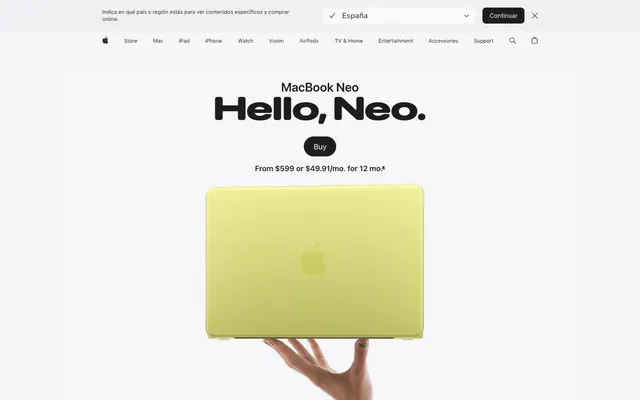
Gallery wall at natural light — enormous type casts shadows on a white surface, color enters only as product.
Color palette
Primary CTA button fill, active nav 'Buy' button — the sole permission-to-act color on the entire page
Inline text links, navigation anchor colors — slightly darker than Azure to distinguish interactive text from interactive buttons
MacBook Neo Citrus finish showcase backdrop — dark-to-citrus theatrical product gradient
MacBook Neo Indigo finish showcase backdrop — dark-to-deep-blue theatrical product gradient
MacBook Neo Blush finish showcase backdrop — dark-to-magenta-violet theatrical product gradient
Product color swatch — Citrus finish selector chip
Product color swatch — Blush finish selector chip
Product color swatch — Indigo finish selector chip
Primary text, headings, nav labels, icon fills — near-black with just enough warmth to avoid harshness on white
Secondary body copy, captions, footnotes, muted nav items
Tertiary body text, supporting link text, secondary nav
Icon strokes, mid-weight body text, button labels in ghost state
Page canvas background, section divider bands, badge fills
Card surfaces, nav background, elevated container fills
Dark card variant, hero icon fills, maximum-contrast black card
Frosted pill button background (country selector), input backgrounds
Badge warning text, price asterisk callouts — deep amber-orange for inline semantic alerts
Typography
- Weights
- 600, 700
- Sizes
- 21px, 24px, 28px, 32px, 40px, 56px, 80px, 96px
- Line height
- 1.04
- Letter spacing
- -0.022em at 96px, -0.019em at 80px, -0.016em at 56px, -0.015em at 40px, -0.005em at 28px, +0.004em at 21px
- Fallback
- Inter, system-ui
All marketing headlines, product name lockups, section titles. Weight 700 at 80-96px is the page's defining visual move — these headlines are 2-4 words at near-poster scale, taking up half the viewport before any product image appears. Negative tracking at display sizes (-0.022em at largest) tightens letterforms into a single typographic mass.
- Weights
- 300, 400, 500, 600
- Sizes
- 12px, 14px, 17px, 18px, 20px, 24px, 44px
- Line height
- 1.24
- Letter spacing
- -0.022em at 44px, -0.010em at 20px, -0.006em at 17px, -0.003em at 14px, -0.003em at 12px
- Fallback
- Inter, system-ui
Body copy, nav labels, captions, button labels, footnotes. Weight 400 at 17px is the default body size. Weight 300 appears at larger marketing sizes (20-24px) for subheadings that should feel lighter than headlines. Weight 600 for emphasis labels. The -0.003em tracking at body sizes is subtle but keeps dense paragraphs from sprawling.
Spacing & shape
Components
backgroundColor #0071e3, color #ffffff, borderRadius 999px, paddingTop 8px, paddingBottom 8px, paddingLeft 16px, paddingRight 16px, font SF Pro Text 17px weight 400. Appears in global nav and anchored product nav. The only #0071e3 element on the page — isolated blue against all-neutral surroundings makes it impossible to miss without competing colors.
backgroundColor transparent, color #1d1d1f, borderRadius 0px, no padding. Rendered as plain weighted text. Used for secondary actions inside feature cards — avoids visual noise next to the single primary CTA.
backgroundColor transparent, color #1d1d1f, borderRadius 28px, no padding. Circular border implied by radius; acts as a pill-shaped tab toggle. Text at SF Pro Text 17px weight 400.
backgroundColor rgba(210, 210, 215, 0.64), color rgba(0,0,0,0.56), borderRadius 36px, no explicit padding. backdrop-filter blur(20px). The frosted glass treatment signals a temporary overlay or in-page selector, visually distinct from all opaque buttons.
backgroundColor #000000, color #ffffff, borderRadius 999px, paddingLeft 16px, paddingRight 16px. Used when the backdrop is a product color gradient — switches from #0071e3 to #000000 to remain legible against vivid gradient backgrounds.
backgroundColor #ffffff, borderRadius 28px, boxShadow none, padding 28px. Lifts off the #f5f5f7 canvas by 1 surface level. The 28px radius is signature Apple — rounded enough to feel premium, not so round it reads as a chip or badge.
backgroundColor #f5f5f7, borderRadius 28px, boxShadow none, padding 28px. Used when the parent section is #ffffff — reverses the surface/card relationship so the card reads as recessed rather than elevated.
backgroundColor #000000, borderRadius 28px, boxShadow none. Text color #ffffff. Used as a single accent card within a light card grid — maximum contrast without color.
backgroundColor #f5f5f7 (or rgba(250,250,252) when open), height ~44px, nav links at SF Pro Text 12px weight 400 color #1d1d1f, Apple logo SVG fill #000000. Sticky, transitions background to semi-opaque white on scroll. Contains 'Buy' primary button at far right.
backgroundColor #ffffff, borderBottom 1px solid #e8e8ed, height ~52px, link text SF Pro Text 14px weight 400 color #1d1d1f, active link has 3px underline in #1d1d1f. Contains Buy pill button in #0071e3 at far right. Stays fixed after hero scroll.
Small circular or short pill, backgroundColor from finish token (--finish-blush #e8d0d0, --finish-citrus #dddc8c, --finish-indigo #596680, --finish-silver #e3e4e5), borderRadius 999px. Selected state adds 3px solid #1d1d1f border ring.
backgroundColor transparent, color #1d1d1f, borderRadius 0px, font SF Pro Text 12px weight 600. Appears as a plain text label, not a pill — anti-convention for a badge, reads as an editorial stamp rather than a UI chip.
Active dot: backgroundColor #1d1d1f, width ~8px, height ~8px, borderRadius 999px. Inactive dots: backgroundColor rgba(210,210,215,0.64), same dimensions. Horizontally centered below carousel, gap 6px.
Guidelines
- Use 28px border-radius for all feature cards (#ffffff and #f5f5f7 backgrounds) — this exact value is the page's geometric signature.
- Reserve #0071e3 exclusively for the primary 'Buy' CTA button. No other UI element uses this blue — its scarcity makes it the only color that reads as an imperative.
- Apply negative letter-spacing scaled to font size: -2.11px at 96px display, -0.9px at 56px heading-lg, -0.1px at 17px body. Positive or zero tracking at display sizes breaks the chiseled headline aesthetic.
- Use #f5f5f7 as page canvas and #ffffff as card surface. Never reverse this — cards must always be lighter than their parent background.
- Set SF Pro Display weight 700 for all primary product headlines at 56px and above. Weight 600 is for supporting headers (24-40px), never for hero text.
- Use rgba(210,210,215,0.64) with backdrop-filter blur(20px) for any temporary overlay controls (country selectors, segmented pickers) — this is the frosted-glass layer distinct from all opaque surfaces.
- Product finish gradients (Citrus, Indigo, Blush) are used only as full-bleed section backdrops for that finish's showcase. Never use them as UI chrome, card backgrounds, or button fills.
- Do not add box-shadow to any card or container. The entire elevation system is color-value-only — shadows break the flat-lit gallery effect.
- Do not use #0066cc (Cobalt Link) for button backgrounds. It is an inline text link color only — using it on filled buttons conflicts with the #0071e3 CTA hierarchy.
- Do not use font weight 300 for headlines below 40px — below that threshold, weight 300 loses definition against the white/fog background.
- Do not place two rounded-pill buttons side by side in the same visual zone. The 999px radius is rationed to one CTA per section to prevent diffusion of focus.
- Do not use the product finish colors (#dddc8c Citrus, #e8d0d0 Blush, #596680 Indigo) as semantic or UI accent colors — they exist only as product identity swatches and gradient source colors.
- Do not use positive letter-spacing on SF Pro Display at sizes above 28px. The +0.007em–+0.011em values from the data appear only at small display sizes (21px); at headline scale positive tracking is tonally inconsistent.
- Do not center-align body paragraphs longer than 2 lines. Apple's body copy left-aligns in two-column feature layouts; centered text is reserved for single-line hero subheadings and price callouts.
About this system
ShowHide
Apple's MacBook Neo product page radiates cool luminosity — a gallery-white canvas where enormous weight-700 headlines at 80-96px dominate above feather-light body copy, creating a tension between mass and air. The page background stays #f5f5f7, one step off pure white, giving cards and content wells a surface-lift effect without any shadows. Negative letter-spacing tightens progressively with size — display headlines track at -0.022em while body text breathes at -0.003em, a signature move that makes large type feel chiseled rather than loose. The single interactive accent (#0071e3 CTA blue) appears only on the 'Buy' pill button and nav links, rationed so every appearance reads as an instruction to act. Product gradients — dark-to-citrus-green, dark-to-blue, dark-to-violet — serve as full-bleed theatrical backdrops for each color finish showcase, never decorating UI chrome.
Max-width ~1200px centered on a #f5f5f7 canvas. Hero is full-viewport centered headline stack (product name at 24px, hero headline at 80-96px, price subtext at 17px, single Buy pill) with product image breaking below the text fold — classic Apple centered-stack hero. Sub-nav becomes sticky at ~52px height after the hero. Section rhythm: alternating white (#ffffff full-width bands) and fog (#f5f5f7) bands with no explicit dividers — the color shift alone creates section breaks. Feature sections use 2-column split (text left at ~40% width, product image right at ~60%) or full-bleed product gradient cards. Highlight carousel is a single-column centered card with horizontal scroll and pagination dots. Specs section uses a tight left-label / right-value two-column table pattern at body-sm size. Feature detail cards stack in a 2×2 grid at 28px radius, each card self-contained. Navigation: translucent sticky global nav at top (12px text, ~44px tall) plus sticky product sub-nav below it (14px text, ~52px tall) — two navigation layers are always visible, keeping section context persistent during long scroll.
Product photography dominates: the MacBook is always the sole subject, photographed on pure white or against the Fog (#f5f5f7) surface — zero lifestyle context, no hands (except the hero hand hold), no desk environment. The hero image is the laptop balanced on a single palm from below-frame, shot at a near-overhead angle with the vivid Citrus finish as the sole color note in an otherwise achromatic composition. Color finish showcases use full-bleed theatrical gradients (dark-to-citrus, dark-to-indigo, dark-to-blush) as the backdrop, with the open laptop emerging from the gradient — product-as-light-source. No illustration. Icons are SF Symbols style: mono, filled/outlined hybrid, 1.5-2px apparent stroke, #1d1d1f on light backgrounds, #ffffff on dark cards. The page is image-heavy relative to text — each major section is anchored by a product image occupying 50-80% of viewport height, with text floating above or below in compact lockups.
Reminiscent of Samsung Galaxy product pages, Dyson product pages, Sony product pages, Teenage Engineering.
# Apple — Style Reference
> Gallery wall at natural light — enormous type casts shadows on a white surface, color enters only as product.

**Theme:** light

**Site:** https://www.apple.com/macbook-neo

Apple's MacBook Neo product page radiates cool luminosity — a gallery-white canvas where enormous weight-700 headlines at 80-96px dominate above feather-light body copy, creating a tension between mass and air. The page background stays #f5f5f7, one step off pure white, giving cards and content wells a surface-lift effect without any shadows. Negative letter-spacing tightens progressively with size — display headlines track at -0.022em while body text breathes at -0.003em, a signature move that makes large type feel chiseled rather than loose. The single interactive accent (#0071e3 CTA blue) appears only on the 'Buy' pill button and nav links, rationed so every appearance reads as an instruction to act. Product gradients — dark-to-citrus-green, dark-to-blue, dark-to-violet — serve as full-bleed theatrical backdrops for each color finish showcase, never decorating UI chrome.

## Tokens — Colors

| Name | Value | Token | Role |
|------|------|------|------|
| Azure | `#0071e3` | `--color-azure` | Primary CTA button fill, active nav 'Buy' button — the sole permission-to-act color on the entire page |
| Cobalt Link | `#0066cc` | `--color-cobalt-link` | Inline text links, navigation anchor colors — slightly darker than Azure to distinguish interactive text from interactive buttons |
| Citrus Gradient | `#dddc8c` | `--color-citrus-gradient` | MacBook Neo Citrus finish showcase backdrop — dark-to-citrus theatrical product gradient |
| Indigo Gradient | `#2535e2` | `--color-indigo-gradient` | MacBook Neo Indigo finish showcase backdrop — dark-to-deep-blue theatrical product gradient |
| Blush Gradient | `#cc29bc` | `--color-blush-gradient` | MacBook Neo Blush finish showcase backdrop — dark-to-magenta-violet theatrical product gradient |
| Citrus Finish | `#dddc8c` | `--color-citrus-finish` | Product color swatch — Citrus finish selector chip |
| Blush Finish | `#e8d0d0` | `--color-blush-finish` | Product color swatch — Blush finish selector chip |
| Indigo Finish | `#596680` | `--color-indigo-finish` | Product color swatch — Indigo finish selector chip |
| Ink | `#1d1d1f` | `--color-ink` | Primary text, headings, nav labels, icon fills — near-black with just enough warmth to avoid harshness on white |
| Graphite | `#707070` | `--color-graphite` | Secondary body copy, captions, footnotes, muted nav items |
| Slate | `#474747` | `--color-slate` | Tertiary body text, supporting link text, secondary nav |
| Ash | `#333333` | `--color-ash` | Icon strokes, mid-weight body text, button labels in ghost state |
| Fog | `#f5f5f7` | `--color-fog` | Page canvas background, section divider bands, badge fills |
| Snow | `#ffffff` | `--color-snow` | Card surfaces, nav background, elevated container fills |
| Obsidian | `#000000` | `--color-obsidian` | Dark card variant, hero icon fills, maximum-contrast black card |
| Silver Mist | `#e8e8ed` | `--color-silver-mist` | Frosted pill button background (country selector), input backgrounds |
| Caution | `#b64400` | `--color-caution` | Badge warning text, price asterisk callouts — deep amber-orange for inline semantic alerts |

## Tokens — Typography

### SF Pro Display
- **Substitute:** Inter, system-ui
- **Weights:** 600, 700
- **Sizes:** 21px, 24px, 28px, 32px, 40px, 56px, 80px, 96px
- **Line height:** 1.04
- **Letter spacing:** -0.022em at 96px, -0.019em at 80px, -0.016em at 56px, -0.015em at 40px, -0.005em at 28px, +0.004em at 21px
- **Role:** All marketing headlines, product name lockups, section titles. Weight 700 at 80-96px is the page's defining visual move — these headlines are 2-4 words at near-poster scale, taking up half the viewport before any product image appears. Negative tracking at display sizes (-0.022em at largest) tightens letterforms into a single typographic mass.

### SF Pro Text
- **Substitute:** Inter, system-ui
- **Weights:** 300, 400, 500, 600
- **Sizes:** 12px, 14px, 17px, 18px, 20px, 24px, 44px
- **Line height:** 1.24
- **Letter spacing:** -0.022em at 44px, -0.010em at 20px, -0.006em at 17px, -0.003em at 14px, -0.003em at 12px
- **Role:** Body copy, nav labels, captions, button labels, footnotes. Weight 400 at 17px is the default body size. Weight 300 appears at larger marketing sizes (20-24px) for subheadings that should feel lighter than headlines. Weight 600 for emphasis labels. The -0.003em tracking at body sizes is subtle but keeps dense paragraphs from sprawling.

## Tokens — Type Scale

Perfect Fourth (1.333) from 17px base.

| Role | Size | Line height | Letter spacing |
|------|------|------|------|
| caption | 12px | 1.33 | -0.26px |
| body-sm | 14px | 1.43 | -0.04em |
| body | 17px | 1.47 | -0.1px |
| subheading | 20px | 1.4 | -0.2px |
| heading-sm | 24px | 1.29 | -0.36px |
| heading | 40px | 1.17 | -0.6px |
| heading-lg | 56px | 1.07 | -0.9px |
| display | 96px | 1.04 | -2.11px |

## Tokens — Spacing

- **Max width:** 1200px
- **Section gap:** 80-120px
- **Card padding:** 28px
- **Element gap:** 10px

## Tokens — Radius

- **Buttons:** 999px
- **Cards:** 28px
- **featureLinks:** 28px
- **navItems:** 980px
- **pillButtons:** 999px
- **roundedButtons:** 36px
- **smallButtons:** 10px

## Layout

Max-width ~1200px centered on a #f5f5f7 canvas. Hero is full-viewport centered headline stack (product name at 24px, hero headline at 80-96px, price subtext at 17px, single Buy pill) with product image breaking below the text fold — classic Apple centered-stack hero. Sub-nav becomes sticky at ~52px height after the hero. Section rhythm: alternating white (#ffffff full-width bands) and fog (#f5f5f7) bands with no explicit dividers — the color shift alone creates section breaks. Feature sections use 2-column split (text left at ~40% width, product image right at ~60%) or full-bleed product gradient cards. Highlight carousel is a single-column centered card with horizontal scroll and pagination dots. Specs section uses a tight left-label / right-value two-column table pattern at body-sm size. Feature detail cards stack in a 2×2 grid at 28px radius, each card self-contained. Navigation: translucent sticky global nav at top (12px text, ~44px tall) plus sticky product sub-nav below it (14px text, ~52px tall) — two navigation layers are always visible, keeping section context persistent during long scroll.

## Imagery

Product photography dominates: the MacBook is always the sole subject, photographed on pure white or against the Fog (#f5f5f7) surface — zero lifestyle context, no hands (except the hero hand hold), no desk environment. The hero image is the laptop balanced on a single palm from below-frame, shot at a near-overhead angle with the vivid Citrus finish as the sole color note in an otherwise achromatic composition. Color finish showcases use full-bleed theatrical gradients (dark-to-citrus, dark-to-indigo, dark-to-blush) as the backdrop, with the open laptop emerging from the gradient — product-as-light-source. No illustration. Icons are SF Symbols style: mono, filled/outlined hybrid, 1.5-2px apparent stroke, #1d1d1f on light backgrounds, #ffffff on dark cards. The page is image-heavy relative to text — each major section is anchored by a product image occupying 50-80% of viewport height, with text floating above or below in compact lockups.

## Components

### Primary Buy Button
*Sole conversion CTA across page and sticky nav*

backgroundColor #0071e3, color #ffffff, borderRadius 999px, paddingTop 8px, paddingBottom 8px, paddingLeft 16px, paddingRight 16px, font SF Pro Text 17px weight 400. Appears in global nav and anchored product nav. The only #0071e3 element on the page — isolated blue against all-neutral surroundings makes it impossible to miss without competing colors.

### Ghost Text Button
*Section 'Learn more' links styled as buttons*

backgroundColor transparent, color #1d1d1f, borderRadius 0px, no padding. Rendered as plain weighted text. Used for secondary actions inside feature cards — avoids visual noise next to the single primary CTA.

### Rounded Ghost Button
*Feature navigation tabs (Calls and Texts, Handoff, iPhone Mirroring, AirDrop)*

backgroundColor transparent, color #1d1d1f, borderRadius 28px, no padding. Circular border implied by radius; acts as a pill-shaped tab toggle. Text at SF Pro Text 17px weight 400.

### Frosted Pill Selector
*Country/region selector and segmented control overlays*

backgroundColor rgba(210, 210, 215, 0.64), color rgba(0,0,0,0.56), borderRadius 36px, no explicit padding. backdrop-filter blur(20px). The frosted glass treatment signals a temporary overlay or in-page selector, visually distinct from all opaque buttons.

### Dark Pill Button
*Hero section 'Buy' CTA on dark product backdrops*

backgroundColor #000000, color #ffffff, borderRadius 999px, paddingLeft 16px, paddingRight 16px. Used when the backdrop is a product color gradient — switches from #0071e3 to #000000 to remain legible against vivid gradient backgrounds.

### White Feature Card
*Primary content card for feature showcases*

backgroundColor #ffffff, borderRadius 28px, boxShadow none, padding 28px. Lifts off the #f5f5f7 canvas by 1 surface level. The 28px radius is signature Apple — rounded enough to feel premium, not so round it reads as a chip or badge.

### Fog Feature Card
*Alternate feature card on white backgrounds*

backgroundColor #f5f5f7, borderRadius 28px, boxShadow none, padding 28px. Used when the parent section is #ffffff — reverses the surface/card relationship so the card reads as recessed rather than elevated.

### Dark Feature Card
*High-contrast product detail card*

backgroundColor #000000, borderRadius 28px, boxShadow none. Text color #ffffff. Used as a single accent card within a light card grid — maximum contrast without color.

### Global Navigation Bar
*Persistent top nav with product categories*

backgroundColor #f5f5f7 (or rgba(250,250,252) when open), height ~44px, nav links at SF Pro Text 12px weight 400 color #1d1d1f, Apple logo SVG fill #000000. Sticky, transitions background to semi-opaque white on scroll. Contains 'Buy' primary button at far right.

### Sticky Product Sub-Nav
*Page-section navigator (Overview, Tech Specs, Compare, Switch from PC to Mac)*

backgroundColor #ffffff, borderBottom 1px solid #e8e8ed, height ~52px, link text SF Pro Text 14px weight 400 color #1d1d1f, active link has 3px underline in #1d1d1f. Contains Buy pill button in #0071e3 at far right. Stays fixed after hero scroll.

### Product Color Swatch Chip
*Finish selector for Silver, Blush, Citrus, Indigo*

Small circular or short pill, backgroundColor from finish token (--finish-blush #e8d0d0, --finish-citrus #dddc8c, --finish-indigo #596680, --finish-silver #e3e4e5), borderRadius 999px. Selected state adds 3px solid #1d1d1f border ring.

### New Badge
*Product 'New' label in nav and product cards*

backgroundColor transparent, color #1d1d1f, borderRadius 0px, font SF Pro Text 12px weight 600. Appears as a plain text label, not a pill — anti-convention for a badge, reads as an editorial stamp rather than a UI chip.

### Carousel Pagination Dot
*Slide indicator in feature carousels*

Active dot: backgroundColor #1d1d1f, width ~8px, height ~8px, borderRadius 999px. Inactive dots: backgroundColor rgba(210,210,215,0.64), same dimensions. Horizontally centered below carousel, gap 6px.

## Guidelines

### Do

- Use 28px border-radius for all feature cards (#ffffff and #f5f5f7 backgrounds) — this exact value is the page's geometric signature.
- Reserve #0071e3 exclusively for the primary 'Buy' CTA button. No other UI element uses this blue — its scarcity makes it the only color that reads as an imperative.
- Apply negative letter-spacing scaled to font size: -2.11px at 96px display, -0.9px at 56px heading-lg, -0.1px at 17px body. Positive or zero tracking at display sizes breaks the chiseled headline aesthetic.
- Use #f5f5f7 as page canvas and #ffffff as card surface. Never reverse this — cards must always be lighter than their parent background.
- Set SF Pro Display weight 700 for all primary product headlines at 56px and above. Weight 600 is for supporting headers (24-40px), never for hero text.
- Use rgba(210,210,215,0.64) with backdrop-filter blur(20px) for any temporary overlay controls (country selectors, segmented pickers) — this is the frosted-glass layer distinct from all opaque surfaces.
- Product finish gradients (Citrus, Indigo, Blush) are used only as full-bleed section backdrops for that finish's showcase. Never use them as UI chrome, card backgrounds, or button fills.

### Don't

- Do not add box-shadow to any card or container. The entire elevation system is color-value-only — shadows break the flat-lit gallery effect.
- Do not use #0066cc (Cobalt Link) for button backgrounds. It is an inline text link color only — using it on filled buttons conflicts with the #0071e3 CTA hierarchy.
- Do not use font weight 300 for headlines below 40px — below that threshold, weight 300 loses definition against the white/fog background.
- Do not place two rounded-pill buttons side by side in the same visual zone. The 999px radius is rationed to one CTA per section to prevent diffusion of focus.
- Do not use the product finish colors (#dddc8c Citrus, #e8d0d0 Blush, #596680 Indigo) as semantic or UI accent colors — they exist only as product identity swatches and gradient source colors.
- Do not use positive letter-spacing on SF Pro Display at sizes above 28px. The +0.007em–+0.011em values from the data appear only at small display sizes (21px); at headline scale positive tracking is tonally inconsistent.
- Do not center-align body paragraphs longer than 2 lines. Apple's body copy left-aligns in two-column feature layouts; centered text is reserved for single-line hero subheadings and price callouts.

## Agent Prompt Guide

QUICK COLOR REFERENCE:
• Page background: #f5f5f7
• Card surface: #ffffff
• Primary text / headlines: #1d1d1f
• Secondary text: #707070
• CTA button fill: #0071e3
• Inline links: #0066cc
• Border / divider: #e8e8ed

EXAMPLE COMPONENT PROMPTS:

1. Hero section: Full-width, background #f5f5f7. Center-stack layout. Eyebrow at SF Pro Text 24px weight 600, color #1d1d1f, letter-spacing -0.36px. Headline at SF Pro Display 96px weight 700, color #1d1d1f, letter-spacing -2.11px, lineHeight 1.04. Price subtext at SF Pro Text 17px weight 400, color #1d1d1f. Single Buy pill button: backgroundColor #000000, color #ffffff, borderRadius 999px, paddingLeft 16px, paddingRight 16px, paddingTop 8px, paddingBottom 8px. Product photo centered below text at full viewport width.

2. Sticky product sub-nav: backgroundColor #ffffff, borderBottom 1px solid #e8e8ed, height 52px. Nav links: SF Pro Text 14px weight 400, color #1d1d1f, spaced 24px apart. Active link has 3px solid #1d1d1f underline. Far-right Buy button: backgroundColor #0071e3, color #ffffff, borderRadius 999px, paddingLeft 16px, paddingRight 16px, paddingTop 8px, paddingBottom 8px, SF Pro Text 17px weight 400.

3. Feature card grid (2-column): Parent band background alternates #ffffff / #f5f5f7. Cards: backgroundColor opposite of parent (#f5f5f7 on white, #ffffff on fog), borderRadius 28px, boxShadow none, padding 28px. Headline inside card: SF Pro Display 28px weight 600, color #1d1d1f, letter-spacing -0.07em. Body: SF Pro Text 17px weight 400, color #707070. Secondary link: color #0066cc, no underline default.

4. Product color gradient showcase: Full-bleed section, height 100vh. Background: linear-gradient(184deg, #1d1d1f 20%, [finish peak color] 43%, [finish mid] 70%, [finish end] 95%). Centered headline: SF Pro Display 56px weight 700, color #ffffff, letter-spacing -0.9px. Product image centered and overlapping gradient. Color swatch chips below: borderRadius 999px, 28px diameter each, separated 8px, selected state has 3px solid #ffffff ring.

5. Section header (left-aligned): Background #f5f5f7 or #ffffff band, padding 40px 40px 20px. Headline: SF Pro Display 40px weight 700, color #1d1d1f, letter-spacing -0.6px, lineHeight 1.17. Supporting paragraph: SF Pro Text 20px weight 300, color #1d1d1f, letter-spacing -0.2px, lineHeight 1.40, max-width 560px.

## Motion System

Primary duration: 0.344s (page transitions, card reveals). Quick feedback: 0.1s (hover states, button presses). Scroll-driven animations: 0.32s ease. Default easing: ease (CSS keyword) for 97% of transitions. background-color and color transitions are the most common animated properties — hover states shift between neutral values. opacity transitions power section entrance reveals. transform transitions handle product image parallax and carousel movement. The overall motion personality is 'expressive' but anchored by slow-ease timing that feels gravity-weighted rather than springy.

## Product Finish Color System

Four hardware finishes map to CSS tokens and gradient backdrops:
• Silver: swatch #e3e4e5 (--finish-silver), no gradient showcase
• Blush: swatch #e8d0d0 (--finish-blush), gradient from #1d1d1f → #f3c4f6 → #f500b4 → #cc29bc
• Citrus: swatch #dddc8c (--finish-citrus), gradient from #1d1d1f → #dfe74f → #5e9c2a → #0a8619
• Indigo: swatch #596680 (--finish-indigo), gradient from #1d1d1f → #a8d3fb → #0012f9 → #2535e2
Each swatch chip: 28px diameter, borderRadius 999px. Selected state: 3px solid border in #1d1d1f (on light) or #ffffff (on dark). Gradient showcases are full-bleed 184° linear gradients used exclusively as section backdrops, never UI fills.
More like this









Keep what you find
A free account saves references to boards and can send you a weekly email of picks based on what you save.
To see every result, go Pro.