Preview image. Unlock full-res
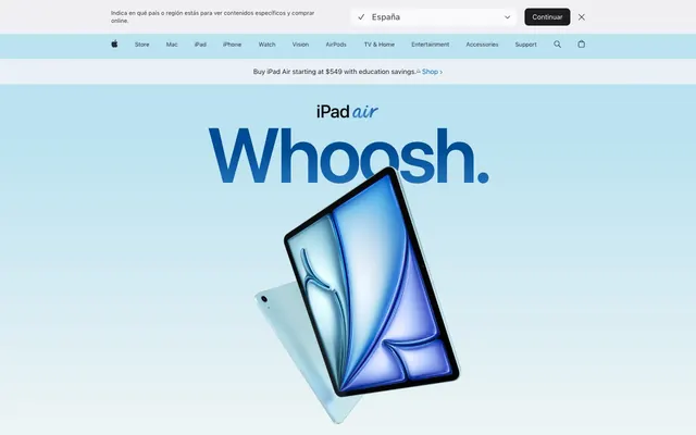
Precise Canvas, Vivid Product. A stark white presentation surface designed to make premium product imagery pop with singular focus.
Color palette
Interactive links, primary action buttons, focused states. This is the dominant interactive brand color.
Primary call to action background, navigation highlights, focus outlines.
Accent color for specific headings, product feature highlights.
Accent color for specific headings, highlighting unique selling points.
Accent color for specific headings, drawing attention to new features.
Badge backgrounds for 'New' indicators or special offers.
Decorative background or hero element for product presentation.
High-impact visual elements, product imagery backgrounds, vivid showcases.
Primary heading and body text, button text, icon default.
Secondary body text, supporting links, muted icons, footer text.
Primary page background, elevated card surfaces, clean sections.
Subtle background for navigation, subtle section dividers, tertiary surface.
Delicate border colors, subtle outlines for form elements.
Tertiary text, certain icon elements, dark button text.
Navigation links, secondary link states, sometimes icon fills.
Button backgrounds in certain states, subtle background tint.
High-contrast text, specific icons, input text.
Call-to-action button backgrounds when muted, form outlines.
Typography
- Weights
- 300, 400, 600
- Sizes
- 8px, 12px, 14px, 17px, 18px, 20px, 24px, 34px, 44px
- Line height
- 1, 1.18, 1.24, 1.29, 1.33, 1.43, 1.47, 1.5, 1.83, 2.12, 2.41
- Letter spacing
- -0.031, -0.027, -0.022, -0.02, -0.019, -0.016, -0.011, -0.01, -0.003
- Fallback
- system-ui, sans-serif
Primary family for all body text, navigation items, buttons, and most UI elements. Its neutrality and subtly varied weights maintain a consistent, readable tone across the interface. Heavy use of precise letter-spacing adjustments for optical balance at different sizes.
- Weights
- 400, 600
- Sizes
- 21px, 28px, 40px, 48px, 56px, 80px, 160px
- Line height
- 0.88, 1.05, 1.07, 1.08, 1.1, 1.14, 1.19, 1.38
- Letter spacing
- -0.04, -0.015, -0.005, -0.003, 0.007, 0.011
- Fallback
- system-ui, sans-serif
Used for large, impactful headlines and display text. Its slightly wider, more open forms are optimized for larger sizes, ensuring legibility and presence in hero sections and key marketing messages. Features tight negative letter-spacing for visual density.
- Weights
- 400
- Sizes
- 13px
- Line height
- 1.2
- Letter spacing
- 0
- Fallback
- sans-serif
Fallback for input fields, ensuring broad system compatibility.
Spacing & shape
Components
Uses SF Pro Text, #0066cc (Ocean Blue), normal weight. No background or padding. Border radius 0px. On hover, may show underline or slight color change.
Background: #0071e3 (Vivid Blue). Text: Pure White (#ffffff), SF Pro Text Medium (400), size 17px, line-height 1.18, letter-spacing -0.16px. Border radius: 28px. Padding varies due to content, but typically 11px vertical and 9px horizontal as minimum.
Background: rgba(0, 0, 0, 0) (transparent). Text: Midnight Graphite (#1d1d1f), SF Pro Text Medium (400), size 17px, line-height 1.18, letter-spacing -0.16px. Border radius: 28px. No visible border.
Background: rgba(0, 0, 0, 0) (transparent). Icon color: Midnight Graphite (#1d1d1f). Border radius: 28px/32px (pill/circular). No padding on button container, padding is internal to the icon asset.
Background: Pure White (#ffffff) or Frost Gray (#f3f6f6). Border radius: 28px. No box shadow. Padding: 14px internal consistent spacing.
Text: Midnight Graphite (#1d1d1f) or Slate Echo (#444545). Font: SF Pro Text, typically 12px or 14px. Letter spacing -0.01em approx. Background is transparent. No border radius. Top and bottom padding of 0px, side padding 10px.
Background: rgba(0, 0, 0, 0) (transparent). Text: Flame Orange (#b64400), SF Pro Text, 12px. No padding. Border radius 0px.
Background: rgba(0, 0, 0, 0) (transparent). Text: Pure Black (#000000), Arial, 13px. Border: 1px solid Steel Accent (#cccfcf). No border-radius, or 0px. Padding implicit from component structure.
Guidelines
- Prioritize SF Pro Text for all body copy and UI elements at weights 300, 400, and 600, applying precise letter-spacing adjustments as defined in the type scale.
- Use SF Pro Display for headlines and display text (40px and above), leveraging its tighter letter-spacing for visual impact.
- Employ Pure White (#ffffff) for primary content backgrounds and Frost Gray (#f3f6f6) for subtly differentiated sections or navigation.
- Reserve Ocean Blue (#0066cc) or Vivid Blue (#0071e3) for all primary interactive elements like buttons and links.
- Apply a 28px border radius for all cards and primary buttons to maintain a consistent soft edge.
- Maintain comfortable density spacing: 10px `elementGap` between small UI elements and a `sectionGap` of 70px to create ample breathing room between content blocks.
- Use Midnight Graphite (#1d1d1f) for primary text and Cloud Mist (#6b6c6c) for secondary/supporting text to create subtle typographic hierarchy.
- Do not introduce new saturated colors outside of the defined accent palette; rely on product imagery for additional color.
- Avoid heavy drop shadows or glows; use subtle surface differentiation (like Pure White on Frost Gray) for depth instead.
- Do not use generic system fonts when SF Pro Text or SF Pro Display are available; they are key to brand identity.
- Do not use border radii smaller than 12px or larger than 980px, except for defined components. Stick to 28px for cards and buttons.
- Avoid arbitrary custom padding values; adhere to the established `elementGap` of 10px, `cardPadding` of 14px, and section spacing of 70px.
- Do not use highly decorative or script fonts; maintain a clean, sans-serif aesthetic throughout.
- Never use dark mode toggles or styles; the aesthetic is strictly light-themed.
About this system
ShowHide
This design system feels like meticulously crafted white space surrounding vibrant, singular product showcases. It projects an aura of premium precision through a mostly monochrome palette and minimal, crisp UI elements. The interplay of subtly differentiated neutral surfaces creates depth without relying on heavy shadows, reserving saturated color almost exclusively for product imagery or primary calls to action. Large, high-impact typography anchors sections, often accompanied by a delicate sans-serif for body text, creating a strong editorial feel.
The page maintains a maximum width, centered model, providing clear boundaries for content. The hero section features a large, impactful product image or render often against a gradient background, with central large-scale typography. Following sections alternate between Pure White and Frost Gray backgrounds, creating a subtle visual rhythm. Content is arranged in alternating 2-column text+image layouts or stacked central blocks for headlines and calls to action. A prominent sticky header and secondary navigation remain at the top, offering persistent access to key links. Spacing is comfortable, utilizing generous vertical gaps between sections and internal padding, contributing to a sense of premium simplicity.
Imagery on this site prioritizes professional, high-fidelity product photography and 3D renders. Products are often shown isolated on clean white or gradient backgrounds, focusing on their aesthetics and features. Photography is full-color, with a bright, high-key treatment. Product screenshots are integrated to demonstrate software capabilities, often with a slight perspective to show the device itself. Iconography is minimalist and monochrome, predominantly filled glyphs with a precise, thin stroke appearance. Images are generally contained within sections, not full-bleed, and maintain sharp edges unless part of a hero section with a soft background gradient. The role of imagery is primarily product showcase and feature explanation, with a high density relative to supporting text in many sections.
Reminiscent of Google (Material Design), Stripe, Samsung (product pages), Microsoft (Surface line pages).
# Apple — Style Reference
> Precise Canvas, Vivid Product. A stark white presentation surface designed to make premium product imagery pop with singular focus.

**Theme:** light

**Site:** https://www.apple.com/ipad-air

This design system feels like meticulously crafted white space surrounding vibrant, singular product showcases. It projects an aura of premium precision through a mostly monochrome palette and minimal, crisp UI elements. The interplay of subtly differentiated neutral surfaces creates depth without relying on heavy shadows, reserving saturated color almost exclusively for product imagery or primary calls to action. Large, high-impact typography anchors sections, often accompanied by a delicate sans-serif for body text, creating a strong editorial feel.

## Tokens — Colors

| Name | Value | Token | Role |
|------|------|------|------|
| Ocean Blue | `#0066cc` | `--color-ocean-blue` | Interactive links, primary action buttons, focused states. This is the dominant interactive brand color. |
| Vivid Blue | `#0071e3` | `--color-vivid-blue` | Primary call to action background, navigation highlights, focus outlines. |
| Sky Teal | `#00a1b3` | `--color-sky-teal` | Accent color for specific headings, product feature highlights. |
| Royal Violet | `#8668ff` | `--color-royal-violet` | Accent color for specific headings, highlighting unique selling points. |
| Sunset Orange | `#ed6300` | `--color-sunset-orange` | Accent color for specific headings, drawing attention to new features. |
| Flame Orange | `#b64400` | `--color-flame-orange` | Badge backgrounds for 'New' indicators or special offers. |
| Deep Sea Gradient | `#004c94` | `--color-deep-sea-gradient` | Decorative background or hero element for product presentation. |
| Spectrum Gradient | `#0090f7` | `--color-spectrum-gradient` | High-impact visual elements, product imagery backgrounds, vivid showcases. |
| Midnight Graphite | `#1d1d1f` | `--color-midnight-graphite` | Primary heading and body text, button text, icon default. |
| Cloud Mist | `#6b6c6c` | `--color-cloud-mist` | Secondary body text, supporting links, muted icons, footer text. |
| Pure White | `#ffffff` | `--color-pure-white` | Primary page background, elevated card surfaces, clean sections. |
| Frost Gray | `#f3f6f6` | `--color-frost-gray` | Subtle background for navigation, subtle section dividers, tertiary surface. |
| Steel Accent | `#cccfcf` | `--color-steel-accent` | Delicate border colors, subtle outlines for form elements. |
| Dark Charcoal | `#313131` | `--color-dark-charcoal` | Tertiary text, certain icon elements, dark button text. |
| Slate Echo | `#444545` | `--color-slate-echo` | Navigation links, secondary link states, sometimes icon fills. |
| Alabaster | `#e8e8ed` | `--color-alabaster` | Button backgrounds in certain states, subtle background tint. |
| Pure Black | `#000000` | `--color-pure-black` | High-contrast text, specific icons, input text. |
| Light Pearl | `#dedfe2` | `--color-light-pearl` | Call-to-action button backgrounds when muted, form outlines. |

## Tokens — Typography

### SF Pro Text
- **Substitute:** system-ui, sans-serif
- **Weights:** 300, 400, 600
- **Sizes:** 8px, 12px, 14px, 17px, 18px, 20px, 24px, 34px, 44px
- **Line height:** 1, 1.18, 1.24, 1.29, 1.33, 1.43, 1.47, 1.5, 1.83, 2.12, 2.41
- **Letter spacing:** -0.031, -0.027, -0.022, -0.02, -0.019, -0.016, -0.011, -0.01, -0.003
- **Role:** Primary family for all body text, navigation items, buttons, and most UI elements. Its neutrality and subtly varied weights maintain a consistent, readable tone across the interface. Heavy use of precise letter-spacing adjustments for optical balance at different sizes.

### SF Pro Display
- **Substitute:** system-ui, sans-serif
- **Weights:** 400, 600
- **Sizes:** 21px, 28px, 40px, 48px, 56px, 80px, 160px
- **Line height:** 0.88, 1.05, 1.07, 1.08, 1.1, 1.14, 1.19, 1.38
- **Letter spacing:** -0.04, -0.015, -0.005, -0.003, 0.007, 0.011
- **Role:** Used for large, impactful headlines and display text. Its slightly wider, more open forms are optimized for larger sizes, ensuring legibility and presence in hero sections and key marketing messages. Features tight negative letter-spacing for visual density.

### Arial
- **Substitute:** sans-serif
- **Weights:** 400
- **Sizes:** 13px
- **Line height:** 1.2
- **Letter spacing:** 0
- **Role:** Fallback for input fields, ensuring broad system compatibility.

## Tokens — Type Scale

Perfect Fifth (1.5) from 14px base.

| Role | Size | Line height | Letter spacing |
|------|------|------|------|
| body | 14px | 1.29 | -0.168px |
| subheading | 18px | 1.24 | -0.342px |
| heading-sm | 20px | 1.2 | -0.4px |
| heading | 24px | 1.18 | -0.288px |
| heading-lg | 44px | 1.14 | -0.484px |
| display | 80px | 1.07 | -0.8px |
| display-xl | 160px | 0.88 | -0.8px |

## Tokens — Spacing

- **Section gap:** 70px
- **Card padding:** 14px
- **Element gap:** 10px

## Tokens — Radius

- **Default:** 12px
- **Buttons:** 28px
- **Cards:** 28px
- **navigation:** 980px

## Layout

The page maintains a maximum width, centered model, providing clear boundaries for content. The hero section features a large, impactful product image or render often against a gradient background, with central large-scale typography. Following sections alternate between Pure White and Frost Gray backgrounds, creating a subtle visual rhythm. Content is arranged in alternating 2-column text+image layouts or stacked central blocks for headlines and calls to action. A prominent sticky header and secondary navigation remain at the top, offering persistent access to key links. Spacing is comfortable, utilizing generous vertical gaps between sections and internal padding, contributing to a sense of premium simplicity.

## Imagery

Imagery on this site prioritizes professional, high-fidelity product photography and 3D renders. Products are often shown isolated on clean white or gradient backgrounds, focusing on their aesthetics and features. Photography is full-color, with a bright, high-key treatment. Product screenshots are integrated to demonstrate software capabilities, often with a slight perspective to show the device itself. Iconography is minimalist and monochrome, predominantly filled glyphs with a precise, thin stroke appearance. Images are generally contained within sections, not full-bleed, and maintain sharp edges unless part of a hero section with a soft background gradient. The role of imagery is primarily product showcase and feature explanation, with a high density relative to supporting text in many sections.

## Components

### Text Link
*Inline navigation and information access.*

Uses SF Pro Text, #0066cc (Ocean Blue), normal weight. No background or padding. Border radius 0px. On hover, may show underline or slight color change.

### Primary CTA Button (Filled)
*Main call to action for key user journeys.*

Background: #0071e3 (Vivid Blue). Text: Pure White (#ffffff), SF Pro Text Medium (400), size 17px, line-height 1.18, letter-spacing -0.16px. Border radius: 28px. Padding varies due to content, but typically 11px vertical and 9px horizontal as minimum.

### Tertiary CTA Button (Ghost)
*Secondary actions or navigation that requires less visual hierarchy.*

Background: rgba(0, 0, 0, 0) (transparent). Text: Midnight Graphite (#1d1d1f), SF Pro Text Medium (400), size 17px, line-height 1.18, letter-spacing -0.16px. Border radius: 28px. No visible border.

### Icon Button (Round)
*Small, interactive elements to trigger actions or navigation, focusing on visual iconography.*

Background: rgba(0, 0, 0, 0) (transparent). Icon color: Midnight Graphite (#1d1d1f). Border radius: 28px/32px (pill/circular). No padding on button container, padding is internal to the icon asset.

### Product Feature Card
*Highlights key features with text and imagery.*

Background: Pure White (#ffffff) or Frost Gray (#f3f6f6). Border radius: 28px. No box shadow. Padding: 14px internal consistent spacing.

### Global Navigation Link
*Top-level navigation items.*

Text: Midnight Graphite (#1d1d1f) or Slate Echo (#444545). Font: SF Pro Text, typically 12px or 14px. Letter spacing -0.01em approx. Background is transparent. No border radius. Top and bottom padding of 0px, side padding 10px.

### Highlight Badge
*Indicates new products or special status.*

Background: rgba(0, 0, 0, 0) (transparent). Text: Flame Orange (#b64400), SF Pro Text, 12px. No padding. Border radius 0px.

### Language Selector Input
*Allows users to choose their region/language.*

Background: rgba(0, 0, 0, 0) (transparent). Text: Pure Black (#000000), Arial, 13px. Border: 1px solid Steel Accent (#cccfcf). No border-radius, or 0px. Padding implicit from component structure.

## Guidelines

### Do

- Prioritize SF Pro Text for all body copy and UI elements at weights 300, 400, and 600, applying precise letter-spacing adjustments as defined in the type scale.
- Use SF Pro Display for headlines and display text (40px and above), leveraging its tighter letter-spacing for visual impact.
- Employ Pure White (#ffffff) for primary content backgrounds and Frost Gray (#f3f6f6) for subtly differentiated sections or navigation.
- Reserve Ocean Blue (#0066cc) or Vivid Blue (#0071e3) for all primary interactive elements like buttons and links.
- Apply a 28px border radius for all cards and primary buttons to maintain a consistent soft edge.
- Maintain comfortable density spacing: 10px `elementGap` between small UI elements and a `sectionGap` of 70px to create ample breathing room between content blocks.
- Use Midnight Graphite (#1d1d1f) for primary text and Cloud Mist (#6b6c6c) for secondary/supporting text to create subtle typographic hierarchy.

### Don't

- Do not introduce new saturated colors outside of the defined accent palette; rely on product imagery for additional color.
- Avoid heavy drop shadows or glows; use subtle surface differentiation (like Pure White on Frost Gray) for depth instead.
- Do not use generic system fonts when SF Pro Text or SF Pro Display are available; they are key to brand identity.
- Do not use border radii smaller than 12px or larger than 980px, except for defined components. Stick to 28px for cards and buttons.
- Avoid arbitrary custom padding values; adhere to the established `elementGap` of 10px, `cardPadding` of 14px, and section spacing of 70px.
- Do not use highly decorative or script fonts; maintain a clean, sans-serif aesthetic throughout.
- Never use dark mode toggles or styles; the aesthetic is strictly light-themed.

## Agent Prompt Guide

Quick Color Reference:
- Primary Text: #1d1d1f (Midnight Graphite)
- Background: #ffffff (Pure White)
- Accent/CTA: #0071e3 (Vivid Blue)
- Secondary Text: #6b6c6c (Cloud Mist)
- Section Background: #f3f6f6 (Frost Gray)

Example Component Prompts:
1. Create a Primary CTA Button: Background Vivid Blue (#0071e3), text Pure White (#ffffff), SF Pro Text Medium (400), 17px, line-height 1.18, letter-spacing -0.16px, border radius 28px, 11px vertical padding, 9px horizontal padding.
2. Design a Product Feature Card: Background Pure White (#ffffff), border radius 28px, 14px padding. Headline SF Pro Display Regular (400), 40px, line-height 1.05, letter-spacing -0.4px, color Midnight Graphite (#1d1d1f). Body text SF Pro Text Regular (400), 17px, line-height 1.29, letter-spacing -0.42px, color Midnight Graphite (#1d1d1f).
3. Create a Global Navigation Link: Text Midnight Graphite (#1d1d1f), SF Pro Text Regular (400), 14px, line-height 1.29, letter-spacing -0.14px. No background, no border. Padding 0px vertical, 10px horizontal.
4. Generate a Hero Headline: 'iPad Air' in SF Pro Display Bold (600), 80px, line-height 1.07, letter-spacing -0.8px, color Midnight Graphite (#1d1d1f). Sub-headline 'Whoosh.' in SF Pro Display Regular (400), 160px, line-height 0.88, letter-spacing -0.8px, in Ocean Blue (#0066cc) or a decorative gradient. Ensure ample vertical sectionGap (70px) and a Pure White background.
5. Implement a Badge: 'New' text, Flame Orange (#b64400), SF Pro Text Regular (400), 12px. No background, transparent padding, 0px border radius.
More like this







Keep what you find
A free account saves references to boards and can send you a weekly email of picks based on what you save.
To see every result, go Pro.