Preview image. Unlock full-res
Polished lens on innovation — clear, precise, and understated.
Color palette
Primary interactive element background, such as filled buttons and focus rings. A vivid, clear blue that signifies action.
Link color for interactive text and outline buttons. Slightly darker than Interactive Blue for text hierarchy.
Vivid blue for interactive states, highlighting links, buttons, and other active elements. Creates a bright, inviting focus.
Secondary accent color, used in specific graphic elements or backgrounds to provide visual variation.
Muted background for specific content sections, providing a soft color block.
Accent color for specific products or promotional blocks, providing a warm, energetic contrast.
Accent color for distinct content blocks, especially in content-rich sections like Apple TV.
Accent color for branding specific products or content categories, often in playful, illustrative contexts.
Contextual background color, likely for specific product displays or themed sections.
Primary text, headline text, glyphs, and navigation elements. Near-black for maximum contrast on light backgrounds.
Secondary text and navigation elements, slightly softer than primary text.
Link text and navigation link text, indicating interactive elements.
Tertiary text, footer text, and subtle UI elements. Softer body copy.
Muted text for less prominent information, icon fills.
Subtle image box shadows, creating depth without heavy obscuration.
Thin, crisp border lines for UI separation.
Subtle background for UI components, hinting at separation.
Dominant page background, primary canvas for content. The foundational light surface.
Elevated UI elements, such as navigation backgrounds or contained content blocks, contrasting subtly with the primary canvas.
Icon fills and occasional headline accents, providing maximum visual punch where needed.
Typography
- Weights
- 300, 400, 600
- Sizes
- 12px, 14px, 17px, 18px, 24px, 26px, 34px, 44px
- Line height
- 1, 1.18, 1.24, 1.29, 1.33, 1.47, 1.5, 2.12, 2.41
- Letter spacing
- -0.26, -0.24, -0.22, -0.19, -0.18, -0.15
- Fallback
- system-ui
Primary typeface for body text, UI labels, buttons, navigation, and footer content. Its wide range of weights and optical sizing ensures clarity across all scales. The light weights maintain an airy feel, while regular and semi-bold provide structure.
- Weights
- 400, 600, 700
- Sizes
- 21px, 28px, 40px, 56px
- Line height
- 1.07, 1.1, 1.14, 1.19
- Letter spacing
- -0.28, 0.29, 0.44
- Fallback
- system-ui
Used for headlines and display-sized text. Optically calibrated for larger sizes, ensuring tight kerning and legibility. The 'numr' feature enforces numeral alignment, maintaining a consistent grid for numbers in headlines.
Spacing & shape
Elevation
Components
Solid Interactive Blue background (#0071e3) with Pure White text (#ffffff), featuring a prominent 980px pill-shape radius. Padding of 11px vertical and 21px horizontal creates a generous, tappable area.
Transparent background (rgba(0, 0, 0, 0)) with Action Blue text (#0066cc) and a matching text-color border (rgb(0, 102, 204)). Uses the same 980px pill radius as the primary button with 11px vertical and 21px horizontal padding.
Transparent background with Midnight Graphite text (#1d1d1f). No explicit border or radius. Padding of 0px for compact inline use. Used for subtle interactions like 'Shop iPhone' next to a primary CTA.
Transparent background with rgba(0, 0, 0, 0.8) text. No explicit border, 0px radius, and 0px padding. Used in headers or inline for actions that don't need strong visual emphasis.
Transparent background and Midnight Graphite text (#1d1d1f), 0px radius. Varied padding, typically 8px, with 4px left margin on some items for horizontal spacing.
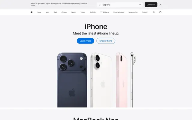
Sections typically occupy full width. Headlines in SF Pro Display (e.g., 56px, weight 600) on Canvas White (#f5f5f7). Often features large product imagery directly below the headline, with minimal padding.
Transparent background (rgba(0, 0, 0, 0)), 0px border-radius, no box shadow. Content is typically full-bleed within the card area, often with unique background colors or imagery as seen in Apple TV content blocks.
Typically uses a light background (e.g., #e2e2e5), with Midnight Graphite text and a simple underline border when active. Focus state indicated by Interactive Blue (#2997ff) border or glow. Padding 8px.
Guidelines
- Prioritize SF Pro Display for headlines (21px and up) with its specific letter spacing and 'numr' feature for numeral alignment.
- Use SF Pro Text for all body copy, UI labels, and navigation elements, leveraging different weights for hierarchy (e.g., 300 for captions, 400 for body, 600 for important labels).
- Apply 980px border-radius for all primary and secondary buttons, ensuring a consistent pill-shape aesthetic.
- Utilize Interactive Blue (#0071e3) as the default background for interactive elements and Action Blue (#0066cc) for link text.
- Maintain a clear visual hierarchy using the neutral color scale: Midnight Graphite (#1d1d1f) for primary text, Deep Gray (#333333) for secondary, and Medium Gray (#707070) for tertiary.
- Frame product imagery tightly, allowing the product to be the central visual element without excessive padding or decorative borders.
- Implement the 10px element gap for consistent vertical spacing between UI items and 15px card padding where applicable for internal content.
- Avoid using harsh drop shadows; instead, suggest elevation through subtle background color shifts (e.g., Canvas White to Pure White) and a very light box-shadow like rgba(0, 0, 0, 0.22) 3px 5px 30px 0px for images.
- Do not deviate from the established pill-shape radius for buttons; rounded rectangles or sharp corners are reserved for specific components like image containers (8px).
- Refrain from using heavily saturated colors for backgrounds unless it is a specific accent area or product showcase as defined by the accent palette.
- Do not introduce decorative borders or heavy strokes around primary content blocks or cards; opt for clean edges or subtle background shifts.
- Avoid excessive letter spacing on body or caption text; maintain the precise, optically balanced tracking values defined in the typography section.
- Do not use generic system default link styles; ensure all links use Action Blue (#0066cc) and inherit SF Pro Text styling.
- Do not introduce extraneous visual elements that compete with product imagery; the UI should be understated and serve to highlight the content.
About this system
ShowHide
The Apple design system exudes a precise, almost ethereal clarity, like a perfectly polished lens focusing on content. Impeccable kerning and tracking, especially in headlines, create an understated authority. A subtle hierarchy of grays defines surfaces without heavy shadows, anchored by a vibrant yet contained blue for interaction. Product imagery is the hero, framed by minimal UI that gets out of the way.
The page primarily employs a max-width contained layout, though specific hero sections and content blocks can extend full-bleed. The hero pattern prominently features a centered headline over a background that shifts between the dominant light mode or product imagery. Sections maintain a consistent vertical rhythm, with ample Canvas White space between distinct content blocks. Content is typically arranged in centered stacks, often with large product images dominating the visual field, followed by explanatory text. Some sections utilize a two-column layout for text and imagery or multi-column grids for featured products and content. The layout emphasizes spaciousness, ensuring each product or content block has visual breathing room. A sticky top navigation bar provides global access to main categories.
The imagery system is product-centric and highly polished. Photography primarily features isolated product shots on clean white backgrounds, often at slightly varied angles or in different colors, making the product the singular focus. There is a strong absence of lifestyle or abstract photography. Iconography is monochromatic, usually in Midnight Graphite or True Black, with a fine stroke weight, integrating seamlessly into the minimalist UI. Graphic elements, when present (e.g., for Apple TV previews), use vibrant, full-color treatments within contained sections, acting as self-contained visual narratives.
Reminiscent of Google, Samsung, Microsoft, Linear.
# Apple — Style Reference
> Polished lens on innovation — clear, precise, and understated.

**Theme:** light

**Site:** https://apple.com

The Apple design system exudes a precise, almost ethereal clarity, like a perfectly polished lens focusing on content. Impeccable kerning and tracking, especially in headlines, create an understated authority. A subtle hierarchy of grays defines surfaces without heavy shadows, anchored by a vibrant yet contained blue for interaction. Product imagery is the hero, framed by minimal UI that gets out of the way.

## Tokens — Colors

| Name | Value | Token | Role |
|------|------|------|------|
| Interactive Blue | `#0071e3` | `--color-interactive-blue` | Primary interactive element background, such as filled buttons and focus rings. A vivid, clear blue that signifies action. |
| Action Blue | `#0066cc` | `--color-action-blue` | Link color for interactive text and outline buttons. Slightly darker than Interactive Blue for text hierarchy. |
| Sky Blue Highlight | `#2997ff` | `--color-sky-blue-highlight` | Vivid blue for interactive states, highlighting links, buttons, and other active elements. Creates a bright, inviting focus. |
| Cerulean Shine | `#3397d4` | `--color-cerulean-shine` | Secondary accent color, used in specific graphic elements or backgrounds to provide visual variation. |
| Pale Blue Overlay | `#9fc6f4` | `--color-pale-blue-overlay` | Muted background for specific content sections, providing a soft color block. |
| Vibrant Orange | `#ec893c` | `--color-vibrant-orange` | Accent color for specific products or promotional blocks, providing a warm, energetic contrast. |
| Deep Plum | `#7424b5` | `--color-deep-plum` | Accent color for distinct content blocks, especially in content-rich sections like Apple TV. |
| Blush Pink | `#ea33c0` | `--color-blush-pink` | Accent color for branding specific products or content categories, often in playful, illustrative contexts. |
| Warm Taupe | `#604630` | `--color-warm-taupe` | Contextual background color, likely for specific product displays or themed sections. |
| Midnight Graphite | `#1d1d1f` | `--color-midnight-graphite` | Primary text, headline text, glyphs, and navigation elements. Near-black for maximum contrast on light backgrounds. |
| Deep Gray | `#333333` | `--color-deep-gray` | Secondary text and navigation elements, slightly softer than primary text. |
| Charcoal Grey | `#474747` | `--color-charcoal-grey` | Link text and navigation link text, indicating interactive elements. |
| Medium Gray | `#707070` | `--color-medium-gray` | Tertiary text, footer text, and subtle UI elements. Softer body copy. |
| Light Gray | `#858585` | `--color-light-gray` | Muted text for less prominent information, icon fills. |
| Light Silver | `#c7c7c7` | `--color-light-silver` | Subtle image box shadows, creating depth without heavy obscuration. |
| Border Silver | `#d6d6d6` | `--color-border-silver` | Thin, crisp border lines for UI separation. |
| Lightest Gray Background | `#e2e2e5` | `--color-lightest-gray-background` | Subtle background for UI components, hinting at separation. |
| Canvas White | `#f5f5f7` | `--color-canvas-white` | Dominant page background, primary canvas for content. The foundational light surface. |
| Pure White | `#ffffff` | `--color-pure-white` | Elevated UI elements, such as navigation backgrounds or contained content blocks, contrasting subtly with the primary canvas. |
| True Black | `#000000` | `--color-true-black` | Icon fills and occasional headline accents, providing maximum visual punch where needed. |

## Tokens — Typography

### SF Pro Text
- **Substitute:** system-ui
- **Weights:** 300, 400, 600
- **Sizes:** 12px, 14px, 17px, 18px, 24px, 26px, 34px, 44px
- **Line height:** 1, 1.18, 1.24, 1.29, 1.33, 1.47, 1.5, 2.12, 2.41
- **Letter spacing:** -0.26, -0.24, -0.22, -0.19, -0.18, -0.15
- **Role:** Primary typeface for body text, UI labels, buttons, navigation, and footer content. Its wide range of weights and optical sizing ensures clarity across all scales. The light weights maintain an airy feel, while regular and semi-bold provide structure.

### SF Pro Display
- **Substitute:** system-ui
- **Weights:** 400, 600, 700
- **Sizes:** 21px, 28px, 40px, 56px
- **Line height:** 1.07, 1.1, 1.14, 1.19
- **Letter spacing:** -0.28, 0.29, 0.44
- **Role:** Used for headlines and display-sized text. Optically calibrated for larger sizes, ensuring tight kerning and legibility. The 'numr' feature enforces numeral alignment, maintaining a consistent grid for numbers in headlines.

## Tokens — Type Scale

Minor Third (1.2) from 12px base.

| Role | Size | Line height | Letter spacing |
|------|------|------|------|
| caption | 12px | 1.5 | -0.15px |
| body-sm | 14px | 1.47 | -0.18px |
| subheading | 18px | 1.24 | -0.22px |
| callout | 21px | 1.19 | -0.28px |
| heading-sm | 24px | 1.33 | -0.24px |
| heading-lg | 28px | 1.14 | 0.29px |
| display-xl | 34px | 1 | -0.1px |
| display-xxl | 40px | 1.1 | 0.44px |
| display-giant | 44px | 2.12 | — |
| display | 56px | 1.07 | -0.28px |

## Tokens — Spacing

- **Section gap:** 70px
- **Card padding:** 15px
- **Element gap:** 10px

## Tokens — Radius

- **Buttons:** 980px
- **Inputs:** 0px
- **Cards:** 0px
- **Images:** 8px
- **lists:** 999px

## Tokens — Elevation

- **Product Image Card:** `rgba(0, 0, 0, 0.22) 3px 5px 30px 0px`

## Layout

The page primarily employs a max-width contained layout, though specific hero sections and content blocks can extend full-bleed. The hero pattern prominently features a centered headline over a background that shifts between the dominant light mode or product imagery. Sections maintain a consistent vertical rhythm, with ample Canvas White space between distinct content blocks. Content is typically arranged in centered stacks, often with large product images dominating the visual field, followed by explanatory text. Some sections utilize a two-column layout for text and imagery or multi-column grids for featured products and content. The layout emphasizes spaciousness, ensuring each product or content block has visual breathing room. A sticky top navigation bar provides global access to main categories.

## Imagery

The imagery system is product-centric and highly polished. Photography primarily features isolated product shots on clean white backgrounds, often at slightly varied angles or in different colors, making the product the singular focus. There is a strong absence of lifestyle or abstract photography. Iconography is monochromatic, usually in Midnight Graphite or True Black, with a fine stroke weight, integrating seamlessly into the minimalist UI. Graphic elements, when present (e.g., for Apple TV previews), use vibrant, full-color treatments within contained sections, acting as self-contained visual narratives.

## Components

### Primary Filled Button
*Call to action*

Solid Interactive Blue background (#0071e3) with Pure White text (#ffffff), featuring a prominent 980px pill-shape radius. Padding of 11px vertical and 21px horizontal creates a generous, tappable area.

### Outline Link Button
*Secondary action or navigation*

Transparent background (rgba(0, 0, 0, 0)) with Action Blue text (#0066cc) and a matching text-color border (rgb(0, 102, 204)). Uses the same 980px pill radius as the primary button with 11px vertical and 21px horizontal padding.

### Text Link Button
*Tertiary action, inline navigation*

Transparent background with Midnight Graphite text (#1d1d1f). No explicit border or radius. Padding of 0px for compact inline use. Used for subtle interactions like 'Shop iPhone' next to a primary CTA.

### Unstyled Text Button
*Minimal interactive element for dense UI*

Transparent background with rgba(0, 0, 0, 0.8) text. No explicit border, 0px radius, and 0px padding. Used in headers or inline for actions that don't need strong visual emphasis.

### Navigation Link
*Global navigation item*

Transparent background and Midnight Graphite text (#1d1d1f), 0px radius. Varied padding, typically 8px, with 4px left margin on some items for horizontal spacing.

### Product Section Hero
*Main product introduction*

Sections typically occupy full width. Headlines in SF Pro Display (e.g., 56px, weight 600) on Canvas White (#f5f5f7). Often features large product imagery directly below the headline, with minimal padding.

### Featured Content Card
*Showcasing media or specific products*

Transparent background (rgba(0, 0, 0, 0)), 0px border-radius, no box shadow. Content is typically full-bleed within the card area, often with unique background colors or imagery as seen in Apple TV content blocks.

### Interactive Dropdown/Input
*User input or selection*

Typically uses a light background (e.g., #e2e2e5), with Midnight Graphite text and a simple underline border when active. Focus state indicated by Interactive Blue (#2997ff) border or glow. Padding 8px.

## Guidelines

### Do

- Prioritize SF Pro Display for headlines (21px and up) with its specific letter spacing and 'numr' feature for numeral alignment.
- Use SF Pro Text for all body copy, UI labels, and navigation elements, leveraging different weights for hierarchy (e.g., 300 for captions, 400 for body, 600 for important labels).
- Apply 980px border-radius for all primary and secondary buttons, ensuring a consistent pill-shape aesthetic.
- Utilize Interactive Blue (#0071e3) as the default background for interactive elements and Action Blue (#0066cc) for link text.
- Maintain a clear visual hierarchy using the neutral color scale: Midnight Graphite (#1d1d1f) for primary text, Deep Gray (#333333) for secondary, and Medium Gray (#707070) for tertiary.
- Frame product imagery tightly, allowing the product to be the central visual element without excessive padding or decorative borders.
- Implement the 10px element gap for consistent vertical spacing between UI items and 15px card padding where applicable for internal content.

### Don't

- Avoid using harsh drop shadows; instead, suggest elevation through subtle background color shifts (e.g., Canvas White to Pure White) and a very light box-shadow like rgba(0, 0, 0, 0.22) 3px 5px 30px 0px for images.
- Do not deviate from the established pill-shape radius for buttons; rounded rectangles or sharp corners are reserved for specific components like image containers (8px).
- Refrain from using heavily saturated colors for backgrounds unless it is a specific accent area or product showcase as defined by the accent palette.
- Do not introduce decorative borders or heavy strokes around primary content blocks or cards; opt for clean edges or subtle background shifts.
- Avoid excessive letter spacing on body or caption text; maintain the precise, optically balanced tracking values defined in the typography section.
- Do not use generic system default link styles; ensure all links use Action Blue (#0066cc) and inherit SF Pro Text styling.
- Do not introduce extraneous visual elements that compete with product imagery; the UI should be understated and serve to highlight the content.

## Agent Prompt Guide

Quick Color Reference:
- Text Primary: #1d1d1f (Midnight Graphite)
- Background Canvas: #f5f5f7 (Canvas White)
- Call To Action: #0071e3 (Interactive Blue)
- Border/Divider: #d6d6d6 (Border Silver)
- Link/Outline Button: #0066cc (Action Blue)

Example Component Prompts:
1. Create a hero section: Canvas White background (#f5f5f7). Headline 'iPhone' at 56px SF Pro Display weight 600, #1d1d1f, letter-spacing -0.28px. Subhead 'Meet the latest iPhone lineup.' at 24px SF Pro Text weight 400, #1d1d1f, letter-spacing -0.24px. Stack with two buttons: 'Learn more' (Primary Filled Button) and 'Shop iPhone' (Outline Link Button), with 10px element gap. Product image occupies the bottom half of the screen.
2. Design a navigation bar: Pure White background (#ffffff). Main navigation links (e.g., 'iPhone', 'Mac') at 14px SF Pro Text weight 400, #1d1d1f, with 8px horizontal padding and 4px left margin. Apple logo icon #000000. Right-aligned search and bag icons in #1d1d1f.
3. Create a secondary content block: Pale Blue Overlay background (#9fc6f4). Headline 'iPad air' at 40px SF Pro Display weight 600, #1d1d1f, letter-spacing 0.44px. Subtitle 'Now supercharged by M4.' at 24px SF Pro Text weight 400, #1d1d1f, letter-spacing -0.24px. Centered. Below, a 'Learn more' (Primary Filled Button) and 'Buy' (Outline Link Button) with 10px element gap.
More like this








Keep what you find
A free account saves references to boards and can send you a weekly email of picks based on what you save.
To see every result, go Pro.