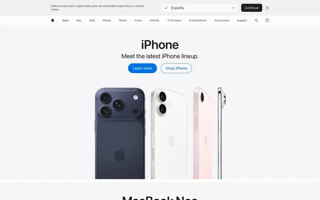
Preview image. Unlock full-res
Gallery White Precision
Color palette
Call-to-action buttons, active states, and focus indicators — the primary interactive accent.
Body text links and ghost button borders, providing a distinct interactive cue.
Hover states for links and icons, offering a brighter, more vivid interactive feedback.
Global page background, default surface.
Secondary background color for sections and footers, creating subtle elevation shifts.
Primary text color for headlines, body copy, and most interactive elements, providing high contrast against light backgrounds.
Secondary text color for descriptive text, muted navigation items, and less prominent information.
Iconography, strong dividers, and occasionally for high-emphasis headings or links.
Observed in other fill, button color, other backgroundColor. Extracted usage does not support a distinct primary control color.
Subtle borders and dividers, indicating UI separation without being visually heavy.
Typography
- Weights
- 700
- Sizes
- 21px, 28px, 40px, 56px
- Line height
- 1.07, 1.1, 1.14, 1.19
- Letter spacing
- -0.56
- Fallback
- system-ui
Prominent display headings, imparting significance with precise tracking.
- Weights
- 400
- Sizes
- 21px, 28px, 40px, 56px
- Line height
- 1.07, 1.1, 1.14, 1.19
- Letter spacing
- 0.29
- Fallback
- system-ui
Large headings and critical product names, balancing legibility with visual impact.
- Weights
- 600
- Sizes
- 12px, 14px, 17px, 18px, 24px, 26px, 34px, 44px
- Line height
- 1, 1.18, 1.24, 1.29, 1.33, 1.47, 1.5, 2.12, 2.41
- Letter spacing
- -0.05
- Fallback
- system-ui
Section titles, subheadings, and emphasized text segments, providing structural hierarchy with minimal weight.
- Weights
- 400
- Sizes
- 12px, 14px, 17px, 18px, 24px, 26px, 34px, 44px
- Line height
- 1, 1.18, 1.24, 1.29, 1.33, 1.47, 1.5, 2.12, 2.41
- Letter spacing
- -0.05
- Fallback
- system-ui
Standard body text, descriptive labels, and form inputs, optimized for reading at various sizes.
- Weights
- 300
- Sizes
- 12px, 14px, 17px, 18px, 24px, 26px, 34px, 44px
- Line height
- 1, 1.18, 1.24, 1.29, 1.33, 1.47, 1.5, 2.12, 2.41
- Letter spacing
- -0.05
- Fallback
- system-ui
Fine print, legal disclaimers, and secondary metadata, maintaining legibility at small sizes.
Spacing & shape
Components
Solid Electric Blue background (#0071e3) with Canvas White text, featuring a 'pill' shape with 980px border-radius and 11px vertical, 21px horizontal padding.
Transparent background with Link Blue text (#0066cc), rounded with a 980px border-radius and 11px vertical, 21px horizontal padding.
Transparent background with Graphite text (#1d1d1f), no border-radius (0px), and no explicit padding, relying on inherent text spacing for interaction.
Subtle Frost background (#f4f8fb) with Graphite text (#1d1d1f), slightly rounded with an 11px border-radius, and 0px vertical, 14px horizontal padding.
Transparent background with 0px border-radius and no box shadow, designed to house content seamlessly within the layout without explicit visual framing. Padding is 0px.
Transparent background with 0px border-radius, featuring a subtle shadow (rgba(0, 0, 0, 0.22) 3px 5px 30px 0px) for depth, typically containing product imagery.
Transparent background with Graphite text (#1d1d1f) at SF Pro Text Regular 12px, with generous 8px vertical padding and 0px horizontal padding, to allow ample tap target.
Graphite text (#1d1d1f) at SF Pro Text Semibold 12px, providing clear categorization within the footer with a 5px top margin.
Guidelines
- Use Electric Blue (#0071e3) exclusively for primary call-to-action buttons to maintain visual focus.
- Apply 980px border-radius to all interactive buttons for a consistent rounded aesthetic.
- Prioritize SF Pro Display for large, impactful headlines, using its specific letter spacing values like -0.56px at 56px.
- Maintain a clear visual hierarchy with Graphite (#1d1d1f) for main text and Cool Gray (#707070) for secondary information.
- Use Canvas White (#ffffff) as the dominant background color to ensure a bright and expansive feel.
- Separate content sections with subtle background shifts to Porcelain (#f5f5f7), rather than heavy dividers or shadows.
- Ensure a horizontal padding of 21px for all primary action buttons for comfortable sizing.
- Do not use saturated blues for non-interactive elements; reserve them for direct user engagement.
- Avoid using custom shadows or borders on standard content cards, as they are meant to be seamless.
- Do not vary letter spacing for body text; maintain the specified SF Pro Text tracking values for legibility.
- Refrain from using color to indicate states like success or error; rely on iconography or structured messaging instead.
- Do not introduce additional font families; adhere strictly to SF Pro Text and SF Pro Display.
- Avoid small, precise radii (e.g., 4px) for interactive elements; stick to the highly rounded 980px for buttons or 11px for contained inputs.
- Never use excessive decorative elements or heavy gradients that would detract from the clean, systematic aesthetic.
About this system
ShowHide
Apple's design system feels like precision engineering in a luminous white gallery. The interplay of crisp neutrals establishes a bright, expansive canvas, punctuated by a vibrant, yet restrained, blue as the sole chromatic accent. Sharp typography with subtle letter spacing and generous negative space conveys a sense of curated order, while highly rounded button capsules provide a soft, approachable contrast to the otherwise rigorous structure.
The page structure uses a contained, centered layout for most content, with a max-width for textual information, but product showcase sections frequently break out into full-bleed photography. The hero section often combines a centered headline with full-width product imagery. Section rhythm is created through alternating a base Canvas White (#ffffff) with Porcelain (#f5f5f7) background bands, maintaining consistent vertical spacing. Content is primarily arranged in single-column stacks for main headlines and descriptive text, often transitioning to a two-column text-left/image-right or image-left/text-right pattern for feature presentations. Navigation is a sticky top bar with clearly segmented product categories and utility icons on the far right.
The visual language predominantly features high-quality product photography, often isolated on pure white or light grey backgrounds to showcase detail without distraction. Photography is usually full-bleed across sections to immerse the user. Iconography is monochromatic and minimalist, often thin-stroked, serving as UI enhancers rather than decorative elements. The overall impression is one of product-focused clarity and premium presentation, conveying a sense of aspiration and innovation through the products themselves.
Reminiscent of Google, Stripe, Figma.
# Apple — Style Reference
> Gallery White Precision

**Theme:** light

**Site:** https://www.apple.com

Apple's design system feels like precision engineering in a luminous white gallery. The interplay of crisp neutrals establishes a bright, expansive canvas, punctuated by a vibrant, yet restrained, blue as the sole chromatic accent. Sharp typography with subtle letter spacing and generous negative space conveys a sense of curated order, while highly rounded button capsules provide a soft, approachable contrast to the otherwise rigorous structure.

## Tokens — Colors

| Name | Value | Token | Role |
|------|------|------|------|
| Electric Blue | `#0071e3` | `--color-electric-blue` | Call-to-action buttons, active states, and focus indicators — the primary interactive accent. |
| Link Blue | `#0066cc` | `--color-link-blue` | Body text links and ghost button borders, providing a distinct interactive cue. |
| Highlight Blue | `#2997ff` | `--color-highlight-blue` | Hover states for links and icons, offering a brighter, more vivid interactive feedback. |
| Canvas White | `#ffffff` | `--color-canvas-white` | Global page background, default surface. |
| Porcelain | `#f5f5f7` | `--color-porcelain` | Secondary background color for sections and footers, creating subtle elevation shifts. |
| Graphite | `#1d1d1f` | `--color-graphite` | Primary text color for headlines, body copy, and most interactive elements, providing high contrast against light backgrounds. |
| Cool Gray | `#707070` | `--color-cool-gray` | Secondary text color for descriptive text, muted navigation items, and less prominent information. |
| Charcoal Black | `#000000` | `--color-charcoal-black` | Iconography, strong dividers, and occasionally for high-emphasis headings or links. |
| Subtle Frost | `#f4f8fb` | `--color-subtle-frost` | Observed in other fill, button color, other backgroundColor. Extracted usage does not support a distinct primary control color. |
| Border Gray | `#e2e2e5` | `--color-border-gray` | Subtle borders and dividers, indicating UI separation without being visually heavy. |

## Tokens — Typography

### SF Pro Display
- **Substitute:** system-ui
- **Weights:** 700
- **Sizes:** 21px, 28px, 40px, 56px
- **Line height:** 1.07, 1.1, 1.14, 1.19
- **Letter spacing:** -0.56
- **Role:** Prominent display headings, imparting significance with precise tracking.

### SF Pro Display
- **Substitute:** system-ui
- **Weights:** 400
- **Sizes:** 21px, 28px, 40px, 56px
- **Line height:** 1.07, 1.1, 1.14, 1.19
- **Letter spacing:** 0.29
- **Role:** Large headings and critical product names, balancing legibility with visual impact.

### SF Pro Text
- **Substitute:** system-ui
- **Weights:** 600
- **Sizes:** 12px, 14px, 17px, 18px, 24px, 26px, 34px, 44px
- **Line height:** 1, 1.18, 1.24, 1.29, 1.33, 1.47, 1.5, 2.12, 2.41
- **Letter spacing:** -0.05
- **Role:** Section titles, subheadings, and emphasized text segments, providing structural hierarchy with minimal weight.

### SF Pro Text
- **Substitute:** system-ui
- **Weights:** 400
- **Sizes:** 12px, 14px, 17px, 18px, 24px, 26px, 34px, 44px
- **Line height:** 1, 1.18, 1.24, 1.29, 1.33, 1.47, 1.5, 2.12, 2.41
- **Letter spacing:** -0.05
- **Role:** Standard body text, descriptive labels, and form inputs, optimized for reading at various sizes.

### SF Pro Text
- **Substitute:** system-ui
- **Weights:** 300
- **Sizes:** 12px, 14px, 17px, 18px, 24px, 26px, 34px, 44px
- **Line height:** 1, 1.18, 1.24, 1.29, 1.33, 1.47, 1.5, 2.12, 2.41
- **Letter spacing:** -0.05
- **Role:** Fine print, legal disclaimers, and secondary metadata, maintaining legibility at small sizes.

## Tokens — Type Scale

Perfect Fourth (1.333) from 12px base.

| Role | Size | Line height | Letter spacing |
|------|------|------|------|
| caption | 12px | 2.41 | -0.13px |
| body-sm | 14px | 1.29 | -0.19px |
| subheading | 18px | 1.33 | -0.18px |
| heading | 24px | 1.19 | -0.26px |
| heading-lg | 40px | 1.1 | 0.44px |
| display | 56px | 1.07 | -0.56px |

## Tokens — Spacing

- **Section gap:** 70-114px
- **Card padding:** 15px
- **Element gap:** 10px

## Tokens — Radius

- **Buttons:** 980px
- **Cards:** 0px
- **formElements:** 11px
- **tags:** 999px

## Layout

The page structure uses a contained, centered layout for most content, with a max-width for textual information, but product showcase sections frequently break out into full-bleed photography. The hero section often combines a centered headline with full-width product imagery. Section rhythm is created through alternating a base Canvas White (#ffffff) with Porcelain (#f5f5f7) background bands, maintaining consistent vertical spacing. Content is primarily arranged in single-column stacks for main headlines and descriptive text, often transitioning to a two-column text-left/image-right or image-left/text-right pattern for feature presentations. Navigation is a sticky top bar with clearly segmented product categories and utility icons on the far right.

## Imagery

The visual language predominantly features high-quality product photography, often isolated on pure white or light grey backgrounds to showcase detail without distraction. Photography is usually full-bleed across sections to immerse the user. Iconography is monochromatic and minimalist, often thin-stroked, serving as UI enhancers rather than decorative elements. The overall impression is one of product-focused clarity and premium presentation, conveying a sense of aspiration and innovation through the products themselves.

## Components

### Primary Filled Button
*Call to action button*

Solid Electric Blue background (#0071e3) with Canvas White text, featuring a 'pill' shape with 980px border-radius and 11px vertical, 21px horizontal padding.

### Ghost Button - Blue Text
*Secondary action button*

Transparent background with Link Blue text (#0066cc), rounded with a 980px border-radius and 11px vertical, 21px horizontal padding.

### Default Header Button
*Navigation button*

Transparent background with Graphite text (#1d1d1f), no border-radius (0px), and no explicit padding, relying on inherent text spacing for interaction.

### Region Selector Button
*Informational button*

Subtle Frost background (#f4f8fb) with Graphite text (#1d1d1f), slightly rounded with an 11px border-radius, and 0px vertical, 14px horizontal padding.

### Standard Content Card
*Content container*

Transparent background with 0px border-radius and no box shadow, designed to house content seamlessly within the layout without explicit visual framing. Padding is 0px.

### Elevated Image Card
*Promotional content card*

Transparent background with 0px border-radius, featuring a subtle shadow (rgba(0, 0, 0, 0.22) 3px 5px 30px 0px) for depth, typically containing product imagery.

### Top Navigation Link
*Primary navigation item*

Transparent background with Graphite text (#1d1d1f) at SF Pro Text Regular 12px, with generous 8px vertical padding and 0px horizontal padding, to allow ample tap target.

### Footer Section Heading
*Information architecture heading*

Graphite text (#1d1d1f) at SF Pro Text Semibold 12px, providing clear categorization within the footer with a 5px top margin.

## Guidelines

### Do

- Use Electric Blue (#0071e3) exclusively for primary call-to-action buttons to maintain visual focus.
- Apply 980px border-radius to all interactive buttons for a consistent rounded aesthetic.
- Prioritize SF Pro Display for large, impactful headlines, using its specific letter spacing values like -0.56px at 56px.
- Maintain a clear visual hierarchy with Graphite (#1d1d1f) for main text and Cool Gray (#707070) for secondary information.
- Use Canvas White (#ffffff) as the dominant background color to ensure a bright and expansive feel.
- Separate content sections with subtle background shifts to Porcelain (#f5f5f7), rather than heavy dividers or shadows.
- Ensure a horizontal padding of 21px for all primary action buttons for comfortable sizing.

### Don't

- Do not use saturated blues for non-interactive elements; reserve them for direct user engagement.
- Avoid using custom shadows or borders on standard content cards, as they are meant to be seamless.
- Do not vary letter spacing for body text; maintain the specified SF Pro Text tracking values for legibility.
- Refrain from using color to indicate states like success or error; rely on iconography or structured messaging instead.
- Do not introduce additional font families; adhere strictly to SF Pro Text and SF Pro Display.
- Avoid small, precise radii (e.g., 4px) for interactive elements; stick to the highly rounded 980px for buttons or 11px for contained inputs.
- Never use excessive decorative elements or heavy gradients that would detract from the clean, systematic aesthetic.

## Agent Prompt Guide

primary action: #0071e3 (filled action)
Create a Primary Action Button: #0071e3 background, #f4f8fb text, 9999px radius, compact pill padding. Use this filled treatment for the main CTA.
More like this








Keep what you find
A free account saves references to boards and can send you a weekly email of picks based on what you save.
To see every result, go Pro.