Preview image. Unlock full-res
Minimalist gallery canvas
Color palette
Links, outlined interactive elements — provides functional distinction without strong visual hierarchy
Page backgrounds, elevated card surfaces, primary input fields
Primary text, headings, strong borders, interactive elements
Subtle background for footer sections
Placeholder text in input fields, secondary body text
Typography
- Weights
- 400, 500, 700
- Sizes
- 12px, 13px, 14px, 16px, 18px, 30px
- Line height
- 1.1, 1.2, 1.3, 1.5
- Letter spacing
- 0.01em-0.04em
- Fallback
- system-ui
Primary typeface for all headings, body text, navigation, and interface elements. Its neutrality allows content to take precedence, with varied letter-spacing adding subtle emphasis where needed.
- Weights
- 400
- Sizes
- 14px
- Line height
- 1.2
- Letter spacing
- normal
- Fallback
- Arial, Helvetica, sans-serif
Used for specific body text scenarios, likely as a fallback or for specific small text applications where system fonts are preferred.
- Weights
- 300, 700
- Sizes
- 12px
- Line height
- 1.2
- Letter spacing
- normal
- Fallback
- system-ui
Specialized usage for specific labels or input fields, its varied weights provide granular control for small, technical text while maintaining overall typographic harmony.
- Weights
- 400
- Sizes
- 16px
- Line height
- 1.5
- Letter spacing
- normal
- Fallback
- system-ui
Likely used for specific informational text blocks or decorative elements, providing a consistent body text size.
- Weights
- 700
- Sizes
- 24px
- Line height
- 1
- Letter spacing
- normal
- Fallback
- system-ui
Used for standout button text, its strong weight and larger size draw attention to calls to action within a generally understated typographic landscape.
- Weights
- 400, 500
- Sizes
- 12px, 13px
- Line height
- 1.2
Founder’s Grotesk — detected in extracted data but not described by AI
Spacing & shape
Components
Used in header and navigation. Text color Ink (#000000), transparent background with no border. Text is typically 12-14px Founders Grotesk, weight 400.
Used in header/footer on dark backgrounds. Text color Canvas White (#ffffff), transparent background. Text is typically 12-14px Founders Grotesk, weight 400.
Minimalist input field, transparent background, text color Canvas White (#ffffff), with a bottom border of Canvas White (#ffffff). Padding is 11px vertical. Placeholder text is Muted Stone (#696159).
Text in Interaction Azure (#0066cc), with a matching 1px bottom border. Used for discrete internal links like 'Privacy Policy'.
Circular button with Ink (#000000) text on a transparent background, radius 50% for a perfect circle. Used for search or similar icons.
Text in Ink (#000000) on Canvas White (#ffffff) background, with 10px horizontal padding. No border and 0px radius, indicating an interactive element within a card or section.
Text in Interaction Azure (#0066cc) with a matching 1px solid border bottom. Provides navigational emphasis without a full button shape.
Guidelines
- Prioritize Ink (#000000) for all primary text and Canvas White (#ffffff) for backgrounds to maintain a clean, high-contrast aesthetic.
- Use Founders Grotesk for all primary typographic elements, adjusting letter-spacing by 0.01em or 0.04em to create subtle variations in emphasis.
- Apply 0px border-radius to interactive buttons unless a perfect circle is intended, favoring sharp edges for UI elements.
- Utilize 40px as the standard vertical separation between major content sections.
- When a distinct call to action is required, use Interaction Azure (#0066cc) for text and outline, avoiding solid colored backgrounds for interactive elements.
- Maintain comfortable density using 8px as the base unit for element gaps, ensuring consistent spacing between components.
- Employ Soft Gray (#746c6c) exclusively for placeholder text within input fields, differentiating it from active input.
- Avoid arbitrary color usage; retain the minimalist achromatic palette with Interaction Azure (#0066cc) as the sole accent color.
- Do not use heavy shadows or gradients; rely on contrast and spacing to define UI hierarchy.
- Refrain from mixing fonts excessively; Founders Grotesk should dominate, with highly limited use of others for specific technical purposes.
- Do not break the 0px radius rule for primary buttons; rounded corners are a specific stylistic departure from this system.
- Avoid dense, information-heavy blocks; ensure generous use of whitespace with a comfortable density strategy.
- Do not introduce strong visual metaphors or decorative elements that disrupt the clean, gallery-like canvas.
- Do not use filled buttons as primary actions; always prefer outlined or text links with Interaction Azure (#0066cc) for emphasis.
About this system
ShowHide
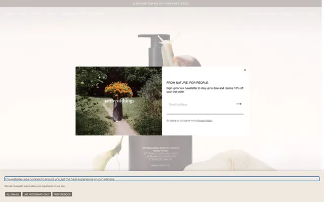
natureofthings uses a quiet luxury aesthetic, built on a foundation of clean achromatic grays and whites. Typography is compact and precise, using Founders Grotesk for most content, often with elevated letter-spacing. Interaction is primarily driven by subtle outline changes and text underlines, with a single muted blue providing unobtrusive functional contrast without disrupting the monochrome canvas.
The page maintains a centered, max-width contained layout, though specific sections may extend full-bleed. The hero section often features a centered headline over a background image or a clean product shot. Content proceeds with consistent vertical spacing, often alternating between text-left/image-right sections and centered text blocks. Card grids, like for product categories, are present but not overly dense. Navigation is handled by a discreet top bar that may become sticky, providing a minimalist browsing experience that prioritizes content.
Imagery primarily features product shots or carefully composed art-direction photography. Product shots are typically clean, isolated items presented on a white or light gray background. Lifestyle photography embeds products or abstract elements within natural, often muted-tone, outdoor settings, offering a sense of calm and organic origin. Images are usually contained within rectangular bounds, without overlapping elements, and serve as decorative atmosphere or product showcase. Icons, when present, are simple, outlined, and monochromatic, maintaining the understated aesthetic. The overall image density is moderate, carefully balanced with text to create a feeling of spaciousness.
Reminiscent of Aesop, Glossier, Byredo.
# natureofthings — Style Reference
> Minimalist gallery canvas

**Theme:** light

**Site:** https://natureofthings.com

natureofthings uses a quiet luxury aesthetic, built on a foundation of clean achromatic grays and whites. Typography is compact and precise, using Founders Grotesk for most content, often with elevated letter-spacing. Interaction is primarily driven by subtle outline changes and text underlines, with a single muted blue providing unobtrusive functional contrast without disrupting the monochrome canvas.

## Tokens — Colors

| Name | Value | Token | Role |
|------|------|------|------|
| Interaction Azure | `#0066cc` | `--color-interaction-azure` | Links, outlined interactive elements — provides functional distinction without strong visual hierarchy |
| Canvas White | `#ffffff` | `--color-canvas-white` | Page backgrounds, elevated card surfaces, primary input fields |
| Ink | `#000000` | `--color-ink` | Primary text, headings, strong borders, interactive elements |
| Muted Stone | `#696159` | `--color-muted-stone` | Subtle background for footer sections |
| Soft Gray | `#746c6c` | `--color-soft-gray` | Placeholder text in input fields, secondary body text |

## Tokens — Typography

### Founders Grotesk
- **Substitute:** system-ui
- **Weights:** 400, 500, 700
- **Sizes:** 12px, 13px, 14px, 16px, 18px, 30px
- **Line height:** 1.1, 1.2, 1.3, 1.5
- **Letter spacing:** 0.01em-0.04em
- **Role:** Primary typeface for all headings, body text, navigation, and interface elements. Its neutrality allows content to take precedence, with varied letter-spacing adding subtle emphasis where needed.

### Arial
- **Substitute:** Arial, Helvetica, sans-serif
- **Weights:** 400
- **Sizes:** 14px
- **Line height:** 1.2
- **Letter spacing:** normal
- **Role:** Used for specific body text scenarios, likely as a fallback or for specific small text applications where system fonts are preferred.

### Atlas Grotesk
- **Substitute:** system-ui
- **Weights:** 300, 700
- **Sizes:** 12px
- **Line height:** 1.2
- **Letter spacing:** normal
- **Role:** Specialized usage for specific labels or input fields, its varied weights provide granular control for small, technical text while maintaining overall typographic harmony.

### GTStandard-M
- **Substitute:** system-ui
- **Weights:** 400
- **Sizes:** 16px
- **Line height:** 1.5
- **Letter spacing:** normal
- **Role:** Likely used for specific informational text blocks or decorative elements, providing a consistent body text size.

### Poppins
- **Substitute:** system-ui
- **Weights:** 700
- **Sizes:** 24px
- **Line height:** 1
- **Letter spacing:** normal
- **Role:** Used for standout button text, its strong weight and larger size draw attention to calls to action within a generally understated typographic landscape.

### Founder’s Grotesk
- **Weights:** 400, 500
- **Sizes:** 12px, 13px
- **Line height:** 1.2
- **Role:** Founder’s Grotesk — detected in extracted data but not described by AI

## Tokens — Type Scale

Perfect Fourth (1.333) from 14px base.

| Role | Size | Line height | Letter spacing |
|------|------|------|------|
| caption | 12px | 1.1 | 0.12px |
| body | 14px | 1.3 | — |
| heading | 18px | 1.2 | 0.18px |
| display | 30px | 1.1 | 0.3px |

## Tokens — Spacing

- **Section gap:** 40px
- **Card padding:** 16px
- **Element gap:** 8px

## Tokens — Radius

- **Default:** 2px
- **Buttons:** 0px

## Layout

The page maintains a centered, max-width contained layout, though specific sections may extend full-bleed. The hero section often features a centered headline over a background image or a clean product shot. Content proceeds with consistent vertical spacing, often alternating between text-left/image-right sections and centered text blocks. Card grids, like for product categories, are present but not overly dense. Navigation is handled by a discreet top bar that may become sticky, providing a minimalist browsing experience that prioritizes content.

## Imagery

Imagery primarily features product shots or carefully composed art-direction photography. Product shots are typically clean, isolated items presented on a white or light gray background. Lifestyle photography embeds products or abstract elements within natural, often muted-tone, outdoor settings, offering a sense of calm and organic origin. Images are usually contained within rectangular bounds, without overlapping elements, and serve as decorative atmosphere or product showcase. Icons, when present, are simple, outlined, and monochromatic, maintaining the understated aesthetic. The overall image density is moderate, carefully balanced with text to create a feeling of spaciousness.

## Components

### Navigation Link (White)
*Ghost link*

Used in header and navigation. Text color Ink (#000000), transparent background with no border. Text is typically 12-14px Founders Grotesk, weight 400.

### Navigation Link (Dark)
*Ghost link*

Used in header/footer on dark backgrounds. Text color Canvas White (#ffffff), transparent background. Text is typically 12-14px Founders Grotesk, weight 400.

### Input Field (Ghost)
*Data entry*

Minimalist input field, transparent background, text color Canvas White (#ffffff), with a bottom border of Canvas White (#ffffff). Padding is 11px vertical. Placeholder text is Muted Stone (#696159).

### Inline Text Link
*Navigation*

Text in Interaction Azure (#0066cc), with a matching 1px bottom border. Used for discrete internal links like 'Privacy Policy'.

### Search Button
*Icon button*

Circular button with Ink (#000000) text on a transparent background, radius 50% for a perfect circle. Used for search or similar icons.

### Shop All Button
*Ghost button with padding*

Text in Ink (#000000) on Canvas White (#ffffff) background, with 10px horizontal padding. No border and 0px radius, indicating an interactive element within a card or section.

### Privacy Policy Link
*Underlined link*

Text in Interaction Azure (#0066cc) with a matching 1px solid border bottom. Provides navigational emphasis without a full button shape.

## Guidelines

### Do

- Prioritize Ink (#000000) for all primary text and Canvas White (#ffffff) for backgrounds to maintain a clean, high-contrast aesthetic.
- Use Founders Grotesk for all primary typographic elements, adjusting letter-spacing by 0.01em or 0.04em to create subtle variations in emphasis.
- Apply 0px border-radius to interactive buttons unless a perfect circle is intended, favoring sharp edges for UI elements.
- Utilize 40px as the standard vertical separation between major content sections.
- When a distinct call to action is required, use Interaction Azure (#0066cc) for text and outline, avoiding solid colored backgrounds for interactive elements.
- Maintain comfortable density using 8px as the base unit for element gaps, ensuring consistent spacing between components.
- Employ Soft Gray (#746c6c) exclusively for placeholder text within input fields, differentiating it from active input.

### Don't

- Avoid arbitrary color usage; retain the minimalist achromatic palette with Interaction Azure (#0066cc) as the sole accent color.
- Do not use heavy shadows or gradients; rely on contrast and spacing to define UI hierarchy.
- Refrain from mixing fonts excessively; Founders Grotesk should dominate, with highly limited use of others for specific technical purposes.
- Do not break the 0px radius rule for primary buttons; rounded corners are a specific stylistic departure from this system.
- Avoid dense, information-heavy blocks; ensure generous use of whitespace with a comfortable density strategy.
- Do not introduce strong visual metaphors or decorative elements that disrupt the clean, gallery-like canvas.
- Do not use filled buttons as primary actions; always prefer outlined or text links with Interaction Azure (#0066cc) for emphasis.

## Agent Prompt Guide

Quick Color Reference:
text: #000000
background: #ffffff
border: #000000
accent: #0066cc
primary action: #0066cc (outlined action border)

Example Component Prompts:
1. Create an Outlined Primary Action: Transparent background, #0066cc border and text, 9999px radius, compact pill padding. Use it for the main CTA instead of a filled button.
2. Design a minimalist input field: 11px vertical padding, transparent background, Canvas White (#ffffff) text, Soft Gray (#746c6c) placeholder, with a 1px bottom border in Canvas White (#ffffff).
3. Generate a 'Shop All' button: Poppins, 24px, weight 700, Ink (#000000) text, Canvas White (#ffffff) background, 10px horizontal padding, 0px border-radius.
4. Create a footer section background: Muted Stone (#696159) background, Ink (#000000) text, with 40px top and bottom padding.
More like this








Keep what you find
A free account saves references to boards and can send you a weekly email of picks based on what you save.
To see every result, go Pro.