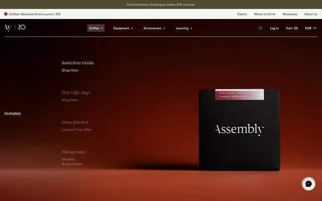
Preview image. Unlock full-res
Shadowy Gallery Vignettes
Color palette
Badge text color and decorative highlights, especially in badge contexts. A rich, warm gold; Decorative gradients often paired with product imagery, hinting at warmth and richness. The primary color is a rich gold
Primary text, deep backgrounds, filled action buttons, subtle borders for interactive elements. This deep black creates a stark, elegant contrast
Primary inverse text, content card backgrounds, input fields, and accents for borders in light contexts
Card backgrounds, secondary iconography, input placeholder text. A softer dark for surface separation on darker backgrounds
Light background wash for contrasting sections, button backgrounds in inverted states
Hairline borders, dividers, input outlines, and card edges on light surfaces. Do not promote it to the primary CTA color
Green state accent for badges, validation surfaces, and short status labels.
Yellow state accent for badges, validation surfaces, and short status labels.
Typography
- Weights
- 300, 400, 500, 600
- Sizes
- 11px, 12px, 13px, 14px, 16px, 18px, 20px, 21px, 24px, 42px
- Line height
- 0.75, 1.2, 1.25, 1.4, 1.5, 2
- Letter spacing
- normal
- Fallback
- system-ui
Primary content font for body text, navigation items, buttons, and most headings. Its clean, modern sans-serif nature provides clarity and a subtle utilitarian feel contrasting with the serif details.
- Weights
- 300, 400
- Sizes
- 16px, 18px, 30px, 36px, 42px
- Line height
- 1, 1.2, 1.25, 1.5
- Letter spacing
- normal
- Fallback
- serif
Signature display font for prominent headings and product titles. Its serif character adds a touch of classic sophistication and artisanal quality, particularly at larger sizes. Weight 300 for headlines implies authority through restraint, not volume.
- Weights
- 400, 500
- Sizes
- 11px, 14px
- Line height
- 1.5
- Letter spacing
- normal
- Fallback
- system-ui
Used for small text elements, captions, and secondary information on cards. A highly legible system font for supporting details.
- Weights
- 400
- Sizes
- 15px, 16px, 22px, 24px
- Line height
- 1
reviewsio-font — detected in extracted data but not described by AI
Spacing & shape
Elevation
Components
Transparent background, 'Midnight Ember' (#000000) text (on light backgrounds) or 'Canvas White' (#ffffff) text (on dark backgrounds), no padding, 0px radius, no border.
Background 'Midnight Ember' (#000000), text 'Canvas White' (#ffffff), 4px radius, 8px vertical padding, 12px horizontal padding. A substantial-looking button for key actions.
Background 'Canvas White' (#ffffff), text 'Midnight Ember' (#000000), 4px radius, 8px vertical padding, 12px horizontal padding.
Transparent background, 0px border radius, no padding, no box shadow. Relies on imagery for definition.
Background 'Charcoal Smoke' (#333333), 6px border radius, no padding or shadow.
Background 'Goldenrod Badge' (#faf080), text 'Midnight Ember' (#000000), 4px radius, 8px padding.
Background 'Moss Badge' (#cadcac), text 'Midnight Ember' (#000000), 4px radius, 8px padding.
Transparent background, text 'Canvas White' (#ffffff), 1px 'Canvas White' (#ffffff) border, 0px radius, 10px vertical padding, 8px left padding, 20px right padding.
Guidelines
- Prioritize 'Midnight Ember' (#000000) as the dominant background or text color to reinforce the dark, sophisticated aesthetic.
- Use 'ID00 Serif' for headings, especially at display sizes, to convey a sense of artisanal quality and gravitas.
- Apply 4px border radius for most interactive elements like buttons and inputs, and 9999px for pill-shaped badges, for a subtle softness.
- Employ 'Greige Outline' (#dfdbca) for hairline borders and subtle dividers, maintaining a minimal presence.
- Utilize 'Goldenrod Badge' (#faf080) and 'Moss Badge' (#cadcac) sparingly for key status indicators or new releases, ensuring they stand out as functional accents.
- Maintain generous section gaps of at least 24px to create a comfortable, uncrowded layout, allowing content to breathe.
- Ensure all body text uses 'GT America Standard' at appropriate weights for maximum legibility on both dark and light surfaces.
- Avoid generic system-level button styles; stick to the defined 'Filled Button - Dark' or 'Filled Button - Light' for primary actions.
- Do not introduce new saturated primary colors; brand expression relies on specific accents and gradients, not broad color usage.
- Refrain from using strong box shadows or heavy borders; the design emphasizes subtle surface changes and near-invisible outlines.
- Do not use highly decorative or illustrative imagery; imagery should be product-focused or abstractly minimal.
- Avoid dense arrangement of interactive elements; prioritize comfortable 'elementGap' spacing of 8px.
- Do not deviate from 'ID00 Serif' for product titles and main headings; its unique character is central to the brand's voice.
- Do not use dark backgrounds with light text for entire pages without defining supporting components for inverse states; stick to the dominant dark theme for surface consistency.
About this system
ShowHide
Assembly Coffee London employs a sophisticated, dark-mode retail aesthetic that exudes understated luxury. A dominant charcoal canvas is punctuated by subtle, almost unnoticeable interactions and light typography. The brand expresses itself through refined product presentation and a restrained use of soft, warm accents for badges and subtle highlights rather than prominent branding features. Elements are typically unbordered, relying on subtle background shifts or very slight elevation for depth.
The page primarily uses a full-bleed layout for background elements, but content is often constrained within a max-width container, likely centered. The hero section features full-bleed dark backgrounds with prominent, centered typographic elements and floating product visuals. Sections typically alternate between dark backgrounds and occasionally lighter 'Ghost Marble' washes or 'Greige Highlight' panels, creating a distinct vertical rhythm. Content arrangement frequently follows a simple stack or two-column grid, especially for product listings, with images and text often paired. Navigation is primarily a top sticky bar with subtle text links and a ghost search/cart functionality. The overall density feels comfortable due to consistent section and element spacing.
This system features a blend of tight product photography and abstract graphic elements. Product images are typically isolated against clean backgrounds (black, white, or light gray) often with minimal staging, focusing intensely on the product itself. The treatment is direct and unfussy, with raw edges and no overlapping. Illustrations are minimalist, often outline-based icons with a moderate stroke weight, and are monochromatic or use single brand accent colors like 'Sunken Gold Highlight'. Imagery serves both decorative atmosphere and product showcase roles, dense in some areas and sparser in others, always maintaining a sophisticated and functional presence.
Reminiscent of A.P.C., Fellow Products, Aesop, Oatly, Tekla Fabrics.
# Assembly Coffee London — Style Reference
> Shadowy Gallery Vignettes

**Theme:** dark

**Site:** https://assemblycoffee.co.uk

Assembly Coffee London employs a sophisticated, dark-mode retail aesthetic that exudes understated luxury. A dominant charcoal canvas is punctuated by subtle, almost unnoticeable interactions and light typography. The brand expresses itself through refined product presentation and a restrained use of soft, warm accents for badges and subtle highlights rather than prominent branding features. Elements are typically unbordered, relying on subtle background shifts or very slight elevation for depth.

## Tokens — Colors

| Name | Value | Token | Role |
|------|------|------|------|
| Sunken Gold Highlight | `#cfa53b` | `--color-sunken-gold-highlight` | Badge text color and decorative highlights, especially in badge contexts. A rich, warm gold; Decorative gradients often paired with product imagery, hinting at warmth and richness. The primary color is a rich gold |
| Midnight Ember | `#000000` | `--color-midnight-ember` | Primary text, deep backgrounds, filled action buttons, subtle borders for interactive elements. This deep black creates a stark, elegant contrast |
| Canvas White | `#ffffff` | `--color-canvas-white` | Primary inverse text, content card backgrounds, input fields, and accents for borders in light contexts |
| Charcoal Smoke | `#333333` | `--color-charcoal-smoke` | Card backgrounds, secondary iconography, input placeholder text. A softer dark for surface separation on darker backgrounds |
| Ghost Marble | `#f6f7f2` | `--color-ghost-marble` | Light background wash for contrasting sections, button backgrounds in inverted states |
| Greige Outline | `#dfdbca` | `--color-greige-outline` | Hairline borders, dividers, input outlines, and card edges on light surfaces. Do not promote it to the primary CTA color |
| Moss Badge | `#cadcac` | `--color-moss-badge` | Green state accent for badges, validation surfaces, and short status labels. |
| Goldenrod Badge | `#faf080` | `--color-goldenrod-badge` | Yellow state accent for badges, validation surfaces, and short status labels. |

## Tokens — Typography

### GT America Standard
- **Substitute:** system-ui
- **Weights:** 300, 400, 500, 600
- **Sizes:** 11px, 12px, 13px, 14px, 16px, 18px, 20px, 21px, 24px, 42px
- **Line height:** 0.75, 1.2, 1.25, 1.4, 1.5, 2
- **Letter spacing:** normal
- **Role:** Primary content font for body text, navigation items, buttons, and most headings. Its clean, modern sans-serif nature provides clarity and a subtle utilitarian feel contrasting with the serif details.

### ID00 Serif
- **Substitute:** serif
- **Weights:** 300, 400
- **Sizes:** 16px, 18px, 30px, 36px, 42px
- **Line height:** 1, 1.2, 1.25, 1.5
- **Letter spacing:** normal
- **Role:** Signature display font for prominent headings and product titles. Its serif character adds a touch of classic sophistication and artisanal quality, particularly at larger sizes. Weight 300 for headlines implies authority through restraint, not volume.

### Helvetica
- **Substitute:** system-ui
- **Weights:** 400, 500
- **Sizes:** 11px, 14px
- **Line height:** 1.5
- **Letter spacing:** normal
- **Role:** Used for small text elements, captions, and secondary information on cards. A highly legible system font for supporting details.

### reviewsio-font
- **Weights:** 400
- **Sizes:** 15px, 16px, 22px, 24px
- **Line height:** 1
- **Role:** reviewsio-font — detected in extracted data but not described by AI

## Tokens — Type Scale

Augmented Fourth (1.414) from 14px base.

| Role | Size | Line height | Letter spacing |
|------|------|------|------|
| caption | 11px | 1.5 | — |
| body | 14px | 1.5 | — |
| heading | 24px | 1.25 | — |
| heading-lg | 30px | 1 | — |
| display | 42px | 0.75 | — |

## Tokens — Spacing

- **Section gap:** 24px
- **Card padding:** 0px
- **Element gap:** 8px

## Tokens — Radius

- **Default:** 4px
- **largeButton:** 60px
- **pill:** 9999px

## Tokens — Elevation

- **Card Shadow:** `rgba(0, 0, 0, 0.1) 0px 1px 3px 0px, rgba(0, 0, 0, 0.1) 0px 1px 2px -1px`

## Layout

The page primarily uses a full-bleed layout for background elements, but content is often constrained within a max-width container, likely centered. The hero section features full-bleed dark backgrounds with prominent, centered typographic elements and floating product visuals. Sections typically alternate between dark backgrounds and occasionally lighter 'Ghost Marble' washes or 'Greige Highlight' panels, creating a distinct vertical rhythm. Content arrangement frequently follows a simple stack or two-column grid, especially for product listings, with images and text often paired. Navigation is primarily a top sticky bar with subtle text links and a ghost search/cart functionality. The overall density feels comfortable due to consistent section and element spacing.

## Imagery

This system features a blend of tight product photography and abstract graphic elements. Product images are typically isolated against clean backgrounds (black, white, or light gray) often with minimal staging, focusing intensely on the product itself. The treatment is direct and unfussy, with raw edges and no overlapping. Illustrations are minimalist, often outline-based icons with a moderate stroke weight, and are monochromatic or use single brand accent colors like 'Sunken Gold Highlight'. Imagery serves both decorative atmosphere and product showcase roles, dense in some areas and sparser in others, always maintaining a sophisticated and functional presence.

## Components

### Text Button - Dark
*Ghost button for navigation and secondary actions on dark backgrounds.*

Transparent background, 'Midnight Ember' (#000000) text (on light backgrounds) or 'Canvas White' (#ffffff) text (on dark backgrounds), no padding, 0px radius, no border.

### Filled Button - Dark
*Primary call to action button.*

Background 'Midnight Ember' (#000000), text 'Canvas White' (#ffffff), 4px radius, 8px vertical padding, 12px horizontal padding. A substantial-looking button for key actions.

### Filled Button - Light
*Alternative primary call to action button for dark backgrounds.*

Background 'Canvas White' (#ffffff), text 'Midnight Ember' (#000000), 4px radius, 8px vertical padding, 12px horizontal padding.

### Product Card - Transparent
*Gallery-style displays for products with visual emphasis on imagery.*

Transparent background, 0px border radius, no padding, no box shadow. Relies on imagery for definition.

### Product Card - Elevated
*Content card for showcasing product details or features within sections.*

Background 'Charcoal Smoke' (#333333), 6px border radius, no padding or shadow.

### Badge - New Release
*Informational tag for new product introductions.*

Background 'Goldenrod Badge' (#faf080), text 'Midnight Ember' (#000000), 4px radius, 8px padding.

### Badge - Elevated Brewing
*Informational tag for premium product features.*

Background 'Moss Badge' (#cadcac), text 'Midnight Ember' (#000000), 4px radius, 8px padding.

### Input Field - Dark Outline
*Form input field for user entry on dark backgrounds.*

Transparent background, text 'Canvas White' (#ffffff), 1px 'Canvas White' (#ffffff) border, 0px radius, 10px vertical padding, 8px left padding, 20px right padding.

## Guidelines

### Do

- Prioritize 'Midnight Ember' (#000000) as the dominant background or text color to reinforce the dark, sophisticated aesthetic.
- Use 'ID00 Serif' for headings, especially at display sizes, to convey a sense of artisanal quality and gravitas.
- Apply 4px border radius for most interactive elements like buttons and inputs, and 9999px for pill-shaped badges, for a subtle softness.
- Employ 'Greige Outline' (#dfdbca) for hairline borders and subtle dividers, maintaining a minimal presence.
- Utilize 'Goldenrod Badge' (#faf080) and 'Moss Badge' (#cadcac) sparingly for key status indicators or new releases, ensuring they stand out as functional accents.
- Maintain generous section gaps of at least 24px to create a comfortable, uncrowded layout, allowing content to breathe.
- Ensure all body text uses 'GT America Standard' at appropriate weights for maximum legibility on both dark and light surfaces.

### Don't

- Avoid generic system-level button styles; stick to the defined 'Filled Button - Dark' or 'Filled Button - Light' for primary actions.
- Do not introduce new saturated primary colors; brand expression relies on specific accents and gradients, not broad color usage.
- Refrain from using strong box shadows or heavy borders; the design emphasizes subtle surface changes and near-invisible outlines.
- Do not use highly decorative or illustrative imagery; imagery should be product-focused or abstractly minimal.
- Avoid dense arrangement of interactive elements; prioritize comfortable 'elementGap' spacing of 8px.
- Do not deviate from 'ID00 Serif' for product titles and main headings; its unique character is central to the brand's voice.
- Do not use dark backgrounds with light text for entire pages without defining supporting components for inverse states; stick to the dominant dark theme for surface consistency.

## Agent Prompt Guide

Quick Color Reference:
- text: #000000
- background: #000000
- border: #dfdbca
- accent: #cfa53b
- primary action: #000000 (filled action)

Example Component Prompts:
- Create a 'New Release' badge: Background 'Goldenrod Badge' (#faf080), text 'Midnight Ember' (#000000), 4px radius, 8px padding. Set font to GT America Standard weight 400 at 12px.
- Build a 'Filled Button - Dark' for primary action: #000000 (filled action)
- Render a Product Card with an elevated background: Background 'Charcoal Smoke' (#333333), 6px border radius, no padding. Include 'ID00 Serif' at 30px weight 300 for the product title.
- Create an Input Field on a dark background: Transparent background, text 'Canvas White' (#ffffff), 1px solid 'Canvas White' (#ffffff) border, 0px radius, 10px vertical padding, 8px left padding, 20px right padding. Use GT America Standard weight 400 at 16px for text input.
More like this







Keep what you find
A free account saves references to boards and can send you a weekly email of picks based on what you save.
To see every result, go Pro.