Preview image. Unlock full-res
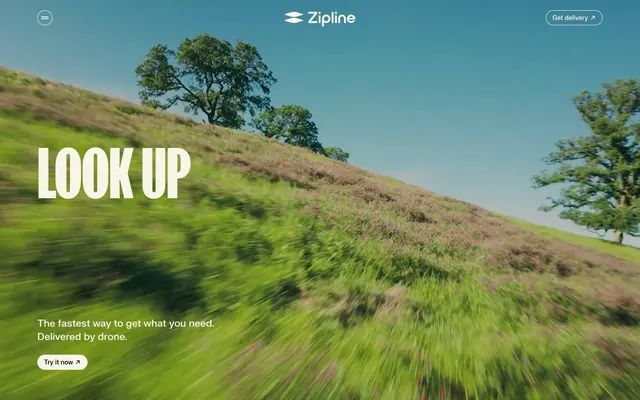
Open-air flight path – vast, clean, and direct.
Color palette
Violet wash for highlight backgrounds, decorative bands, and soft emphasis behind content. Do not promote it to the primary CTA color
Page backgrounds, subtle card surfaces, ghost button backgrounds, default text color in inverse contexts
Primary text, prominent headings, button backgrounds, strong borders, icons. Provides high contrast against Cream Canvas
Subtle section backgrounds, divider lines, muted interface elements
Typography
- Weights
- 400, 500, 600, 700
- Sizes
- 14px, 16px, 18px, 22px, 120px
- Line height
- 0.85, 1, 1.2, 1.4
- Letter spacing
- -0.01em
- Fallback
- Inter
Primary UI text for body copy, buttons, navigation, and detailed information. The consistent, slightly tracked letter spacing maintains legibility and a contemporary feel.
- Weights
- 700
- Sizes
- 40px, 90px, 120px, 150px
- Line height
- 0.85
- Letter spacing
- normal
- Fallback
- Bebas Neue
Dominant display headings, used for impact and brand statements. Its compressed, heavy weight commands attention, often appearing in all caps.
- Weights
- 400
- Sizes
- 22px
- Line height
- 0.85
- Letter spacing
- normal
- Fallback
- Oswald
Used for secondary, impactful headings that require less visual dominance than fkScreamer. The slightly wider form provides contrast to the compressed fkScreamer.
Spacing & shape
Components
Solid Midnight Ink background with Cream Canvas text. Corner radius of 20px, with generous horizontal padding of 20px and minimal vertical padding (inferred 12px vertical based on 0px button variants).
Cream Canvas background with Midnight Ink text, outlined by a 1px Midnight Ink border. Corner radius of 20px, with 14px horizontal padding and inferred 12px vertical padding.
Transparent background with Cream Canvas text. No distinct border or radius, primarily used for navigation or subtle interactions. Example: top-right 'Get Delivery' button.
Transparent background with a 20px border radius. Used for visual separation of content, relying on underlying section backgrounds for definition. No shadow.
Solid Zipline Violet background with a 20px border radius. Used to highlight specific content blocks, contrasting with the neutral palette. No shadow.
Guidelines
- Use Midnight Ink (#000000) for all primary text and calls to action against Cream Canvas (#f7f4e8) backgrounds.
- Apply fkScreamer Bold (700 weight) for all hero and display headings, ranging from 40px to 150px with a tight line-height of 0.85.
- Maintain a uniform border radius of 20px across all buttons, cards, and images, promoting a soft, approachable feel.
- Employ the Cream Canvas (#f7f4e8) as the predominant page background and for ghost button text.
- Utilize a baseline letter-spacing of -0.01em for all fkGroteskNeue body text, navigation, and button labels to improve density.
- Structure content with section gaps of 53px and element gaps of 24px to create a comfortable, airy feel.
- Limit the use of Zipline Violet (#643aed) to specific cards or decorative elements; avoid using it for primary interactive states.
- Do not introduce new primary action colors; Midnight Ink (#000000) filled buttons and Midnight Ink borders for outlined buttons are the defined interactive styles.
- Avoid applying shadows or complex elevations to cards or components; the design relies on flat surfaces and color contrast for hierarchy.
- Do not deviate from the 20px border radius for interactive elements and content containers; consistency is key to the brand's shape language.
- Refrain from using fkScreamer or fkDisplay for body copy or navigation; these are strictly for large, impactful headings.
- Do not use generic gray tones for backgrounds or text; adhere to Cream Canvas (#f7f4e8), Cloud Gray (#c6c3ba), and Midnight Ink (#000000).
- Avoid excessive use of Zipline Violet (#643aed); it's an accent, not a primary color for large areas or ubiquitous interface elements.
- Do not introduce highly saturated or brightly colored illustrations in contexts where photography or minimal graphics are typically used; maintain visual restraint.
About this system
ShowHide
Zipline's aesthetic is an open-air flight path: stark typography grounded in cream and black, punctuated by a single vibrant violet. The system prioritizes crisp text on expansive, neutral backgrounds, using strong contrasts to anchor content. Components are lightweight and direct, relying on bold text and large-radius containers rather than subtle shadows or complex surface layering. Color is deployed sparingly to highlight navigation, branding, and interactive elements, retaining an overall impression of efficiency and precision.
The page model is primarily a max-width contained layout of 1320px, with occasional full-bleed sections, especially for heroes. The hero pattern is often a full-viewport dynamic video or large image with a centered, bold headline. Sections alternate between light and cream backgrounds, creating a clear vertical rhythm. Content often uses 2-column layouts with text and visuals, but also features centered stacks for impactful messages. There are instances of 3-column card grids for features or articles. Overall density is comfortable, with generous breathing room between sections. Navigation is a sticky top bar with a left-aligned hamburger menu, a center-aligned logo, and right-aligned ghost buttons.
Imagery predominantly features dynamic, high-motion photography, often showcasing drones or expansive natural landscapes from a unique perspective, reinforcing the theme of flight and speed. There's also some use of tightly-cropped product photography or candid lifestyle shots, often integrated directly into text blocks. Visuals are full-bleed for hero sections or contained within organic, wave-like masks. When present, icons are minimalist, outlined, and monochromatic, primarily in Midnight Ink.
Reminiscent of Wing, Skydio, Starship Technologies, OpenAI.
# Zipline — Style Reference
> Open-air flight path – vast, clean, and direct.

**Theme:** light

**Site:** https://www.zipline.com

Zipline's aesthetic is an open-air flight path: stark typography grounded in cream and black, punctuated by a single vibrant violet. The system prioritizes crisp text on expansive, neutral backgrounds, using strong contrasts to anchor content. Components are lightweight and direct, relying on bold text and large-radius containers rather than subtle shadows or complex surface layering. Color is deployed sparingly to highlight navigation, branding, and interactive elements, retaining an overall impression of efficiency and precision.

## Tokens — Colors

| Name | Value | Token | Role |
|------|------|------|------|
| Zipline Violet | `#643aed` | `--color-zipline-violet` | Violet wash for highlight backgrounds, decorative bands, and soft emphasis behind content. Do not promote it to the primary CTA color |
| Cream Canvas | `#f7f4e8` | `--color-cream-canvas` | Page backgrounds, subtle card surfaces, ghost button backgrounds, default text color in inverse contexts |
| Midnight Ink | `#000000` | `--color-midnight-ink` | Primary text, prominent headings, button backgrounds, strong borders, icons. Provides high contrast against Cream Canvas |
| Cloud Gray | `#c6c3ba` | `--color-cloud-gray` | Subtle section backgrounds, divider lines, muted interface elements |

## Tokens — Typography

### fkGroteskNeue
- **Substitute:** Inter
- **Weights:** 400, 500, 600, 700
- **Sizes:** 14px, 16px, 18px, 22px, 120px
- **Line height:** 0.85, 1, 1.2, 1.4
- **Letter spacing:** -0.01em
- **Role:** Primary UI text for body copy, buttons, navigation, and detailed information. The consistent, slightly tracked letter spacing maintains legibility and a contemporary feel.

### fkScreamer
- **Substitute:** Bebas Neue
- **Weights:** 700
- **Sizes:** 40px, 90px, 120px, 150px
- **Line height:** 0.85
- **Letter spacing:** normal
- **Role:** Dominant display headings, used for impact and brand statements. Its compressed, heavy weight commands attention, often appearing in all caps.

### fkDisplay
- **Substitute:** Oswald
- **Weights:** 400
- **Sizes:** 22px
- **Line height:** 0.85
- **Letter spacing:** normal
- **Role:** Used for secondary, impactful headings that require less visual dominance than fkScreamer. The slightly wider form provides contrast to the compressed fkScreamer.

## Tokens — Type Scale

Augmented Fourth (1.414) from 16px base.

| Role | Size | Line height | Letter spacing |
|------|------|------|------|
| caption | 14px | 1.4 | -0.14px |
| body | 16px | 1.4 | -0.16px |
| subheading | 18px | 1.4 | -0.18px |
| heading-sm | 22px | 1.2 | -0.22px |
| heading | 40px | 0.85 | — |
| display-md | 90px | 0.85 | — |
| display-lg | 120px | 0.85 | — |
| display | 150px | 0.85 | — |

## Tokens — Spacing

- **Max width:** 1320px
- **Section gap:** 53px
- **Card padding:** 14px
- **Element gap:** 24px

## Tokens — Radius

- **Buttons:** 20px
- **Cards:** 20px
- **Images:** 20px

## Layout

The page model is primarily a max-width contained layout of 1320px, with occasional full-bleed sections, especially for heroes. The hero pattern is often a full-viewport dynamic video or large image with a centered, bold headline. Sections alternate between light and cream backgrounds, creating a clear vertical rhythm. Content often uses 2-column layouts with text and visuals, but also features centered stacks for impactful messages. There are instances of 3-column card grids for features or articles. Overall density is comfortable, with generous breathing room between sections. Navigation is a sticky top bar with a left-aligned hamburger menu, a center-aligned logo, and right-aligned ghost buttons.

## Imagery

Imagery predominantly features dynamic, high-motion photography, often showcasing drones or expansive natural landscapes from a unique perspective, reinforcing the theme of flight and speed. There's also some use of tightly-cropped product photography or candid lifestyle shots, often integrated directly into text blocks. Visuals are full-bleed for hero sections or contained within organic, wave-like masks. When present, icons are minimalist, outlined, and monochromatic, primarily in Midnight Ink.

## Components

### Filled Primary Button
*Call to action*

Solid Midnight Ink background with Cream Canvas text. Corner radius of 20px, with generous horizontal padding of 20px and minimal vertical padding (inferred 12px vertical based on 0px button variants).

### Outlined Secondary Button
*Secondary action*

Cream Canvas background with Midnight Ink text, outlined by a 1px Midnight Ink border. Corner radius of 20px, with 14px horizontal padding and inferred 12px vertical padding.

### Ghost Text Button
*Navigation or tertiary action*

Transparent background with Cream Canvas text. No distinct border or radius, primarily used for navigation or subtle interactions. Example: top-right 'Get Delivery' button.

### Standard Card
*Content grouping*

Transparent background with a 20px border radius. Used for visual separation of content, relying on underlying section backgrounds for definition. No shadow.

### Branded Violet Card
*Emphasized content grouping*

Solid Zipline Violet background with a 20px border radius. Used to highlight specific content blocks, contrasting with the neutral palette. No shadow.

## Guidelines

### Do

- Use Midnight Ink (#000000) for all primary text and calls to action against Cream Canvas (#f7f4e8) backgrounds.
- Apply fkScreamer Bold (700 weight) for all hero and display headings, ranging from 40px to 150px with a tight line-height of 0.85.
- Maintain a uniform border radius of 20px across all buttons, cards, and images, promoting a soft, approachable feel.
- Employ the Cream Canvas (#f7f4e8) as the predominant page background and for ghost button text.
- Utilize a baseline letter-spacing of -0.01em for all fkGroteskNeue body text, navigation, and button labels to improve density.
- Structure content with section gaps of 53px and element gaps of 24px to create a comfortable, airy feel.
- Limit the use of Zipline Violet (#643aed) to specific cards or decorative elements; avoid using it for primary interactive states.

### Don't

- Do not introduce new primary action colors; Midnight Ink (#000000) filled buttons and Midnight Ink borders for outlined buttons are the defined interactive styles.
- Avoid applying shadows or complex elevations to cards or components; the design relies on flat surfaces and color contrast for hierarchy.
- Do not deviate from the 20px border radius for interactive elements and content containers; consistency is key to the brand's shape language.
- Refrain from using fkScreamer or fkDisplay for body copy or navigation; these are strictly for large, impactful headings.
- Do not use generic gray tones for backgrounds or text; adhere to Cream Canvas (#f7f4e8), Cloud Gray (#c6c3ba), and Midnight Ink (#000000).
- Avoid excessive use of Zipline Violet (#643aed); it's an accent, not a primary color for large areas or ubiquitous interface elements.
- Do not introduce highly saturated or brightly colored illustrations in contexts where photography or minimal graphics are typically used; maintain visual restraint.

## Agent Prompt Guide

Quick Color Reference:
text: #000000
background: #f7f4e8
border: #000000
accent: #643aed
primary action: #000000 (filled action)

Example Component Prompts:
Create a hero section: full-bleed background (placeholder image of natural landscape). Headline 'Zipline: Look Up' at 150px fkScreamer, #000000, normal letter-spacing. Subtext 'The fastest way to get what you need.' at 22px fkGroteskNeue, #000000, letter-spacing -0.22px, line-height 1.4. A Filled Primary Button 'Try it now' with background #000000, text #f7f4e8, 20px radius, 12px 20px padding (vertical horizontal).

Generate an accordion component: Uses Cream Canvas (#f7f4e8) as background. Title uses fkGroteskNeue 18px 500 weight, #000000, letter-spacing -0.18px. Content uses fkGroteskNeue 16px 400 weight, #000000, letter-spacing -0.16px. Border for each accordion item is 1px solid #000000. Corner radius for the overall component 20px.

Design a simple card section: Three standard cards arranged in a grid with 24px element gap. Each card has a Zipline Violet (#643aed) background, 20px radius, and contains a fkGroteskNeue 22px 700 weight heading in #f7f4e8, letter-spacing -0.22px, and fkGroteskNeue 16px 400 weight body text in #f7f4e8, letter-spacing -0.16px. No padding for cards, content should bleed to edges.
More like this








Keep what you find
A free account saves references to boards and can send you a weekly email of picks based on what you save.
To see every result, go Pro.