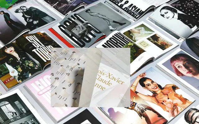
Preview image. Unlock full-res
Shifting Editorial Canvas
Color palette
Hero background, prominent section backgrounds — provides a warm, earthy foundation for key content
Heading text in select sections, decorative borders— a subtle, natural accent
Link text, heading text in specific content blocks — adds a rich, natural tone
Heading text, decorative borders — a cool, muted accent for content differentiation
Heading text, body text in specific content areas — provides a sophisticated, deep-sea accent
Heading text, decorative borders — a slightly more vibrant cool accent
Heading text, link text—a delicate, desaturated red that adds a soft highlight
Headline accents, decorative borders — a punchy, warm highlight for emphasis
Headline accents, decorative borders — a rich, earthy yellow for warmth and visual interest
Heading text accents — a deep, muted teal for sophisticated contrast
Gray accent for outlined action borders, linked labels, and lightweight interactive emphasis. Do not promote it to the primary CTA color
Primary text across pages, default borders, and iconography — provides strong contrast on light canvases
Page backgrounds, card surfaces, and high-contrast text on dark surfaces
Heading text, fine borders — a warm, desaturated neutral used for subtle visual breaks
Heading and body text in certain sections — a cool, almost blue-grey
Typography
- Weights
- 400, 500
- Sizes
- 10px, 11px, 13px, 16px, 18px, 20px, 23px, 25px, 32px, 38px, 40px, 62px, 68px
- Line height
- 1, 1.03, 1.05, 1.1, 1.16, 1.3, 1.31, 1.44, 1.82, 2, 2.12, 2.27, 2.45, 2.73
- Letter spacing
- -0.0410em (at 68px), 0.1000em (at 10px), 0.4000em (at 11px), -0.0340em (at 40px), -0.0210em (at 32px), 0.0150em (at 18px), 0.1360em (at 13px), 0.2730em (at 16px)
- Fallback
- Lora
Primary headings, subheadings, and featured body text. Its delicate, spiky serifs and varied letter-spacing create a highly artistic and editorial feel, prioritizing visual craft over immediate readability for large blocks. The 'dlig', 'liga', 'swsh' features likely enhance its unique character.
- Weights
- 400, 700
- Sizes
- 18px, 50px
- Line height
- 1.67
- Letter spacing
- normal
- Fallback
- Inter
Functional body text, navigation elements, and captions. Provides a clean, highly legible counterpoint to the decorative serif font, used for clarity and information density. The 'dlig', 'liga', 'swsh' features subtly enhance its presentation.
Spacing & shape
Components
Transparent background with a Pale Rose Quartz (#ddbad0) 1px border. Text is Pale Rose Quartz (#ddbad0). Features generously rounded corners (120px radius). Padding is 24px vertical, 26px horizontal. Uses Hanae Regular font.
Transparent background with a Pale Rose Quartz (#ddbad0) 1px border. Placeholder/input text is Pale Rose Quartz (#ddbad0). Features extreme rounded corners (140px radius). Padding is 18px vertical, 20px horizontal. Uses Hanae Regular font.
Minimalist text links using Open Sans. Active or hovered states are indicated by a Pale Rose Quartz (#ddbad0) 1px bottom border. Generous 180px radius hints at a pill-like visual for potential button-like navigation elements, even if not fully applied to text links.
Set in Hanae Regular, typically with large sizes and distinctive letter-spacing. Colors vary by section, often using the accent palette (e.g., Dusty Sage, Forest Moss) for visual distinction, contributing to the shifting editorial canvas feel. Features unique font features like ligatures and swashes.
Guidelines
- Prioritize Hanae Regular for all headlines and artistic text to establish the brand's unique editorial voice, embracing its wide letter-spacing and ligatures.
- Use Open Sans only for functional text like navigation, body copy, and captions to ensure legibility and structural integrity.
- Apply the Pale Rose Quartz (#ddbad0) 1px border to all ghost buttons and input fields, paired with the extreme 120px/140px radius for a consistently soft, pill-like interactive element.
- Use the shifting color palette for section backgrounds and major typography, rather than strict section dividers, to create a fluid, magazine-like scrolling experience.
- Maintain a spacious density with section gaps of 30px and significant card/element padding to allow content and imagery to breathe and command attention.
- Always apply Hanae Regular's font feature settings ('"dlig", "liga", "swsh"') including when using Open Sans, for a subtle consistency in typographic refinement.
- Employ Soft Umber (#a65d4d) as a warm, anchoring background for prominent or introductory sections, complementing the cooler accent tones.
- Avoid solid, filled background buttons for primary actions; instead, prefer ghost buttons with Pale Rose Quartz outlines to maintain the system's delicate aesthetic.
- Do not use dark, heavy shadows or strong elevation effects; the design relies on color shifts and spatial separation for hierarchy, not depth.
- Refrain from introducing new sans-serif fonts; Open Sans handles all legible text needs without needing additional variety.
- Do not use highly saturated or primary colors outside of the defined accent palette; such colors would conflict with the system's muted, vintage-inspired tone.
- Avoid tight letter-spacing for Hanae Regular, especially at larger sizes, as its character is built upon its open, airy presentation.
- Do not break the established pattern of highly rounded corners for interactive elements; maintaining 120px+ radii ensures brand consistency.
- Avoid dense, compact text blocks; spacing and generous line heights are crucial for the editorial layout.
About this system
ShowHide
Ayaka B. Ito's design system creates a soft, refined, and editorial feel through its use of muted, vintage-inspired color palettes that shift gracefully between sections. Typography is highly distinctive, featuring a delicate custom serif with generous tracking and unique ligatures, paired with a legible sans-serif for functional text. Components are minimal and ghost-like, prioritizing content and visual artistry over heavy UI elements. The overall presentation is that of a curated portfolio, where every detail contributes to an atmosphere of understated elegance and artistic craft.
The page structure heavily uses full-width sections that can shift background colors, creating a 'shifting editorial canvas' effect. Layout is primarily max-width contained for text and UI elements, but often allows large-format imagery or color blocks to bleed to the edges. The hero section is characterized by a full-bleed color background (e.g., Soft Umber) with centered, prominent text. Content sections alternate between these distinct background schemes, often employing a two-column layout with text on one side and a large visual on the other, or full-width blocks for showcasing typography. Vertical spacing between sections is generous, contributing to the spacious density. Navigation is a minimalist top bar with ghost-like links, maintaining a light footprint.
This system features a mix of high-fidelity photography, often focusing on editorial layouts and product shots (magazines, type specimens). Illustrations are highly stylized, often incorporating custom typography as intrinsic design elements. Imagery serves a decorative, inspirational, and explanatory role, showcasing the designer's craft rather than generic stock photography. Photography is typically high-key or features controlled studio lighting, emphasizing texture and detail. Icons, if present, are minimal and likely outlined, consistent with the delicate aesthetic. Imagery is occasionally full-bleed or large-scale, dominating sections, while at other times it is integrated seamlessly with text.
Reminiscent of Kerem Suer, Jessica Hische, Pentagram, Sagmeister & Walsh.
# Ayaka B. Ito — Style Reference
> Shifting Editorial Canvas

**Theme:** light

**Site:** https://ayakaito.com

Ayaka B. Ito's design system creates a soft, refined, and editorial feel through its use of muted, vintage-inspired color palettes that shift gracefully between sections. Typography is highly distinctive, featuring a delicate custom serif with generous tracking and unique ligatures, paired with a legible sans-serif for functional text. Components are minimal and ghost-like, prioritizing content and visual artistry over heavy UI elements. The overall presentation is that of a curated portfolio, where every detail contributes to an atmosphere of understated elegance and artistic craft.

## Tokens — Colors

| Name | Value | Token | Role |
|------|------|------|------|
| Soft Umber | `#a65d4d` | `--color-soft-umber` | Hero background, prominent section backgrounds — provides a warm, earthy foundation for key content |
| Dusty Sage | `#576041` | `--color-dusty-sage` | Heading text in select sections, decorative borders— a subtle, natural accent |
| Forest Moss | `#495116` | `--color-forest-moss` | Link text, heading text in specific content blocks — adds a rich, natural tone |
| Misty Blue | `#9cb8d3` | `--color-misty-blue` | Heading text, decorative borders — a cool, muted accent for content differentiation |
| Deep Teal | `#167070` | `--color-deep-teal` | Heading text, body text in specific content areas — provides a sophisticated, deep-sea accent |
| Cerulean Mist | `#9ec5d6` | `--color-cerulean-mist` | Heading text, decorative borders — a slightly more vibrant cool accent |
| Faded Coral | `#d7b5bf` | `--color-faded-coral` | Heading text, link text—a delicate, desaturated red that adds a soft highlight |
| Vivid Orange | `#f75929` | `--color-vivid-orange` | Headline accents, decorative borders — a punchy, warm highlight for emphasis |
| Golden Ochre | `#cda04f` | `--color-golden-ochre` | Headline accents, decorative borders — a rich, earthy yellow for warmth and visual interest |
| Dark Forest Teal | `#507f70` | `--color-dark-forest-teal` | Heading text accents — a deep, muted teal for sophisticated contrast |
| Pale Rose Quartz | `#ddbad0` | `--color-pale-rose-quartz` | Gray accent for outlined action borders, linked labels, and lightweight interactive emphasis. Do not promote it to the primary CTA color |
| Charcoal Ink | `#000000` | `--color-charcoal-ink` | Primary text across pages, default borders, and iconography — provides strong contrast on light canvases |
| Paper White | `#ffffff` | `--color-paper-white` | Page backgrounds, card surfaces, and high-contrast text on dark surfaces |
| Stone Grey | `#c7afac` | `--color-stone-grey` | Heading text, fine borders — a warm, desaturated neutral used for subtle visual breaks |
| Glacial Grey | `#6b969f` | `--color-glacial-grey` | Heading and body text in certain sections — a cool, almost blue-grey |

## Tokens — Typography

### Hanae Regular
- **Substitute:** Lora
- **Weights:** 400, 500
- **Sizes:** 10px, 11px, 13px, 16px, 18px, 20px, 23px, 25px, 32px, 38px, 40px, 62px, 68px
- **Line height:** 1, 1.03, 1.05, 1.1, 1.16, 1.3, 1.31, 1.44, 1.82, 2, 2.12, 2.27, 2.45, 2.73
- **Letter spacing:** -0.0410em (at 68px), 0.1000em (at 10px), 0.4000em (at 11px), -0.0340em (at 40px), -0.0210em (at 32px), 0.0150em (at 18px), 0.1360em (at 13px), 0.2730em (at 16px)
- **Role:** Primary headings, subheadings, and featured body text. Its delicate, spiky serifs and varied letter-spacing create a highly artistic and editorial feel, prioritizing visual craft over immediate readability for large blocks. The 'dlig', 'liga', 'swsh' features likely enhance its unique character.

### Open Sans
- **Substitute:** Inter
- **Weights:** 400, 700
- **Sizes:** 18px, 50px
- **Line height:** 1.67
- **Letter spacing:** normal
- **Role:** Functional body text, navigation elements, and captions. Provides a clean, highly legible counterpoint to the decorative serif font, used for clarity and information density. The 'dlig', 'liga', 'swsh' features subtly enhance its presentation.

## Tokens — Type Scale

| Role | Size | Line height | Letter spacing |
|------|------|------|------|
| caption | 10px | 2 | 1px |
| heading | 18px | 1.67 | 0.015em |
| heading-lg | 25px | 1.82 | — |
| display | 68px | 1 | -0.41px |

## Tokens — Spacing

- **Section gap:** 30px
- **Card padding:** 26px
- **Element gap:** 10px

## Tokens — Radius

- **Buttons:** 120px
- **Inputs:** 140px
- **navItems:** 180px

## Layout

The page structure heavily uses full-width sections that can shift background colors, creating a 'shifting editorial canvas' effect. Layout is primarily max-width contained for text and UI elements, but often allows large-format imagery or color blocks to bleed to the edges. The hero section is characterized by a full-bleed color background (e.g., Soft Umber) with centered, prominent text. Content sections alternate between these distinct background schemes, often employing a two-column layout with text on one side and a large visual on the other, or full-width blocks for showcasing typography. Vertical spacing between sections is generous, contributing to the spacious density. Navigation is a minimalist top bar with ghost-like links, maintaining a light footprint.

## Imagery

This system features a mix of high-fidelity photography, often focusing on editorial layouts and product shots (magazines, type specimens). Illustrations are highly stylized, often incorporating custom typography as intrinsic design elements. Imagery serves a decorative, inspirational, and explanatory role, showcasing the designer's craft rather than generic stock photography. Photography is typically high-key or features controlled studio lighting, emphasizing texture and detail. Icons, if present, are minimal and likely outlined, consistent with the delicate aesthetic. Imagery is occasionally full-bleed or large-scale, dominating sections, while at other times it is integrated seamlessly with text.

## Components

### Ghost Button
*Primary interaction button*

Transparent background with a Pale Rose Quartz (#ddbad0) 1px border. Text is Pale Rose Quartz (#ddbad0). Features generously rounded corners (120px radius). Padding is 24px vertical, 26px horizontal. Uses Hanae Regular font.

### Outlined Input Field
*Text input areas*

Transparent background with a Pale Rose Quartz (#ddbad0) 1px border. Placeholder/input text is Pale Rose Quartz (#ddbad0). Features extreme rounded corners (140px radius). Padding is 18px vertical, 20px horizontal. Uses Hanae Regular font.

### Navigation Item
*Primary navigation links*

Minimalist text links using Open Sans. Active or hovered states are indicated by a Pale Rose Quartz (#ddbad0) 1px bottom border. Generous 180px radius hints at a pill-like visual for potential button-like navigation elements, even if not fully applied to text links.

### Editorial Header
*Section titles and prominent text blocks*

Set in Hanae Regular, typically with large sizes and distinctive letter-spacing. Colors vary by section, often using the accent palette (e.g., Dusty Sage, Forest Moss) for visual distinction, contributing to the shifting editorial canvas feel. Features unique font features like ligatures and swashes.

## Guidelines

### Do

- Prioritize Hanae Regular for all headlines and artistic text to establish the brand's unique editorial voice, embracing its wide letter-spacing and ligatures.
- Use Open Sans only for functional text like navigation, body copy, and captions to ensure legibility and structural integrity.
- Apply the Pale Rose Quartz (#ddbad0) 1px border to all ghost buttons and input fields, paired with the extreme 120px/140px radius for a consistently soft, pill-like interactive element.
- Use the shifting color palette for section backgrounds and major typography, rather than strict section dividers, to create a fluid, magazine-like scrolling experience.
- Maintain a spacious density with section gaps of 30px and significant card/element padding to allow content and imagery to breathe and command attention.
- Always apply Hanae Regular's font feature settings ('"dlig", "liga", "swsh"') including when using Open Sans, for a subtle consistency in typographic refinement.
- Employ Soft Umber (#a65d4d) as a warm, anchoring background for prominent or introductory sections, complementing the cooler accent tones.

### Don't

- Avoid solid, filled background buttons for primary actions; instead, prefer ghost buttons with Pale Rose Quartz outlines to maintain the system's delicate aesthetic.
- Do not use dark, heavy shadows or strong elevation effects; the design relies on color shifts and spatial separation for hierarchy, not depth.
- Refrain from introducing new sans-serif fonts; Open Sans handles all legible text needs without needing additional variety.
- Do not use highly saturated or primary colors outside of the defined accent palette; such colors would conflict with the system's muted, vintage-inspired tone.
- Avoid tight letter-spacing for Hanae Regular, especially at larger sizes, as its character is built upon its open, airy presentation.
- Do not break the established pattern of highly rounded corners for interactive elements; maintaining 120px+ radii ensures brand consistency.
- Avoid dense, compact text blocks; spacing and generous line heights are crucial for the editorial layout.

## Agent Prompt Guide

### Quick Color Reference
text: #000000
background: #ffffff
border: #ddbad0
accent: #a65d4d
primary action: #ddbad0 (outlined action border)

### 3-5 Example Component Prompts
1. Create a hero section with a Soft Umber (#a65d4d) background. Place an (INTRO) heading in Hanae Regular, size 10px, Charcoal Ink (#000000), letter-spacing 1.0px. Below it, a main headline 'Hi, I’m Ayaka. I’m based in New York City and Tokyo...' in Hanae Regular, size 50px, weight 400, Paper White (#ffffff), with a default line height.
2. Design a Ghost Button: 'SIGN UP' in Hanae Regular, size 18px, Pale Rose Quartz (#ddbad0) text color, with a 1px Pale Rose Quartz (#ddbad0) border, 120px border-radius, and 24px vertical / 26px horizontal padding.
3. Create an Outlined Input Field: with a 1px Pale Rose Quartz (#ddbad0) border, 140px border-radius, and 18px vertical / 20px horizontal padding. The placeholder text should be Pale Rose Quartz (#ddbad0).
4. Assemble a navigation bar: with Open Sans, size 18px, Charcoal Ink (#000000) text. Active link should have a 1px Pale Rose Quartz (#ddbad0) bottom border.
5. Design a content block featuring 'Jasmine Display' headline in Hanae Regular, size 62px, weight 400, Dark Forest Teal (#507f70), letter-spacing -0.41em. Followed by description 'Delicate, modern serif typeface with...' in Charcoal Ink (#000000), Open Sans, size 18px.
More like this









Keep what you find
A free account saves references to boards and can send you a weekly email of picks based on what you save.
To see every result, go Pro.