Preview image. Unlock full-res
Editorial Grid, Ink on Paper
Color palette
Illustrative accent within content, serving as a vibrant brand identifier in select visuals and prominent typographic elements
Page background, primary surface for content areas, creating a clean white canvas
Dark borders and separators for elevated surfaces and inverted UI. Do not promote it to the primary CTA color
Muted secondary text, subtle borders, and supporting information where a softer contrast is desired
Typography
- Weights
- 400
- Sizes
- 81px
- Line height
- 1
- Letter spacing
- -0.0100em at 81px
- Fallback
- Bebas Neue
Prominent navigation and headings requiring a strong, condensed visual presence. Its tightly tracked, bold nature establishes a distinct brand voice.
- Weights
- 400
- Sizes
- 12px, 14px
- Line height
- 1.21, 1.28
- Letter spacing
- normal
- Fallback
- Inter
Primary body text, descriptive content, and subheadings. This font provides readability and a clean, direct tone for all textual information.
Spacing & shape
Components
Minimal interactive elements rendered as plain text or linked content, using the default text color with no background or border. This focuses interaction directly on the text while maintaining a clean aesthetic. Text is Jet Black, background is transparent, and border is 0px.
Guidelines
- Prioritize Jet Black (#000000) for all primary text and headings against Canvas White (#ffffff) backgrounds to maintain high contrast and legibility.
- Utilize Founders Grotesk X Condensed Semibold at 81px with -0.0100em letter spacing for page titles and navigation to project a bold, editorial feel.
- Employ Die Grotesk A Regular at 14px for main body text and 12px for smaller content, ensuring ample line height for comfortable reading.
- Use a default padding of 15px around content sections and between grouped elements for comfortable density.
- Reserve Machine Orange (#ff5c26) exclusively for key brand accents in illustrations or powerful typographic statements, not for functional UI elements.
- Maintain sharp, 0px border radii for all elements to reinforce the architectural and precise visual style.
- Implement motion transitions with `ease` timing function and a duration of 0.3s for interactive elements like color changes to provide smooth feedback.
- Avoid using drop shadows or complex gradients on UI elements; the design emphasizes flat surfaces.
- Do not introduce additional bold, saturated colors beyond Machine Orange (#ff5c26) as primary accents; maintain the strict monochrome base.
- Refrain from using varied border radii; all corners should be sharp 0px.
- Do not deviate from the established typographic scale and font families; inconsistent typography dilutes the brand's directness.
- Avoid excessive spacing or overly sparse layouts that might break the content's structured read on the page.
- Do not use #ababab (Ash Gray) for primary calls to action or essential information; it is reserved for secondary, muted content.
About this system
ShowHide
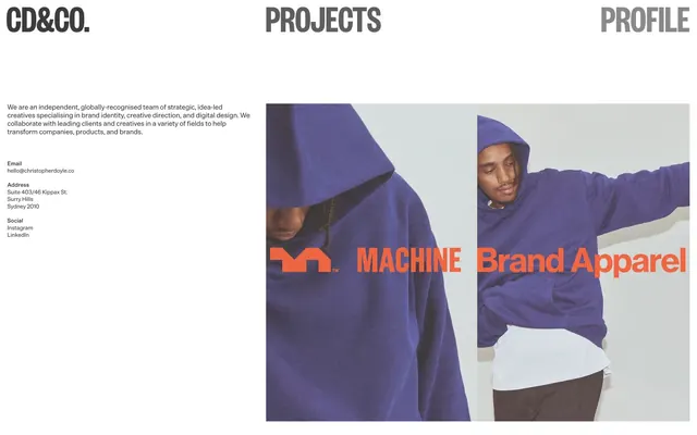
Christopher Doyle & Co. employs a stark, editorial aesthetic centered on high-contrast typography and a monochrome palette. Visual impact comes from precise typographic arrangements and the bold use of negative space. Elements are lightweight, relying on inherent content structure rather than heavy borders or shadows. Color is reserved for accent imagery and bold typographic callouts, creating a strong brand presence through restraint and clear communication.
The page structure is a full-bleed design, allowing content to extend to the viewport edges without a maximum width constraint. The hero section is characterized by a large-scale photograph directly behind overlapping typographic elements, creating a layered effect. The overall section rhythm appears to be based on large, distinct content blocks. Navigation is a simple, high-contrast textual top bar. Content is arranged in a dynamic, offset grid, with text blocks often juxtaposed against imagery, creating an asymmetrical composition that emphasizes individual elements. The density is comfortable but with bold, prominent features.
This site predominantly uses large, editorial lifestyle photography integrated directly into the layout, often cropped to fill significant portions of the screen. The imagery is product-focused, featuring models interacting with apparel, rendered in natural lighting with colors that pop. There are no illustrations or abstract graphics. Icons are minimal or absent. Imagery serves as atmospheric content and product showcase, with a high density, often competing for visual space with large typographic elements.
Reminiscent of AIGA, Pentagram, Sagmeister & Walsh, The New York Times (Digital).
# Christopherdoyle — Style Reference
> Editorial Grid, Ink on Paper

**Theme:** light

**Site:** https://christopherdoyle.co

Christopher Doyle & Co. employs a stark, editorial aesthetic centered on high-contrast typography and a monochrome palette. Visual impact comes from precise typographic arrangements and the bold use of negative space. Elements are lightweight, relying on inherent content structure rather than heavy borders or shadows. Color is reserved for accent imagery and bold typographic callouts, creating a strong brand presence through restraint and clear communication.

## Tokens — Colors

| Name | Value | Token | Role |
|------|------|------|------|
| Machine Orange | `#ff5c26` | `--color-machine-orange` | Illustrative accent within content, serving as a vibrant brand identifier in select visuals and prominent typographic elements |
| Canvas White | `#ffffff` | `--color-canvas-white` | Page background, primary surface for content areas, creating a clean white canvas |
| Jet Black | `#000000` | `--color-jet-black` | Dark borders and separators for elevated surfaces and inverted UI. Do not promote it to the primary CTA color |
| Ash Gray | `#ababab` | `--color-ash-gray` | Muted secondary text, subtle borders, and supporting information where a softer contrast is desired |

## Tokens — Typography

### Founders Grotesk X Condensed
- **Substitute:** Bebas Neue
- **Weights:** 400
- **Sizes:** 81px
- **Line height:** 1
- **Letter spacing:** -0.0100em at 81px
- **Role:** Prominent navigation and headings requiring a strong, condensed visual presence. Its tightly tracked, bold nature establishes a distinct brand voice.

### Die Grotesk A
- **Substitute:** Inter
- **Weights:** 400
- **Sizes:** 12px, 14px
- **Line height:** 1.21, 1.28
- **Letter spacing:** normal
- **Role:** Primary body text, descriptive content, and subheadings. This font provides readability and a clean, direct tone for all textual information.

## Tokens — Spacing

- **Section gap:** 75px
- **Card padding:** 0px
- **Element gap:** 15px

## Tokens — Radius

- **none:** 0px

## Layout

The page structure is a full-bleed design, allowing content to extend to the viewport edges without a maximum width constraint. The hero section is characterized by a large-scale photograph directly behind overlapping typographic elements, creating a layered effect. The overall section rhythm appears to be based on large, distinct content blocks. Navigation is a simple, high-contrast textual top bar. Content is arranged in a dynamic, offset grid, with text blocks often juxtaposed against imagery, creating an asymmetrical composition that emphasizes individual elements. The density is comfortable but with bold, prominent features.

## Imagery

This site predominantly uses large, editorial lifestyle photography integrated directly into the layout, often cropped to fill significant portions of the screen. The imagery is product-focused, featuring models interacting with apparel, rendered in natural lighting with colors that pop. There are no illustrations or abstract graphics. Icons are minimal or absent. Imagery serves as atmospheric content and product showcase, with a high density, often competing for visual space with large typographic elements.

## Components

### Ghost Button
*Interactive element*

Minimal interactive elements rendered as plain text or linked content, using the default text color with no background or border. This focuses interaction directly on the text while maintaining a clean aesthetic. Text is Jet Black, background is transparent, and border is 0px.

## Guidelines

### Do

- Prioritize Jet Black (#000000) for all primary text and headings against Canvas White (#ffffff) backgrounds to maintain high contrast and legibility.
- Utilize Founders Grotesk X Condensed Semibold at 81px with -0.0100em letter spacing for page titles and navigation to project a bold, editorial feel.
- Employ Die Grotesk A Regular at 14px for main body text and 12px for smaller content, ensuring ample line height for comfortable reading.
- Use a default padding of 15px around content sections and between grouped elements for comfortable density.
- Reserve Machine Orange (#ff5c26) exclusively for key brand accents in illustrations or powerful typographic statements, not for functional UI elements.
- Maintain sharp, 0px border radii for all elements to reinforce the architectural and precise visual style.
- Implement motion transitions with `ease` timing function and a duration of 0.3s for interactive elements like color changes to provide smooth feedback.

### Don't

- Avoid using drop shadows or complex gradients on UI elements; the design emphasizes flat surfaces.
- Do not introduce additional bold, saturated colors beyond Machine Orange (#ff5c26) as primary accents; maintain the strict monochrome base.
- Refrain from using varied border radii; all corners should be sharp 0px.
- Do not deviate from the established typographic scale and font families; inconsistent typography dilutes the brand's directness.
- Avoid excessive spacing or overly sparse layouts that might break the content's structured read on the page.
- Do not use #ababab (Ash Gray) for primary calls to action or essential information; it is reserved for secondary, muted content.

## Agent Prompt Guide

Quick Color Reference:
text: #000000
background: #ffffff
border: #000000
accent: #ff5c26
primary action: no distinct CTA color

Example Component Prompts:

1. Create a primary navigation item: Founders Grotesk X Condensed, weight 400, 81px, #000000, letter-spacing -0.0100em, with a transparent background and 0px border radius.
2. Create a body text block: Die Grotesk A, weight 400, 14px, #000000, line height 1.28, normal letter spacing.
3. Create a footer link: Die Grotesk A, weight 400, 12px, #ababab, line height 1.28, normal letter spacing, with transparent background.
More like this









Keep what you find
A free account saves references to boards and can send you a weekly email of picks based on what you save.
To see every result, go Pro.