Preview image. Unlock full-res
Architectural blueprint on white marble
Color palette
Pink outline accent for tags, dividers, and focused UI edges
Highlight cards, callout backgrounds, primary accent for important information — adds focus and urgency
Link text, outlined button borders — a secondary interactive color distinct from black
Page backgrounds, subtle surface differentiation
Card backgrounds, primary interactive surfaces
Primary text, strong headings, primary interactive elements (buttons, links)
Secondary text, subheadings, supporting information
Muted text, helper text, subtle borders
Decorative card backgrounds, subtle dividers
Typography
- Weights
- 400
- Sizes
- 12px
- Line height
- 1.2
- Letter spacing
- normal
- Fallback
- system-ui
Fallback or system font for small UI elements and metadata, ensuring broad compatibility.
- Weights
- 400
- Sizes
- 24px, 32px, 48px
- Line height
- 1.2, 1.5
- Letter spacing
- -0.0470em at 48px, -0.0310em at 32px
- Fallback
- Bebas Neue
Impactful headings and display text. Its condensed nature allows for larger sizes without consuming excessive horizontal space, while the strong weight ensures immediate attention. The aggressive negative letter-spacing at larger sizes contributes to a tight, assertive visual feel.
- Weights
- 400, 600, 700
- Sizes
- 11px, 14px, 16px
- Line height
- 1.18, 1.2, 1.29, 1.3, 1.43, 1.5, 1.64, 1.73
- Letter spacing
- -0.0100em
- Fallback
- Inter
The primary typeface for body copy, subheadings, and UI elements. Its neutrality and high legibility support densely packed information, while various weights provide a clear typographic hierarchy. The consistent slight negative tracking keeps text blocks compact.
- Weights
- 400
- Sizes
- 11px, 13px
- Line height
- 1.2
- Letter spacing
- normal
- Fallback
- Roboto Mono
Monospaced font for code snippets, technical details, and any content requiring fixed-width alignment.
- Weights
- 400
- Sizes
- 11px
- Line height
- 1.2
- Letter spacing
- normal
- Fallback
- Noto Sans Mono
Supplementary monospaced font, likely for specific code or data display. Used sparingly.
- Weights
- 700
- Sizes
- 11px, 14px, 18px
- Line height
- 1.2, 1.43, 1.64, 2
- Letter spacing
- -0.01
Inter-Bold — detected in extracted data but not described by AI
- Weights
- 500
- Sizes
- 14px
- Line height
- 1.43, 1.5, 2
Inter-Medium — detected in extracted data but not described by AI
- Weights
- 300
- Sizes
- 11px
- Line height
- 1.73
- Letter spacing
- -0.01
Inter-Light — detected in extracted data but not described by AI
- Weights
- 900
- Sizes
- 24px
- Line height
- 1.2
Inter-Black — detected in extracted data but not described by AI
- Weights
- 600
- Sizes
- 32px
- Line height
- 1.2
Inter-SemiBold — detected in extracted data but not described by AI
Spacing & shape
Elevation
Components
Solid Ink Black background with Surface White text. Uses a 6px border radius and generous padding of 12px vertical, 8-12px horizontal. Text is typically 12px system sans-serif.
Transparent background with a 1px Midnight Ink Blue border and Midnight Ink Blue text. Uses a 6px border radius, 12px vertical padding, and 8-12px horizontal padding. Text is typically 12px system sans-serif.
Background of rgba(255, 255, 255, 0.8) with a 12px border radius. No shadows, giving a flat, clean appearance. Padding is typically absent for these cards, relying on internal element spacing.
Surface White background, 12px border radius, and a complex, subtle multi-layer shadow stack (rgba(0,0,0,0.09) starting at 0px 2.15px 3px). Provides significant visual lift without adding heavy dark tones. No internal padding defined at the card level.
Goldenrod background, 12px border radius. Uses a subtle, warm shadow tint (rgba(112, 94, 0, 0.05) starting at 0px 2.15px 1.72px). Features consistent internal padding of 20px horizontal and 20-32px vertical. Text in Ink Black.
Purple Haze background, 12px border radius. Uses a subtle, cool-toned shadow (rgba(61, 32, 75, 0.05) starting at 0px 2.15px 1.72px). Features consistent internal padding of 20px horizontal and 20-32px vertical. Text in Ink Black.
Guidelines
- Always use Canvas Ice (#f7f7f7) as the base page background.
- Apply Surface White (#ffffff) for all elevated cards and primary UI elements that require a clean, bright backdrop.
- Prioritize Ink Black (#000000) for all primary text and bold headlines to ensure high contrast and readability.
- Reserve Goldenrod (#ffb700) and Purple Haze (#914db2) exclusively for accent cards, callouts, or small functional indicators, never for large background areas or primary text.
- Maintain a clear visual hierarchy by utilizing Van Condensed Pro Bold for main headings and Inter for all body text, with Inter's various weights for subheadings and emphasis.
- Use 12px border-radius for all cards and container elements to maintain the consistent soft, modern feel.
- Ensure generous vertical spacing between sections, using the defined sectionGap of 60px to provide breathing room.
- Avoid using multiple different accent colors on a single screen; limit to Goldenrod or Purple Haze for focused attention.
- Do not use dark backgrounds for main content areas; maintain the light theme with Canvas Ice and Surface White providing the primary surfaces.
- Refrain from using strong, opaque shadows; instead, apply the subtle, tiered shadow stacks seen on Elevated Content Cards for a soft lift.
- Do not vary border radius arbitrarily; adhere to 12px for cards and 6px for buttons and interactive elements.
- Avoid decorative imagery that competes with UI elements; imagery should be contained, product-focused, or purely illustrative.
- Do not introduce new typefaces outside of Van Condensed Pro Bold, Inter, Roboto Mono, Noto Sans Mono, or the system sans-serif fallback.
- Exclude heavy gradients or complex background patterns, maintaining the flat and clean aesthetic of the primary surfaces.
About this system
ShowHide
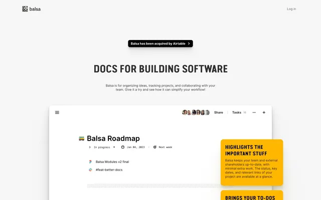
Balsa employs a modern, structured aesthetic, blending a pristine white canvas with soft, elevated cards to organize content. Typography is deliberately dense and confident, using strong impactful headlines and compact body text to convey information efficiently. A vibrant yellow and deep violet act as functional highlights, drawing attention to calls-to-action and important information within a predominantly achromatic interface. The overall impression is one of clarity, precision, and productivity.
The page model is primarily centered content within a contained width, though the hero section spans full-bleed. The hero presents a centered headline and subtext, followed by a product screenshot on a clean Canvas Ice background. Sections follow a consistent vertical rhythm, with `sectionGap` (60px) providing ample separation. Content is often arranged in simple, centered stacks, or in 3-column card grids for features and pricing. Navigation is a minimal top-right 'Log in' link.
This site uses product screenshots and contained graphical elements. Product screenshots are typically clean, isolated views of the Balsa interface, often shown within a browser frame on a white background, highlighting specific features or workflows. Illustrations are flat, geometric, and follow brand colors, primarily used for decorative accents or simple icons. Iconography is generally outlined or filled, with varying stroke weights, maintaining a functional purpose rather than being purely ornamental. Imagery serves to explain product features and add visual interest in a contained, text-dominant layout.
Reminiscent of Linear, Asana, Notion, Figma.
# Balsa — Style Reference
> Architectural blueprint on white marble

**Theme:** light

**Site:** https://www.balsa.com

Balsa employs a modern, structured aesthetic, blending a pristine white canvas with soft, elevated cards to organize content. Typography is deliberately dense and confident, using strong impactful headlines and compact body text to convey information efficiently. A vibrant yellow and deep violet act as functional highlights, drawing attention to calls-to-action and important information within a predominantly achromatic interface. The overall impression is one of clarity, precision, and productivity.

## Tokens — Colors

| Name | Value | Token | Role |
|------|------|------|------|
| Purple Haze | `#914db2` | `--color-purple-haze` | Pink outline accent for tags, dividers, and focused UI edges |
| Goldenrod | `#ffb700` | `--color-goldenrod` | Highlight cards, callout backgrounds, primary accent for important information — adds focus and urgency |
| Midnight Ink Blue | `#003399` | `--color-midnight-ink-blue` | Link text, outlined button borders — a secondary interactive color distinct from black |
| Canvas Ice | `#f7f7f7` | `--color-canvas-ice` | Page backgrounds, subtle surface differentiation |
| Surface White | `#ffffff` | `--color-surface-white` | Card backgrounds, primary interactive surfaces |
| Ink Black | `#000000` | `--color-ink-black` | Primary text, strong headings, primary interactive elements (buttons, links) |
| Graphite | `#313131` | `--color-graphite` | Secondary text, subheadings, supporting information |
| Storm Gray | `#686868` | `--color-storm-gray` | Muted text, helper text, subtle borders |
| Silver Mist | `#bbbbbb` | `--color-silver-mist` | Decorative card backgrounds, subtle dividers |

## Tokens — Typography

### sans-serif
- **Substitute:** system-ui
- **Weights:** 400
- **Sizes:** 12px
- **Line height:** 1.2
- **Letter spacing:** normal
- **Role:** Fallback or system font for small UI elements and metadata, ensuring broad compatibility.

### Van Condensed Pro Bold
- **Substitute:** Bebas Neue
- **Weights:** 400
- **Sizes:** 24px, 32px, 48px
- **Line height:** 1.2, 1.5
- **Letter spacing:** -0.0470em at 48px, -0.0310em at 32px
- **Role:** Impactful headings and display text. Its condensed nature allows for larger sizes without consuming excessive horizontal space, while the strong weight ensures immediate attention. The aggressive negative letter-spacing at larger sizes contributes to a tight, assertive visual feel.

### Inter
- **Substitute:** Inter
- **Weights:** 400, 600, 700
- **Sizes:** 11px, 14px, 16px
- **Line height:** 1.18, 1.2, 1.29, 1.3, 1.43, 1.5, 1.64, 1.73
- **Letter spacing:** -0.0100em
- **Role:** The primary typeface for body copy, subheadings, and UI elements. Its neutrality and high legibility support densely packed information, while various weights provide a clear typographic hierarchy. The consistent slight negative tracking keeps text blocks compact.

### Roboto Mono
- **Substitute:** Roboto Mono
- **Weights:** 400
- **Sizes:** 11px, 13px
- **Line height:** 1.2
- **Letter spacing:** normal
- **Role:** Monospaced font for code snippets, technical details, and any content requiring fixed-width alignment.

### Noto Sans Mono
- **Substitute:** Noto Sans Mono
- **Weights:** 400
- **Sizes:** 11px
- **Line height:** 1.2
- **Letter spacing:** normal
- **Role:** Supplementary monospaced font, likely for specific code or data display. Used sparingly.

### Inter-Bold
- **Weights:** 700
- **Sizes:** 11px, 14px, 18px
- **Line height:** 1.2, 1.43, 1.64, 2
- **Letter spacing:** -0.01
- **Role:** Inter-Bold — detected in extracted data but not described by AI

### Inter-Medium
- **Weights:** 500
- **Sizes:** 14px
- **Line height:** 1.43, 1.5, 2
- **Role:** Inter-Medium — detected in extracted data but not described by AI

### Inter-Light
- **Weights:** 300
- **Sizes:** 11px
- **Line height:** 1.73
- **Letter spacing:** -0.01
- **Role:** Inter-Light — detected in extracted data but not described by AI

### Inter-Black
- **Weights:** 900
- **Sizes:** 24px
- **Line height:** 1.2
- **Role:** Inter-Black — detected in extracted data but not described by AI

### Inter-SemiBold
- **Weights:** 600
- **Sizes:** 32px
- **Line height:** 1.2
- **Role:** Inter-SemiBold — detected in extracted data but not described by AI

## Tokens — Type Scale

Perfect Fourth (1.333) from 14px base.

| Role | Size | Line height | Letter spacing |
|------|------|------|------|
| caption | 11px | 1.73 | -0.11px |
| body | 14px | 1.43 | -0.14px |
| heading-sm | 18px | 1.43 | -0.18px |
| heading | 24px | 1.2 | -1.13px |
| heading-lg | 32px | 1.2 | -0.99px |
| display | 48px | 1.2 | -2.26px |

## Tokens — Spacing

- **Section gap:** 60px
- **Card padding:** 12px
- **Element gap:** 8px

## Tokens — Radius

- **Buttons:** 6px
- **Cards:** 12px
- **minimal:** 1px
- **tags:** 16px

## Tokens — Elevation

- **Elevated Content Card:** `rgba(0, 0, 0, 0.09) 0px 2.14989px 3.00985px -0.5625px, rgba(0, 0, 0, 0.086) 0px 5.09563px 7.13388px -1.125px, rgba(0, 0, 0, 0.082) 0px 9.29495px 13.0129px -1.6875px, rgba(0, 0, 0, 0.08) 0px 15.4528px 21.634px -2.25px, rgba(0, 0, 0, 0.075) 0px 24.9551px 34.9371px -2.8125px, rgba(0, 0, 0, 0.063) 0px 40.849px 57.1886px -3.375px, rgba(0, 0, 0, 0.047) 0px 70.3392px 98.4749px -3.9375px, rgba(0, 0, 0, 0.01) 0px 128px 179.2px -4.5px`
- **Callout Card (Goldenrod):** `rgba(112, 94, 0, 0.05) 0px 2.14989px 1.71992px -0.3125px, rgba(112, 94, 0, 0.05) 0px 5.09563px 4.0765px -0.625px, rgba(112, 94, 0, 0.05) 0px 9.29495px 7.43596px -0.9375px, rgba(112, 94, 0, 0.05) 0px 15.4528px 12.3623px -1.25px, rgba(112, 94, 0, 0.05) 0px 24.9551px 19.9641px -1.5625px, rgba(112, 94, 0, 0.05) 0px 40.849px 32.6792px -1.875px, rgba(112, 94, 0, 0.05) 0px 70.3392px 56.2714px -2.1875px, rgba(112, 94, 0, 0.05) 0px 128px 102.4px -2.5px`
- **Callout Card (Purple Haze):** `rgba(61, 32, 75, 0.05) 0px 2.14989px 1.71992px -0.3125px, rgba(61, 32, 75, 0.05) 0px 5.09563px 4.0765px -0.625px, rgba(61, 32, 75, 0.05) 0px 9.29495px 7.43596px -0.9375px, rgba(61, 32, 75, 0.05) 0px 15.4528px 12.3623px -1.25px, rgba(61, 32, 75, 0.05) 0px 24.9551px 19.9641px -1.5625px, rgba(61, 32, 75, 0.05) 0px 40.849px 32.6792px -1.875px, rgba(61, 32, 75, 0.05) 0px 70.3392px 56.2714px -2.1875px, rgba(61, 32, 75, 0.05) 0px 128px 102.4px -2.5px`
- **Focus Ring:** `rgb(255, 255, 255) 0px 0px 0px 2px`

## Layout

The page model is primarily centered content within a contained width, though the hero section spans full-bleed. The hero presents a centered headline and subtext, followed by a product screenshot on a clean Canvas Ice background. Sections follow a consistent vertical rhythm, with `sectionGap` (60px) providing ample separation. Content is often arranged in simple, centered stacks, or in 3-column card grids for features and pricing. Navigation is a minimal top-right 'Log in' link.

## Imagery

This site uses product screenshots and contained graphical elements. Product screenshots are typically clean, isolated views of the Balsa interface, often shown within a browser frame on a white background, highlighting specific features or workflows. Illustrations are flat, geometric, and follow brand colors, primarily used for decorative accents or simple icons. Iconography is generally outlined or filled, with varying stroke weights, maintaining a functional purpose rather than being purely ornamental. Imagery serves to explain product features and add visual interest in a contained, text-dominant layout.

## Components

### Primary Filled Button
*Main call-to-action*

Solid Ink Black background with Surface White text. Uses a 6px border radius and generous padding of 12px vertical, 8-12px horizontal. Text is typically 12px system sans-serif.

### Outline Accent Button (Midnight Ink Blue)
*Secondary call-to-action or informational link*

Transparent background with a 1px Midnight Ink Blue border and Midnight Ink Blue text. Uses a 6px border radius, 12px vertical padding, and 8-12px horizontal padding. Text is typically 12px system sans-serif.

### Base Card (No Shadow)
*Content grouping, pricing tiers in neutral state*

Background of rgba(255, 255, 255, 0.8) with a 12px border radius. No shadows, giving a flat, clean appearance. Padding is typically absent for these cards, relying on internal element spacing.

### Elevated Content Card
*Prominent content blocks, feature descriptions*

Surface White background, 12px border radius, and a complex, subtle multi-layer shadow stack (rgba(0,0,0,0.09) starting at 0px 2.15px 3px). Provides significant visual lift without adding heavy dark tones. No internal padding defined at the card level.

### Callout Card (Goldenrod)
*Highlighting key information, warnings, or tips*

Goldenrod background, 12px border radius. Uses a subtle, warm shadow tint (rgba(112, 94, 0, 0.05) starting at 0px 2.15px 1.72px). Features consistent internal padding of 20px horizontal and 20-32px vertical. Text in Ink Black.

### Callout Card (Purple Haze)
*Highlighting secondary key information or status updates*

Purple Haze background, 12px border radius. Uses a subtle, cool-toned shadow (rgba(61, 32, 75, 0.05) starting at 0px 2.15px 1.72px). Features consistent internal padding of 20px horizontal and 20-32px vertical. Text in Ink Black.

## Guidelines

### Do

- Always use Canvas Ice (#f7f7f7) as the base page background.
- Apply Surface White (#ffffff) for all elevated cards and primary UI elements that require a clean, bright backdrop.
- Prioritize Ink Black (#000000) for all primary text and bold headlines to ensure high contrast and readability.
- Reserve Goldenrod (#ffb700) and Purple Haze (#914db2) exclusively for accent cards, callouts, or small functional indicators, never for large background areas or primary text.
- Maintain a clear visual hierarchy by utilizing Van Condensed Pro Bold for main headings and Inter for all body text, with Inter's various weights for subheadings and emphasis.
- Use 12px border-radius for all cards and container elements to maintain the consistent soft, modern feel.
- Ensure generous vertical spacing between sections, using the defined sectionGap of 60px to provide breathing room.

### Don't

- Avoid using multiple different accent colors on a single screen; limit to Goldenrod or Purple Haze for focused attention.
- Do not use dark backgrounds for main content areas; maintain the light theme with Canvas Ice and Surface White providing the primary surfaces.
- Refrain from using strong, opaque shadows; instead, apply the subtle, tiered shadow stacks seen on Elevated Content Cards for a soft lift.
- Do not vary border radius arbitrarily; adhere to 12px for cards and 6px for buttons and interactive elements.
- Avoid decorative imagery that competes with UI elements; imagery should be contained, product-focused, or purely illustrative.
- Do not introduce new typefaces outside of Van Condensed Pro Bold, Inter, Roboto Mono, Noto Sans Mono, or the system sans-serif fallback.
- Exclude heavy gradients or complex background patterns, maintaining the flat and clean aesthetic of the primary surfaces.

## Agent Prompt Guide

**Quick Color Reference:**
- text: #000000
- background: #f7f7f7
- border: no distinct chromatic border color
- accent: #ffb700
- primary action: #000000 (filled action)

**3-5 Example Component Prompts:**
1. Create a large section headline: 'Docs for building software' using Van Condensed Pro Bold, size 48px, weight 400, color Ink Black, letter-spacing -2.26px. Place it above body text 'Balsa is for organizing ideas...' using Inter, size 16px, weight 400, color Graphite, letter-spacing -0.16px, centered, with 32px vertical spacing between the headline and body text.
2. Create a Primary Action Button: #000000 background, #ffffff text, 9999px radius, compact pill padding. Use this filled treatment for the main CTA.
3. Design an Elevated Content Card: 12px border radius, Surface White background, applying the 'Elevated Content Card' shadow style. Inside, include a heading 'Starter' (Inter, 18px, weight 700, Ink Black, letter-spacing -0.18px) and a body text paragraph (Inter, 14px, weight 400, Graphite, letter-spacing -0.14px). Internal padding for main content should be 20px.
4. Create a Callout Card (Goldenrod): Goldenrod background, 12px border radius, applying the 'Callout Card (Goldenrod)' shadow style. Text inside should be Ink Black, using Inter 14px weight 400, letter-spacing -0.14px, with 20px horizontal and 20px top padding and 32px bottom padding.
5. Assemble a list item: using Inter, 14px, weight 400, color Ink Black, letter-spacing -0.14px. Pair it with a small icon (say, a checkmark) and ensure 8px `elementGap` between the icon and text.
More like this








Keep what you find
A free account saves references to boards and can send you a weekly email of picks based on what you save.
To see every result, go Pro.