Preview image. Unlock full-res
Digital blueprint, on-chain precision.
Color palette
Violet outline accent for tags, dividers, and focused UI edges. Do not promote it to the primary CTA color
Outlined button borders, ghost link text, supporting body copy, providing contrast without being heavy
Green decorative accent for icons, marks, and small graphic details. Use as a supporting accent, not as a status color
Page backgrounds, card surfaces, ghost button text (when on primary brand color)
Primary text, strong headings, button borders (neutral ghost), general UI elements
Subtle background for navigation elements, soft dividers
Navigation borders, denser text elements
Secondary text, metadata, subtle informational elements
Muted navigation text, tertiary UI text and icon fills
Typography
- Weights
- 400, 700
- Sizes
- 16px, 115px
- Line height
- 0.7, 1.5
- Letter spacing
- -0.0250em
- Fallback
- Montserrat
Display and prominent headings. The extreme letter-spacing and varied line heights suggest a highly crafted, almost artistic use of typography for visual impact rather than pure body text readability.
- Weights
- 400, 500
- Sizes
- 12px, 14px, 15px, 16px, 32px, 80px, 110px
- Line height
- 0.7, 1, 1.13, 1.14, 1.3, 1.33, 1.5
- Letter spacing
- -0.0500em at 110px, -0.0300em at 80px, -0.0100em at 32px, 0.0100em at 12px
- Fallback
- Inter
Large headings and callouts, designed for impact and clarity, providing an extended typographic range for key messaging.
- Weights
- 400
- Sizes
- 14px, 16px
- Line height
- 1.14, 1.43, 1.5
- Letter spacing
- normal
- Fallback
- Open Sans
Base body text. Its compact line-height and normal letter spacing optimize for content density without sacrificing readability.
- Weights
- 350, 400
- Sizes
- 12px, 14px
- Line height
- 0.9, 1.43
- Letter spacing
- 0.0730em
- Fallback
- Roboto Mono
Monospaced text for code snippets, data readouts, or elements requiring distinct visual separation due to their technical nature. The generous letter spacing enhances legibility for short code-like strings.
- Weights
- 400
- Sizes
- 18px
- Line height
- 1.3
- Letter spacing
- -0.0140em
- Fallback
- Inter
Secondary body text and detailed descriptions. Its slightly larger size and tighter letter-spacing distinguish it from the main body copy, adding a touch of elegance for longer content blocks.
Spacing & shape
Components
Text in Ink Black (#000000) or Slate Mist (#b1b7c3) on Canvas White (#ffffff) background. No distinct background or border, minimal padding of 10px on all sides, 8px border radius. Interactive state uses Vivid Cobalt (#0000ff) border and text color.
Background is Vivid Cobalt (#0000ff) with Canvas White (#ffffff) text. Uses 8px border radius, 4px vertical padding and 12px horizontal padding. Letter spacing is tight.
Transparent background with Subtle Granite (#717886) border and text. Uses 8px border radius and 10px general padding. Emphasizes action without visual weight.
Canvas White (#ffffff) background. Padding is 12px. Uses an 8px border radius. Content typically includes a descriptive icon and text. Borders are minimal or absent.
Guidelines
- Prioritize Ink Black (#000000) for all primary body text and headings.
- Use Haze Gray (#f2f2f2) sparingly for subtle background separation in navigation or soft dividers.
- Apply Vivid Cobalt (#0000ff) exclusively for interactive elements like buttons, active states, and links to maintain its impact.
- Maintain a compact button padding strategy: 4px vertical, 12px horizontal for filled buttons; 10px all-around for ghost/outlined buttons.
- Employ an 8px border radius for all interactive elements and informational cards, with an optional 2px radius for very small elements.
- Use 'doto' for display headlines requiring maximal visual impact, applying the specified negative letter-spacing for density.
- Ensure the page-level content is contained within a max-width of 1128px.
- Do not introduce new chromatic colors outside of Vivid Cobalt (#0000ff) and Emerald Green (#098551) to avoid diluting the brand palette.
- Avoid heavy shadows or gradients, preserving the lightweight and flat aesthetic of surfaces.
- Do not use `coinbaseDisplay` for body copy; reserve it for clear, focused text blocks.
- Do not deviate from the established letter-spacing values for display and heading typography; these are critical for visual identity.
- Avoid complex, multi-layered backgrounds; keep canvas and card surfaces clean and monochromatic.
- Do not use generic button styles; stick to the Ghost, Outlined, and Filled variants with their predefined color and radius tokens.
- Do not use base unit multiples other than 4px for spacing decisions.
About this system
ShowHide
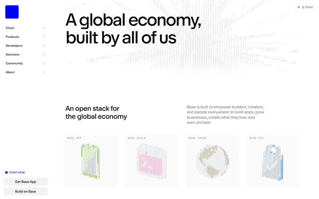
Base projects a precise, technical elegance with a high-contrast achromatic canvas punctuated by a single vibrant violet accent. Typography is dominant, employing a stark sans-serif for headlines and a more functional family for body text, creating a strong editorial feel. UI elements are compact, utilizing ghost buttons and minimal borders to maintain a lightweight, ethereal presence while the branding color provides clear, unambiguous interactive states. The overall impression is digital, modular, and performance-oriented.
The page maintains a centered max-width of 1128px for most content. The hero section features a large, stark headline centered over an abstract, faintly visible background graphic. Content sections alternate between full-width and centered text blocks. A prominent left-aligned sticky navigation bar features ghost links. Product features are presented in a 2x2 grid of informational cards that use the same abstract graphic style. Vertical rhythm is established by consistent 48px section gaps and compact element spacing within blocks.
The site uses abstract, geometric 3D renders with a wireframe or voxelated style. These graphics are primarily brand-colored (Vivid Cobalt, Emerald Green, Subtle Granite) against achromatic backgrounds, serving decorative and explanatory roles for product features. They are contained within their own sections, not full-bleed, and generally appear as symbolic representations rather than literal product screenshots. Icons are minimalist, outlined, and monochromatic, used sparsely to accompany text or data.
Reminiscent of Stripe, Linear, Figma, Vercel.
# Base — Style Reference
> Digital blueprint, on-chain precision.

**Theme:** light

**Site:** https://www.base.org

Base projects a precise, technical elegance with a high-contrast achromatic canvas punctuated by a single vibrant violet accent. Typography is dominant, employing a stark sans-serif for headlines and a more functional family for body text, creating a strong editorial feel. UI elements are compact, utilizing ghost buttons and minimal borders to maintain a lightweight, ethereal presence while the branding color provides clear, unambiguous interactive states. The overall impression is digital, modular, and performance-oriented.

## Tokens — Colors

| Name | Value | Token | Role |
|------|------|------|------|
| Vivid Cobalt | `#0000ff` | `--color-vivid-cobalt` | Violet outline accent for tags, dividers, and focused UI edges. Do not promote it to the primary CTA color |
| Subtle Granite | `#717886` | `--color-subtle-granite` | Outlined button borders, ghost link text, supporting body copy, providing contrast without being heavy |
| Emerald Green | `#098551` | `--color-emerald-green` | Green decorative accent for icons, marks, and small graphic details. Use as a supporting accent, not as a status color |
| Canvas White | `#ffffff` | `--color-canvas-white` | Page backgrounds, card surfaces, ghost button text (when on primary brand color) |
| Ink Black | `#000000` | `--color-ink-black` | Primary text, strong headings, button borders (neutral ghost), general UI elements |
| Haze Gray | `#f2f2f2` | `--color-haze-gray` | Subtle background for navigation elements, soft dividers |
| Twilight Graphite | `#323232` | `--color-twilight-graphite` | Navigation borders, denser text elements |
| Muted Ash | `#999999` | `--color-muted-ash` | Secondary text, metadata, subtle informational elements |
| Slate Mist | `#b1b7c3` | `--color-slate-mist` | Muted navigation text, tertiary UI text and icon fills |

## Tokens — Typography

### doto
- **Substitute:** Montserrat
- **Weights:** 400, 700
- **Sizes:** 16px, 115px
- **Line height:** 0.7, 1.5
- **Letter spacing:** -0.0250em
- **Role:** Display and prominent headings. The extreme letter-spacing and varied line heights suggest a highly crafted, almost artistic use of typography for visual impact rather than pure body text readability.

### coinbaseSans
- **Substitute:** Inter
- **Weights:** 400, 500
- **Sizes:** 12px, 14px, 15px, 16px, 32px, 80px, 110px
- **Line height:** 0.7, 1, 1.13, 1.14, 1.3, 1.33, 1.5
- **Letter spacing:** -0.0500em at 110px, -0.0300em at 80px, -0.0100em at 32px, 0.0100em at 12px
- **Role:** Large headings and callouts, designed for impact and clarity, providing an extended typographic range for key messaging.

### coinbaseDisplay
- **Substitute:** Open Sans
- **Weights:** 400
- **Sizes:** 14px, 16px
- **Line height:** 1.14, 1.43, 1.5
- **Letter spacing:** normal
- **Role:** Base body text. Its compact line-height and normal letter spacing optimize for content density without sacrificing readability.

### coinbaseMono
- **Substitute:** Roboto Mono
- **Weights:** 350, 400
- **Sizes:** 12px, 14px
- **Line height:** 0.9, 1.43
- **Letter spacing:** 0.0730em
- **Role:** Monospaced text for code snippets, data readouts, or elements requiring distinct visual separation due to their technical nature. The generous letter spacing enhances legibility for short code-like strings.

### baseSans
- **Substitute:** Inter
- **Weights:** 400
- **Sizes:** 18px
- **Line height:** 1.3
- **Letter spacing:** -0.0140em
- **Role:** Secondary body text and detailed descriptions. Its slightly larger size and tighter letter-spacing distinguish it from the main body copy, adding a touch of elegance for longer content blocks.

## Tokens — Type Scale

Augmented Fourth (1.414) from 15px base.

| Role | Size | Line height | Letter spacing |
|------|------|------|------|
| caption | 12px | 1.14 | — |
| body-sm | 14px | 1.14 | — |
| body | 15px | 1.14 | — |
| body-lg | 16px | 1.14 | — |
| heading-sm | 32px | 1.14 | — |
| heading | 80px | 1.14 | — |
| heading-lg | 110px | 1.14 | — |

## Tokens — Spacing

- **Max width:** 1128px
- **Section gap:** 48px
- **Card padding:** 12px
- **Element gap:** 4px

## Tokens — Radius

- **Default:** 8px
- **small:** 2px

## Layout

The page maintains a centered max-width of 1128px for most content. The hero section features a large, stark headline centered over an abstract, faintly visible background graphic. Content sections alternate between full-width and centered text blocks. A prominent left-aligned sticky navigation bar features ghost links. Product features are presented in a 2x2 grid of informational cards that use the same abstract graphic style. Vertical rhythm is established by consistent 48px section gaps and compact element spacing within blocks.

## Imagery

The site uses abstract, geometric 3D renders with a wireframe or voxelated style. These graphics are primarily brand-colored (Vivid Cobalt, Emerald Green, Subtle Granite) against achromatic backgrounds, serving decorative and explanatory roles for product features. They are contained within their own sections, not full-bleed, and generally appear as symbolic representations rather than literal product screenshots. Icons are minimalist, outlined, and monochromatic, used sparsely to accompany text or data.

## Components

### Ghost Navigation Item
*Primary navigation links in the sidebar*

Text in Ink Black (#000000) or Slate Mist (#b1b7c3) on Canvas White (#ffffff) background. No distinct background or border, minimal padding of 10px on all sides, 8px border radius. Interactive state uses Vivid Cobalt (#0000ff) border and text color.

### Filled Primary Button
*Main call-to-action button*

Background is Vivid Cobalt (#0000ff) with Canvas White (#ffffff) text. Uses 8px border radius, 4px vertical padding and 12px horizontal padding. Letter spacing is tight.

### Outlined Secondary Button
*Secondary or alternative actions*

Transparent background with Subtle Granite (#717886) border and text. Uses 8px border radius and 10px general padding. Emphasizes action without visual weight.

### Informational Card
*Cards displaying product features or statistics*

Canvas White (#ffffff) background. Padding is 12px. Uses an 8px border radius. Content typically includes a descriptive icon and text. Borders are minimal or absent.

## Guidelines

### Do

- Prioritize Ink Black (#000000) for all primary body text and headings.
- Use Haze Gray (#f2f2f2) sparingly for subtle background separation in navigation or soft dividers.
- Apply Vivid Cobalt (#0000ff) exclusively for interactive elements like buttons, active states, and links to maintain its impact.
- Maintain a compact button padding strategy: 4px vertical, 12px horizontal for filled buttons; 10px all-around for ghost/outlined buttons.
- Employ an 8px border radius for all interactive elements and informational cards, with an optional 2px radius for very small elements.
- Use 'doto' for display headlines requiring maximal visual impact, applying the specified negative letter-spacing for density.
- Ensure the page-level content is contained within a max-width of 1128px.

### Don't

- Do not introduce new chromatic colors outside of Vivid Cobalt (#0000ff) and Emerald Green (#098551) to avoid diluting the brand palette.
- Avoid heavy shadows or gradients, preserving the lightweight and flat aesthetic of surfaces.
- Do not use `coinbaseDisplay` for body copy; reserve it for clear, focused text blocks.
- Do not deviate from the established letter-spacing values for display and heading typography; these are critical for visual identity.
- Avoid complex, multi-layered backgrounds; keep canvas and card surfaces clean and monochromatic.
- Do not use generic button styles; stick to the Ghost, Outlined, and Filled variants with their predefined color and radius tokens.
- Do not use base unit multiples other than 4px for spacing decisions.

## Agent Prompt Guide

Quick Color Reference:
- text: #000000
- background: #ffffff
- border: #717886
- accent: #0000ff
- primary action: no distinct CTA color

Example Component Prompts:
- Create a primary navigation item: text 'Products' in Ink Black (#000000) against Canvas White (#ffffff) background, 8px radius, no visible border, with 10px padding on all sides. When active, text and left border should be Vivid Cobalt (#0000ff).
No distinct primary action color was observed; use the extracted neutral button treatments instead of inventing a filled CTA color.
- Design an outlined secondary button: 'Connect Wallet' in Subtle Granite (#717886) text with a 1px Subtle Granite (#717886) border, 8px radius, on a transparent background, 10px padding on all sides.
- Create a feature card: title 'Base App' in Ink Black (#000000) using coinbaseDisplay weight 400 at 16px, body text in Subtle Granite (#717886) using coinbaseDisplay weight 400 at 14px, on a Canvas White (#ffffff) background. Include an abstract visual element at the top. Use 8px border radius and 12px padding.
More like this







Keep what you find
A free account saves references to boards and can send you a weekly email of picks based on what you save.
To see every result, go Pro.