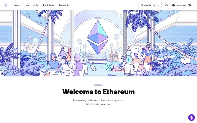
Preview image. Unlock full-res
Abstract digital canvas, illuminated.
Color palette
Section backgrounds, informational panels. Provides a soft, branded backdrop.
Primary call-to-action buttons, interactive elements, significant links. The dominant brand accent, signaling action.
Text on dark backgrounds, subtle shading within illustrations, creating depth.
Ambient background effects, creating a sense of ethereal space and depth.
Secondary accent for links, icons, and supporting visuals. Adds vibrancy and a touch of playfulness.
Tertiary accent for illustrative elements, links, and icons. Expands the vibrant, futuristic palette.
Contextual links and icon accents, adding a contrasting but harmonious hue.
Page backgrounds, card surfaces, critical text on brand accents.
Primary text, prominent headings, strong UI elements. Provides high contrast against light backgrounds.
Secondary text, subtle labels, less prominent UI elements.
Borders, dividers, subtle outlines. Establishes visual separation without strong contrast.
Subtle background shifts for sections or hover states.
Typography
- Weights
- 400, 700, 900
- Sizes
- 10px, 14px, 16px, 18px, 20px, 24px, 30px, 35px, 36px, 48px, 60px, 64px
- Line height
- 1, 1.1, 1.2, 1.3, 1.4, 1.6, 2
- Letter spacing
- normal
- Fallback
- system-ui, sans-serif
The primary typeface for all content - body text (400), bold emphasis (700), and striking headlines (900). Its clean, modern lines support readability across all sizes, from small labels to large display text. The weight 900 for display headlines provides significant visual impact.
- Weights
- 400
- Sizes
- 14px, 16px
- Line height
- 1.6
- Letter spacing
- normal
- Fallback
- Menlo, Consolas, monospace
Used for specialized UI elements like navigation items, denoting a technical or code-related context. Its monospaced nature subtly hints at the underlying technology focus.
Spacing & shape
Components
A transparent button with Graphite text (#121212) and no border, 4px border-radius. Padding 8px vertical, 16px horizontal. Signifies a low-priority action or navigation.
A transparent button with Ash Gray text (#616161) and a Silver Mist border (#cfcfcf), 0px border-radius. Padding 0px. Used for subtle actions like secondary navigation or hidden functionality.
A compact version of the primary button, with Electric Violet background (#6c24e0) and Cloud White text (#ffffff). Border radius 4px, padding 8px vertical, 16px horizontal. Used for inline or less prominent primary actions.
A card with no background color, no box-shadow, and 0px border-radius. It serves as a transparent container for content, relying on surrounding layout for definition.
A button with 9999px border-radius, typically used for tagging or filter functions, giving a distinct soft shape.
Guidelines
- Use Electric Violet (#6c24e0) exclusively for primary calls-to-action and active states to maintain visual hierarchy.
- Employ the Inter font at weight 900 for all display and large headings (48px, 60px, 64px) to convey authority and impact.
- Apply Lavender Bloom (#ece0ff) for background sections that need a branded, soft distinction from the main Cloud White canvas.
- Ensure generous padding, primarily 16px for content blocks and 32px for larger structural elements, to create an airy, spacious feel.
- Utilize 8px border-radius for primary buttons to give a modern, approachable feel, offsetting the sharper aesthetic of core UI elements.
- Implement the background radial gradient for hero sections or key interstitial blocks to introduce visual depth and brand mood.
- Do not use multiple contrasting accent colors in a single area; prioritize Electric Violet, reserving Fuchsia Burst and Indigo Orb for secondary illustration details.
- Avoid box-shadow on cards that are meant to be simple content containers; maintain the flat aesthetic unless elevation is explicitly required by interaction.
- Refrain from using more than two distinct font families; Inter and IBM Plex Mono are sufficient for all content and UI needs.
- Do not vary paragraph text size excessively; stick to 16px for body and 14px for captions for consistent readability.
- Avoid applying tight letter-spacing; all text should maintain 'normal' letter-spacing except where specific display styles are defined by the type scale.
About this system
ShowHide
This design system feels like a tech conference where abstract ideas are made tangible. Its light theme and ample white space convey clarity and openness, while a spectrum of vibrant violet-to-pink gradients and sharp vector illustrations infuse it with a futuristic, playful energy. The interplay between strong, almost black headings and lighter grey body text, anchored by a prominent purple accent, creates a sophisticated yet dynamic informational aesthetic. Rounded corners on interactive elements provide a friendly counterpoint to predominantly straight lines in graphics.
The page primarily uses a max-width, centered content model, providing ample white space on either side. The hero section is a full-bleed illustrated graphic, setting an immersive tone. Subsequent sections alternate between the main centered content block and full-width background treatments (like Lavender Bloom). Content arrangement often features a single-column stack for headlines and lead paragraphs, transitioning to multi-column layouts for features or exploratory content, frequently with text on one side and an accompanying illustration on the other. Vertical spacing between sections is generous (typically 40px), creating clear visual breaks. Navigation is a sticky top bar, containing branding, main links, and utility actions like search and language selection, maintaining constant access.
The site uses a distinctive style of 'line-art' vector illustrations, often featuring pastel-colored fills and outlines in the brand's violet, pink, and indigo hues. These are not flat but have a subtle dimensionality and often include abstract geometric elements (like the Ethereum logo). They are frequently full-width or large hero elements, serving decorative, atmospheric, and explanatory roles without being strictly product screenshots. There's an absence of traditional photography, favoring a consistent, stylized graphic language. Icons are outlined, matching the illustration style, usually monochrome or employing brand accents. Density favors imagery, with large illustrations often dominating sections, establishing an immersive visual experience rather than a text-heavy one.
Reminiscent of Aave, Uniswap, Arbitrum, Figma.
# ethereum.org — Style Reference
> Abstract digital canvas, illuminated.

**Theme:** light

**Site:** https://ethereum.org

This design system feels like a tech conference where abstract ideas are made tangible. Its light theme and ample white space convey clarity and openness, while a spectrum of vibrant violet-to-pink gradients and sharp vector illustrations infuse it with a futuristic, playful energy. The interplay between strong, almost black headings and lighter grey body text, anchored by a prominent purple accent, creates a sophisticated yet dynamic informational aesthetic. Rounded corners on interactive elements provide a friendly counterpoint to predominantly straight lines in graphics.

## Tokens — Colors

| Name | Value | Token | Role |
|------|------|------|------|
| Lavender Bloom | `#ece0ff` | `--color-lavender-bloom` | Section backgrounds, informational panels. Provides a soft, branded backdrop. |
| Electric Violet | `#6c24e0` | `--color-electric-violet` | Primary call-to-action buttons, interactive elements, significant links. The dominant brand accent, signaling action. |
| Deep Violet | `#41128c` | `--color-deep-violet` | Text on dark backgrounds, subtle shading within illustrations, creating depth. |
| Violet Mist Gradient | `#9357f4` | `--color-violet-mist-gradient` | Ambient background effects, creating a sense of ethereal space and depth. |
| Fuchsia Burst | `#f60e9d` | `--color-fuchsia-burst` | Secondary accent for links, icons, and supporting visuals. Adds vibrancy and a touch of playfulness. |
| Indigo Orb | `#3d4ceb` | `--color-indigo-orb` | Tertiary accent for illustrative elements, links, and icons. Expands the vibrant, futuristic palette. |
| Emerald Spark | `#0f9972` | `--color-emerald-spark` | Contextual links and icon accents, adding a contrasting but harmonious hue. |
| Cloud White | `#ffffff` | `--color-cloud-white` | Page backgrounds, card surfaces, critical text on brand accents. |
| Graphite | `#121212` | `--color-graphite` | Primary text, prominent headings, strong UI elements. Provides high contrast against light backgrounds. |
| Ash Gray | `#616161` | `--color-ash-gray` | Secondary text, subtle labels, less prominent UI elements. |
| Silver Mist | `#cfcfcf` | `--color-silver-mist` | Borders, dividers, subtle outlines. Establishes visual separation without strong contrast. |
| Ghost White | `#f7f7f7` | `--color-ghost-white` | Subtle background shifts for sections or hover states. |

## Tokens — Typography

### Inter
- **Substitute:** system-ui, sans-serif
- **Weights:** 400, 700, 900
- **Sizes:** 10px, 14px, 16px, 18px, 20px, 24px, 30px, 35px, 36px, 48px, 60px, 64px
- **Line height:** 1, 1.1, 1.2, 1.3, 1.4, 1.6, 2
- **Letter spacing:** normal
- **Role:** The primary typeface for all content - body text (400), bold emphasis (700), and striking headlines (900). Its clean, modern lines support readability across all sizes, from small labels to large display text. The weight 900 for display headlines provides significant visual impact.

### IBM Plex Mono
- **Substitute:** Menlo, Consolas, monospace
- **Weights:** 400
- **Sizes:** 14px, 16px
- **Line height:** 1.6
- **Letter spacing:** normal
- **Role:** Used for specialized UI elements like navigation items, denoting a technical or code-related context. Its monospaced nature subtly hints at the underlying technology focus.

## Tokens — Type Scale

Perfect Fourth (1.333) from 16px base.

| Role | Size | Line height | Letter spacing |
|------|------|------|------|
| caption | 10px | 1.4 | — |
| body-sm | 14px | 1.4 | — |
| body | 16px | 1.4 | — |
| subheading | 18px | 1.4 | — |
| heading-sm | 20px | 1.4 | — |
| heading | 24px | 1.3 | — |
| heading-lg | 30px | 1.3 | — |
| display | 64px | 1 | — |

## Tokens — Spacing

- **Section gap:** 40px
- **Card padding:** 0px
- **Element gap:** 8px

## Tokens — Radius

- **Default:** 4px
- **Buttons:** 8px
- **Cards:** 0px
- **large:** 32px
- **links:** 16px
- **pill:** 9999px

## Layout

The page primarily uses a max-width, centered content model, providing ample white space on either side. The hero section is a full-bleed illustrated graphic, setting an immersive tone. Subsequent sections alternate between the main centered content block and full-width background treatments (like Lavender Bloom). Content arrangement often features a single-column stack for headlines and lead paragraphs, transitioning to multi-column layouts for features or exploratory content, frequently with text on one side and an accompanying illustration on the other. Vertical spacing between sections is generous (typically 40px), creating clear visual breaks. Navigation is a sticky top bar, containing branding, main links, and utility actions like search and language selection, maintaining constant access.

## Imagery

The site uses a distinctive style of 'line-art' vector illustrations, often featuring pastel-colored fills and outlines in the brand's violet, pink, and indigo hues. These are not flat but have a subtle dimensionality and often include abstract geometric elements (like the Ethereum logo). They are frequently full-width or large hero elements, serving decorative, atmospheric, and explanatory roles without being strictly product screenshots. There's an absence of traditional photography, favoring a consistent, stylized graphic language. Icons are outlined, matching the illustration style, usually monochrome or employing brand accents. Density favors imagery, with large illustrations often dominating sections, establishing an immersive visual experience rather than a text-heavy one.

## Components

### CTA Button Group

### Popular Topics Cards

### Feature Section Card — Network Badge

### Ghost Button - Default
*Interactive element*

A transparent button with Graphite text (#121212) and no border, 4px border-radius. Padding 8px vertical, 16px horizontal. Signifies a low-priority action or navigation.

### Ghost Button - Secondary
*Interactive element*

A transparent button with Ash Gray text (#616161) and a Silver Mist border (#cfcfcf), 0px border-radius. Padding 0px. Used for subtle actions like secondary navigation or hidden functionality.

### Compact Action Button
*Call-to-action*

A compact version of the primary button, with Electric Violet background (#6c24e0) and Cloud White text (#ffffff). Border radius 4px, padding 8px vertical, 16px horizontal. Used for inline or less prominent primary actions.

### Feature Card - Basic
*Content container*

A card with no background color, no box-shadow, and 0px border-radius. It serves as a transparent container for content, relying on surrounding layout for definition.

### Pill Button
*Meta navigation / Tag*

A button with 9999px border-radius, typically used for tagging or filter functions, giving a distinct soft shape.

## Guidelines

### Do

- Use Electric Violet (#6c24e0) exclusively for primary calls-to-action and active states to maintain visual hierarchy.
- Employ the Inter font at weight 900 for all display and large headings (48px, 60px, 64px) to convey authority and impact.
- Apply Lavender Bloom (#ece0ff) for background sections that need a branded, soft distinction from the main Cloud White canvas.
- Ensure generous padding, primarily 16px for content blocks and 32px for larger structural elements, to create an airy, spacious feel.
- Utilize 8px border-radius for primary buttons to give a modern, approachable feel, offsetting the sharper aesthetic of core UI elements.
- Implement the background radial gradient for hero sections or key interstitial blocks to introduce visual depth and brand mood.

### Don't

- Do not use multiple contrasting accent colors in a single area; prioritize Electric Violet, reserving Fuchsia Burst and Indigo Orb for secondary illustration details.
- Avoid box-shadow on cards that are meant to be simple content containers; maintain the flat aesthetic unless elevation is explicitly required by interaction.
- Refrain from using more than two distinct font families; Inter and IBM Plex Mono are sufficient for all content and UI needs.
- Do not vary paragraph text size excessively; stick to 16px for body and 14px for captions for consistent readability.
- Avoid applying tight letter-spacing; all text should maintain 'normal' letter-spacing except where specific display styles are defined by the type scale.

## Agent Prompt Guide

### Quick Color Reference
- Primary Text: #121212
- Background: #ffffff
- Call-to-Action: #6c24e0
- Border/Divider: #cfcfcf
- Secondary Text: #616161
- Section Background: #ece0ff

### 3-5 Example Component Prompts
1. Create a `Primary Action Button`: background #6c24e0, text #ffffff, border-radius 8px, padding 12px 32px. Text 'Learn More' in Inter weight 400, size 16px, line-height 1.4.
2. Design a `Feature Card`: no background, no shadow, border-radius 0px, padding 0px. Within it, a heading 'What is Ethereum?' in Inter weight 900, size 35px, color #121212, line-height 1.1, followed by body text 'Ethereum is a decentralized...' in Inter weight 400, size 16px, color #616161, line-height 1.4.
3. Implement a `Section Header`: a small label 'NETWORK' in Inter weight 700, size 14px, color #f60e9d, followed by a main heading 'What is Ethereum?' in Inter weight 900, size 48px, color #121212, line-height 1.2.
4. Generate a `Ghost Button - Secondary` for a navigation link: background rgba(0, 0, 0, 0), text #616161, border-bottom 1px solid #cfcfcf, border-radius 0px, padding 0px. The text should be 'Search ⌘ K' in IBM Plex Mono weight 400, size 16px, line-height 1.6.
5. Build a `Full-width Background Section`: background color #ece0ff, with content centered with 40px top/bottom padding. The content inside will use standard Graphite text on Cloud White backgrounds.
More like this









Keep what you find
A free account saves references to boards and can send you a weekly email of picks based on what you save.
To see every result, go Pro.