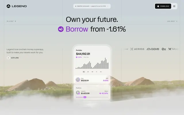
Preview image. Unlock full-res
Architectural blueprint on white marble
Color palette
Violet outline accent for tags, dividers, and focused UI edges. Do not promote it to the primary CTA color
Background gradient for specific sections, adding naturalistic depth with desaturated greens and browns
Used for background elements that need a deeper, more atmospheric transition from dark neutral to a hint of warmth
Page backgrounds, large content blocks, primary surfaces — a warm white that establishes a spacious, clean foundation
Primary text, strong borders, prominent icons, hero headlines — provides high contrast against light surfaces
Dark card backgrounds, secondary text on dark surfaces, subtle borders — a deep, almost off-black for elevated elements
Muted body text, secondary interface borders, subtle background tints — provides visual separation without high contrast
Subtle border accents, helper text, disabled states — an even lighter gray for tertiary information
Navigation text, less prominent body text, soft background accents — provides a soft contrast against brighter grays
Dark borders and separators for elevated surfaces and inverted UI. Do not promote it to the primary CTA color
Filled button backgrounds for secondary actions — a dark, solid gray for contained interactive elements
Subtle background panels, alternative light surface — a very light, almost white gray for layering
Typography
- Weights
- 400, 500
- Sizes
- 12px, 16px, 20px, 22px, 44px, 56px
- Line height
- 1, 1.1, 1.25, 1.3, 1.4, 1.5
- Letter spacing
- -0.0100em
- Fallback
- Inter
Primary typeface for headings, body text, and UI elements. Its clean, sans-serif forms with slightly condensed characters convey precision and modernity. While default weight is 400, a bolder 500 is used for key interface elements.
- Weights
- 400
- Sizes
- 11px, 13px
- Line height
- 1, 1.35
- Letter spacing
- 0.0600em
- Fallback
- Space Mono
Monospaced font for technical details, coordinates, and subtle navigation. Its fixed width creates a structured, data-driven feel and distinguishes it from the primary typeface, hinting at underlying complexity.
Spacing & shape
Elevation
Components
Text uses knapp font at 12px or 16px, Ink Black color, with a faint 1px border on hover or active states. Padding is usually 10px vertically and 16px horizontally.
No background color, Ink Black text, 0px border radius. Example: 'EXPLORE' button. Uses knapp font.
Background color is Button Gray (#2d2d2d), text is Canvas White (#ededed), border radius is 4px. Example: '+ −' buttons in expandable content sections.
White text on an Ink Black background, 8px border radius, with 16px padding on either side. Uses knapp font.
Background color is Deep Gray (#131313) with a 32px border radius and no box shadow. Padding is generally absent as content reaches the edges.
Background is transparent, uses Accent Violet (#8931c4) for the 'Q' or icon, and Ink Black for the question text. Features an Outline Gray (#474747) 1px border. The associated button has a Button Gray (#2d2d2d) background and 4px radius.
Guidelines
- Use Canvas White (#ededed) as the default page background to maintain a bright, expansive canvas.
- Apply Deep Gray (#131313) for cards or elevated content blocks to create subtle visual layering.
- Reserve Accent Violet (#8931c4) exclusively for key headlines, interactive states, and essential data points.
- Utilize knapp font family with its defined weights and line heights for all primary text content.
- Employ diatypeMono font for coordinates, technical details, or any data requiring a fixed-width presentation.
- Ensure buttons and interactive elements use either 4px or 8px border radius, as defined by their type (e.g., 4px for action buttons, 8px for nav buttons).
- Maintain a consistent 20px elementGap to structure content with comfortable breathing room.
- Do not introduce new saturated colors; the palette is intentionally monochromatic with a single accent.
- Avoid heavy drop shadows or excessive elevation; the system relies on subtle borders and background shifts for depth.
- Do not use generic font sizes; always refer to the established type scale (e.g., 56px for display, 16px for body).
- Never embed branding or illustrative elements that clash with the crisp, technical aesthetic.
- Do not use letter-spacing values other than the ones defined for knapp and diatypeMono.
- Avoid arbitrary border radii; adhere strictly to 4px, 8px, 12px, and 32px for specific components.
- Do not introduce gradients unless they are the Muted Forest Gradient or Charcoal Dawn Gradient, and only in defined background contexts.
About this system
ShowHide
Legend employs a stark, almost architectural interface, leveraging precise typography and a highly restrained achromatic color palette. A single vivid violet provides a 'switched-on' accent, pulling focus to key data points or interactive elements without overwhelming the clean surfaces. Components are lightweight and subtly defined, often through borders or slight shifts in gray rather than heavy fills, creating an experience that feels understated yet highly functional.
The page adheres to a max-width of 1416px, content is horizontally centered. The hero section uses a full-bleed background often incorporating subtle gradients and misty landscapes, with primary headlines stacked centrally. Subsequent sections alternate between full-width informational blocks and symmetrical two-column layouts featuring text on one side and a product screenshot or visual on the other. Vertical rhythm is established with a consistent section gap, creating a spacious and composed feel. Navigation is a fixed top bar on larger screens, highly utilitarian with minimal styling.
Imagery is predominantly product screenshots of a mobile application, presented in a clean, isolated style with very soft, diffused backgrounds that sometimes feature muted, out-of-focus naturalistic elements like hills or mist, often with a slight violet tint from the brand's accent color. Graphics are minimal, typically monochromatic icons or subtle geometric shapes, featuring fine outlines and filled states. The overall density of imagery is balanced, serving to exemplify product features rather than purely decorative atmospheric elements.
Reminiscent of Linear, Rive, Framer, Superhuman.
# Legend — Style Reference
> Architectural blueprint on white marble

**Theme:** light

**Site:** https://legend.xyz

Legend employs a stark, almost architectural interface, leveraging precise typography and a highly restrained achromatic color palette. A single vivid violet provides a 'switched-on' accent, pulling focus to key data points or interactive elements without overwhelming the clean surfaces. Components are lightweight and subtly defined, often through borders or slight shifts in gray rather than heavy fills, creating an experience that feels understated yet highly functional.

## Tokens — Colors

| Name | Value | Token | Role |
|------|------|------|------|
| Accent Violet | `#8931c4` | `--color-accent-violet` | Violet outline accent for tags, dividers, and focused UI edges. Do not promote it to the primary CTA color |
| Muted Forest Gradient | `#9c9991` | `--color-muted-forest-gradient` | Background gradient for specific sections, adding naturalistic depth with desaturated greens and browns |
| Charcoal Dawn Gradient | `#655c5b` | `--color-charcoal-dawn-gradient` | Used for background elements that need a deeper, more atmospheric transition from dark neutral to a hint of warmth |
| Canvas White | `#ededed` | `--color-canvas-white` | Page backgrounds, large content blocks, primary surfaces — a warm white that establishes a spacious, clean foundation |
| Ink Black | `#000000` | `--color-ink-black` | Primary text, strong borders, prominent icons, hero headlines — provides high contrast against light surfaces |
| Deep Gray | `#131313` | `--color-deep-gray` | Dark card backgrounds, secondary text on dark surfaces, subtle borders — a deep, almost off-black for elevated elements |
| Medium Gray | `#949494` | `--color-medium-gray` | Muted body text, secondary interface borders, subtle background tints — provides visual separation without high contrast |
| Light Gray | `#b2b2b2` | `--color-light-gray` | Subtle border accents, helper text, disabled states — an even lighter gray for tertiary information |
| Muted Gray | `#6c6c6c` | `--color-muted-gray` | Navigation text, less prominent body text, soft background accents — provides a soft contrast against brighter grays |
| Outline Gray | `#474747` | `--color-outline-gray` | Dark borders and separators for elevated surfaces and inverted UI. Do not promote it to the primary CTA color |
| Button Gray | `#2d2d2d` | `--color-button-gray` | Filled button backgrounds for secondary actions — a dark, solid gray for contained interactive elements |
| Background Gray | `#dedddc` | `--color-background-gray` | Subtle background panels, alternative light surface — a very light, almost white gray for layering |

## Tokens — Typography

### knapp
- **Substitute:** Inter
- **Weights:** 400, 500
- **Sizes:** 12px, 16px, 20px, 22px, 44px, 56px
- **Line height:** 1, 1.1, 1.25, 1.3, 1.4, 1.5
- **Letter spacing:** -0.0100em
- **Role:** Primary typeface for headings, body text, and UI elements. Its clean, sans-serif forms with slightly condensed characters convey precision and modernity. While default weight is 400, a bolder 500 is used for key interface elements.

### diatypeMono
- **Substitute:** Space Mono
- **Weights:** 400
- **Sizes:** 11px, 13px
- **Line height:** 1, 1.35
- **Letter spacing:** 0.0600em
- **Role:** Monospaced font for technical details, coordinates, and subtle navigation. Its fixed width creates a structured, data-driven feel and distinguishes it from the primary typeface, hinting at underlying complexity.

## Tokens — Type Scale

Perfect Fifth (1.5) from 11px base.

| Role | Size | Line height | Letter spacing |
|------|------|------|------|
| caption | 11px | 1 | 0.66px |
| heading | 20px | 1.3 | -0.2px |
| heading-lg | 22px | 1.25 | -0.22px |
| display-sm | 44px | 1.1 | -0.44px |
| display | 56px | 1.4 | -0.56px |

## Tokens — Spacing

- **Max width:** 1416px
- **Section gap:** 68px
- **Card padding:** 20px
- **Element gap:** 20px

## Tokens — Radius

- **General:** 4px
- **Buttons:** 4px
- **Cards:** 32px
- **navItems:** 12px

## Tokens — Elevation

- **Navigation Bar:** `rgba(0, 0, 0, 0.05) 0px 2px 2px 0px`

## Layout

The page adheres to a max-width of 1416px, content is horizontally centered. The hero section uses a full-bleed background often incorporating subtle gradients and misty landscapes, with primary headlines stacked centrally. Subsequent sections alternate between full-width informational blocks and symmetrical two-column layouts featuring text on one side and a product screenshot or visual on the other. Vertical rhythm is established with a consistent section gap, creating a spacious and composed feel. Navigation is a fixed top bar on larger screens, highly utilitarian with minimal styling.

## Imagery

Imagery is predominantly product screenshots of a mobile application, presented in a clean, isolated style with very soft, diffused backgrounds that sometimes feature muted, out-of-focus naturalistic elements like hills or mist, often with a slight violet tint from the brand's accent color. Graphics are minimal, typically monochromatic icons or subtle geometric shapes, featuring fine outlines and filled states. The overall density of imagery is balanced, serving to exemplify product features rather than purely decorative atmospheric elements.

## Components

### Navigation Item
*Text link within the primary navigation bar.*

Text uses knapp font at 12px or 16px, Ink Black color, with a faint 1px border on hover or active states. Padding is usually 10px vertically and 16px horizontally.

### Primary Ghost Button
*Text-only button with a transparent background.*

No background color, Ink Black text, 0px border radius. Example: 'EXPLORE' button. Uses knapp font.

### Secondary Filled Button
*Contained button for secondary actions.*

Background color is Button Gray (#2d2d2d), text is Canvas White (#ededed), border radius is 4px. Example: '+ −' buttons in expandable content sections.

### Navigation Utility Button
*Button within the utility navigation area (e.g. download button, menu icon).*

White text on an Ink Black background, 8px border radius, with 16px padding on either side. Uses knapp font.

### Product Display Card
*Showcases key data or features, like a phone screen rendering.*

Background color is Deep Gray (#131313) with a 32px border radius and no box shadow. Padding is generally absent as content reaches the edges.

### Expandable Content Header
*Header for an accordion-style content section.*

Background is transparent, uses Accent Violet (#8931c4) for the 'Q' or icon, and Ink Black for the question text. Features an Outline Gray (#474747) 1px border. The associated button has a Button Gray (#2d2d2d) background and 4px radius.

## Guidelines

### Do

- Use Canvas White (#ededed) as the default page background to maintain a bright, expansive canvas.
- Apply Deep Gray (#131313) for cards or elevated content blocks to create subtle visual layering.
- Reserve Accent Violet (#8931c4) exclusively for key headlines, interactive states, and essential data points.
- Utilize knapp font family with its defined weights and line heights for all primary text content.
- Employ diatypeMono font for coordinates, technical details, or any data requiring a fixed-width presentation.
- Ensure buttons and interactive elements use either 4px or 8px border radius, as defined by their type (e.g., 4px for action buttons, 8px for nav buttons).
- Maintain a consistent 20px elementGap to structure content with comfortable breathing room.

### Don't

- Do not introduce new saturated colors; the palette is intentionally monochromatic with a single accent.
- Avoid heavy drop shadows or excessive elevation; the system relies on subtle borders and background shifts for depth.
- Do not use generic font sizes; always refer to the established type scale (e.g., 56px for display, 16px for body).
- Never embed branding or illustrative elements that clash with the crisp, technical aesthetic.
- Do not use letter-spacing values other than the ones defined for knapp and diatypeMono.
- Avoid arbitrary border radii; adhere strictly to 4px, 8px, 12px, and 32px for specific components.
- Do not introduce gradients unless they are the Muted Forest Gradient or Charcoal Dawn Gradient, and only in defined background contexts.

## Agent Prompt Guide

primary action: #2d2d2d (filled action)
Create a Primary Action Button: #2d2d2d background, #ededed text, 9999px radius, compact pill padding. Use this filled treatment for the main CTA.

Example Component Prompts:
2. Create a feature card: Deep Gray background, 32px border radius. Inside, place a knapp font, 16px, Canvas White text title, and a diatypeMono font, 11px, Light Gray supporting text with 0.06em letter-spacing.
3. Create a secondary action button: Button Gray background, Canvas White text, 4px border radius, 16px horizontal and 10px vertical padding, using the knapp font, 16px, weight 500.
More like this






Keep what you find
A free account saves references to boards and can send you a weekly email of picks based on what you save.
To see every result, go Pro.